
Fraktur is a calligraphic hand of the Latin alphabet and any of several blackletter typefaces derived from this hand. It is designed such that the beginnings and ends of the individual strokes that make up each letter will be clearly visible, and often emphasized; in this way it is often contrasted with the curves of the Antiqua (common) typefaces where the letters are designed to flow and strokes connect together in a continuous fashion. The word "Fraktur" derives from Latin frāctūra, built from frāctus, passive participle of frangere, which is also the root for the English word "fracture". In non-professional contexts, the term "Fraktur" is sometimes misused to refer to all blackletter typefaces – while Fraktur typefaces do fall under that category, not all blackletter typefaces exhibit the Fraktur characteristics described above.
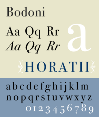
Bodoni is the name given to the serif typefaces first designed by Giambattista Bodoni (1740–1813) in the late eighteenth century and frequently revived since. Bodoni's typefaces are classified as Didone or modern. Bodoni followed the ideas of John Baskerville, as found in the printing type Baskerville—increased stroke contrast reflecting developing printing technology and a more vertical axis—but he took them to a more extreme conclusion. Bodoni had a long career and his designs changed and varied, ending with a typeface of a slightly condensed underlying structure with flat, unbracketed serifs, extreme contrast between thick and thin strokes, and an overall geometric construction.

Futura is a geometric sans-serif typeface designed by Paul Renner and released in 1927. It was designed as a contribution on the New Frankfurt-project. It is based on geometric shapes, especially the circle, similar in spirit to the Bauhaus design style of the period. It was developed as a typeface by the Bauer Type Foundry, in competition with Ludwig & Mayer's seminal Erbar typeface of 1926.

Antiqua is a style of typeface used to mimic styles of handwriting or calligraphy common during the 15th and 16th centuries. Letters are designed to flow, and strokes connect together in a continuous fashion; in this way it is often contrasted with Fraktur-style typefaces where the individual strokes are broken apart. The two typefaces were used alongside each other in the germanophone world, with the Antiqua–Fraktur dispute often dividing along ideological or political lines. After the mid-20th century, Fraktur fell out of favor and Antiqua-based typefaces became the official standard in Germany.
Hermann Joseph Otto Hubert August Constantin Hupp was a German graphical artist. His main working area was heraldry, yet he also worked as a typeface designer, creating commercial symbols and metal works.
Oblique type is a form of type that slants slightly to the right, used for the same purposes as italic type. Unlike italic type, however, it does not use different glyph shapes; it uses the same glyphs as roman type, except slanted. Oblique and italic type are technical terms to distinguish between the two ways of creating slanted font styles; oblique designs may be labelled italic by companies selling fonts or by computer programs. Oblique designs may also be called slanted or sloped roman styles. Oblique fonts, as supplied by a font designer, may be simply slanted, but this is often not the case: many have slight corrections made to them to give curves more consistent widths, so they retain the proportions of counters and the thick-and-thin quality of strokes from the regular design.
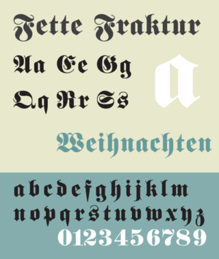
Fette Fraktur is a blackletter typeface of the sub-classification Fraktur designed by the German punchcutter Johann Christian Bauer (1802–1867) in 1850. The C.E. Weber Foundry published a version in 1875, and the D Stempel AG foundry published the version shown here in 1908.
Bauersche Gießerei was a German type foundry founded in 1837 by Johann Christian Bauer in Frankfurt am Main. Noted typeface designers, among them Lucian Bernhard, Konrad Friedrich Bauer, Walter Baum, Heinrich Jost, Imre Reiner, Friedrich Hermann Ernst Schneidler, Emil Rudolf Weiß, and Heinrich Wienyck, designed typefaces for the company.

Breitkopf Fraktur is a Blackletter font designed by typographer and German music publisher Johann Gottlob Immanuel Breitkopf (1719–1794). Breitkopf was the son of the publisher Bernhard Christoph Breitkopf, founder of the publishing house Breitkopf & Härtel, a firm that continues to the present day.
Continental Type Founders Association was founded by Melbert Brinckerhoff Cary Jr. in 1925 to distribute foundry type imported from European foundries. The influence of more modern European type design was thus felt in the United States for the first time, and American foundries responded by imitating many of the more popular faces. A.T.F.'s Paramount and Monotype's Sans Serif series are two examples of this.
The Wöllmer Type Foundry was founded by black-letter and script type designer Wilhelm Wöllmer. Wöllmer was first assistant in the commercial type foundry of Eduard Haenel. Wöllmer founded his own company in 1854 in Berlin as a commercial printing business. Ten years later, in 1864, he supplemented the business by opening a type foundry which remained in operation until 1938.
Ludwig & Mayer was a German type foundry in Frankfurt am Main, Germany. Many important designers worked for the Ludwig and Mayer type foundry, including Heinrich Jost, Karlgeorg Hoefer, Helmut Matheis, and most notably Jakob Erbar, whose Erbar Book was one of the first geometric sans-serif typefaces, predating both Paul Renner's Futura and Rudolf Koch's Kabel by some five years. Starting in 1925, Ludwig & Mayer types were distributed in the United States by Continental Type Founders Association. When the foundry ceased operations in 1984, rights to the typefaces was transmitted to the Neufville Typefoundry.

D. Stempel AG was a German typographic foundry founded by David Stempel (1869–1927), in Frankfurt am Main, Germany. Many important font designers worked for the Stempel foundry, including Hans Bohn, Warren Chappell, F. H. Ehmcke, Friedrich Heinrichsen, Hanns Th. Hoyer, F. W. Kleukens, Erich Meyer, Hans Möhring, Hiero Rhode, Wilhelm Schwerdtner, Herbert Thannhaeuser, Martin Wilke, Rudolf Wolf, Victor Hammer, Hermann Zapf, and Gudrun Zapf von Hesse. With the introduction of Memphis in 1929, the foundry was the first to cast modern slab serif typefaces.
Johann Christian Bauer (1802–1867) was a German type designer, punchcutter, and founder of the Bauer Type Foundry. Bauer was born in Hanau and began working as a punch-cutter in 1827. He ran a type foundry in Frankfurt am Main, Germany for three years with Christian Nies, before founding the Bauersche Gießerei in 1837. From 1837 to 1847 he worked for the firm of P.A. Wilson in Edinburgh, where he could study punch-cutting and type founding, as Great Britain was at that time in the forefront of the industry. While still in Edinburgh, he founded the firm of Bauer, Furgusson et Huie, though upon his return to Germany in 1847 the foundry was renamed Englische Schriftschneiderei und Gravieranstalt . A prolific craftsman, Bauer cut more than 10,000 punches with his own hands, though few of his designs are in use today as they are typical of the excesses of pre-Arts and Crafts Movement nineteenth century design. By the end of his life, the Bauer foundry was a worldwide concern.

J.G. Schelter & Giesecke was a German type foundry and manufacturer of printing presses started 1819 in Leipzig by punchcutter Johann Schelter and typefounder Christian Friedrich Giesecke (1793-1850). The foundry was nationalized in 1946 by the new German Democratic Republic, forming VEB Typoart, Dresden.

Haas Type Foundry was a Swiss manufacturer of foundry type. First the factory was located in Basel, in the 1920s they relocated to Münchenstein.
Schriftguss AG was a type foundry in Germany founded in 1892 under the name Brüder Butter by purchasing the type casting firm of Otto Ludwig Bechert that had been founded in 1889. It was later incorporated in 1922 as Schriftguss A.-G. vorm. [prev.] Brüder Butter. Their types were known for “vigour, liveliness and freshness.” Though some faces were done in house, the foundry mainly worked with outside “Schriftkünstler”, more than was typical at the time. A unique product of the foundry were modular systems of “Plakattype” to compose shapes and letterforms for display and jobbing applications, for instance Dekora, or Albert Auspurg’s 1931 Ne-Po (negative–positive), and finally Super-Plakattype in 1949. After the Nazi seizure of power in 1933 the last of the Butter brothers resigned from the corporation and it was changed to a limited partnership. In 1948 the company was expropriated by the post-war communist government and became public property, under the name VEB Schriftguss Dresden, eventually becoming merged into VEB Typoart – Drucktypen, Matrizen, Messinglinien in 1951. As a state run enterprise, the foundry lost its verve and panache and settled into producing serviceable type without distinction.
The Inland Type Foundry was an American type foundry established in 1894 in Saint Louis, Missouri and later with branch offices in Chicago and New York City. Although it was founded to compete directly with the "type trust", and was consistently profitable, it was eventually sold to ATF.
J. D. Trennert and Son was a German type foundry established in Altona.
Max Salzmann was a German designer at the Schelter & Giesecke Type Foundry. He immigrated to the United States.
