Related Research Articles
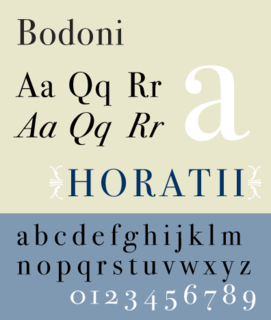
Bodoni is the name given to the serif typefaces first designed by Giambattista Bodoni (1740–1813) in the late eighteenth century and frequently revived since. Bodoni's typefaces are classified as Didone or modern. Bodoni followed the ideas of John Baskerville, as found in the printing type Baskerville—increased stroke contrast reflecting developing printing technology and a more vertical axis—but he took them to a more extreme conclusion. Bodoni had a long career and his designs changed and varied, ending with a typeface of a slightly condensed underlying structure with flat, unbracketed serifs, extreme contrast between thick and thin strokes, and an overall geometric construction.
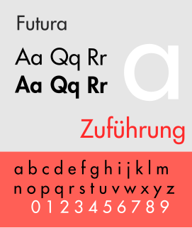
Futura is a geometric sans-serif typeface designed by Paul Renner and released in 1927. It was designed as a contribution on the New Frankfurt-project. It is based on geometric shapes, especially the circle, similar in spirit to the Bauhaus design style of the period. It was developed as a typeface by the Bauer Type Foundry, in competition with Ludwig & Mayer's seminal Erbar typeface of 1926.
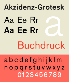
Akzidenz-Grotesk is a sans-serif typeface family originally released by the Berthold Type Foundry of Berlin. "Akzidenz" indicates its intended use as a typeface for commercial print runs such as publicity, tickets and forms, as opposed to fine printing, and "grotesque" was a standard name for sans-serif typefaces at the time.
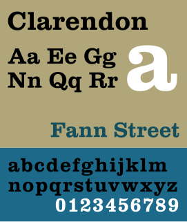
Clarendon is the name of a slab-serif typeface that was released in 1845 by Thorowgood and Co. of London, a letter foundry often known as the Fann Street Foundry. The original Clarendon design is credited to Robert Besley, a partner in the foundry, and was originally engraved by punchcutter Benjamin Fox, who may also have contributed to its design. Many copies, adaptations and revivals have been released, becoming almost an entire genre of type design.

Stephenson Blake is an engineering company based in Sheffield, England. The company was active from the early 19th century as a type founder, remaining until the 1990s as the last active type foundry in Britain, since when it has diversified into specialist engineering.
The Bauer Type Foundry was a German type foundry founded in 1837 by Johann Christian Bauer in Frankfurt am Main. Noted typeface designers, among them Lucian Bernhard, Konrad Friedrich Bauer, Walter Baum, Heinrich Jost, Imre Reiner, Friedrich Hermann Ernst Schneidler, Emil Rudolf Weiß, and Heinrich Wienyck, designed typefaces for the company.
Continental Type Founders Association was founded by Melbert Brinckerhoff Cary Jr. in 1925 to distribute foundry type imported from European foundries. The influence of more modern European type design was thus felt in the United States for the first time, and American foundries responded by imitating many of the more popular faces. A.T.F.'s Paramount and Monotype's Sans Serif series are two examples of this.

The Intertype Corporation produced the Intertype, a typecasting machine closely resembling the Linotype, and using the same matrices as the Linotype. It was founded in New York in 1911 by Hermann Ridder, of Ridder Publications, as the International Typesetting Machine Company, but purchased by a syndicate for $1,650,000 in 1916 and reorganized as the Intertype Corporation.

D. Stempel AG was a German typographic foundry founded by David Stempel (1869–1927), in Frankfurt am Main, Germany. Many important font designers worked for the Stempel foundry, including Hans Bohn, Warren Chappell, F. H. Ehmcke, Friedrich Heinrichsen, Hanns Th. Hoyer, F. W. Kleukens, Erich Meyer, Hans Möhring, Hiero Rhode, Wilhelm Schwerdtner, Herbert Thannhaeuser, Martin Wilke, Rudolf Wolf, Victor Hammer, Hermann Zapf, and Gudrun Zapf von Hesse. With the introduction of Memphis in 1929, the foundry was the first to cast modern slab serif typefaces.

In typography, Erbar or Erbar-Grotesk is a sans-serif typeface in the geometric style, one of the first designs of this kind released as type. Designer Jakob Erbar's aim was to design a printing type which would be free of all individual characteristics, possess thoroughly legible letter forms, and be a purely typographic creation. His conclusion was that this could only work if the type form was developed from a fundamental element, the circle. Erbar-Grotesk was developed in stages; Erbar wrote that he had originally sketched out the design in 1914 but had been prevented from working on it due to the war. The original version of Erbar was released in 1926, following Erbar's "Phosphor" titling capitals of 1922 which are very similar in design.
Johann Christian Bauer (1802–1867) was a German type designer, punchcutter, and founder of the Bauer Type Foundry. Bauer was born in Hanau and began working as a punch-cutter in 1827. He ran a type foundry in Frankfurt am Main, Germany for three years with Christian Nies, before founding the Bauersche Gießerei in 1837. From 1837 to 1847 he worked for the firm of P.A. Wilson in Edinburgh, where he could study punch-cutting and type founding, as Great Britain was at that time in the forefront of the industry. While still in Edinburgh, he founded the firm of Bauer, Furgusson et Huie, though upon his return to Germany in 1847 the foundry was renamed Englische Schriftschneiderei und Gravieranstalt . A prolific craftsman, Bauer cut more than 10,000 punches with his own hands, though few of his designs are in use today as they are typical of the excesses of pre-Arts and Crafts Movement nineteenth century design. By the end of his life, the Bauer foundry was a worldwide concern.
Konrad Friedrich Bauer was a German type designer who, though not related to founder Johann Christian Bauer, was head of the art department for the Bauer Type Foundry from 1928 until his retirement in 1968. Bauer's father was a type founder in Altona and Bauer studied art and the history of lettering before serving a printers's apprentiship. Bauer revived and modified many nineteenth-century designs and he designed Fortune the first Clarendon typeface with a matching italic. He is the author of many books on the history of design and taught book design, type and printing at the University of Mainz from 1947 until his death.
Walter Baum was a German type designer, graphic artist and teacher. Baum trained as a typesetter from 1935 to 1939, he resumed his studies after the war before becoming head of the graphics studio at the Bauer Type Foundry in 1948. There he collaborated with Konrad Friedrich Bauer in designing many typefaces, including Fortune, the first Clarendon typeface with a matching italic. From 1972 to 1986 he was director of the Kunstschule Westend in Frankfurt am Main.
C.E. Weber was a German type foundry established in 1827 in Stuttgart. Noted designers working for the foundry included Georg Trump, and Ernst Schneidler. The foundry closed in 1970; some designs passed to the Johannes Wagner Type Foundry, others to Stempel.
The Type foundry Amsterdam was a Dutch type foundry that contributed a number of original type designs early in the 20th century. It eventually became a division of Tetterode. On October 1, 2000, Tetterode transferred the rights for all of its typefaces to Linotype.
Genzsch & Heyse was a German type foundry established in Hamburg. In the 1920s and 1930s, G+H types were sold in the United States by Continental Type Founders Association.
There have been two, unrelated firms using the name Baltimore Type Foundry.
Martin Wilke was a German type designer, mostly of script faces. He studied at the School of Arts and Crafts or School of Applied Arts in Berlin in 1921. After 1923, he was hired by studio of Wilhelm Deffke and later became an independent graphic designer.
References
- ↑ Genzmer, Fritz, Das Buch des Setzers, 1948.
- ↑ List of foundry types taken from these sources:
- Jaspert, W. Pincus, W. Turner Berry and A.F. Johnson, The Encyclopedia of Type Faces, Blandford Press Lts.: 1953, 1983, ISBN 0-7137-1347-X, p. 2408-2409.
- "Foundry Type Fonts of German Type Foundries at the End of the Nazi Era Pro" (PDF). Ulrich Stiehl. 22 February 1999. Retrieved 9 November 2011.