Garamond is a group of many serif typefaces, named for sixteenth-century Parisian engraver Claude Garamond, generally spelled as Garamont in his lifetime. Garamond-style typefaces are popular and particularly often used for book printing and body text.

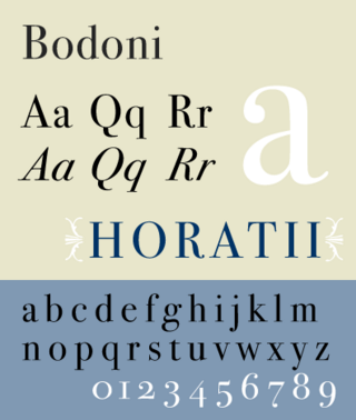
Bodoni is the name given to the serif typefaces first designed by Giambattista Bodoni (1740–1813) in the late eighteenth century and frequently revived since. Bodoni's typefaces are classified as Didone or modern. Bodoni followed the ideas of John Baskerville, as found in the printing type Baskerville—increased stroke contrast reflecting developing printing technology and a more vertical axis—but he took them to a more extreme conclusion. Bodoni had a long career and his designs changed and varied, ending with a typeface of a slightly condensed underlying structure with flat, unbracketed serifs, extreme contrast between thick and thin strokes, and an overall geometric construction.

American Type Founders (ATF) Co. was a business trust created in 1892 by the merger of 23 type foundries, representing about 85 percent of all type manufactured in the United States at the time. The new company, consisting of a consolidation of firms from throughout the United States, was incorporated in New Jersey.

Franklin Gothic and its related faces are a large family of sans-serif typefaces in the industrial or grotesque style developed in the early years of the 20th century by the type foundry American Type Founders (ATF) and credited to its head designer Morris Fuller Benton. “Gothic” was a contemporary term meaning sans-serif.

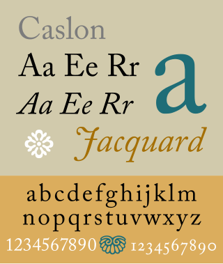
Caslon is the name given to serif typefaces designed by William Caslon I (c. 1692–1766) in London, or inspired by his work.

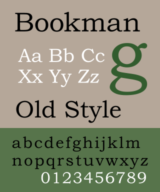
Bookman or Bookman Old Style, is a serif typeface. A wide, legible design that is slightly bolder than most body text faces, Bookman has been used for both display typography, for trade printing such as advertising, and less commonly for body text. In advertising use it is particularly associated with the graphic design of the 1960s and 1970s, when revivals of it were very popular. It is also used as the official font of Indonesian laws since 2011.

Cheltenham is a typeface for display use designed in 1896 by architect Bertram Goodhue and Ingalls Kimball, director of the Cheltenham Press. The original drawings were known as Boston Old Style and were made about 14" high. These drawings were then turned over to Morris Fuller Benton at American Type Founders (ATF) who developed it into a final design. Trial cuttings were made as early as 1899 but the face was not complete until 1902. The face was patented by Kimball in 1904. Later the basic face was spun out into an extensive type family by Morris Fuller Benton.

Goudy Old Style is an old-style serif typeface originally created by Frederic W. Goudy for American Type Founders (ATF) in 1915.

News Gothic is a sans-serif typeface designed by Morris Fuller Benton, and was released in 1908 by his employer American Type Founders (ATF). The typeface is similar in proportion and structure to Franklin Gothic, also designed by Benton, but lighter.

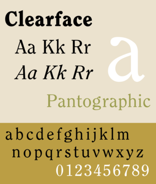
Clearface is a serif typeface designed by Morris Fuller Benton with the collaboration of his father Linn Boyd Benton, produced at American Type Founders in 1907.

Broadway is a decorative typeface, perhaps the archetypal Art Deco typeface. The original face was designed by Morris Fuller Benton in 1927 for ATF as a capitals only display face. It had a long initial run of popularity, before being discontinued by ATF in 1954. It was re-discovered in the Cold Type Era and has ever since been used to evoke the feeling of the twenties and thirties. The font has been used in the TV shows Rhoda and My Life as a Teenage Robot. Several variants were made:
Barnhart Brothers & Spindler Type Foundry was an American company founded as the Great Western Type Foundry in 1873. It became Barnhart Brothers & Spindler ten years later. It was a successful foundry known for innovative type design and well designed type catalogs. Oz Cooper, Will Ransom, Robert Wiebking, and Sidney Gaunt all designed for BB&S. It was bought out by American Type Founders in 1911 with the proviso that the merger would not take effect for twenty years, so that the employees would have a chance to find new work or retire over time. The foundry was finally closed in 1933.
Robert Wiebking (1870–1927) was a German-American engraver typeface designer who was known for cutting type matrices for Frederic Goudy from 1911 to 1926.

Spartan is a geometric sans-serif typeface created for Mergenthaler Linotype Company as a direct competitor to Bauer's Futura. The face was made for machine composition by Linotype, while identical foundry type was issued by American Type Founders (ATF). Although some have credited John L. Renshaw with the design of Spartan, he worked at ATF, not Linotype, and only worked on the designs of some additional weights of Spartan for ATF which Linotype did not offer. Testing by Bausch & Lomb, after the creation of Spartan in 1951, determined it to be the "most readable" typeface of the time.

Century is a family of serif type faces particularly intended for body text. The family originates from a first design, Century Roman, cut by American Type Founders designer Linn Boyd Benton in 1894 for master printer Theodore Low De Vinne, for use in The Century Magazine. ATF rapidly expanded it into a very large family, first by Linn Boyd, and later by his son Morris.
Samuel Winfield "Tommy" Thompson (1906–1967) was an American calligrapher, graphic artist and typeface designer. He was born Blue Point, New York. In 1944 he became the first designer to earn royalties for a type design, from Photo Lettering Inc. for his Thompson Quill Script. Previously, designers had worked in house for foundries or had sold the rights to their faces outright. He maintained a studio in Norwalk, Connecticut and was the author of several books on type and lettering.

In typography, a fat face letterform is a serif typeface or piece of lettering in the Didone or modern style with an extremely bold design. Fat face typefaces appeared in London around 1805–1810 and became widely popular; John Lewis describes the fat face as "the first real display typeface."


