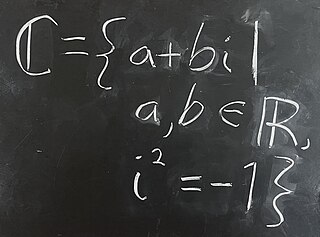
Blackboard bold is a style of writing bold symbols on a blackboard by doubling certain strokes, commonly used in mathematical lectures, and the derived style of typeface used in printed mathematical texts. The style is most commonly used to represent the number sets , (integers), , , and .

Type design is the art and process of designing typefaces. This involves drawing each letterform using a consistent style. The basic concepts and design variables are described below.

A typeface is a design of letters, numbers and other symbols, to be used in printing or for electronic display. Most typefaces include variations in size, weight, slope, width, and so on. Each of these variations of the typeface is a font.
Although people in many parts of the world share common alphabets and numeral systems, styles of handwritten letterforms vary between individuals, and sometimes also vary systematically between regions.

Phi is the twenty-first letter of the Greek alphabet.

The long s⟨ſ⟩, also known as the medial s or initial s, is an archaic form of the lowercase letter ⟨s⟩. It replaced the single s, or one or both of the letters s in a "double s" sequence. The modern ⟨s⟩ letterform is known as the "short", "terminal", or "round" s. In typography, it is known as a type of swash letter, commonly referred to as a "swash s". The long s is the basis of the first half of the grapheme of the German alphabet ligature letter ⟨ß⟩,.

Univers is a large sans-serif typeface family designed by Adrian Frutiger and released by his employer Deberny & Peignot in 1957. Classified as a neo-grotesque sans-serif, one based on the model of nineteenth-century German typefaces such as Akzidenz-Grotesk, it was notable for its availability from the moment of its launch in a comprehensive range of weights and widths. The original marketing for Univers deliberately referenced the periodic table to emphasise its scope.

In writing and typography, a ligature occurs where two or more graphemes or letters are joined to form a single glyph. Examples are the characters ⟨æ⟩ and ⟨œ⟩ used in English and French, in which the letters ⟨a⟩ and ⟨e⟩ are joined for the first ligature and the letters ⟨o⟩ and ⟨e⟩ are joined for the second ligature. For stylistic and legibility reasons, ⟨f⟩ and ⟨i⟩ are often merged to create ⟨fi⟩ ; the same is true of ⟨s⟩ and ⟨t⟩ to create ⟨st⟩. The common ampersand developed from a ligature in which the handwritten Latin letters ⟨e⟩ and ⟨t⟩ were combined.

Letter case is the distinction between the letters that are in larger uppercase or capitals and smaller lowercase in the written representation of certain languages. The writing systems that distinguish between the upper- and lowercase have two parallel sets of letters: each in the majuscule set has a counterpart in the minuscule set. Some counterpart letters have the same shape, and differ only in size, but for others the shapes are different. The two case variants are alternative representations of the same letter: they have the same name and pronunciation and are typically treated identically when sorting in alphabetical order.
Gaelic type is a family of Insular script typefaces devised for printing Classical Gaelic. It was widely used from the 16th century until the mid-18th century in Scotland and the mid-20th century in Ireland, but is now rarely used. Sometimes, all Gaelic typefaces are called Celtic or uncial although most Gaelic types are not uncials. The "Anglo-Saxon" types of the 17th century are included in this category because both the Anglo-Saxon types and the Gaelic/Irish types derive from the insular manuscript hand.

In metal typesetting, a font is a particular size, weight and style of a typeface. Each font is a matched set of type, with a piece for each glyph. A typeface consists of various fonts that share an overall design.
A letter is a segmental symbol of a phonemic writing system. The inventory of all letters forms an alphabet. Letters broadly correspond to phonemes in the spoken form of the language, although there is rarely a consistent and exact correspondence between letters and phonemes.
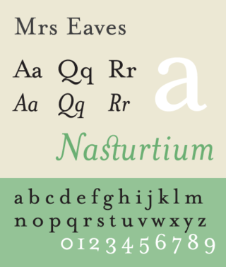
Mrs Eaves is a transitional serif typeface designed by Zuzana Licko in 1996. It is a variant of Baskerville, which was designed in Birmingham, England, in the 1750s. Mrs Eaves adapts Baskerville for use in display contexts, such as headings and book blurbs, through the use of a low x-height and a range of unusual combined characters or ligatures.

Bell Centennial is a sans-serif typeface in the industrial or grotesque style designed by Matthew Carter in the period 1975–1978. The typeface was commissioned by AT&T as a proprietary type to replace their then current directory typeface Bell Gothic on the occasion of AT&T's one hundredth anniversary. Carter was working for the Mergenthaler Linotype Company, which now licenses the face for general public use.

Bulmer is the name given to a serif typeface originally designed by punchcutter William Martin around 1790 for the Shakespeare Press, run by William Bulmer (1757–1830). The types were used for printing the Boydell Shakespeare folio edition.

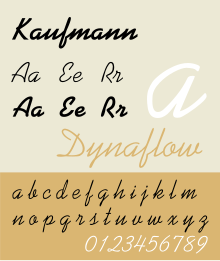
Balloon is a brush script commonly used for signage or display purposes. It was designed in 1939 by Max R. Kaufmann, for American Type Founders, in response to Howard Allen Trafton's Cartoon, cut for Bauer Type Foundry in 1936. It had no lowercase letters and was cast in Light, Bold, and Extra Bold. The two lighter weights were identical with Kaufmann Script and so could be used as alternate capitals for that face. It is most notably used in the Madeline books, TV series and film. The font was most famously known for the typeface of the Nickelodeon logo from late 1984 to 2009 in white letters with an orange splat background.

Script typefaces are based upon the varied and often fluid stroke created by handwriting. They are generally used for display or trade printing, rather than for extended body text in the Latin alphabet. Some Greek alphabet typefaces, especially historically, have been a closer simulation of handwriting.

Handel Gothic is a geometric sans-serif typeface designed in 1965 by Donald J. Handel (1936–2002), who worked for the graphic designer Saul Bass.
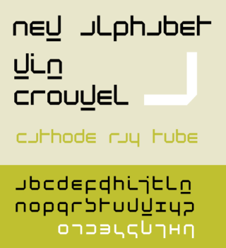
New Alphabet is a parametric typeface designed by Wim Crouwel, released in 1967. It embraced the limitations of the display technology that it was displayed on by only using horizontal and vertical strokes. This meant that some of the letters had little resemblance to the letters they were supposed to represent. New Alphabet was notably used on the cover of Joy Division's 1988 compilation album Substance.
Typeface anatomy describes the graphic elements that make up letters in a typeface.