Related Research Articles

Palatino is the name of an old-style serif typeface designed by Hermann Zapf, initially released in 1949 by the Stempel foundry and later by other companies, most notably the Mergenthaler Linotype Company.

Optima is a humanist sans-serif typeface designed by Hermann Zapf and released by the D. Stempel AG foundry, Frankfurt, West Germany in 1958.
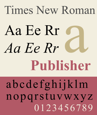
Times New Roman is a serif typeface. It was commissioned by the British newspaper The Times in 1931 and conceived by Stanley Morison, the artistic adviser to the British branch of the printing equipment company Monotype, in collaboration with Victor Lardent, a lettering artist in The Times's advertising department. It has become one of the most popular typefaces of all time and is installed on most personal computers.
The Mergenthaler Linotype Company is a corporation founded in the United States in 1886 to market the Linotype machine, a system to cast metal type in lines (linecaster) invented by Ottmar Mergenthaler. It became the world's leading manufacturer of book and newspaper typesetting equipment; outside North America, its only serious challenger for book typesetting was the Anglo-American Monotype Corporation. Starting in 1960, the Mergenthaler Linotype Company became a major supplier of phototypesetting equipment which included laser typesetters, typefonts, scanners, typesetting computers. In 1987, the US-based Mergenthaler Linotype Company became part of the German Linotype-Hell AG; in the US the company name changed to Linotype Co. In 1996, the German Linotype-Hell AG was taken over by the German printing machine company Heidelberger Druckmaschinen AG. A separate business, Linotype Library GmbH was established to manage the digital assets. In 2005, Linotype Library GmbH shortened its name to Linotype GmbH, and in 2007, Linotype GmbH was acquired by Monotype Imaging Holdings, Inc., the parent of Monotype Imaging, Inc. and others.

Helvetica, also known by its original name Neue Haas Grotesk, is a widely used sans-serif typeface developed in 1957 by Swiss typeface designer Max Miedinger and Eduard Hoffmann.

Matthew Carter is a British type designer. A 2005 New Yorker profile described him as 'the most widely read man in the world' by considering the amount of text set in his commonly used fonts.

Frutiger is a series of typefaces named after its Swiss designer, Adrian Frutiger. Frutiger is a humanist sans-serif typeface, intended to be clear and highly legible at a distance or at small text sizes. A very popular design worldwide, type designer Steve Matteson described its structure as "the best choice for legibility in pretty much any situation" at small text sizes, while Erik Spiekermann named it as "the best general typeface ever".

Univers is a large sans-serif typeface family designed by Adrian Frutiger and released by his employer Deberny & Peignot in 1957. Classified as a neo-grotesque sans-serif, one based on the model of nineteenth-century German typefaces such as Akzidenz-Grotesk, it was notable for its availability from the moment of its launch in a comprehensive range of weights and widths. The original marketing for Univers deliberately referenced the periodic table to emphasise its scope.

Adrian Johann Frutiger was a Swiss typeface designer who influenced the direction of type design in the second half of the 20th century. His career spanned the hot metal, phototypesetting and digital typesetting eras. Until his death, he lived in Bremgarten bei Bern.
Monotype Imaging Holdings Inc., founded as Lanston Monotype Machine Company in 1887 in Philadelphia by Tolbert Lanston, is an American company that specializes in digital typesetting and typeface design for use with consumer electronics devices. Incorporated in Delaware and headquartered in Woburn, Massachusetts, the company has been responsible for many developments in printing technology—in particular the Monotype machine, which was a fully mechanical hotmetal typesetter, that produced texts automatically, all single type. Monotype was involved in the design and production of many typefaces in the 20th century. Monotype developed many of the most widely used typeface designs, including Times New Roman, Gill Sans, Arial, Bembo and Albertus.

Kris Holmes is an American typeface designer, calligrapher, type design educator and animator. She, with Charles Bigelow, is the co-creator of the Lucida and Wingdings font families, among many other typeface designs. She is President of Bigelow & Holmes Inc., a typeface design studio.

In metal typesetting, a font is a particular size, weight and style of a typeface. Each font is a matched set of type, with a piece for each glyph. A typeface consists of various fonts that share an overall design.
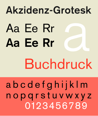
Akzidenz-Grotesk is a sans-serif typeface family originally released by the Berthold Type Foundry of Berlin. "Akzidenz" indicates its intended use as a typeface for commercial print runs such as publicity, tickets and forms, as opposed to fine printing, and "grotesque" was a standard name for sans-serif typefaces at the time.

DIN 1451 is a sans-serif typeface that is widely used for traffic, administrative and technical applications.

Sabon is an old-style serif typeface designed by the German-born typographer and designer Jan Tschichold (1902–1974) in the period 1964–1967. It was released jointly by the Linotype, Monotype, and Stempel type foundries in 1967. The design of the roman is based on types by Claude Garamond, particularly a specimen printed by the Frankfurt printer Konrad Berner. Berner had married the widow of a fellow printer Jacques Sabon, the source of the face's name, who had bought some of Garamond's type after his death. The italics are based on types designed by a contemporary of Garamond's, Robert Granjon. It is effectively a Garamond revival, though a different name was chosen as many other modern typefaces already carry this name.

Syntax comprises a family of fonts designed by Swiss typeface designer Hans Eduard Meier. Originally just a sans-serif font, it was extended with additional serif designs.

Bank Gothic is a rectilinear geometric sans-serif typeface designed by Morris Fuller Benton for American Type Founders and released in 1930. The design has become popular from the late twentieth century to suggest a science-fiction, military, corporate, or sports aesthetic.
Max Miedinger was a Swiss typeface designer, best known for creating the Neue Haas Grotesk typeface in 1957, renamed Helvetica in 1960. Marketed as a symbol of cutting-edge Swiss technology, Helvetica achieved immediate global success.

OCR-A is a font issued in 1966 and first implemented in 1968. A special font was needed in the early days of computer optical character recognition, when there was a need for a font that could be recognized not only by the computers of that day, but also by humans. OCR-A uses simple, thick strokes to form recognizable characters. The font is monospaced (fixed-width), with the printer required to place glyphs 0.254 cm apart, and the reader required to accept any spacing between 0.2286 cm and 0.4572 cm.
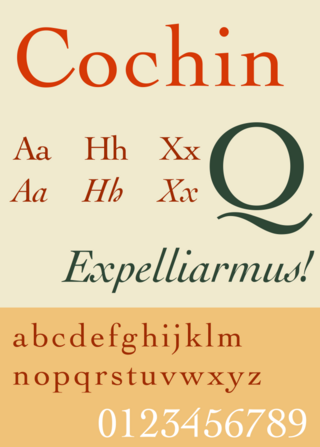
Cochin is a serif typeface. It was originally produced in 1912 by Georges Peignot for the Paris foundry G. Peignot et Fils and was based on the copperplate engravings of 18th century French artist Charles-Nicolas Cochin, from which the typeface also takes its name. The font has a small x-height with long ascenders. Georges Peignot also created the design 'Nicolas-Cochin' as a looser variation in the same style.
References
- ↑ "Daniel John Andrew Reynolds" (PDF). klingspor-museum.de (in German). Retrieved 10 September 2023.
- ↑ "Malabar® font family". Linotype.com. Retrieved 10 September 2023.
- ↑ "German Design Council - Winner". Archived from the original on 1 October 2011. Retrieved 15 November 2011.