Category | Sans-serif |
---|---|
Classification | Geometric sans-serif |
Designer(s) | Christian Schwartz |
Foundry | House Industries |
Date released | 2002 |
Neutraface is a geometric sans-serif typeface designed by Christian Schwartz for House Industries, an American digital type foundry. [1] [2] It was influenced by the work of architect Richard Neutra and was developed with the assistance of Neutra's son and former partner, Dion Neutra.
Neutraface was designed by Christian Schwartz over the period of a year with assistance in art direction from Ken Barber and Andy Cruz. [3] [4] It was the result of a project started by Schwartz to design "the most typographically complete geometric sans serif family ever", [3] based on Richard Neutra's principles of architecture and design. [5] The Neutraface alphabet was developed through consultation with Neutra's son and former partner, Dion Neutra, and with reference to the signs on the buildings designed by Neutra. [5] Since there were limited samples of Neutra's signage and no lowercase, much of the design was Schwartz's invention. The lowercase was influenced by Avenir, Futura, Nobel and Tempo. [3] [1]
Although Neutraface was conceived as a display and headline typeface, Neutraface Text was created to complement Neutraface Display. Neutraface Text has a larger x-height than its display counterpart and increased stroke contrast. [5]
Neutraface was originally released with Display and Text styles. Additional weights have been released.
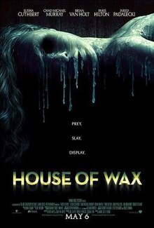
Neutraface is very widely used, and Schwartz has commented, "I can't leave my apartment without running into an ad for a new condo development using it, or a restaurant, or a new cookbook." [8] [12] Some examples of the usage of Neutraface are in the signage for the New York City Shake Shack chain, [13] book covers for Taschen's Movie Icons series, [14] advertising material for Wendy's fast food restaurants, and posters for movies. For example, it was used for the title of the 2005 remake of House of Wax , [15] and 2008 film Quantum of Solace . [16] Neutraface was also used in both the intro and outro of the 2005 film Robots . Rite Aid's new logo since 2020 uses Neutraface. Neutraface is the official font of the University of Minnesota. [17] The font has been called the "gentrification font" for its use in house numbers on new midcenturyesque housing developments. [18]
Neutraface was also the subject of a parody video of Lady Gaga's song "Poker Face" on YouTube, titled "Neutra Face: An Ode On A Typeface". [19]
Asked why Neutraface became popular, Schwartz commented "I guess it was just normal enough and just different enough...a House font that you could buy and your boss would let you use. There’s only so much you could do with the Rat Fink fonts." [20]
In typography and lettering, a sans-serif, sans serif, gothic, or simply sans letterform is one that does not have extending features called "serifs" at the end of strokes. Sans-serif typefaces tend to have less stroke width variation than serif typefaces. They are often used to convey simplicity and modernity or minimalism. For the purposes of type classification, sans-serif designs are usually divided into these major groups: § Grotesque, § Neo-grotesque, § Geometric, § Humanist, and § Other or mixed.
A typeface is a design of letters, numbers and other symbols, to be used in printing or for electronic display. Most typefaces include variations in size, weight, slope, width, and so on. Each of these variations of the typeface is a font.
Rockwell is a slab serif typeface designed by the Monotype Corporation and released in 1934. The project was supervised by Monotype's engineering manager Frank Hinman Pierpont. This typeface is distinguished by a serif at the apex of the uppercase A, while the lowercase a has two storeys. Because of its monoweighted stroke, Rockwell is used primarily for display or at small sizes rather than as a body text. Rockwell is based on an earlier, more condensed slab serif design cast by the Inland Type Foundry called Litho Antique.
Futura is a geometric sans-serif typeface designed by Paul Renner and released in 1927. It was designed as a contribution on the New Frankfurt-project. It is based on geometric shapes, especially the circle, similar in spirit to the Bauhaus design style of the period. It was developed as a typeface by the Bauer Type Foundry, in competition with Ludwig & Mayer's seminal Erbar typeface of 1926.
Gill Sans is a humanist sans-serif typeface designed by Eric Gill and released by the British branch of Monotype from 1928 onwards.
Corbel is a humanist sans-serif typeface designed by Jeremy Tankard for Microsoft. It is part of the ClearType Font Collection, a suite of fonts from various designers released with Windows Vista. All start with the letter C to reflect that they were designed to work well with Microsoft's ClearType text rendering system, a text rendering engine designed to make text clearer to read on LCD monitors. The other fonts in the same group are Calibri, Cambria, Candara, Consolas and Constantia.
Roboto is a typeface family developed by Google. The first typeface was created as the system font for its Android operating system, and released in 2011 for Android 4.0 "Ice Cream Sandwich".
In metal typesetting, a font or fount is a particular size, weight and style of a typeface, defined as the set of fonts that share an overall design. For instance, the typeface Bauer Bodoni includes fonts "Roman", "bold" and "italic"; each of these exists in a variety of sizes.
Clarendon is a slab serif typeface that was released in 1845 by Thorowgood and Co. of London, a letter foundry often known as the Fann Street Foundry. The original Clarendon design is credited to Robert Besley, a partner in the foundry, and was originally engraved by punchcutter Benjamin Fox, who may also have contributed to its design. Many copies, adaptations and revivals have been released, becoming almost an entire genre of type design.
In typography, the Vox-ATypI classification makes it possible to classify typefaces into general classes. Devised by Maximilien Vox in 1954, it was adopted in 1962 by the Association Typographique Internationale (ATypI) and in 1967 as a British Standard, as British Standards Classification of Typefaces, which is a very basic interpretation and adaptation/modification of the earlier Vox-ATypI classification.
ITC Avant Garde Gothic is a geometric sans serif font family based on the logo font used in the Avant Garde magazine. Herb Lubalin devised the logo concept and its companion headline typeface, and then he and Tom Carnase, a partner in Lubalin's design firm, worked together to transform the idea into a full-fledged typeface.
Erbar or Erbar-Grotesk is a sans-serif typeface in the geometric style, one of the first designs of this kind released as type. Designer Jakob Erbar's aim was to design a printing type which would be free of all individual characteristics, possess thoroughly legible letter forms, and be a purely typographic creation. He concluded that this could only work if the type form was developed from a fundamental element, the circle. Erbar-Grotesk was developed in stages; Erbar wrote that he had originally sketched out the design in 1914 but had been prevented from working on it due to the war. The original version of Erbar was released in 1926, following Erbar's "Phosphor" titling capitals of 1922 which are very similar in design.
Memphis is a slab-serif typeface designed by Rudolf Wolf and released in 1929 by the Stempel Type Foundry.
Tempo is a 1930 sans-serif typeface designed by R. Hunter Middleton for the Ludlow Typograph company. Tempo is a geometric sans-serif design, closely copying German typefaces in this style, above all Futura, which had attracted considerable attention in the United States. Unlike Futura, however, it has a "dynamic" true italic, with foot serifs suggesting handwriting and optional swash capitals.
Karnak is a slab-serif typeface designed by R. Hunter Middleton for the Ludlow Typograph company and issued in the period 1931–1942.
Beton is a slab-serif typeface designed by Heinrich Jost and released originally by the Bauer Type Foundry from 1929 onwards, with most major styles released by 1931. "Beton" is German for concrete, a choice of name suggesting its industrial aesthetic.
A display typeface is a typeface that is intended for use in display type at large sizes for titles, headings, pull quotes, and other eye-catching elements, rather than for extended passages of body text.
Metro is a sans-serif typeface family created by William Addison Dwiggins and released by the American Mergenthaler Linotype Company from 1929 onwards.
Graphik is a neo-grotesque sans-serif typeface designed by Christian Schwartz and published by Commercial Type in 2009. It is currently used as Accenture's and Snap Inc.'s official typeface. Eighteen styles are included with macOS.
{{cite web}}
: CS1 maint: bot: original URL status unknown (link)