
Unicode, formally The Unicode Standard is an information technology standard for the consistent encoding, representation, and handling of text expressed in most of the world's writing systems. The standard, which is maintained by the Unicode Consortium, defines as of the current version (14.0) 144,697 characters covering 159 modern and historic scripts, as well as symbols, emoji, and non-visual control and formatting codes.

Ghostscript is a suite of software based on an interpreter for Adobe Systems' PostScript and Portable Document Format (PDF) page description languages. Its main purposes are the rasterization or rendering of such page description language files, for the display or printing of document pages, and the conversion between PostScript and PDF files.

A typeface is the design of lettering that can include variations in size, weight, slope, width, and so on. Each of these variations of the typeface is a font.

Helvetica is a widely used sans-serif typeface developed in 1957 by Swiss typeface designer Max Miedinger and Eduard Hoffmann.

In typography, kerning is the process of adjusting the spacing between characters in a proportional font, usually to achieve a visually pleasing result. Kerning adjusts the space between individual letterforms, while tracking (letter-spacing) adjusts spacing uniformly over a range of characters. In a well-kerned font, the two-dimensional blank spaces between each pair of characters all have a visually similar area. The term "keming" is sometimes used informally to refer to poor kerning
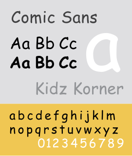
Comic Sans MS is a sans-serif script typeface designed by Vincent Connare and released in 1994 by Microsoft Corporation. It is a non-connecting script inspired by comic book lettering, intended for use in cartoon speech bubbles, as well as in other casual environments, like informal documents and children's materials.
Core fonts for the Web was a project started by Microsoft in 1996 to create a standard pack of fonts for the World Wide Web. It included the proprietary fonts Andalé Mono, Arial, Arial Black, Comic Sans MS, Courier New, Georgia, Impact, Times New Roman, Trebuchet MS, Verdana and Webdings, all of them in TrueType font format packaged in executable files (".exe") for Microsoft Windows and in BinHexed Stuff-It archives (".sit.hqx") for Macintosh. These packages were published as freeware under a proprietary license imposing some restrictions on distribution.

Kufic script is a style of Arabic script that gained prominence early on as a preferred script for Quran transcription and architectural decoration, and it has since become a reference and an archetype for a number of other Arabic scripts. It developed from the Arabic alphabet in the city of Kufa, from which its name is derived. Kufic script is characterized by angular, rectilinear letterforms and its horizontal orientation. There are many different versions of Kufic script, such as square Kufic, floriated Kufic, knotted Kufic, and others.

Consolas is a monospaced typeface designed by Luc(as) de Groot. It is a part of the ClearType Font Collection, a suite of fonts that take advantage of Microsoft's ClearType font rendering technology. It has been included with Windows since Windows Vista, Microsoft Office 2007 and Microsoft Visual Studio 2010, and is available for download from Microsoft. It is the only standard Windows Vista font with a slash through the zero character. It is the default font for Microsoft Notepad as of Windows 8.
Font hinting is the use of mathematical instructions to adjust the display of an outline font so that it lines up with a rasterized grid. At low screen resolutions, hinting is critical for producing clear, legible text. It can be accompanied by antialiasing and subpixel rendering for further clarity.
A Unicode font is a computer font that maps glyphs to code points defined in the Unicode Standard. The vast majority of modern computer fonts use Unicode mappings, even those fonts which only include glyphs for a single writing system, or even only support the basic Latin alphabet. Fonts which support a wide range of Unicode scripts and Unicode symbols are sometimes referred to as "pan-Unicode fonts", although as the maximum number of glyphs that can be defined in a TrueType font is restricted to 65,535, it is not possible for a single font to provide individual glyphs for all defined Unicode characters. This article lists some widely used Unicode fonts that support a comparatively large number and broad range of Unicode characters.

Nimbus Roman is a serif typeface created by URW Studio in 1982.
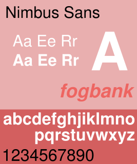
Nimbus Sans is a sans-serif typeface created by URW++, based on Helvetica.
The Web Open Font Format (WOFF) is a font format for use in web pages. WOFF files are OpenType or TrueType fonts, with format-specific compression applied and additional XML metadata added. The two primary goals are first to distinguish font files intended for use as web fonts from fonts files intended for use in desktop applications via local installation, and second to reduce web font latency when fonts are transferred from a server to a client over a network connection.

M+ FONTS is a series of Japanese fonts designed by Coji Morishita. The "M" stands for "minimum", while the plus sign means "above minimum".
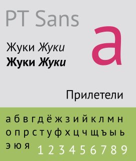
The Public Type or PT Fonts are a family of free/libre fonts released from 2009 onwards, comprising PT Sans, PT Serif and PT Mono. They were commissioned from the design agency ParaType by Rospechat, a department of the Russian Ministry of Communications, to celebrate the 300th anniversary of Peter the Great's orthography reform and to create a font family that supported all the different variations of Cyrillic script used by the minority languages of Russia, as well as the Latin alphabet.

Cantarell is the default typeface supplied with the user interface of GNOME since version 3.0, replacing Bitstream Vera and DejaVu. The font was originated by Dave Crossland in 2009.

Noto is a font family comprising over 100 individual fonts, which are together designed to cover all the scripts encoded in the Unicode standard. As of October 2016, Noto fonts cover all 93 scripts defined in Unicode version 6.1, although fewer than 30,000 of the nearly 75,000 CJK unified ideographs in version 6.0 are covered. In total, Noto fonts cover nearly 64,000 characters, which is under half of the 144,762 characters defined in Unicode 14.0.

Google Fonts is a computer font and web font service owned by Google. This includes free and open source font families, an interactive web directory for browsing the library, and APIs for using the fonts via CSS and Android. Popular fonts in the Google Fonts library include Roboto, Open Sans, Lato, Oswald, Montserrat, Source Sans Pro, and Raleway.

Montserrat is a geometric sans-serif typeface designed by Argentine graphic designer Julieta Ulanovsky and released in 2011. It was inspired by posters, signs and painted windows from the first half of the twentieth century, seen in the historic Montserrat neighbourhood of Buenos Aires.