
A reglet is a piece of wooden spacing material used in typesetting, usually to provide spacing between paragraphs, though it is sometimes used to fill in small spaces not taken up by type in the chase. [1]
A reglet is a piece of wooden spacing material used in typesetting, usually to provide spacing between paragraphs, though it is sometimes used to fill in small spaces not taken up by type in the chase. [1]
| | This typography-related article is a stub. You can help Wikipedia by expanding it. |
TeX, stylized within the system as TeX, is a typesetting system which was designed and written by computer scientist and Stanford University professor Donald Knuth and first released in 1978. TeX is a popular means of typesetting complex mathematical formulae; it has been noted as one of the most sophisticated digital typographical systems.
troff, short for "typesetter roff", is the major component of a document processing system developed by Bell Labs for the Unix operating system. troff and the related nroff were both developed from the original roff.

Typography is the art and technique of arranging type to make written language legible, readable and appealing when displayed. The arrangement of type involves selecting typefaces, point sizes, line lengths, line spacing, letter spacing, and spaces between pairs of letters. The term typography is also applied to the style, arrangement, and appearance of the letters, numbers, and symbols created by the process. Type design is a closely related craft, sometimes considered part of typography; most typographers do not design typefaces, and some type designers do not consider themselves typographers. Typography also may be used as an ornamental and decorative device, unrelated to the communication of information.

A monospaced font, also called a fixed-pitch, fixed-width, or non-proportional font, is a font whose letters and characters each occupy the same amount of horizontal space. This contrasts with variable-width fonts, where the letters and spacings have different widths.

The IBM Electric were an early series of electric typewriters that IBM manufactured, starting in the mid-1930s. They used the conventional moving carriage and typebar mechanism, as opposed to the fixed carriage and type ball used in the IBM Selectric, introduced in 1961. After 1944, each model came in both "Standard" and "Executive" versions, the latter featuring proportional spacing.
In writing, a space is a blank area that separates words, sentences, syllables and other written or printed glyphs (characters). Conventions for spacing vary among languages, and in some languages the spacing rules are complex. Inter-word spaces ease the reader's task of identifying words, and avoid outright ambiguities such as "now here" vs. "nowhere". They also provide convenient guides for where a human or program may start new lines.

In typography, emphasis is the strengthening of words in a text with a font in a different style from the rest of the text, to highlight them. It is the equivalent of prosody stress in speech.

In typography, kerning is the process of adjusting the spacing between characters in a proportional font, usually to achieve a visually pleasing result. Kerning adjusts the space between individual letterforms while tracking (letter-spacing) adjusts spacing uniformly over a range of characters. In a well-kerned font, the two-dimensional blank spaces between each pair of characters all have a visually similar area. The term "keming" is sometimes used informally to refer to poor kerning.
In typography, leading is the space between adjacent lines of type; the exact definition varies.
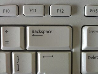
Backspace is the keyboard key that in typewriters originally pushed the carriage one position backwards, and in modern computer systems typically moves the display cursor one position backwards, deletes the character at that position, and shifts back any text after that position by one character.

In printing and typography, hot metal typesetting is a technology for typesetting text in letterpress printing. This method injects molten type metal into a mold that has the shape of one or more glyphs. The resulting sorts or slugs are later used to press ink onto paper. Normally the typecasting machine would be controlled by a keyboard or by a paper tape.

Lucida is an extended family of related typefaces designed by Charles Bigelow and Kris Holmes and released from 1984 onwards. The family is intended to be extremely legible when printed at small size or displayed on a low-resolution display – hence the name, from 'lucid'.
Letter spacing, character spacing or tracking is an optically consistent typographical adjustment to the space between letters to change the visual density of a line or block of text. Letter spacing is distinct from kerning, which adjusts the spacing of particular pairs of adjacent characters such as "7." which would appear to be badly spaced if left unadjusted, and leading, the spacing between lines.
In typesetting and page layout, alignment or range is the setting of text flow or image placement relative to a page, column (measure), table cell, or tab.
Sentence spacing concerns how spaces are inserted between sentences in typeset text and is a matter of typographical convention. Since the introduction of movable-type printing in Europe, various sentence spacing conventions have been used in languages with a Latin alphabet. These include a normal word space, a single enlarged space, and two full spaces.
In typesetting, a sort or type is a block with a typographic character etched on it, used—when lined up with others—to print text. In movable-type printing, the sort or type is cast from a matrix mold and assembled by hand with other sorts bearing additional characters into lines of type to make up a form, from which a page is printed.

In typesetting, a slug is any of several kinds of piece of lead or other type metal. One kind of slug is a piece of spacing material used to space paragraphs. In the era of commercial typesetting in metal type, they were usually manufactured in strips of 6-point lead. Another kind of slug is a single sort, bearing a single letter or any other symbol. More recently, a slug can be an entire line of Linotype typeset matter, where a single piece of lead has been cast bearing a line of text.

In typography, rivers are gaps in typesetting which appear to run through a paragraph of text due to a coincidental alignment of spaces. Rivers can occur regardless of the spacing settings, but are most noticeable with wide inter-word spaces caused by full text justification or monospaced fonts. Rivers are less noticeable with proportional fonts, due to narrow spacing. Another cause of rivers is the close repetition of a long word or similar words at regular intervals, such as "maximization" with "minimization" or "optimization".

The history of sentence spacing is the evolution of sentence spacing conventions from the introduction of movable type in Europe by Johannes Gutenberg to the present day.
Sentence spacing in digital media concerns the horizontal width of the space between sentences in computer- and web-based media. Digital media allow sentence spacing variations not possible with the typewriter. Most digital fonts permit the use of a variable space or a no-break space. Some modern font specifications, such as OpenType, have the ability to automatically add or reduce space after punctuation, and users may be able to choose sentence spacing variations.