This article has multiple issues. Please help improve it or discuss these issues on the talk page . (Learn how and when to remove these template messages)
|
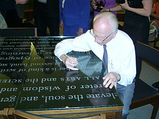
Rick Cusick is an American lettering artist, calligrapher, type designer and book designer.
This article has multiple issues. Please help improve it or discuss these issues on the talk page . (Learn how and when to remove these template messages)
|
Rick Cusick is an American lettering artist, calligrapher, type designer and book designer.
Cusick began his lettering career designing illuminated signs for Ad/Art, Inc. in his hometown of Stockton, California, followed by study at Art Center College of Design in Los Angeles, where lettering artist Mortimer Leach was among his teachers. Since 1971, he has worked in lettering and typographic design and as a book designer for Hallmark Cards, in Kansas City, Missouri. He has designed books, journals, posters, brochures, packaging, logos, cards, giftwrap and fonts. As a lettering studio manager, his duties include overseeing font development. He has designed several proprietary typefaces for Hallmark that are used on a range of products, such as greeting cards, books, films and packaging. [1]
Cusick also freelances calligraphy, lettering and design projects and has done a wide variety of work, from Las Vegas signage to a 17 ft (5.2 m) long biblical quotation for the Community of Christ's headquarters, Independence Temple, designed by the renowned architect, Gyo Obata.
Nyx is an Adobe Original stencil font created by Cusick and released by Adobe Systems in 1997. [2] It is named after Cusick's muse, Nyx, the Greek goddess of night.
From 1984 to 1990, Cusick taught typography and publication design at the University of Kansas. He has taught numerous workshops worldwide, including a five-day workshop for the Schreibwerkstatt in Offenbach, Germany. [3] He has lectured at Kansas City Art Institute, Indiana Central University, Art Directors Club of El Paso, New York Society of Scribes, Los Angeles Society for Calligraphy, TypeCon 2003 and more.
Cusick has judged numerous lettering and type contests, including TDC2, 2005 type design contest. [4]
Cusick has compiled, edited and designed numerous books including two books about prominent twentieth century American calligraphers: With Respect ... To RFD, an appreciation of Raymond F. DaBoll; and Straight Impressions, essays and calligraphy by Lloyd Reynolds. The Proverbial Bestiary, features proverbs hand-lettered by Cusick and paired with drawings by the late Warren Chappell, which was a Book of the Month Club bonus selection. Cusick was art director of Letter Arts Review from 1992 -2003. He has designed numerous books for various publishers, including Andrews & McMeel, American Century, Harrow Books and City of Fountain Foundation.
His work has appeared in numerous books and periodicals including: Communication Arts, Typography 6, Calligraphy Today, Typography 18, Visible Language, Signs of the Times, Alphabet, International Calligraphy Today, Fine Print, and Letter Arts Review. He has written articles for Fine Print, Calligraphy Review, Alphabet, ABC-XYZapf, and Calligraphic Type Design in the Digital Age.
Cusick is proprietor of Nyx Editions, which has created a range of books and pamphlets regarding the lettering arts including OK, It's All Yours: Recollections of Arnold Bank, and Type Fa*ce*tious: Earth-shattering quotations featuring the font designs of Jill Bell.
What Our Lettering Needs: The Contribution of Hermann Zapf to Calligraphy & Type Design at Hallmark Cards written and designed by Cusick, is a thorough account of Hermann Zapf’s contributions to the artistry and success of Hallmark Cards. This beautifully illustrated book, published by RIT Cary Graphic Arts Press in December, 2011, is a tribute to Zapf’s own philosophy that the artist’s challenge is “to ensure, despite technology and mass production, that beauty is never lost.” [5]
Cusick's work has appeared in numerous group shows in museums and galleries worldwide, including New York, San Francisco, Los Angeles, Dallas, London, New Delhi, Offenbach, Tallinn and Moscow.

Palatino is the name of an old-style serif typeface designed by Hermann Zapf, initially released in 1949 by the Stempel foundry and later by other companies, most notably the Mergenthaler Linotype Company.

Optima is a humanist sans-serif typeface designed by Hermann Zapf and released by the D. Stempel AG foundry, Frankfurt, West Germany in 1958.
Hermann Zapf was a German type designer and calligrapher who lived in Darmstadt, Germany. He was married to the calligrapher and typeface designer Gudrun Zapf-von Hesse. Typefaces he designed include Palatino, Optima, and Zapfino. He is considered one of the greatest type designers of all time.

Adrian Johann Frutiger was a Swiss typeface designer who influenced the direction of type design in the second half of the 20th century. His career spanned the hot metal, phototypesetting and digital typesetting eras. Until his death, he lived in Bremgarten bei Bern.

Antiqua is a style of typeface used to mimic styles of handwriting or calligraphy common during the 15th and 16th centuries. Letters are designed to flow and strokes connect together in a continuous fashion; in this way it is often contrasted with Fraktur-style typefaces where the individual strokes are broken apart. The two typefaces were used alongside each other in the germanophone world, with the Antiqua–Fraktur dispute often dividing along ideological or political lines. After the mid-20th century, Fraktur fell out of favor and Antiqua-based typefaces became the official standard.

Western calligraphy is the art of writing and penmanship as practiced in the Western world, especially using the Latin alphabet.
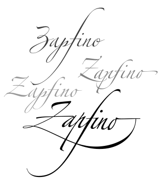
Zapfino is a calligraphic typeface designed for Linotype by typeface designer Hermann Zapf in 1998. It is based on an alphabet Zapf originally penned in 1944. As a font, it makes extensive use of ligatures and character variations.

Lettering is an umbrella term that covers the art of drawing letters, instead of simply writing them. Lettering is considered an art form, where each letter in a phrase or quote acts as an illustration. Each letter is created with attention to detail and has a unique role within a composition. Lettering is created as an image, with letters that are meant to be used in a unique configuration. Lettering words do not always translate into alphabets that can later be used in a typeface, since they are created with a specific word in mind.

Kris Holmes is an American typeface designer, calligrapher, type design educator and animator. She, with Charles Bigelow, is the co-creator of the Lucida and Wingdings font families, among many other typeface designs. She is President of Bigelow & Holmes Inc., a typeface design studio.
Robert Joseph Slimbach is Principal Type Designer at Adobe, Inc., where he has worked since 1987. He has won many awards for his digital typeface designs, including the rarely awarded Prix Charles Peignot from the Association Typographique Internationale, the SoTA Typography Award, and repeated TDC2 awards from the Type Directors Club. His typefaces are among those most commonly used in books.

Rudolf Koch was a German type designer, professor, and a master of lettering, calligraphy, typography and illustration. Commonly known for his typefaces created for the Klingspor Type Foundry, his most widely used typefaces include Neuland and Kabel.

Carol Twombly is an American designer, best known for her type design. She worked as a type designer at Adobe Systems from 1988 through 1999, during which time she designed, or contributed to the design of, many typefaces, including Trajan, Myriad and Adobe Caslon.

Gudrun Zapf-von Hesse was a German book-binder, calligrapher and typographer.
Julian Waters is a calligrapher, type designer and teacher.

Arno, or Arno Pro, is a serif type family created by Robert Slimbach at Adobe intended for professional use. The name refers to the river that runs through Florence, a centre of the Italian Renaissance. Arno is an old-style serif font, drawing inspiration from a variety of 15th and 16th century typefaces. Slimbach has described the design as a combination of the period's Aldine and Venetian styles, with italics inspired by the calligraphy and printing of Ludovico degli Arrighi.
Sumner Stone is a typeface designer and graphic artist. He notably designed ITC Stone while working for Adobe. A specimen of ITC Stone is shown at his personal website.
Ilene Strizver is a noted typographic educator, author, designer and founder of The Type Studio in Westport, Connecticut. Her book, Type Rules! The designer’s guide to professional typography, is now in its 4th edition.
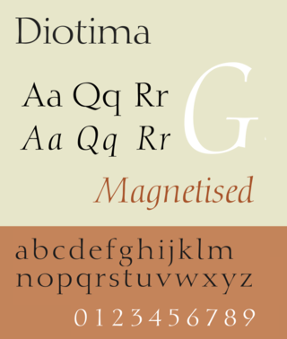
Diotima is a serif typeface designed by Gudrun Zapf-von Hesse and published by Stempel.
The Frederic W. Goudy Award & Lecture were established in 1969 by funds donated to Rochester Institute of Technology (RIT) by the Mary Flagler Cary Charitable Trust in memory of her late husband, Melbert B. Cary, Jr., a typographer, type importer, fine printer, book collector, and president of AIGA. The award was named after illustrious American type designer Frederic W. Goudy, a friend and business associate of Melbert Cary.
| International | |
|---|---|
| National | |
| Other | |