Related Research Articles

Typography is the art and technique of arranging type to make written language legible, readable and appealing when displayed. The arrangement of type involves selecting typefaces, point sizes, line lengths, line-spacing (leading), and letter-spacing (tracking), as well as adjusting the space between pairs of letters (kerning). The term typography is also applied to the style, arrangement, and appearance of the letters, numbers, and symbols created by the process. Type design is a closely related craft, sometimes considered part of typography; most typographers do not design typefaces, and some type designers do not consider themselves typographers. Typography also may be used as an ornamental and decorative device, unrelated to the communication of information.

A logo is a graphic mark, emblem, or symbol used to aid and promote public identification and recognition. It may be of an abstract or figurative design or include the text of the name it represents as in a wordmark.
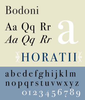
Bodoni is the name given to the serif typefaces first designed by Giambattista Bodoni (1740–1813) in the late eighteenth century and frequently revived since. Bodoni's typefaces are classified as Didone or modern. Bodoni followed the ideas of John Baskerville, as found in the printing type Baskerville—increased stroke contrast reflecting developing printing technology and a more vertical axis—but he took them to a more extreme conclusion. Bodoni had a long career and his designs changed and varied, ending with a typeface of a slightly condensed underlying structure with flat, unbracketed serifs, extreme contrast between thick and thin strokes, and an overall geometric construction.
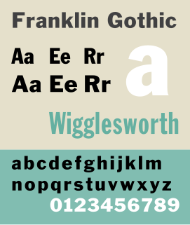
Franklin Gothic and its related faces are a large family of sans-serif typefaces in the industrial or grotesque style developed in the early years of the 20th century by the type foundry American Type Founders (ATF) and credited to its head designer Morris Fuller Benton. “Gothic” was a contemporary term meaning sans-serif.
Rudy VanderLans is a Dutch graphic designer, photographer, and the co-founder of Emigre Fonts with his wife Zuzana Licko. Emigre Fonts is an independent type foundry in Berkeley, CA. He was also the art director and editor of Emigre magazine, the legendary journal devoted to visual communications from 1984 to 2005. Since arriving in California in 1981, he has been photographing his adoptive Golden State as an ongoing side project. He has authored a total of 11 photo books on the topic, and staged two solo exhibits at Gallery 16 in San Francisco.

Rudolf Koch was a German type designer, professor, and a master of lettering, calligraphy, typography and illustration. Commonly known for his typefaces created for the Klingspor Type Foundry, his most widely used typefaces include Neuland and Kabel.

The International Typographic Style, also known as the Swiss Style, is a graphic design style that emerged in Russia, the Netherlands, and Germany in the 1920s and was further developed by designers in Switzerland during the 1950s. The International Typographic Style has had profound influence on graphic design as a part of the modernist movement, impacting many design-related fields including architecture and art. It emphasizes cleanness, readability, and objectivity. Hallmarks of the style are asymmetric layouts, use of a grid, sans-serif typefaces like Akzidenz Grotesk, and flush left, ragged right text. The style is also associated with a preference for photography in place of illustrations or drawings. Many of the early International Typographic Style works featured typography as a primary design element in addition to its use in text, and it is for this that the style is named. The influences of this graphic movement can still be seen in design strategy and theory to this day.
Anton Janson was a Dutch type founder and printer.
Emil Ruder was a Swiss typographer and graphic designer, who with Armin Hofmann joined the faculty of the Schule für Gestaltung Basel.

Didot is a group of typefaces. The word/name Didot came from the famous French printing and type producing Didot family. The classification is known as modern, or Didone.

Sabon is an old-style serif typeface designed by the German-born typographer and designer Jan Tschichold (1902–1974) in the period 1964–1967. It was released jointly by the Linotype, Monotype, and Stempel type foundries in 1967. The design of the roman is based on types by Claude Garamond, particularly a specimen printed by the Frankfurt printer Konrad Berner. Berner had married the widow of a fellow printer Jacques Sabon, the source of the face's name, who had bought some of Garamond's type after his death. The italics are based on types designed by a contemporary of Garamond's, Robert Granjon. It is effectively a Garamond revival, though a different name was chosen as many other modern typefaces already carry this name.

City is a slab serif typeface designed by Georg Trump and released around 1930 by the Berthold type foundry in Berlin, Germany. Though classified as a slab serif, City displays a strong modernist influence in its geometric structure of right angles and opposing round corners. The typeface takes inspiration from the machine age, and industry. A consistent application of repeated parts: an outer circle softening interior rectilinear spaces, results in a highly unified and refined typeface.
Philip Baxter Meggs was an American graphic designer, professor, historian and author of books on graphic design. His book History of Graphic Design is a definitive, standard read for the study of graphic design.
In design, New Wave or Swiss Punk Typography refers to an approach to typography that defies strict grid-based arrangement conventions. Characteristics include inconsistent letterspacing, varying typeweights within single words and type set at non-right angles.
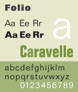
Folio is a sans-serif typeface in the neo-grotesque style designed by Konrad Bauer and Walter Baum in 1957 for the Bauer Type Foundry. Bauer licensed the design to Fonderie Typographique Française for sale in France under the name Caravelle.

In typography, a column is one or more vertical blocks of content positioned on a page, separated by gutters or rules. Columns are most commonly used to break up large bodies of text that cannot fit in a single block of text on a page. Additionally, columns are used to improve page composition and readability. Newspapers very frequently use complex multi-column layouts to break up different stories and longer bodies of texts within a story. Column can also more generally refer to the vertical delineations created by a typographic grid system which type and image may be positioned. In page layout, the whitespace on the outside of the page are known as margins; the gap between two facing pages is also considered a gutter, since there are columns on both sides.
Philip Alston Willcox Purvis, son of Melvin Purvis, is an American graphic designer, artist, professor and author.

Century is a family of serif type faces particularly intended for body text. The family originates from a first design, Century Roman, cut by American Type Founders designer Linn Boyd Benton in 1894 for master printer Theodore Low De Vinne, for use in The Century Magazine. ATF rapidly expanded it into a very large family, first by Linn Boyd, and later by his son Morris.
Typeface anatomy describes the graphic elements that make up letters in a typeface.
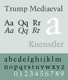
Trump Mediaeval is an old-style serif typeface designed by Georg Trump. It was released in 1954 both by the C. E. Weber foundry as metal type and Linotype for hot metal typesetting. Despite a common association with blackletter typefaces, the mediaeval name refers to the German typographical term for roman typefaces dark in color like the old style Venetian typefaces.
References
- ↑ "Rob Carter". Graphic Design Faculty. Richmond, Virginia: Virginia Commonwealth University. 2010. Retrieved 28 January 2010.
- ↑ "Rob Carter". Rob Carter. Retrieved 15 January 2013.
- ↑ "inauthor:"Rob Carter" - Google Search". www.google.com. Retrieved 2019-05-31.
- ↑ Meggs, Philip B.; Carter, Rob (1993-12-15). Typographic Specimens: The Great Typefaces. John Wiley & Sons. ISBN 9780471284291.
- ↑ Meggs, Philip B.; Carter, Rob; Meggs, Libby Phillips; Wheeler, Sandy (2007-09-21). Meggs: making graphic design history. Wiley. ISBN 9780470008393.
- ↑ Carter, Rob; Meggs, Philip B.; Day, Ben; Maxa, Sandra; Sanders, Mark (2014-09-29). Typographic Design: Form and Communication. John Wiley & Sons. ISBN 9781118715765.