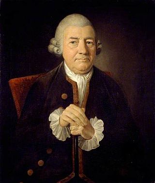
John Baskerville was an English businessman, in areas including japanning and papier-mâché, but he is best remembered as a printer and type designer. He was also responsible for inventing "wove paper", which was considerably smoother than "laid paper", allowing for sharper printing results.

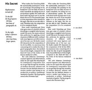
Typography is the art and technique of arranging type to make written language legible, readable and appealing when displayed. The arrangement of type involves selecting typefaces, point sizes, line lengths, line-spacing (leading), and letter-spacing (tracking), as well as adjusting the space between pairs of letters (kerning). The term typography is also applied to the style, arrangement, and appearance of the letters, numbers, and symbols created by the process. Type design is a closely related craft, sometimes considered part of typography; most typographers do not design typefaces, and some type designers do not consider themselves typographers. Typography also may be used as an ornamental and decorative device, unrelated to the communication of information.

Stanley Arthur Morison was a British typographer, printing executive and historian of printing. Largely self-educated, he promoted higher standards in printing and an awareness of the best printing and typefaces of the past.

Type color, or colour, is an element of typography that describes how dense or heavy the text appears on the page. Finding the correct balance of type color and white space can make text more easily readable. The term type color should not be confused with the usual meaning of color, ; instead it has more to do with the blackness or boldness of the text on the page. A bold font weight creates more contrast on the page, therefore creates more emphasis. Using a bold font is therefore one way that type color can be adjusted.
Rob Carter is an American professor of typography and graphic design at Virginia Commonwealth University.

The International Typographic Style, also known as the Swiss Style, is a systemic approach to graphic design that emerged in Switzerland during the 1950s but continued to develop internationally. It expanded on and formalized the modernist typographic innovations of the 1920s that emerged in part out of art movements such as Constructivism (Russia), De Stijl and at the Bauhaus (Germany). The International Typographic Style has had profound influence on graphic design as a part of the modernist movement, impacting many design-related fields including architecture and art. It emphasizes simplicity, clarity, readability, and objectivity. Hallmarks of the style are asymmetric layouts, use of a grid, sans-serif typefaces like Akzidenz Grotesk and Helvetica, and flush left, ragged right text. The style is also associated with a preference for photography in place of illustrations or drawings. Many of the early International Typographic Style works featured typography as a primary design element in addition to its use in text, and it is for this that the style is named. The influences of this graphic movement can still be seen in design strategy and theory to this day.
The Fleuron was a British journal of typography and book arts published in seven volumes from 1923 to 1930. A fleuron is a floral ornament used by typographers.
The London Society of Compositors was a British trade union, representing print workers in London.
The Typographical Association (TA) was a trade union representing typographers in the United Kingdom and Ireland.

TypeCon is an annual convention presented by the Society of Typographic Aficionados. The 10th iteration of this event, themed “Punkt” was held at the Hyatt Regency in Buffalo, New York between July 15–20, 2008. The conference offered workshops and lectures covering topics such as letterpress, typography, history, and print. The convention was sponsored by the Western New York Book Arts Collaborative, the Albright-Knox Art Gallery, and the University at Buffalo, as well as other local schools and non-profit organizations.

Fred Smeijers is a Dutch type designer, researcher and writer. He was educated at the ArtEZ Hogeschool voor de Kunsten in Arnhem in the early 1980s.
Ilene Strizver is a noted typographic educator, author, designer and founder of The Type Studio in Westport, Connecticut. Her book, Type Rules! The designer’s guide to professional typography, is now in its 4th edition.

The International Society of Typographic Designers (ISTD) is a professional body run by and for typographers, graphic designers, and educators. The society has an international membership and its aims are to establish and maintain standards of typography and to provide a forum for debate.
Vincent Steer was a compositor noted for founding the British Typographers' Guild and for his book on typography, which was known as the "Typographer's Bible".
Harris Carleton Dair, known as Carl Dair, was a Canadian graphic designer, teacher, type designer, and author. Primarily a self-taught designer, Dair was internationally known and developed visual design principles for typography which are still in use today.

Horace Greeley, also known as the Greeley Memorial, is an outdoor bronze sculpture of Horace Greeley by Alexander Doyle, located in Greeley Square Park in Manhattan, New York. The statue, cast in 1892 and dedicated on May 30, 1894, sits atop a Quincy granite pedestal. It contains the following inscription:

Gail Anderson is an American graphic designer, writer, and educator- known for her typographic skill, hand-lettering and poster design.

The Printing and Kindred Trades Federation (P&KTF) was a trade union federation in the United Kingdom.
The South African Typographical Union (SATU) is a trade union representing workers in the printing and media industries in South Africa.


