The Mergenthaler Linotype Company is a corporation founded in the United States in 1886 to market the Linotype machine, a system to cast metal type in lines (linecaster) invented by Ottmar Mergenthaler. It became the world's leading manufacturer of book and newspaper typesetting equipment; outside North America, its only serious challenger for book typesetting was the Anglo-American Monotype Corporation.
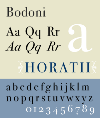
Bodoni is the name given to the serif typefaces first designed by Giambattista Bodoni (1740–1813) in the late eighteenth century and frequently revived since. Bodoni's typefaces are classified as Didone or modern. Bodoni followed the ideas of John Baskerville, as found in the printing type Baskerville—increased stroke contrast reflecting developing printing technology and a more vertical axis—but he took them to a more extreme conclusion. Bodoni had a long career and his designs changed and varied, ending with a typeface of a slightly condensed underlying structure with flat, unbracketed serifs, extreme contrast between thick and thin strokes, and an overall geometric construction.
Morris Fuller Benton was an American typeface designer who headed the design department of the American Type Founders (ATF), for which he was the chief type designer from 1900 to 1937.

Franklin Gothic and its related faces are a large family of sans-serif typefaces in the industrial or grotesque style developed in the early years of the 20th century by the type foundry American Type Founders (ATF) and credited to its head designer Morris Fuller Benton. "Gothic" was a contemporary term meaning sans-serif.

Rudolph Ruzicka was a Czech American wood engraver, etcher, illustrator, typeface designer, and book designer. Ruzicka designed typefaces and wood engraving illustrations for Daniel Berkeley Updike's Merrymount Press, and was a designer for, and consultant to, the Mergenthaler Linotype Company for fifty years. He designed a number of seals and medals, including the American Institute of Graphic Arts (AIGA) and the Dartmouth Medal of the American Library Association.

Copperplate Gothic is a typeface designed by Frederic W. Goudy and first produced by American Type Founders (ATF) beginning in 1901.

Bookman, or Bookman Old Style, is a serif typeface. A wide, legible design that is slightly bolder than most body text faces, Bookman has been used for both display typography, for trade printing such as advertising, and less commonly for body text. In advertising use it is particularly associated with the graphic design of the 1960s and 1970s, when revivals of it were very popular.
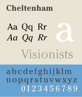
Cheltenham is a typeface for display use designed in 1896 by architect Bertram Goodhue and Ingalls Kimball, director of the Cheltenham Press. The original drawings were known as Boston Old Style and were made about 14" high. These drawings were then turned over to Morris Fuller Benton at American Type Founders (ATF) who developed it into a final design. Trial cuttings were made as early as 1899 but the face was not complete until 1902. The face was patented by Kimball in 1904. Later the basic face was spun out into an extensive type family by Morris Fuller Benton.

Goudy Old Style is an old-style serif typeface originally created by Frederic W. Goudy for American Type Founders (ATF) in 1915.

News Gothic is a sans-serif typeface designed by Morris Fuller Benton, and was released in 1908 by his employer American Type Founders (ATF). The typeface is similar in proportion and structure to Franklin Gothic, also designed by Benton, but lighter.

Bank Gothic is a rectilinear geometric sans-serif typeface designed by Morris Fuller Benton for American Type Founders and released in 1930. The design has become popular from the late twentieth century to suggest a science-fiction, military, corporate, or sports aesthetic.

Stencil refers to two typefaces released within months of each other in 1937. The face created by R. Hunter Middleton for Ludlow was advertised in June, while Gerry Powell's version for American Type Founders appeared one month later. Both fonts consist of only capital letters with rounded edges and thick main strokes, much like a Clarendon typeface, except with breaks in the face to give it the appearance of the stenciled alphabets used on boxes and crates. Powell's exploration of Stencil became very popular over time and is still used today.
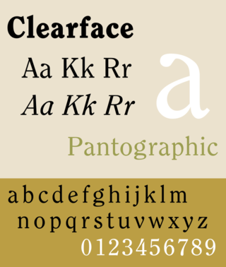
Clearface is a serif typeface designed by Morris Fuller Benton with the collaboration of his father Linn Boyd Benton, produced at American Type Founders in 1907.

Broadway is a decorative typeface, perhaps the archetypal Art Deco typeface. The original face was designed by Morris Fuller Benton in 1927 for ATF as a capitals-only display face. It had a long initial run of popularity, before being discontinued by ATF in 1954. It was re-discovered in the Cold Type Era and has ever since been used to evoke the feeling of the twenties and thirties. The font has been used in the TV shows Rhoda, My Life as a Teenage Robot, and Miami Vice. Several variants were made:

Thomas Maitland Cleland was an American book designer, painter, illustrator, and type designer.

Century is a family of serif type faces particularly intended for body text. The family originates from a first design, Century Roman, cut by American Type Founders designer Linn Boyd Benton in 1894 for master printer Theodore Low De Vinne, for use in The Century Magazine. ATF rapidly expanded it into a very large family, first by Linn Boyd, and later by his son Morris.

Souvenir is a serif typeface designed in 1914 by Morris Fuller Benton for American Type Founders. It was loosely based on Schelter-Antiqua and Schelter-Kursiv, a 1905 Art Nouveau type issued by the J.G. Schelter & Giesecke foundry in Leipzig. It has a much softer appearance than other old style faces, with a generally light look, rounded serifs, and very little contrast between thick and thin strokes. Like Cheltenham, it shows the influence of the Arts and Crafts Movement without belonging to a specific historical style. A 1970s redesign by Ed Benguiat, adding extra styles and an italic, became far more popular than the initial release, and is the source of most versions sold today.

Cloister is a serif typeface that was designed by Morris Fuller Benton and published by American Type Founders from around 1913. It is loosely based on the printing of Nicolas Jenson in Venice in the 1470s, in what is now called the "old style" of serif fonts. American Type Founders presented it as an attractive but highly usable serif typeface, suitable both for body text and display use.
The Inland Type Foundry was an American type foundry established in 1894 in Saint Louis, Missouri and later with branch offices in Chicago and New York City. Although it was founded to compete directly with the "type trust", and was consistently profitable, it was eventually sold to ATF.

