Related Research Articles
LaTeX is a software system for document preparation. When writing, the writer uses plain text as opposed to the formatted text found in "What You See Is What You Get" word processors like Microsoft Word, LibreOffice Writer and Apple Pages. The writer uses markup tagging conventions to define the general structure of a document to stylise text throughout a document, and to add citations and cross-references. A TeX distribution such as TeX Live or MiKTeX is used to produce an output file suitable for printing or digital distribution.

In computer text processing, a markup language is metadata for annotating a document, which is visually distinguishable from how the user typically sees the document. It is used only for formatting the text, thus when the document is rendered for display, the markup language doesn't appear. The idea and terminology evolved from the "marking up" of paper manuscripts, which is traditionally written with a red pen or blue pencil on authors' manuscripts. Such "markup" typically includes both content corrections, and also typographic instructions, such as to make a heading larger or boldface.
TeX, stylized within the system as TeX, is a typesetting system which was designed and written by Donald Knuth and first released in 1978. TeX is a popular means of typesetting complex mathematical formulae; it has been noted as one of the most sophisticated digital typographical systems.
Metafont is a description language used to define raster fonts. It is also the name of the interpreter that executes Metafont code, generating the bitmap fonts that can be embedded into e.g. PostScript. Metafont was devised by Donald Knuth as a companion to his TeX typesetting system.
Desktop publishing (DTP) is the creation of documents using page layout software on a personal ("desktop") computer. It was first used almost exclusively for print publications, but now it also assists in the creation of various forms of online content. Desktop publishing software can generate layouts and produce typographic-quality text and images comparable to traditional typography and printing. Desktop publishing is also the main reference for digital typography. This technology allows individuals, businesses, and other organizations to self-publish a wide variety of content, from menus to magazines to books, without the expense of commercial printing.

A typeface is the design of lettering that can include variations in size, weight, slope, width, and so on. Each of these variations of the typeface is a font.
GNU TeXmacs is a scientific word processor and typesetting component of the GNU Project. It was inspired by TeX and GNU Emacs, though it shares no code with those programs. TeXmacs does use TeX fonts. It is written and maintained by Joris van der Hoeven and a group of developers. The program produces structured documents with a WYSIWYG user interface. New document styles can be created by the user. The editor provides high-quality typesetting algorithms and TeX and other fonts for publishing professional looking documents.
LilyPond is a computer program and file format for music engraving. One of LilyPond's major goals is to produce scores that are engraved with traditional layout rules, reflecting the era when scores were engraved by hand.

Typesetting is the composition of text by means of arranging physical type or its digital equivalents. Stored letters and other symbols are retrieved and ordered according to a language's orthography for visual display. Typesetting requires one or more fonts. One significant effect of typesetting was that authorship of works could be spotted more easily, making it difficult for copiers who have not gained permission.
In typography, leading is the space between adjacent lines of type; the exact definition varies.
XSL-FO is a markup language for XML document formatting that is most often used to generate PDF files. XSL-FO is part of XSL, a set of W3C technologies designed for the transformation and formatting of XML data. The other parts of XSL are XSLT and XPath. Version 1.1 of XSL-FO was published in 2006.

In typography, the point is the smallest unit of measure. It is used for measuring font size, leading, and other items on a printed page. The size of the point has varied throughout printing's history. Since the 18th century, the size of a point has been between 0.18 and 0.4 millimeters. Following the advent of desktop publishing in the 1980s and 1990s, digital printing has largely supplanted the letterpress printing and has established the DTP point as the de facto standard. The DTP point is defined as 1⁄72 of an international inch and, as with earlier American point sizes, is considered to be 1⁄12 of a pica.

In printing and typography, hot metal typesetting is a technology for typesetting text in letterpress printing. This method injects molten type metal into a mold that has the shape of one or more glyphs. The resulting sorts or slugs are later used to press ink onto paper. Normally the typecasting machine would be controlled by a keyboard or by a paper tape.

In typography, the x-height, or corpus size, is the distance between the baseline and the mean line of lower-case letters in a typeface. Typically, this is the height of the letter x in the font, as well as the letters v, w, and z. One of the most important dimensions of a font, x-height is used to define how high lower-case letters without ascenders are compared to the cap height of upper-case letters.
TeX font metric (TFM) is a font file format used by the TeX typesetting system. It is a font metric format, not an outline font format like TrueType, because it provides only the information necessary to typeset the font such as each character's width, height and depth. The actual glyphs are stored elsewhere. This is not unique to TeX; Adobe's AFM files and Windows' PFM files use the same technique.
In European and West Asian typography and penmanship, the baseline is the line upon which most letters sit and below which descenders extend.
PSTricks is a set of macros that allow the inclusion of PostScript drawings directly inside TeX or LaTeX code. It was originally written by Timothy Van Zandt and has been maintained in recent years by Denis Girou, Sebastian Rahtz and Herbert Voss.
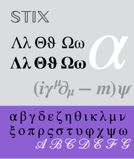
The STIX Fonts project or Scientific and Technical Information Exchange (STIX), is a project sponsored by several leading scientific and technical publishers to provide, under royalty-free license, a comprehensive font set of mathematical symbols and alphabets, intended to serve the scientific and engineering community for electronic and print publication. The STIX fonts are available as fully hinted OpenType/CFF fonts. There is currently no TrueType version of the STIX fonts available, but the STIX Mission Statement includes the intention to create one in the future. However, there exists an unofficial conversion of STIX Fonts to TrueType, suitable for use with software without OpenType support.

A subscript or superscript is a character that is set slightly below or above the normal line of type, respectively. It is usually smaller than the rest of the text. Subscripts appear at or below the baseline, while superscripts are above. Subscripts and superscripts are perhaps most often used in formulas, mathematical expressions, and specifications of chemical compounds and isotopes, but have many other uses as well.
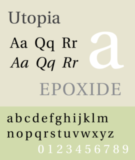
Utopia is the name of a transitional serif typeface designed by Robert Slimbach and released by Adobe Systems in 1989.
References
- ↑ Donald E. Knuth. The TeXbook (Computers and Typesetting, Volume A). Reading, Massachusetts: Addison-Wesley, 1984. ISBN 0-201-13448-9, page 82.
- ↑ Braams, J. and Carlisle, D. and Jeffrey, A. and Lamport, L. and Mittelbach, F. and Rowley, C. and Schöpf, R., The LaTeX2e Sources. 2009/09/24, pages 19 and 129. Available online as PDF and LaTeX source.