
Optima is a humanist sans-serif typeface designed by Hermann Zapf and released by the D. Stempel AG foundry, Frankfurt, West Germany in 1958.
Hermann Zapf was a German type designer and calligrapher who lived in Darmstadt, Germany. He was married to the calligrapher and typeface designer Gudrun Zapf-von Hesse. Typefaces he designed include Palatino, Optima, and Zapfino. He is considered one of the greatest type designers of all time.

In typography and lettering, a sans-serif, sans serif, gothic, or simply sans letterform is one that does not have extending features called "serifs" at the end of strokes. Sans-serif typefaces tend to have less stroke width variation than serif typefaces. They are often used to convey simplicity and modernity or minimalism. For the purposes of type classification, sans-serif designs are usually divided into these major groups: § Grotesque and § Neo-grotesque, § Geometric, § Humanist and § Other or mixed.

A typeface is a design of letters, numbers and other symbols, to be used in printing or for electronic display. Most typefaces include variations in size, weight, slope, width, and so on. Each of these variations of the typeface is a font.

Matthew Carter is a British type designer. A 2005 New Yorker profile described him as 'the most widely read man in the world' by considering the amount of text set in his commonly used typefaces.
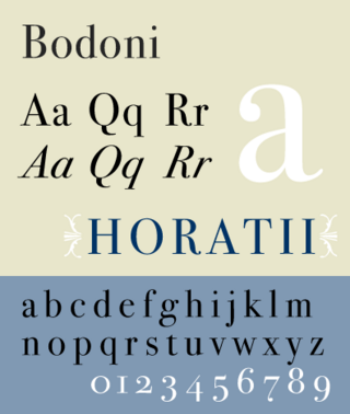
Bodoni is the name given to the serif typefaces first designed by Giambattista Bodoni (1740–1813) in the late eighteenth century and frequently revived since. Bodoni's typefaces are classified as Didone or modern. Bodoni followed the ideas of John Baskerville, as found in the printing type Baskerville—increased stroke contrast reflecting developing printing technology and a more vertical axis—but he took them to a more extreme conclusion. Bodoni had a long career and his designs changed and varied, ending with a typeface of a slightly condensed underlying structure with flat, unbracketed serifs, extreme contrast between thick and thin strokes, and an overall geometric construction.

Emigre, Inc., doing business as Emigre Fonts, is a digital type foundry based in Berkeley, California, that was founded in 1985 by husband-and-wife team Rudy VanderLans and Zuzana Licko. The type foundry grew out of Emigre magazine, a publication founded by VanderLans and two Dutch friends who met in San Francisco, CA in 1984. Note that unlike the word émigré, Emigre is officially spelled without accents.
Zuzana Licko is a Slovak-born American type designer and visual artist known for co-founding Emigre Fonts, a digital type foundry in Berkeley, CA. She has designed and produced numerous digital typefaces including the popular Mrs Eaves, Modula, Filosofia, and Matrix. As a corresponding interest she also creates ceramic sculptures and jacquard weavings.

Franklin Gothic and its related faces are a large family of sans-serif typefaces in the industrial or grotesque style developed in the early years of the 20th century by the type foundry American Type Founders (ATF) and credited to its head designer Morris Fuller Benton. "Gothic" was a contemporary term meaning sans-serif.
Aldo Novarese was an Italian type designer who lived and worked mostly in Turin.

Kris Holmes is an American typeface designer, calligrapher, type design educator and animator. She, with Charles Bigelow, is the co-creator of the Lucida and Wingdings font families, among many other typeface designs. She is President of Bigelow & Holmes Inc., a typeface design studio.
Robert Joseph Slimbach is Principal Type Designer at Adobe, Inc., where he has worked since 1987. He has won many awards for his digital typeface designs, including the rarely awarded Prix Charles Peignot from the Association Typographique Internationale, the SoTA Typography Award, and repeated TDC2 awards from the Type Directors Club. His typefaces are among those most commonly used in books.

Kabel is a geometric sans-serif typeface that was designed by the German designer Rudolf Koch and released by the Klingspor foundry from 1927 onward.

Rotis is a typeface developed in 1988 by Otl Aicher, a German graphic designer and typographer. In Rotis, Aicher explores an attempt at maximum legibility through a highly unified yet varied typeface family that ranges from full serif, glyphic, and sans-serif. The four basic Rotis variants are:

A swash is a typographical flourish, such as an exaggerated serif, terminal, tail, entry stroke, etc., on a glyph. The use of swash characters dates back to at least the 16th century, as they can be seen in Ludovico Vicentino degli Arrighi's La Operina, which is dated 1522. As with italic type in general, they were inspired by the conventions of period handwriting. Arrighi's designs influenced designers in Italy and particularly in France.
The International Typeface Corporation (ITC) was a type manufacturer founded in New York in 1970 by Aaron Burns, Herb Lubalin and Edward Rondthaler. The company was one of the world's first type foundries to have no history in the production of metal type. It is now a wholly owned brand or subsidiary of Monotype Imaging.

The Bauhaus typeface design is based on Herbert Bayer's 1925 experimental Universal typeface and the Bauhaus aesthetic overall.

The Adobe Originals program is a series of digital typefaces created by Adobe Systems from 1989 for professional use, intended to be of extremely high design quality while offering a large feature set across many languages. Many are strongly influenced by research into classic designs from the past and calligraphy. Adobe Originals fonts are sold separately or with Adobe products such as InDesign.

Goudy Sans is a sans-serif typeface designed by Frederic Goudy around 1929–1931 and published by Lanston Monotype.
The ITC Stone font family is a collection of typefaces designed by Sumner Stone, a typeface designer and graphic artist. It was created in 1987 with Bob Ishi when Stone was the Director of Typography at Adobe Systems. The font family includes fours different types: ITC Stone Serif, ITC Stone Sans, ITC Humanistic, and ITC Stone Informal. It was created with the intention that different styles could be mixed into one page.
