Related Research Articles

Optima is a humanist sans-serif typeface designed by Hermann Zapf and released by the D. Stempel AG foundry, Frankfurt, West Germany in 1958.
Hermann Zapf was a German type designer and calligrapher who lived in Darmstadt, Germany. He was married to the calligrapher and typeface designer Gudrun Zapf-von Hesse. Typefaces he designed include Palatino, Optima, and Zapfino. He is considered one of the greatest type designers of all time.

Matthew Carter is a British type designer. A 2005 New Yorker profile described him as 'the most widely read man in the world' by considering the amount of text set in his commonly used typefaces.
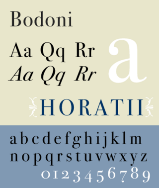
Bodoni is the name given to the serif typefaces first designed by Giambattista Bodoni (1740–1813) in the late eighteenth century and frequently revived since. Bodoni's typefaces are classified as Didone or modern. Bodoni followed the ideas of John Baskerville, as found in the printing type Baskerville—increased stroke contrast reflecting developing printing technology and a more vertical axis—but he took them to a more extreme conclusion. Bodoni had a long career and his designs changed and varied, ending with a typeface of a slightly condensed underlying structure with flat, unbracketed serifs, extreme contrast between thick and thin strokes, and an overall geometric construction.

Adrian Johann Frutiger was a Swiss typeface designer who influenced the direction of type design in the second half of the 20th century. His career spanned the hot metal, phototypesetting and digital typesetting eras. Until his death, he lived in Bremgarten bei Bern.

William Addison Dwiggins, was an American type designer, calligrapher, and book designer. He attained prominence as an illustrator and commercial artist, and he brought to the designing of type and books some of the boldness that he displayed in his advertising work. His work can be described as ornamented and geometric, similar to the Art Moderne and Art Deco styles of the period, using Oriental influences and breaking from the more antiquarian styles of his colleagues and mentors Updike, Cleland and Goudy.

Ephram Edward Benguiat was an American type designer and lettering artist. He designed over 600 typefaces, including Tiffany, Bookman, Panache, Souvenir, Edwardian Script, and the eponymous Benguiat and Benguiat Gothic.

Caslon is the name given to serif typefaces designed by William Caslon I in London, or inspired by his work.

Kris Holmes is an American typeface designer, calligrapher, type design educator and animator. She, with Charles Bigelow, is the co-creator of the Lucida and Wingdings font families, among many other typeface designs. She is President and Co-Founder of Bigelow & Holmes Inc., a typeface design studio.

Bookman, or Bookman Old Style, is a serif typeface. A wide, legible design that is slightly bolder than most body text faces, Bookman has been used for both display typography, for trade printing such as advertising, and less commonly for body text. In advertising use it is particularly associated with the graphic design of the 1960s and 1970s, when revivals of it were very popular.

Kabel is a geometric sans-serif typeface that was designed by the German designer Rudolf Koch and released by the Klingspor foundry from 1927 onward.

A swash is a typographical flourish, such as an exaggerated serif, terminal, tail, entry stroke, etc., on a glyph. The use of swash characters dates back to at least the 16th century, as they can be seen in Ludovico Vicentino degli Arrighi's La Operina, which is dated 1522. As with italic type in general, they were inspired by the conventions of period handwriting. Arrighi's designs influenced designers in Italy and particularly in France.
Doyald Young was an American typeface designer and teacher who specialized in the design of logotypes, corporate alphabets, lettering and typefaces.
The International Typeface Corporation (ITC) was a type manufacturer founded in New York in 1970 by Aaron Burns, Herb Lubalin and Edward Rondthaler. The company was one of the world's first type foundries to have no history in the production of metal type. It is now a wholly owned brand or subsidiary of Monotype Imaging.
ITC Avant Garde Gothic is a geometric sans serif font family based on the logo font used in the Avant Garde magazine. Herb Lubalin devised the logo concept and its companion headline typeface, and then he and Tom Carnase, a partner in Lubalin's design firm, worked together to transform the idea into a full-fledged typeface.

Les Usherwood was born in England, studied in Kent and started his career as a lettering artist. He moved to Toronto, Ontario, Canada in 1957 and worked for various companies until he started Typsettra with David Thomason in 1968. The company supplied typographic layouts, headline and text typesetting, mechanicals, custom lettering and notably typeface design.
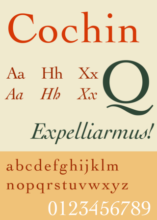
Cochin is a serif typeface. It was originally produced in 1912 by Georges Peignot for the Paris foundry G. Peignot et Fils and was based on the copperplate engravings of 18th century French artist Charles-Nicolas Cochin, from which the typeface also takes its name. The font has a small x-height with long ascenders. Georges Peignot also created the design 'Nicolas-Cochin' as a looser variation in the same style.
Josef Týfa was a Czech type designer. He significantly contributed to the cultivation of corporate style and the development of book design and advertising in the 1950s and 60s. Typefaces he designed include: Kolektiv, Tyfa, Juvenis, Amos and Academia, many of which he digitized with František Štorm, founder of Storm Type Foundry. He has indicated that his influences include Jaroslav Benda, Pier Luigi Nervi, and modern graphic design and architecture including functionalism.
Colin Brignall is an English type designer and photographer. In addition to designing typefaces himself, he has worked as a type director and typographic consultant to Letraset and the International Typeface Corporation (ITC), selecting and overseeing other designers' typefaces.
References
| International | |
|---|---|
| National | |