Maple is a symbolic and numeric computing environment as well as a multi-paradigm programming language. It covers several areas of technical computing, such as symbolic mathematics, numerical analysis, data processing, visualization, and others. A toolbox, MapleSim, adds functionality for multidomain physical modeling and code generation.
OpenDX stands for Open Data Explorer and is IBM's scientific data visualization software. It can handle complex domains along with measured or computed data. The data may be scalar, vector or tensor fields at different points of the object. The points at which data is measured don't have to be equally spaced and not need to be homogeneously spaced. The project started in 1991 as Visualization Data Explorer.

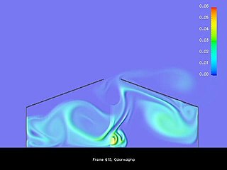
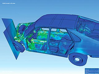
Scientific visualization is an interdisciplinary branch of science concerned with the visualization of scientific phenomena. It is also considered a subset of computer graphics, a branch of computer science. The purpose of scientific visualization is to graphically illustrate scientific data to enable scientists to understand, illustrate, and glean insight from their data. Research into how people read and misread various types of visualizations is helping to determine what types and features of visualizations are most understandable and effective in conveying information.
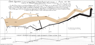
Visualization, also known as Graphics Visualization, is any technique for creating images, diagrams, or animations to communicate a message. Visualization through visual imagery has been an effective way to communicate both abstract and concrete ideas since the dawn of humanity. from history include cave paintings, Egyptian hieroglyphs, Greek geometry, and Leonardo da Vinci's revolutionary methods of technical drawing for engineering purposes that actively involve scientific requirements.
The following outline is provided as an overview of and topical guide to human–computer interaction:
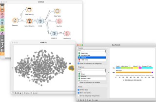
Orange is an open-source data visualization, machine learning and data mining toolkit. It features a visual programming front-end for exploratory qualitative data analysis and interactive data visualization.
Geovisualization or geovisualisation, also known as cartographic visualization, refers to a set of tools and techniques supporting the analysis of geospatial data through the use of interactive visualization.
Data and information visualization is the practice of designing and creating easy-to-communicate and easy-to-understand graphic or visual representations of a large amount of complex quantitative and qualitative data and information with the help of static, dynamic or interactive visual items. Typically based on data and information collected from a certain domain of expertise, these visualizations are intended for a broader audience to help them visually explore and discover, quickly understand, interpret and gain important insights into otherwise difficult-to-identify structures, relationships, correlations, local and global patterns, trends, variations, constancy, clusters, outliers and unusual groupings within data. When intended for the general public to convey a concise version of known, specific information in a clear and engaging manner, it is typically called information graphics.
The completion of the human genome sequencing in the early 2000s was a turning point in genomics research. Scientists have conducted series of research into the activities of genes and the genome as a whole. The human genome contains around 3 billion base pairs nucleotide, and the huge quantity of data created necessitates the development of an accessible tool to explore and interpret this information in order to investigate the genetic basis of disease, evolution, and biological processes. The field of genomics has continued to grow, with new sequencing technologies and computational tool making it easier to study the genome.

UCSF Chimera is an extensible program for interactive visualization and analysis of molecular structures and related data, including density maps, supramolecular assemblies, sequence alignments, docking results, trajectories, and conformational ensembles. High-quality images and movies can be created. Chimera includes complete documentation and can be downloaded free of charge for noncommercial use.
VSim is a cross-platform computational framework for multi-physics, compatible with Windows, Linux, and macOS.
VisIt is an open-source, interactive parallel visualization, and graphical analysis tool designed for viewing scientific data. It can visualize scalar and vector fields on 2D and 3D structured and unstructured meshes.

Visual analytics is a multidisciplinary science and technology field that emerged from information visualization and scientific visualization. It focuses on how analytical reasoning can be facilitated by interactive visual interfaces.
The Grid Analysis and Display System (GrADS) is an interactive desktop tool that is used for easy access, manipulation, and visualization of earth science data. The format of the data may be either binary, GRIB, NetCDF, or HDF-SDS. GrADS has been implemented worldwide on a variety of commonly used operating systems and is freely distributed over the Internet.
In computing, 3D interaction is a form of human-machine interaction where users are able to move and perform interaction in 3D space. Both human and machine process information where the physical position of elements in the 3D space is relevant.
KNIME, the Konstanz Information Miner, is a free and open-source data analytics, reporting and integration platform. KNIME integrates various components for machine learning and data mining through its modular data pipelining "Building Blocks of Analytics" concept. A graphical user interface and use of JDBC allows assembly of nodes blending different data sources, including preprocessing, for modeling, data analysis and visualization without, or with minimal, programming.

A motion chart is a dynamic bubble chart which allows efficient and interactive exploration and visualization of longitudinal multivariate data. Motion charts provide mechanisms for mapping ordinal, nominal and quantitative variables onto time, 2D coordinate axes, size, colors, glyphs and appearance characteristics, which facilitate the interactive display of multidimensional and temporal data.

Systrip is a visual environment for the analysis of time-series data in the context of biological networks. Systrip gathers bioinformatics and graph theoretical algorithms that can be assembled in different ways to help biologists in their visual mining process. It had been used to analyze various real biological data.

The NASA Exoplanet Archive is an online astronomical exoplanet catalog and data service that collects and serves public data that support the search for and characterization of extra-solar planets (exoplanets) and their host stars. It is part of the Infrared Processing and Analysis Center and is on the campus of the California Institute of Technology (Caltech) in Pasadena, CA. The archive is funded by NASA and was launched in early December 2011 by the NASA Exoplanet Science Institute as part of NASA's Exoplanet Exploration Program. In June 2019, the archive's collection of confirmed exoplanets surpassed 4,000.