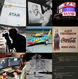
Graphic design is a profession, academic discipline and applied art whose activity consists in projecting visual communications intended to transmit specific messages to social groups, with specific objectives. Graphic design is an interdisciplinary branch of design and of the fine arts. Its practice involves creativity, innovation and lateral thinking using manual or digital tools, where it is usual to use text and graphics to communicate visually.

A logo is a graphic mark, emblem, or symbol used to aid and promote public identification and recognition. It may be of an abstract or figurative design or to include the text of the name that it represents as in a wordmark.

Starbucks Corporation is an American multinational chain of coffeehouses and roastery reserves headquartered in Seattle, Washington. It was founded in 1971, and is currently the world's largest coffeehouse chain.
Brand equity, in marketing, is the worth of a brand in and of itself – i.e., the social value of a well-known brand name. The owner of a well-known brand name can generate more revenue simply from brand recognition, as consumers perceive the products of well-known brands as better than those of lesser-known brands.

Rebranding is a marketing strategy in which a new name, term, symbol, design, concept or combination thereof is created for an established brand with the intention of developing a new, differentiated identity in the minds of consumers, investors, competitors, and other stakeholders. Often, this involves radical changes to a brand's logo, name, legal names, image, marketing strategy, and advertising themes. Such changes typically aim to reposition the brand/company, occasionally to distance itself from negative connotations of the previous branding, or to move the brand upmarket; they may also communicate a new message a new board of directors wishes to communicate.
Product design is the process of creating new products for sale businesses to its customers. It involves the generation and development of ideas through a systematic process that leads to the creation of innovative products. Thus, it is a major aspect of new product development.
Communication design is a mixed discipline between design and information-development concerned with how media communicate with people. A communication design approach is concerned with developing the message and aesthetics in media. It also creates new media channels to ensure the message reaches the target audience. Due to overlapping skills, some designers use graphic design and communication design interchangeably.

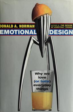
Emotional Design is both the title of a book by Donald Norman and of the concept it represents.
A lifestyle brand is a brand that attempts to embody the values, aspirations, interests, attitudes, or opinions of a group or a culture for marketing purposes. Lifestyle brands seek to inspire, guide, and motivate people, with the goal of making their products contribute to the definition of the consumer's way of life. As such, they are closely associated with the advertising and other promotions used to gain mind share in their target market. They often operate from an ideology, hoping to attract a relatively high number of people and ultimately become a recognised social phenomenon.
User experience design defines the experience a user would go through when interacting with a company, its services, and its products. User experience design is a user centered design approach because it considers the user's experience when using a product or platform. Research, data analysis, and test results drive design decisions in UX design rather than aesthetic preferences and opinions. Unlike user interface design, which focuses solely on the design of a computer interface, UX design encompasses all aspects of a user's perceived experience with a product or website, such as its usability, usefulness, desirability, brand perception, and overall performance. UX design is also an element of the customer experience (CX), and encompasses all aspects and stages of a customer's experience and interaction with a company.

Visual merchandising is the practice in the retail industry of optimizing the presentation of products and services to better highlight their features and benefits. The purpose of such visual merchandising is to attract, engage, and motivate the customer towards making a purchase.
A touchpoint can be defined as any way consumers can interact with a business organization, whether it be person-to-person, through a website, an app or any form of communication. When consumers come in contact with these touchpoints it gives them the opportunity to compare their prior perceptions of the business and form an opinion.
Brand awareness is the extent to which customers are able to recall or recognize a brand under different conditions. Brand awareness is one of two dimensions from brand knowledge, an associative network memory model. Brand awareness is a key consideration in consumer behavior, advertising management, and brand management. The consumer's ability to recognize or recall a brand is central to purchasing decision-making. Purchasing cannot proceed unless a consumer is first aware of a product category and a brand within that category. Awareness does not necessarily mean that the consumer must be able to recall a specific brand name, but they must be able to recall enough distinguishing features for purchasing to proceed. Creating brand awareness is the main step in advertising a new product or bringing back the older brand in light.

A brand is a name, term, design, symbol or any other feature that distinguishes one seller's good or service from those of other sellers. Brands are used in business, marketing, and advertising for recognition and, importantly, to create and store value as brand equity for the object identified, to the benefit of the brand's customers, its owners and shareholders. Brand names are sometimes distinguished from generic or store brands.
Emotional branding is a term used within marketing communication that refers to the practice of building brands that appeal directly to a consumer's emotional state, needs and aspirations. Emotional branding is successful when it triggers an emotional response in the consumer, that is, a desire for the advertised brand that cannot fully be rationalized. Emotional brands have a significant impact when the consumer experiences a strong and lasting attachment to the brand comparable to a feeling of bonding, companionship or love. Examples of emotional branding include the nostalgic attachment to the Kodak brand of film, bonding with the Jim Beam bourbon brand, and love for the McDonald’s brand.

Brand language is the body of words, phrases, and terms that an organization uses to describe its purpose or in reference to its products. Brand language is used in marketing to help consumers connect specific words or ideas to specific companies or products. When developing a brand language, word choice and tone are the two fundamental components. Word choice is the vocabulary that is used in the marketing or advertising, while tone refers to the attitude of the advertisement. Tone is not limited to language, it can also be incorporated through visual elements as well as delivery.
A sound trademark, sound logo, or audio logo is a trademark where sound is used to perform the trademark function of uniquely identifying the commercial origin of products or services.
Sensory branding is a type of marketing that appeals to all the senses in relation to the brand. It uses the senses to relate with customers on an emotional level. It is believed that the difference between an ordinary product and a captivating product is emotion. When emotion flows in the marketplace, your product shines. When there is no emotion from the product, customers lack the enthusiasm and passion that launches a product to success. Brands can forge emotional associations in the customers' minds by appealing to their senses. A multi-sensory brand experience generates certain beliefs, feelings, thoughts and opinions to create a brandgon image in the consumer's mind.

Debranding is a marketing strategy to remove the manufacturers name from a product to appear less corporate, or to save on advertising. De-corporatizing is when a company removes its name from its logo for a marketing campaign in an attempt to make themselves appear less corporate and more personal. "Transitioning into generic" is when a company with a well-known brand opts to appear more generic. This means the company will eliminate advertising and reduce prices and debranding in this sense can increase profit margins.
An icon brand is a symbol-intensive brand that carry powerful universal values making it instantly recognisable thanks to ownable and distinctive codes. Becoming an icon is the peak of the marketing. Icon brands include various luxury brands and fashion brands, though any brand—regardless of its origins and sector—can become an icon brand if marketed competently.


