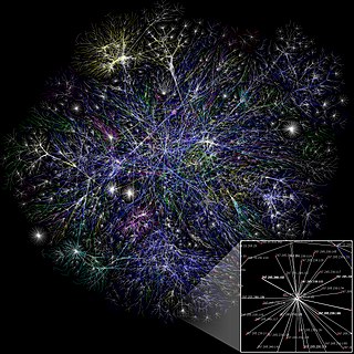
Social network analysis (SNA) is the process of investigating social structures through the use of networks and graph theory. It characterizes networked structures in terms of nodes and the ties, edges, or links that connect them. Examples of social structures commonly visualized through social network analysis include social media networks, memes spread, information circulation, friendship and acquaintance networks, business networks, knowledge networks, difficult working relationships, social networks, collaboration graphs, kinship, disease transmission, and sexual relationships. These networks are often visualized through sociograms in which nodes are represented as points and ties are represented as lines. These visualizations provide a means of qualitatively assessing networks by varying the visual representation of their nodes and edges to reflect attributes of interest.

Graph drawing is an area of mathematics and computer science combining methods from geometric graph theory and information visualization to derive two-dimensional depictions of graphs arising from applications such as social network analysis, cartography, linguistics, and bioinformatics.
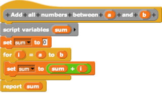
In computing, a visual programming language (VPL) is any programming language that lets users create programs by manipulating program elements graphically rather than by specifying them textually. A VPL allows programming with visual expressions, spatial arrangements of text and graphic symbols, used either as elements of syntax or secondary notation. For example, many VPLs are based on the idea of "boxes and arrows", where boxes or other screen objects are treated as entities, connected by arrows, lines or arcs which represent relations.

Graphviz is a package of open-source tools initiated by AT&T Labs Research for drawing graphs specified in DOT language scripts having the file name extension "gv". It also provides libraries for software applications to use the tools. Graphviz is free software licensed under the Eclipse Public License.
DOT is a graph description language. DOT graphs are typically files with the filename extension gv or dot. The extension gv is preferred, to avoid confusion with the extension dot used by versions of Microsoft Word before 2007.
Visualization or visualisation is any technique for creating images, diagrams, or animations to communicate a message. Visualization through visual imagery has been an effective way to communicate both abstract and concrete ideas since the dawn of humanity. Examples from history include cave paintings, Egyptian hieroglyphs, Greek geometry, and Leonardo da Vinci's revolutionary methods of technical drawing for engineering and scientific purposes.

Infographics are graphic visual representations of information, data, or knowledge intended to present information quickly and clearly. They can improve cognition by utilizing graphics to enhance the human visual system's ability to see patterns and trends. Similar pursuits are information visualization, data visualization, statistical graphics, information design, or information architecture. Infographics have evolved in recent years to be for mass communication, and thus are designed with fewer assumptions about the readers' knowledge base than other types of visualizations. Isotypes are an early example of infographics conveying information quickly and easily to the masses.

A dendrogram is a diagram representing a tree. This diagrammatic representation is frequently used in different contexts:

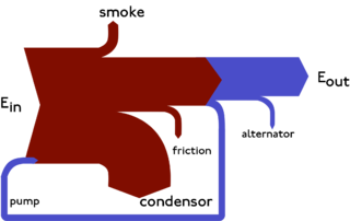
Flow diagram is a collective term for a diagram representing a flow or set of dynamic relationships in a system. The term flow diagram is also used as a synonym for flowchart, and sometimes as a counterpart of the flowchart.
Sankerry are a type of flow diagram in which the width of the arrows is proportional to the flow rate.
Apache Hadoop is a collection of open-source software utilities that facilitates using a network of many computers to solve problems involving massive amounts of data and computation. It provides a software framework for distributed storage and processing of big data using the MapReduce programming model. Hadoop was originally designed for computer clusters built from commodity hardware, which is still the common use. It has since also found use on clusters of higher-end hardware. All the modules in Hadoop are designed with a fundamental assumption that hardware failures are common occurrences and should be automatically handled by the framework.
Cytoscape is an open source bioinformatics software platform for visualizing molecular interaction networks and integrating with gene expression profiles and other state data. Additional features are available as plugins. Plugins are available for network and molecular profiling analyses, new layouts, additional file format support and connection with databases and searching in large networks. Plugins may be developed using the Cytoscape open Java software architecture by anyone and plugin community development is encouraged. Cytoscape also has a JavaScript-centric sister project named Cytoscape.js that can be used to analyse and visualise graphs in JavaScript environments, like a browser.
First developed in 1985 by RockWare Inc, RockWorks is used by the mining, petroleum, and environmental industry for subsurface visualization, borehole database management as well as the creation of grids, solid models, calculating volumetric analysis, etc.

Visual analytics is an outgrowth of the fields of information visualization and scientific visualization that focuses on analytical reasoning facilitated by interactive visual interfaces.
KNIME, the Konstanz Information Miner, is a free and open-source data analytics, reporting and integration platform. KNIME integrates various components for machine learning and data mining through its modular data pipelining "Building Blocks of Analytics" concept. A graphical user interface and use of JDBC allows assembly of nodes blending different data sources, including preprocessing, for modeling, data analysis and visualization without, or with only minimal, programming.
Node graph architecture is a software design structured around the notion of a node graph. Both the source code as well as the user interface is designed around the editing and composition of atomic functional units.
D3.js is a JavaScript library for producing dynamic, interactive data visualizations in web browsers. It makes use of Scalable Vector Graphics (SVG), HTML5, and Cascading Style Sheets (CSS) standards. It is the successor to the earlier Protovis framework. Its development was noted in 2011, as version 2.0.0 was released in August 2011.
NodeXL is a network analysis and visualization software package for Microsoft Excel 2007/2010/2013/2016. It is a popular package similar to other network visualization tools such as Pajek, UCINet, and Gephi. It is widely applied in ring, mapping of vertex and edge, and customizable visual attributes and tags. It enables researchers to undertake social network analysis work’s metrics such as centrality, degree, and clustering. It allows us to see the relational data and describe the overall relational network structure. When we applied it in Twitter data analysis, it can show the huge network of all users participating in public discussion and its internal structure through big data mining. It permits social Network analysis (SNA) emphasizes the relationships rather than isolated individuals or organizations, so this method allows us to investigate the ‘two-way dialogue between the organization and the public. SNA also provides researchers with a flexible measurement system and parameter selection to confirm the influential nodes in the network, such as in-degree and out-degree centrality. The free version contains network visualization and social network analysis features. The commercial version includes access to social media network data importers, advanced network metrics, and automation.

ConceptDraw DIAGRAM is proprietary diagramming software used to create business graphics, including: diagrams, flowcharts, Infographics, data visualization for business process models, data presentation and project management documentation. It can also be used for creating professional and technical diagrams, such as: UML diagrams, DFD, ERD, computer networks topology, engineering schemes, floor plans, and other technical graphic formats. The program was developed by CS Odessa in 1999. Since 2008, it has formed a part of ConceptDraw OFFICE. A set of solution add-ons that include collections of task-oriented templates and vector stencils libraries, have been released for ConceptDraw DIAGRAM, relating to certain industry-specific graphical tasks. The software also contains a set of tools for vector graphics drawing, along with a built-in presentation mode.
Similarity in network analysis occurs when two nodes fall in the same equivalence class.
