
In typography and lettering, a sans-serif, sans serif, gothic, or simply sans letterform is one that does not have extending features called "serifs" at the end of strokes. Sans-serif typefaces tend to have less stroke width variation than serif typefaces. They are often used to convey simplicity and modernity or minimalism. For the purposes of type classification, sans-serif designs are usually divided into these major groups: § Grotesque, § Neo-grotesque, § Geometric, § Humanist, and § Other or mixed.

A typeface is a design of letters, numbers and other symbols, to be used in printing or for electronic display. Most typefaces include variations in size, weight, slope, width, and so on. Each of these variations of the typeface is a font.
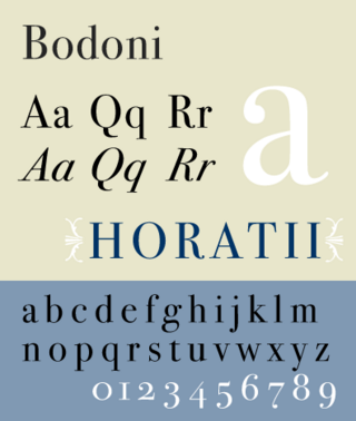
Bodoni is the name given to the serif typefaces first designed by Giambattista Bodoni (1740–1813) in the late eighteenth century and frequently revived since. Bodoni's typefaces are classified as Didone or modern. Bodoni followed the ideas of John Baskerville, as found in the printing type Baskerville—increased stroke contrast reflecting developing printing technology and a more vertical axis—but he took them to a more extreme conclusion. Bodoni had a long career and his designs changed and varied, ending with a typeface of a slightly condensed underlying structure with flat, unbracketed serifs, extreme contrast between thick and thin strokes, and an overall geometric construction.

Rockwell is a slab serif typeface designed by the Monotype Corporation and released in 1934. The project was supervised by Monotype's engineering manager Frank Hinman Pierpont. This typeface is distinguished by a serif at the apex of the uppercase A, while the lowercase a has two storeys. Because of its monoweighted stroke, Rockwell is used primarily for display or at small sizes rather than as a body text. Rockwell is based on an earlier, more condensed slab serif design cast by the Inland Type Foundry called Litho Antique.

Futura is a geometric sans-serif typeface designed by Paul Renner and released in 1927. It was designed as a contribution on the New Frankfurt-project. It is based on geometric shapes, especially the circle, similar in spirit to the Bauhaus design style of the period. It was developed as a typeface by the Bauer Type Foundry, in competition with Ludwig & Mayer's seminal Erbar typeface of 1926.

A type foundry is a company that designs or distributes typefaces. Before digital typography, type foundries manufactured and sold metal and wood typefaces for hand typesetting, and matrices for line-casting machines like the Linotype and Monotype, for letterpress printers. Today's digital type foundries accumulate and distribute typefaces created by type designers, who may either be freelancers operating their own independent foundry, or employed by a foundry. Type foundries may also provide custom type design services.
Oblique type is a form of type that slants slightly to the right, used for the same purposes as italic type. Unlike italic type, however, it does not use different glyph shapes; it uses the same glyphs as roman type, except slanted. Oblique and italic type are technical terms to distinguish between the two ways of creating slanted font styles; oblique designs may be labelled italic by companies selling fonts or by computer programs. Oblique designs may also be called slanted or sloped roman styles. Oblique fonts, as supplied by a font designer, may be simply slanted, but this is often not the case: many have slight corrections made to them to give curves more consistent widths, so they retain the proportions of counters and the thick-and-thin quality of strokes from the regular design.

In typography, a slab serif typeface is a type of serif typeface characterized by thick, block-like serifs. Serif terminals may be either blunt and angular (Rockwell), or rounded (Courier). Slab serifs were introduced in the early nineteenth century.

Didone is a genre of serif typeface that emerged in the late 18th century and was the standard style of general-purpose printing during the 19th century. It is characterized by:
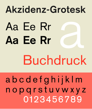
Akzidenz-Grotesk is a sans-serif typeface family originally released by the Berthold Type Foundry of Berlin. "Akzidenz" indicates its intended use as a typeface for commercial print runs such as publicity, tickets and forms, as opposed to fine printing, and "grotesque" was a standard name for sans-serif typefaces at the time.

Clarendon is the name of a slab serif typeface that was released in 1845 by Thorowgood and Co. of London, a letter foundry often known as the Fann Street Foundry. The original Clarendon design is credited to Robert Besley, a partner in the foundry, and was originally engraved by punchcutter Benjamin Fox, who may also have contributed to its design. Many copies, adaptations and revivals have been released, becoming almost an entire genre of type design.

Archer is a slab serif typeface designed in 2001 by Tobias Frere-Jones and Jonathan Hoefler for use in Martha Stewart Living magazine. It was later released by Hoefler & Frere-Jones for commercial licensing.

Monotype Grotesque is a family of sans-serif typefaces released by the Monotype Corporation for its hot metal typesetting system. It belongs to the grotesque or industrial genre of early sans-serif designs. Like many early sans-serifs, it forms a sprawling family designed at different times.

In typography, Erbar or Erbar-Grotesk is a sans-serif typeface in the geometric style, one of the first designs of this kind released as type. Designer Jakob Erbar's aim was to design a printing type which would be free of all individual characteristics, possess thoroughly legible letter forms, and be a purely typographic creation. His conclusion was that this could only work if the type form was developed from a fundamental element, the circle. Erbar-Grotesk was developed in stages; Erbar wrote that he had originally sketched out the design in 1914 but had been prevented from working on it due to the war. The original version of Erbar was released in 1926, following Erbar's "Phosphor" titling capitals of 1922 which are very similar in design.
Memphis is a slab-serif typeface designed by Rudolf Wolf and released in 1929 by the Stempel Type Foundry.

Karnak is a slab-serif typeface designed by R. Hunter Middleton for the Ludlow Typograph company and issued in the period 1931–1942.

A display typeface is a typeface that is intended for use in display type at large sizes for titles, headings, pull quotes, and other eye-catching elements, rather than for extended passages of body text.
The Legibility Group is a series of serif typefaces created by the American Mergenthaler Linotype Company and intended for use in newspapers on Linotype's hot metal typesetting system. They were developed in-house by Linotype's design team, led by Chauncey H. Griffith, and released from 1925, when the first member, Ionic No. 5, appeared.
