Composition (visual arts)

Last updated
The Art of Painting by Jan Vermeer Jan Vermeer - The Art of Painting - Google Art Project.jpg
The Art of Painting by Jan Vermeer

The term composition means "putting together". It can be thought of as the organization of the elements of art according to the principles of art. Composition can apply to any work of art, from music through writing and into photography, that is arranged using conscious thought.

Contents

In the visual arts, composition is often used interchangeably with various terms such as design, form, visual ordering, or formal structure, depending on the context. In graphic design for press and desktop publishing, composition is commonly referred to as page layout.

The composition of a picture is different from its subject (what is depicted), whether a moment from a story, a person or a place. Many subjects, for example Saint George and the Dragon, are often portrayed in art, but using a great range of compositions even though the two figures are typically the only ones shown.

Elements of design

The central visual element, known as element of design, formal element, or element of art, constitute the vocabulary with which the visual artist compose. These elements in the overall design usually relate to each other and to the whole art work.

The elements of design are:

Line and shape

Patterns in the frosted glass form leading lines which help draw in the viewer's eye in this photograph of a ledge in the Brooklyn Botanic Garden. Brooklyn Botanic Garden New York May 2015 003.jpg
Patterns in the frosted glass form leading lines which help draw in the viewer's eye in this photograph of a ledge in the Brooklyn Botanic Garden.

Lines are optical phenomena that allow the artist to direct the eye of the viewer. The optical illusion of lines does exist in nature, and in visual arts, elements can be arranged to create this illusion. The viewer unconsciously "reads" the image through the continuous arrangement of different elements and subjects at varying distances. Such elements can be of dramatic use in the composition of the image. These could be literal lines such as telephone and power cables or rigging on boats. Lines can also derive from the borders of different colors or contrast, or sequences of discrete elements. Movement is also a source of lines, where the blurred movement renders as a line. [1]

Subject lines contribute to both mood and linear perspective, giving the viewer the illusion of depth. Oblique lines convey a sense of movement, and angular lines generally convey dynamism and possibly tension. Lines can also direct attention towards the main subject of the picture or contribute to the organization by dividing it into compartments. The artist may exaggerate or create lines, perhaps as part of their message to the viewer. Many lines without a clear subject-point suggest chaos in the image, and may conflict with the mood the artist is trying to evoke.[ citation needed ]

A line's angle and its relationship to the frame's size influence the perspective of the image. Horizontal lines, commonly found in landscape photography, can give the impression of calm, tranquility, and space. An image filled with strong vertical lines tends to have the appearance of height and grandeur. Tightly angled convergent lines give a dynamic, lively, and active effect to the image. Firmly turned, almost diagonal lines produce tension in the picture. The viewpoint of visual art is fundamental because every different perspective views different angled lines. This change of perspective elicits a different response to the image. Changing the air only by some degrees or some centimeters lines in embodiments can vary tremendously, and a distinct feeling can be transported.[ clarification needed ] Straight lines are also strongly influenced by tone, color, and repetition concerning the rest of the image.

Compared to straight lines, curves provide a greater dynamic influence in a picture. They are also generally more aesthetically pleasing, as the viewer associates them with nature and softness. In photography, curved lines can give graduated shadows when paired with soft-directional lighting, which usually results in a very harmonious line structure within the image. There are two main types of curves, a simple "C" curve as well as a more sinuous "S" curve. [2]

Color

There are three properties of color: hue, brightness or chroma, and value. Hue is the name of a color (red, yellow, and blue, etc.). Brightness and chroma refer to the intensity and strength of the color. A high chroma color is more pure and less greyed than a low chroma color. The lightness or darkness to a color is the value. Color also has the ability to work within our emotions. Given that, we can use color to create mood. It can also be used as tone, pattern, light, movement, symbol, form, harmony, and contrast. [3] [4]

Texture

Texture refers to how an object feels or how it looks like it may feel if it were touched. There are two ways we experience texture, physically and optically. Different techniques can be used to create physical texture, which allows qualities of visual art to be seen and felt. This can include surfaces such as metal, sand, and wood. Optical texture is when the illusion of physical texture is created. Photography, paintings, and drawings use visual texture to create a more realistic appearance. [5]

Value

Lightness and darkness are known as value in visual art. Value deals with how light reflects off objects and how we see it. The more light that is reflected, the higher the value. White is the highest or lightest value while black is the lowest or darkest value. Colors also have value; for example, yellow has a high value while blue and red have a low value. If you take a black and white picture of a colorful scene, all you are left with are the values. This important element of design, especially in painting and drawing, allows the artist to create the illusion of light through value contrast. [6]

Form

The term form can mean different things in visual art. Form suggests a three-dimensional object in space. It is also described as the physical nature of the artwork, such as sculptures. It can also be looked at as art form, which can be expressed through fine art. A form encloses volume, has length, width, and height, unlike a shape, which is only two-dimensional. Forms that are mathematical, a sphere, pyramid, cube, cylinder, and cone, are known as geometric forms. Organic forms are typically irregular and asymmetrical. This form can be found in nature, such as flowers, rocks, trees, etc., but can also be seen in architecture. [7]

Forms in drawing and painting convey the illusion of three-dimensional form through lighting, shadows, value, and tone. The more contrast in value, the more pronounced the three-dimensional form is. Forms with little value appear flatter than those with greater variation and contrasting.

Space

Space is the area around, above, and within an object. Photographers can capture space, architects build space, and painters create space. This element is found in each of the visual arts. It can be positive or negative, open or closed, shallow or deep, and two-dimensional or three-dimensional. In drawing or painting, space is not actually there, but the illusion of it is. Positive space is the subject of the piece. The empty spaces around, above, and within, is negative space. [8] [9]

Principles of organization

The artist determines what the center of interest (focus in photography) of the art work will be, and composes the elements accordingly. The gaze of the viewer will then tend to linger over these points of interest, elements are arranged with consideration of several factors (known variously as the principles of organization, principles of art, or principles of design) into a harmonious whole which works together to produce the desired statement – a phenomenon commonly referred to as unity. Such factors in composition should not be confused with the elements of art (or elements of design) themselves. For example, shape is an element; the usage of shape is characterized by various principles.

Some principles of organization affecting the composition of a picture are:

Viewpoint (leading with the eye)

The position of the viewer can strongly influence the aesthetics of an image, even if the subject is entirely imaginary and viewed "within the mind's eye". Not only does it influence the elements within the picture, but it also influences the viewer's interpretation of the subject.

For example, if a boy is photographed from above, perhaps from the eye level of an adult, he is diminished in stature. A photograph taken at the child's level would treat him as an equal, and one taken from below could result in an impression of dominance. Therefore, the photographer is choosing the viewer's positioning.

A subject can be rendered more dramatic when it fills the frame. There exists a tendency to perceive things as larger than they actually are, and filling the frame fulfills this psychological mechanism. This can be used to eliminate distractions from the background.

In photography, altering the position of the camera can change the image so that the subject has fewer or more distractions with which to compete. This may be achieved by getting closer, moving laterally, tilting, panning, or moving the camera vertically.

Compositional techniques

There are numerous approaches or "compositional techniques" to achieve a sense of unity within an artwork, depending on the goals of the artist. For example, a work of art is said to be aesthetically pleasing to the eye if the elements within the work are arranged in a balanced compositional way. [10] However, there are artists such as Salvador Dalí who aim to disrupt traditional composition and challenge the viewer to rethink balance and design elements within art works.

Conventional composition can be achieved with a number of techniques:

Rule of thirds

The rule of thirds is a composition guide that states that arranging the important features of an image on or near the horizontal and vertical lines that would divide the image into thirds horizontally and vertically is visually pleasing. The objective is to stop the subjects and areas of interest (such as the horizon) from bisecting the image, by placing them near one of the lines that would divide the image into three equal columns and rows, ideally near the intersection of those lines.

Rule of thirds: Note how the horizon falls close to the bottom grid line, and how the dark areas are in the left third, the overexposed in the right third. Rule of thirds photo.jpg
Rule of thirds: Note how the horizon falls close to the bottom grid line, and how the dark areas are in the left third, the overexposed in the right third.

The rule of thirds is thought to be a simplification of the golden ratio. The golden ratio is thought to have been used by artists throughout history as a composition guide, but there is little evidence to support this claim.

Rule of odds

The "rule of odds" suggests that an odd number of subjects in an image is more interesting than an even number. Thus if you have more than one subject in your picture, the suggestion is to choose an arrangement with at least three subjects. An even number of subjects produces symmetries in the image, which can appear less natural for a naturalistic, informal composition.

An image of a person surrounded/framed by two other persons, for instance, where the person in the center is the object of interest in that image/artwork, is more likely to be perceived as friendly and comforting by the viewer, than an image of a single person with no significant surroundings.

Rule of space

Image of a racing car with lead room BMW M3 -4.jpg
Image of a racing car with lead room

The rule of space applies to artwork (photography, advertising, illustration) picturing objects to which the artist wants to apply the illusion of movement, or which is supposed to create a contextual bubble in the viewer's mind.

This can be achieved, for instance, by leaving white space in the direction the eyes of a portrayed person are looking, or, when picturing a runner, adding white space in front of him rather than behind him to indicate movement. Studies with naive participants have confirmed this preference. [11]

Simplification

Images with clutter can distract from the main elements within the picture and make it difficult to identify the subject. By decreasing the extraneous content, the viewer is more likely to focus on the primary objects. Clutter can also be reduced through the use of lighting, as the brighter areas of the image tend to draw the eye, as do lines, squares and colour. In painting, the artist may use less detailed and defined brushwork towards the edges of the picture. Removing the elements to the focus of the object, taking only the needed components.

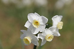
Shallow depth of field

In photography, and also (via software simulation of real lens limitations) in 3D graphics, one approach to achieving simplification is to use a wide aperture when shooting to limit the depth of field. When used properly in the right setting, this technique can place everything that is not the subject of the photograph out of focus.

The blurred background focuses the eye on the flowers. Jonquil flowers at f5.jpg
The blurred background focuses the eye on the flowers.
At a smaller aperture, the background competes for the viewer's attention. Jonquil flowers at f32.jpg
At a smaller aperture, the background competes for the viewer's attention.

A similar approach, given the right equipment, is to take advantage of the Scheimpflug principle to change the plane of focus.

Geometry and symmetry

A simple composition with cloud and rooftop that creates asymmetry. Composition with cloud.JPG
A simple composition with cloud and rooftop that creates asymmetry.

Related to the rule of odds is the observation that triangles are an aesthetically pleasing implied shape within an image. In a canonically attractive face, the mouth and eyes fall within the corners of the area of an equilateral triangle.[ citation needed ] Paul Cézanne successfully used triangles in his compositions of still lifes. A triangular format creates a sense of stability and strength.

Creating movement

It is generally thought to be more pleasing to the viewer if the image encourages the eye to move around the image, rather than immediately fixating on a single place or no place in particular. Artists will often strive to avoid creating compositions that feel "static" or "flat" by incorporating movement into the image. In image A the 2 mountains are equally sized and positioned beside each other creating a very static and uninteresting image. In image B the mountains are differently sized and one is placed closer to the horizon, guiding the eye to move from one mountain to the other creating a more interesting and pleasing image. This also feels more natural because in nature objects are rarely the same size and evenly spaced.

Image A Composition Image A.svg
Image A
Image B Composition Image B.svg
Image B

Other techniques

These principles can be means of a good composition yet they cannot be applied separately but should act together to form a good composition.

Example

These paintings all show the same subject, the Raising of Lazarus, and essentially the same figures, but have very different compositions:

See also

Related Research Articles

<span class="mw-page-title-main">Drawing</span> Visual artwork on two-dimensional surface

Drawing is a visual art that uses an instrument to mark paper or another two-dimensional surface. The instrument might be pencils, crayons, pens with inks, brushes with paints, or combinations of these, and in more modern times, computer styluses with graphics tablets.

<span class="mw-page-title-main">Optical illusion</span> Visually perceived images that differ from objective reality

In visual perception, an optical illusion is an illusion caused by the visual system and characterized by a visual percept that arguably appears to differ from reality. Illusions come in a wide variety; their categorization is difficult because the underlying cause is often not clear but a classification proposed by Richard Gregory is useful as an orientation. According to that, there are three main classes: physical, physiological, and cognitive illusions, and in each class there are four kinds: Ambiguities, distortions, paradoxes, and fictions. A classical example for a physical distortion would be the apparent bending of a stick half immerged in water; an example for a physiological paradox is the motion aftereffect. An example for a physiological fiction is an afterimage. Three typical cognitive distortions are the Ponzo, Poggendorff, and Müller-Lyer illusion. Physical illusions are caused by the physical environment, e.g. by the optical properties of water. Physiological illusions arise in the eye or the visual pathway, e.g. from the effects of excessive stimulation of a specific receptor type. Cognitive visual illusions are the result of unconscious inferences and are perhaps those most widely known.

<span class="mw-page-title-main">Image</span> Visual artifact that depicts or records perception

An image is a visual representation of something. An image can be two-dimensional, such as a drawing, painting, or photograph, or three-dimensional, such as a carving or sculpture. Images may be displayed through other media, including projection on a surface, activation of electronic signals, or digital displays; they can also be reproduced through mechanical means, such as photography, printmaking or photocopying. Images can also be animated through digital or physical processes.

<span class="mw-page-title-main">Op art</span> Art movement

Op art, short for optical art, is a style of visual art that uses optical illusions.

<span class="mw-page-title-main">Stereoscopy</span> Technique for creating or enhancing the illusion of depth in an image

Stereoscopy is a technique for creating or enhancing the illusion of depth in an image by means of stereopsis for binocular vision. The word stereoscopy derives from Greek στερεός (stereos) 'firm, solid', and σκοπέω (skopeō) 'to look, to see'. Any stereoscopic image is called a stereogram. Originally, stereogram referred to a pair of stereo images which could be viewed using a stereoscope.

<span class="mw-page-title-main">Depth perception</span> Visual ability to perceive the world in 3D

Depth perception is the ability to perceive distance to objects in the world using the visual system and visual perception. It is a major factor in perceiving the world in three dimensions. Depth perception happens primarily due to stereopsis and accommodation of the eye.

<span class="mw-page-title-main">Autostereogram</span> Visual illusion of 3D scene achieved by unfocusing eyes when viewing specific 2D images

An autostereogram is a two-dimensional (2D) image that can create the optical illusion of a three-dimensional (3D) scene. Autostereograms use only one image to accomplish the effect while normal stereograms require two. The 3D scene in an autostereogram is often unrecognizable until it is viewed properly, unlike typical stereograms. Viewing any kind of stereogram properly may cause the viewer to experience vergence-accommodation conflict.

<span class="mw-page-title-main">Visual communication</span> Method of communication

Visual communication is the use of visual elements to convey ideas and information which include signs, typography, drawing, graphic design, illustration, industrial design, advertising, animation, and electronic resources. Visual communication has been proven to be unique when compared to other verbal or written languages because of its more abstract structure. It stands out for its uniqueness, as the interpretation of signs varies on the viewer's field of experience. The interpretation of imagery is often compared to the set alphabets and words used in oral or written languages. Another point of difference found by scholars is that, though written or verbal languages are taught, sight does not have to be learned and therefore people of sight may lack awareness of visual communication and its influence in their everyday life. Many of the visual elements listed above are forms of visual communication that humans have been using since prehistoric times. Within modern culture, there are several types of characteristics when it comes to visual elements, they consist of objects, models, graphs, diagrams, maps, and photographs. Outside the different types of characteristics and elements, there are seven components of visual communication: color, shape, tones, texture, figure-ground, balance, and hierarchy.

<span class="mw-page-title-main">False color</span> Methods of visualizing information by translating to colors

False color refers to a group of color rendering methods used to display images in color which were recorded in the visible or non-visible parts of the electromagnetic spectrum. A false-color image is an image that depicts an object in colors that differ from those a photograph would show. In this image, colors have been assigned to three different wavelengths that human eyes cannot normally see.

Visual design elements and principles describe fundamental ideas about the practice of visual design.

Elements of art are stylistic features that are included within an art piece to help the artist communicate. The seven most common elements include line, shape, texture, form, space, color and value, with the additions of mark making, and materiality. When analyzing these intentionally utilized elements, the viewer is guided towards a deeper understanding of the work.

<span class="mw-page-title-main">Outline of the visual arts</span> Overview of and topical guide to the visual arts

The following outline is provided as an overview of and topical guide to the visual arts:

<span class="mw-page-title-main">Framing (visual arts)</span> Presentation of visual elements in an image

In visual arts and particularly cinematography, framing is the presentation of visual elements in an image, especially the placement of the subject in relation to other objects. Framing can make an image more aesthetically pleasing and keep the viewer's focus on the framed object(s). It can also be used as a repoussoir, to direct attention back into the scene. It can add depth to an image, and can add interest to the picture when the frame is thematically related to the object being framed.

<span class="mw-page-title-main">Atelier</span> Workshop or studio of a professional artist in the fine or decorative arts

An atelier is the private workshop or studio of a professional artist in the fine or decorative arts or an architect, where a principal master and a number of assistants, students, and apprentices can work together producing fine art or visual art released under the master's name or supervision.

<span class="mw-page-title-main">Texture (visual arts)</span> Perceived surface quality of a work of art

In the visual arts, texture refers to the perceived surface quality of a work of art. It is an element found in both two-dimensional and three-dimensional designs, and it is characterized by its visual and physical properties. The use of texture, in conjunction with other design elements, can convey a wide range of messages and evoke various emotions.

In photography and cinematography, headroom or head room is a concept of aesthetic composition that addresses the relative vertical position of the subject within the frame of the image. Headroom refers specifically to the distance between the top of the subject's head and the top of the frame, but the term is sometimes used instead of lead room, nose room or 'looking room' to include the sense of space on both sides of the image. The amount of headroom that is considered aesthetically pleasing is a dynamic quantity; it changes relative to how much of the frame is filled by the subject. Rather than pointing and shooting, one must compose the image to be pleasing. Too much room between a subject's head and the top of frame results in dead space.

<span class="mw-page-title-main">Diagonal method</span> Photography

The diagonal method (DM) is a rule of thumb in photography, painting and drawing. Dutch photographer and lecturer Edwin Westhoff discovered the method when, after having long taught the rule of thirds in photography courses, he conducted visual experiments to investigate why this rule of thirds only loosely prescribes that points of interest should be placed more or less near the intersection of lines, rather than being rigid and demanding placement to be precisely on these intersections. Having studied many photographs, paintings and etchings, he discovered that details of interest were often placed precisely on the diagonals of a square, instead of any "strong points" that the rule of thirds or the photographic adaptation of the golden ratio suggests. A photograph is usually a rectangular shape with a ratio of 4:3 or 3:2, from which the diagonals of the photograph are placed at the bisection of each corner. Manually placing certain elements of interest on these lines results in a more pleasing photograph.

<span class="mw-page-title-main">Image editing</span> Processes of altering images

Image editing encompasses the processes of altering images, whether they are digital photographs, traditional photo-chemical photographs, or illustrations. Traditional analog image editing is known as photo retouching, using tools such as an airbrush to modify photographs or editing illustrations with any traditional art medium. Graphic software programs, which can be broadly grouped into vector graphics editors, raster graphics editors, and 3D modelers, are the primary tools with which a user may manipulate, enhance, and transform images. Many image editing programs are also used to render or create computer art from scratch. The term "image editing" usually refers only to the editing of 2D images, not 3D ones.

Bottle, Glass, Fork is an oil on canvas painting by Pablo Picasso (1881–1973). It was painted in the spring of 1912, at the height of the development of Analytic Cubism. Bottle, Glass, Fork is one of the best representations of the point in Picasso's career when his Cubist painting reached almost full abstraction. The analytic phase of Cubism was an original art movement developed by Picasso and his contemporary Georges Braque (1882–1963) and lasted from 1908-1912. Like Bottle, Glass, Fork, the paintings of this movement are characterized by the limited use of color, and a complex, elegant composition of small, fragmented, tightly interwoven planes within an all-over composition of broader planes. While the figures in Bottle, Glass, Fork can be difficult to discern, the objects do emerge after careful study of the painting. The painting is displayed in the Cleveland Museum of Art.

The Van Hare Effect is a 3D stereoscopic viewing technique for creating or enhancing the illusion of depth in an image by means of stereopsis for binocular vision using psychophysical percepts. The Van Hare Effect creates the illusion of dimensionality, rather than actual dimensionality in the subject being viewed. The Van Hare Effect is achieved by employing the stereoscopic cross-eyed viewing technique on a pair of identical images placed side-by-side. In doing so, it artificially tricks the human brain and optical center into seeing depth in what is actually a two-dimensional, non-stereoscopic image. The illusion of depth is interesting in that even if the image pair is not itself originally stereoscopic, the brain perceives it as if it is.

References

  1. Wrigley, Alex. "How to Use Leading Lines in Your Photography Composition". Click and Learn Photography. Retrieved 6 February 2019.
  2. Taylor, David (21 February 2015). Understanding Composition: The Expanded Guide. East Sussex: Ammonite Press. p. 68. ISBN   9781781451083.
  3. Esaak, Shelley. "What is the Definition of Color in Art?". ThoughtCo. Retrieved March 8, 2017.
  4. "Element of Design: Color". Art Foundations. Archived from the original on 2018-12-23. Retrieved 2018-04-03.
  5. "The Visual Elements". Artyfactory.
  6. Fussell, Matt. "The Elements of Art-"Value"". The Virtual Instructor.
  7. Marder, Lisa. "What Does the Term 'Form' Mean in Regards to Art?". ThoughtCo. Retrieved January 23, 2018.
  8. Esaak, Shelley. "Exploring the Spaces Between and Within Us". ThoughtCo. Retrieved February 19, 2018.
  9. "What is Space?". Sophia. Sophia Learning.
  10. Dunstan, Bernard. (1979). Composing Your Paintings. London, Studio Vista.
  11. Bertamini, M, Bennett, KM, Bode, C (2011). "The anterior bias in visual art: The case of images of animals". Laterality. 16 (6): 673–689. doi:10.1080/1357650X.2010.508219. PMID   21347971. S2CID   12733437.

Further reading