Related Research Articles
The First Things First 2000 manifesto, launched by Adbusters magazine in 1999, was an updated version of the earlier First Things First manifesto written and published in 1964 by Ken Garland, a British designer.

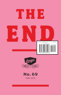
Emigre was a graphic design magazine published by Emigre Graphics between 1984 and 2005; it was first published in 1984 in Berkeley, California, United States. Art-directed by Rudy VanderLans using fonts designed by his wife, Zuzana Licko, Emigre was one of the first publications to use Macintosh computers and had a large influence on graphic designers exploring the new technology. Its variety of layouts, use of guest designers, and opinionated articles also had an effect on the profession of graphic design in general.

Peter Andrew Saville is an English art director and graphic designer. He came to prominence for the many record sleeves he designed for Factory Records, which he co-founded in 1978 alongside Tony Wilson and Alan Erasmus.

Psychedelic art is art, graphics or visual displays related to or inspired by psychedelic experiences and hallucinations known to follow the ingestion of psychedelic drugs such as LSD and psilocybin. The word "psychedelic" means "mind manifesting". By that definition, all artistic efforts to depict the inner world of the psyche may be considered "psychedelic". In common parlance "psychedelic art" refers above all to the art movement of the late 1960s counterculture, featuring highly distorted or surreal visuals, bright colors and full spectrums and animation to evoke, convey, or enhance psychedelic experiences. Psychedelic visual arts were a counterpart to psychedelic rock music. Concert posters, album covers, liquid light shows, liquid light art, murals, comic books, underground newspapers and more reflected not only the kaleidoscopically swirling colour patterns of LSD hallucinations, but also revolutionary political, social and spiritual sentiments inspired by insights derived from these psychedelic states of consciousness.
Vaughan Oliver was a British graphic designer based in Epsom, Surrey. Oliver was best known for his work with graphic design studios 23 Envelope and v23. Both studios maintained a close relationship with record label 4AD between 1982 and 1998 and gave distinct visual identities for the 4AD releases by many bands, including Mojave 3, Lush, Cocteau Twins, The Breeders, This Mortal Coil, Pale Saints, Pixies, and Throwing Muses. Oliver also designed record sleeves for such artists as David Sylvian, The Golden Palominos, and Bush.
Hapshash and the Coloured Coat was an influential British graphic design and avant-garde musical partnership in the late 1960s, consisting of Michael English and Nigel Waymouth. It produced popular psychedelic posters, and two albums of underground music.

The International Typographic Style, also known as the Swiss Style, is a graphic design style that emerged in Russia, the Netherlands, and Germany in the 1920s and was further developed by designers in Switzerland during the 1950s. The International Typographic Style has had profound influence on graphic design as a part of the modernist movement, impacting many design-related fields including architecture and art. It emphasizes cleanness, readability, and objectivity. Hallmarks of the style are asymmetric layouts, use of a grid, sans-serif typefaces like Akzidenz Grotesk, and flush left, ragged right text. The style is also associated with a preference for photography in place of illustrations or drawings. Many of the early International Typographic Style works featured typography as a primary design element in addition to its use in text, and it is for this that the style is named. The influences of this graphic movement can still be seen in design strategy and theory to this day.

Emil Ruder (1914–1970) was a Swiss typographer and graphic designer, who with Armin Hofmann joined the faculty of the Schule für Gestaltung Basel.
Grapus was a collective of graphic artists, working together between 1970 and 1991, which sought to combine excellence of design with a social conscience.

Eye magazine, the international review of graphic design, is a quarterly print magazine on graphic design and visual culture.
Rick Poynor is a British writer on design, graphic design, typography, and visual culture.
Hoofdletters, Tweeling- en Meerlingdrukwas a Dutch book published in 1958. In the book, author Dr. George van den Bergh made several propositions for a more economical arrangement of type in books. The book was featured in Herbert Spencer's Typographica in and Eye magazine. In Rick Poynor's Typographica he translates the Dutch title as "Capitals, twin- and multi-print."
23 Envelope was the name given to the graphic design partnership of graphic designer Vaughan Oliver and photographer/filmmaker Nigel Grierson from 1980–1988. During this time, they created a distinct visual identity for the British independent music label 4AD through their record sleeve designs for bands such as Cocteau Twins, Dead Can Dance, and This Mortal Coil.
Jeffery Keedy, born 1957, is an American graphic designer, type designer, writer and educator. He is notable as an essayist and contributor to books and periodicals on graphic design. He is also notable for the design of Keedy Sans, a typeface acquired in the permanent collection of the Museum of Modern Art in 2011.
Malcolm Leslie Garrett is a British graphic designer, and Creative Director of Images&Co, a communications design consultancy based in London, UK. He is Ambassador for Manchester School of Art and co-founder of the annual Design Manchester festival, now in its eighth year.
Richard Hollis is a British graphic designer. He has taught at various art schools, written books, and worked as a printer, as a magazine editor and as a print-production manager.
Ken Garland is a British graphic designer, photographer, writer and educator. He has made a significant contribution to the development of graphic design since the mid-twentieth century and formed the prolific design studio Ken Garland & Associates in 1962 in Camden, London, where he continues to live and work.
Robin Kinross is an author and publisher on the topic of visual communication and typography. His most significant work is Modern Typography. He is a proprietor of Hyphen Press, which published books on design and typography from 1980 to 2017.

Walter Herdeg was a Swiss graphic designer, noted for his travel posters and work with Graphis Magazine, who was awarded an AIGA medal in 1986.
Hugo Puttaert is a graphic designer, organizer, teacher and editor based in the greater Brussels area, Belgium.
References
- Rick Poynor (2003-02-10). "The 'Ernst Bettler' problem". Eye .
- Michael Bierut (2008-01-08). "Will the Real Ernst Bettler Please Stand Up?". Design Observer . Archived from the original on 2013-01-21.