
In typography and lettering, a sans-serif, sans serif, gothic, or simply sans letterform is one that does not have extending features called "serifs" at the end of strokes. Sans-serif typefaces tend to have less stroke width variation than serif typefaces. They are often used to convey simplicity and modernity or minimalism. For the purposes of type classification, sans-serif designs are usually divided into these major groups: § Grotesque, § Neo-grotesque, § Geometric, § Humanist, and § Other or mixed.

St Giles-without-Cripplegate is an Anglican church in the City of London, located on Fore Street within the modern Barbican complex. When built it stood without the city wall, near the Cripplegate. The church is dedicated to St Giles, patron saint of handicapped and infirm people of many different kinds. It is one of the few medieval churches left in the City of London, having survived the Great Fire of 1666.

A type foundry is a company that designs or distributes typefaces. Before digital typography, type foundries manufactured and sold metal and wood typefaces for hand typesetting, and matrices for line-casting machines like the Linotype and Monotype, for letterpress printers. Today's digital type foundries accumulate and distribute typefaces created by type designers, who may either be freelancers operating their own independent foundry, or employed by a foundry. Type foundries may also provide custom type design services.

In typography, a slab serif typeface is a type of serif typeface characterized by thick, block-like serifs. Serif terminals may be either blunt and angular (Rockwell), or rounded (Courier). Slab serifs were introduced in the early nineteenth century.

Sir Charles Reed FSA was a British politician who served as Member of Parliament for Hackney and for St Ives, Chairman of the London School Board, Director and Trustee of the original Abney Park Cemetery Joint Stock Company, Chairman of the Bunhill Fields Preservation Committee, associate of George Peabody, lay Congregationalist, and owner of a successful commercial type-founding business in London. He was elected a Fellow of the Society of Antiquaries, and was knighted by the Queen at Windsor Castle in 1874. As a pastime he collected autographed letters and keys.

Clarendon is the name of a slab serif typeface that was released in 1845 by Thorowgood and Co. of London, a letter foundry often known as the Fann Street Foundry. The original Clarendon design is credited to Robert Besley, a partner in the foundry, and was originally engraved by punchcutter Benjamin Fox, who may also have contributed to its design. Many copies, adaptations and revivals have been released, becoming almost an entire genre of type design.

DIN 1451 is a sans-serif typeface that is widely used for traffic, administrative and technical applications.

Talbot Baines Reed was an English writer of boys' fiction who established a genre of school stories that endured into the mid-20th century. Among his best-known work is The Fifth Form at St. Dominic's. He was a regular and prolific contributor to The Boy's Own Paper (B.O.P.), in which most of his fiction first appeared. Through his family's business, Reed became a prominent typefounder, and wrote a standard work on the subject: History of the Old English Letter Foundries.
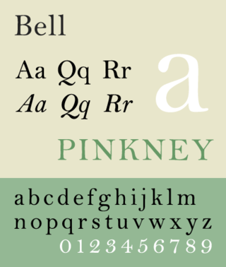
Bell is the name given to a serif typeface designed and cut in 1788 by the punchcutter Richard Austin for the British Letter Foundry, operated by publisher John Bell, and revived several times since.

Stephenson Blake is an engineering company based in Sheffield, England. The company was active from the early 19th century as a type founder, remaining until the 1990s as the last active type foundry in Britain, since when it has diversified into specialist engineering.
Max Miedinger was a Swiss typeface designer, best known for creating the Neue Haas Grotesk typeface in 1957, renamed Helvetica in 1960. Marketed as a symbol of cutting-edge Swiss technology, Helvetica achieved immediate global success.
Robert Besley (1794–1876) was an English typographer, creator of the Clarendon typeface in 1845, and the Lord Mayor of London in 1869.
Edmund Fry (1754–1835) was an English type-founder.

Vincent Figgins was a British typefounder based in London, who cast and sold metal type for printing. After an apprenticeship with typefounder Joseph Jackson, he established his own type foundry in 1792. His company was extremely successful and, with its range of modern serif faces and display typefaces, had a strong influence on the styles of British printing in the nineteenth century. A successor company continued to make type until the 1970s.

Chiswell Street is in the London Borough of Islington. It includes several buildings listed by Historic England.

The Fann Street Foundry was a type foundry located on Fann Street, City of London.
Robert Thorne was a British type founder and typographer. An apprentice to Thomas Cottrell, who had been an employee of William Caslon, Thorne later acquired Cottrell's type foundry. He was successful in business and left a fortune of £25,000 on his death in 1820. Thorne is buried at Holloway Road Cemetery, where his tomb is extant.

A reverse-contrast or reverse-stress letterform is a design in which the stress is reversed from the norm: a typeface or custom lettering where the horizontal lines are the thickest. This is the reverse of the vertical lines being the same width or thicker than horizontals, which is normal in Latin-alphabet writing and especially printing. The result is a dramatic effect, in which the letters seem to have been printed the wrong way round. The style invented in the early nineteenth century as attention-grabbing novelty display designs. Modern font designer Peter Biľak, who has created a design in the genre, has described them as "a dirty trick to create freakish letterforms that stood out."
Anthony John Camp is a British genealogist and former director of the Society of Genealogists.

In typography, a fat face letterform is a serif typeface or piece of lettering in the Didone or modern style with an extremely bold design. Fat face typefaces appeared in London around 1805–1810 and became widely popular; John Lewis describes the fat face as "the first real display typeface."

