"Colormap" redirects here. For indexed palettes, see Indexed color.
Heat map generated from DNA microarray data reflecting gene expression values in several conditions (Eisen et al.)Shaded matrix display from Toussaint Loua (1873)A heat map showing the RF coverage of a drone detection system
A heat map (or heatmap) is a 2-dimensional data visualization technique that represents the magnitude of individual values within a dataset as a color. The variation in color may be by hue or intensity.
In some applications such as crime analytics or website click-tracking, color is used to represent the density of data points rather than a value associated with each point.
"Heat map" is a relatively new term, but the practice of shading matrices has existed for over a century.[1]
History
Heat maps originated in 2D displays of the values in a data matrix. Larger values were represented by small dark gray or black squares (pixels) and smaller values by lighter squares. The earliest known example dates to 1873, when Toussaint Loua used a hand-drawn and colored shaded matrix to visualize social statistics across the districts of Paris.[1] The idea of reordering rows and columns to reveal structure in a data matrix, known as seriation, was introduced by Flinders Petrie in 1899. In 1950, Louis Guttman developed the Scalogram, a method for ordering binary matrices to expose a one-dimensional scale structure. In 1957, Peter Sneath displayed the results of a cluster analysis by permuting the rows and the columns of a matrix to place similar values near each other according to the clustering. This idea was implemented by Robert Ling in 1973 with a computer program called SHADE. Ling used overstruck printer characters to represent different shades of gray, one character-width per pixel.[1]Leland Wilkinson developed the first computer program in 1994 (SYSTAT) to produce cluster heat maps with high-resolution color graphics. The Eisen et al. display shown in the figure is a replication of the earlier SYSTAT design.[1]
Software designer Cormac Kinney trademarked the term 'heat map' in 1991 to describe computer software used to display real-time financial market information.[2] In 1998 the trademark was acquired by SS&C Technologies, Inc., but the company did not extend the license, so it was annulled in 2006.[3]
Spatial Heat Map Example: Displays atmospheric carbon across a world image with red being the highest and blue being the lowest concentration of CO2 (5 April 2019).
Types
There are two primary categories of heat maps: spatial and grid. Additionally, there are over ten various types of heat maps.
A spatial heat map displays the magnitude of a spatial phenomena as color, usually cast over a map. In the image labeled "Spatial Heat Map Example," temperature is displayed by color range across a map of the world. Color ranges from blue (cold) to red (hot).
A grid heat map displays magnitude as color in a two-dimensional matrix, with each dimension representing a category of trait and the color representing the magnitude of some measurement on the combined traits from each of the two categories. For example, one dimension might represent year, and the other dimension might represent month, and the value measured might be temperature. This heat map would show how temperature changed over the years in each month. Grid heat maps are further categorized into two different types of matrices: clustered, and correlogram.[citation needed]
Clustered heat map: The example of the monthly temperature by year is a clustered heat map.
Correlogram: A correlogram is a clustered heat map that has the same trait for each axis in order to display how the traits in the set of traits interact with each other. The correlogram is a triangle instead of a square because the combination of A-B is the same as the combination of B-A and so does not need to be expressed twice.
In a grid heat map, colors are presented in a grid of a fixed size, with every cell in the grid also being an equal size and shape. The goal is to detect clustering, or suggest the presence of clusters.
A spatial heat map is often used on maps or satellite imagery (see GIS), where there is no concept of cells, and instead the colors vary continuously.
Type
Description
Applications
Basic Matrix Heat Map
Displays values in a 2D grid with color encoding. Simple structure without clustering or hierarchy.
Encodes more than one variable using color, size, shape, or annotation in each cell.
AI interpretability, genomics, data dashboards
Correlogram
A symmetric matrix showing pairwise correlations, often with color intensity and signs.
Economics, psychology, education research
Uses
Heat maps have a wide range of possibilities amongst applications due to their ability to simplify data and make for visually appealing to read data analysis. Many applications using different types of heat maps are listed below.
Warming stripes graphics are one-dimensional heat maps that show global warming's yearly progress—in this example, since 1850. To represent cooler and warmer temperatures, the design's originator, climatologist Ed Hawkins, chose the 8 most saturated blues and reds of the ColorBrewer 9-class single hue palette.
Business Analysis: Heat maps are used in business analytics to give a visual representation about a company's current functioning, performance, and the need for improvements. Heat maps are a way to analyze a company's existing data and update it to reflect growth and other specific efforts. Heat maps visually appeal to team members and clients of the business or company.
Websites: There are many different ways heat maps are used within websites to determine a visiting users actions. Typically, there are multiple heat maps used together to determine insight to a website on what are the best and worst performing elements on the page. Some specific heat maps used for website analysis are listed below.
Mouse Tracking: Mouse tracking heat maps or hover maps, are used to visualize where the user of the site hovers their cursor.
Eye tracking: Eye tracking heat maps measure the eye position of the website's users and gathers measurements such as eye fixation volume, eye fixation duration, and areas of interest.
Click Tracking: Click tracking heat maps or touch maps, are similar to mouse tracking heat maps, but instead of hover actions, these types of heat maps help visualize the users click actions. Click tracking heat maps not only allow for visual cues on clickable components on a webpage, such as buttons or dropdown menus, but these heat maps also allow for tracking on non-clickable objects anywhere on the page.
AI-Generation Attention: AI-generated attention heat maps help visualize where the visiting user's attention will go on a certain section of a webpage. These types of heat maps are implemented using a created software algorithm to determine and predict the attention actions of the user.
Scroll Tracking: Scroll tracking heat maps are used to represent the scrolling behavior of the website's users. This helps produce visual cues to what section on the website the user spends the most time at.[4]
Data Analysis Heat Map Example: Displays the normalized linkage disequilibrium of Genomic Windows within the Hist1 region of a mouse (Mus musculus).Data Analysis Heat Map Example: Subgraph of one of five hub nodes with a large degree of centrality in a genomic region in mice (Mus musculus) called the Hist1 region, where each cell in the graph represents one edge in the genomic network.
Exploratory Data Analysis: Working with small and large data sets, data scientists and data analysts look at and determine essential relationships and characteristics amongst different points in a data set as well as features of those data points. Data scientists and analysts work with a team of others in different professions. The use of heat maps make for a visually easy way to summarize findings and main components. There are other ways to represent data, however heat maps can visualize these data points and their relationships in a high dimensional space without becoming too compact and visually unappealing. Heat maps in data analysis, allow for specific variables of rows and/or columns on the axes and even on the diagonal.
Biology: In the biological field, heat maps are used to visually represent large and small sets of data. The focus is towards patterns and similarities in DNA, RNA, gene expression, etc. Working with these sets of data, data scientists in bioinformatics, focus on different concepts, some of which being community detection, association and correlation, and the concept of centrality, where heat maps are a compelling way to visually summarize results and to share amongst other professions not in the field of biology or bioinformatics. The two heat maps to the right, labeled "Data Analysis Heat Map Example," show different ways in which one may present genomic data over a specific region (Hist1 region) to someone outside the field of biology so they have a better understanding of the general concept a biologist or data scientist are trying to present.[5]
Financial Analysis: The values of different product and assets fluctuate both rapidly and/or gradually over time. The need to log changes to the daily markets is imperative. It allows for the ability to draw predictions from patterns while being able to revisit past numerical data. Heat maps are able to remove the tedious process and enable the user to visualize data points and compare amongst the different performers.[6]
Geographical Visualization: Heat maps are used to visualize and display a geographic distribution of data. Heat maps represent different densities of data points on a geographical map to help users see the intensities of certain phenomena and to show items of most or least importance. Heat maps used in geographical visualization are sometimes confused with choropleth maps, but the difference comes with how certain data is presented which differentiate the two.[7]
Sports: Heat maps can be used in many sports and can influence manager's and/or coaches decisions based on high and low densities of data displayed. Users can identify patterns within the game, the strategies of opponents and one's own team, make more informed decisions benefitting the player, team, and business, and can enhance performance in different areas by identifying enhancement is needed. Heat maps also visualize comparisons and relationships amongst different teams in the same sport or between different sports all together.[6]
Cybersecurity: In intrusion detection systems and log analysis, heat maps are used to highlight unusual access patterns, port scanning attempts, and malicious IP clustering. They help SOC (Security Operations Center) analysts quickly spot anomalies in large datasets.[8]
Urban Planning: Heat maps are used in urban planning to visualize traffic congestion, pedestrian flow, and environmental conditions for data-driven infrastructure development (Batty et al., 2012). Environmental heat maps track air quality and urban heat islands, guiding green space planning (EEA, 2021). Noise pollution heat maps aid zoning and mitigation near residential areas (EEA, 2020). Commercial planners use foot traffic heat maps to optimize retail layouts (SmartSantander, 2014). Integrated in smart city systems, these maps enhance livability, sustainability, and safety (Batty et al., 2012).[9][10][11][12]
Color schemes
Many different color schemes can be used to illustrate the heat map, with perceptual advantages and disadvantages for each. Choosing a good color scheme is integral to accurately and effectively displaying data, whereas a poor color scheme can lead viewers to inaccurate conclusions or exclude those with color deficiencies from proper analysis of said data.[13]
Combination of surface plot and heat map, where the surface height represents the amplitude of the function, and the color represents the phase angle.
Rainbow color maps, while a common choice, suffer from both accessibility and data continuity concerns.[14] Rainbow maps pose a challenge for users with color vision deficiencies, particularly in those with issues distinguishing red and green – a condition affecting a significant portion of the population.[14] In addition to accessibility issues, rainbow heat map colors are not perceptually uniform; equal increments in data values do not correspond to equal changes in color.[15] The lack of uniformity can create misleading visual effects, like an artificial boundary or gradient.[15] These effects can compromise the accuracy of effectiveness of the visualization. This example of the amplitude with the colors showcasing the phase angle can be hard to interpret with the entire rainbow of colors. In this case, the rainbow color scheme may cloud interpretation for those with color vision deficiencies or create confusion by some of the hard color boundaries across the diagram.[15] To address these challenges, perceptually uniform color sets have been created to accommodate visual impairments and maintain consistent color differences proportional to differences in data.[16]
Rainbow vs Viridis scheme heat maps
Perceptually uniform color schemes are carefully designed to maintain consistent perceptual differences and offer a better viewing experience for viewers with color vision deficiencies. When implementing these color schemes into a heat map, designers must consider the data context and intended emphasis. These schemes follow three main patterns: sequential gradients (varying intensity of a single hue), diverging palettes (two contrasting hues with a neutral midpoint), and qualitative sets for categorical data.[17] Scientific visualization has produced several perceptually uniform color sets (like Viridis, Magma, and Cividis) that address both uniformity and accessibility concerns.[18]
Virdis scheme heatmap to illustrate the use of perceptually uniform color sets
Device limitations can also significantly affect heat map visualization effectiveness. When displayed on low-resolution screens, highly detailed color gradients may appear pixelated or banded, reducing the quality of the visualization; this is known as color quantization, which can obscure or wrongly emphasize pieces of data. To mitigate these effects, designers should consider all devices that will display their heat map, and their color limitations. Comprehensive testing and using a scheme with few colors is the safest bet when creating a heat map that will be viewed across multiple device types.
grey-scale heat map generated using python package seaborn
Grey-scale compatibility is essential for heat map accessibility, especially when considering print media, black and white only displays, or monochromatic vision. When converting to grey-scale, many color schemes will lose their distinctive data mappings, allowing for different values to appear identical in luminescence. Grey-scale friendly color schemes are designed to incorporate contrast between data points even when color is removed, such as the "virdis" family.[18]
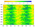
A heat map showing the average temperature in the Southern Rockies from 1950 to 2020 using the "Blues" color palette from the Color Brewer library
Software implementations
Several heat map software implementations are freely available:
This heat map was created using seaborn. It shows the normalized linkage of Genomic Windows within the Hist1 region on a mouse.
R, a free software environment for statistical computing and graphics, contains several functions to trace heat maps,[19][20]
Gnuplot, a universal and free command-line plotting program, can trace 2D and 3D heat maps.[21]
Dave Green's 'cubehelix' colour scheme provides resources for a colour scheme that prints as a monotonically increasing greyscale on black and white postscript devices.[23]
Openlayers3 can render a heat map layer of a selected property of all geographic features in a vector layer.[24]
Python, a widely used language for data analysis and visualization, supports several libraries for creating heat maps:
Matplotlib'simshow() function visualizes 2D numerical arrays as color-coded images, with control over color mapping and axes.[31]
Seaborn'sheatmap() function provides an aesthetically refined heat map with minimal code, often used with Pandas DataFrames.[32]
Plotly'sgo.Heatmap() function creates interactive HTML-based heat maps. It allows for x- and y-axis labels, 2D matrices, custom color scales, and detailed hover information.[33]
Java, heat maps can be created using graphics libraries such as JavaFX, Swing, or third-party charting libraries.
This heatmap visualizes normalized linkage disequilibrium (D′) between genomic windows, showing how often alleles are inherited together. Using JavaFX Canvas APIJavaFX Canvas API allows drawing grid-based heat maps by manually coloring rectangular cells based on data values. The GraphicsContext.fillRect() and Color classes enable full control over rendering.[34]
JFreeChart supports heat map-style visualizations using XYBlockRenderer with customizable color scales and axis labeling, suitable for plotting matrix-style data.[35]
HeatChart (a lightweight Java library) generates basic heat maps with minimal configuration, using a 2D array and producing a BufferedImage that can be embedded in Swing GUIs.[36]
XChart provides support for creating charts in Java, including color-mapped scatter plots that resemble heat maps; useful for lightweight applications without JavaFX.[37]
Processing (Java-based) is used in interactive data visualizations, including real-time heat maps for sensor data and simulations, with easy color interpolation methods.[38]
heatmap of genomic data comparing 27 NPs (nuclear profiles) across 81 genomic windows Optimal clusters within the Hist1 region were identified and refined using k-means clustering, visualized through Seaborn in PythonC, heat maps can be created using low-level image manipulation, graphics libraries, or bindings to rendering engines for data visualization.
PPM (Portable Pixmap Format) allows for the simplest form of heat map generation in C by writing color-coded pixel values directly to a file. It is a plain-text or binary format that can be manually implemented without external libraries.[39]
libpng enables the creation of compressed, high-quality PNG heat maps by mapping data values to RGB and writing image buffers. It supports alpha transparency and is suitable for scientific visualization.[40]
SDL2 (Simple DirectMedia Layer) allows for real-time heat map rendering in a window. It supports pixel-level manipulation, making it ideal for interactive visualizations or sensor data maps.[41]
OpenGL, via C bindings (e.g., GLUT or GLFW), provides GPU-accelerated heat map rendering with texture mapping and shaders. This is used in high-performance or simulation-based applications.[42]
Choropleth maps versus heat maps
A choropleth map visualizing United States population density by state.
Choropleth maps and heat maps are often used in place of one another incorrectly when referring to data visualized geographically.[43] Both techniques show the proportion of a variable of interest, but the two differ in how the boundaries for the variable's data aggregations are constructed. If the data were collected and aggregated using irregular boundaries, such as administrative units, then a heat map displaying that data will be the same as a choropleth map, encouraging confusion about how the two differ.
Choropleth maps show data grouped by geographic boundaries like countries, states, provinces or even floodplains. Each region has a singular value, visualized by color intensity, shading or pattern. The figure on the right displaying a choropleth map showing the United States' population density by state may be used as an example. The figure illustrates a singular value (population) denoted by blue color intensity proportionate to the state's value relative to all other states' values, bounded by each state's border.
A heat map visualizing population density per square kilometer around the world in 1994.
Similarly, heat maps may also visualize data over a geographic region. However, unlike choropleth maps, heat maps show the proportion of a variable over an arbitrary, but usually small grid size, independent of geographic boundaries.[44][45] The figure on the right displaying a heat map of world population is an example. The figure illustrates a single value (population) bounded in an arbitrary grid (square kilometers) with each cell in the grid represented by a color intensity proportionate to the value of the cell relative to all other cells. Some heat maps that are created using approximated regional data may show familiar geographic borders in the visualization where none really exist. The illusion of geographic borders is due to the existence of patterns within the dataset rather than the visualization technique. The figure on the right displaying a heat map of world population also contains this occurrence. Areas in rural parts of the United States and South America may closely resemble familiar geographic borders in those regions.
Lake effect snow – weather radar information is usually shown using a heat map.
Another example of a heatmap over a geographic area is a visualization of lake effect snow around Buffalo, New York, in mid-October 2006. This figure shows another usage of heat maps with geographic areas, and how useful they can be in showcasing the effects of weather on specific areas as opposed to countries or states.
Bertin J (1967). Sémiologie Graphique. Les diagrammes, les réseaux, les cartes[Graphic semiotics. Diagrams, networks, maps] (in French). Gauthier-Villars. OCLC2656278.
Friendly M (March 1994). "Mosaic Displays for Multi-Way Contingency Tables". Journal of the American Statistical Association. 89 (425): 190–200. doi:10.1080/01621459.1994.10476460. JSTOR2291215.
This page is based on this Wikipedia article Text is available under the CC BY-SA 4.0 license; additional terms may apply. Images, videos and audio are available under their respective licenses.