Typography is the art and technique of arranging type to make written language legible, readable and appealing when displayed. The arrangement of type involves selecting typefaces, point sizes, line lengths, line spacing, letter spacing, and spaces between pairs of letters. The term typography is also applied to the style, arrangement, and appearance of the letters, numbers, and symbols created by the process. Type design is a closely related craft, sometimes considered part of typography; most typographers do not design typefaces, and some type designers do not consider themselves typographers. Typography also may be used as an ornamental and decorative device, unrelated to the communication of information.

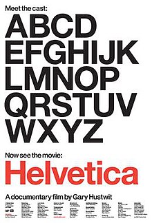
Helvetica, also known by its original name Neue Haas Grotesk, is a widely used sans-serif typeface developed in 1957 by Swiss typeface designer Max Miedinger and Eduard Hoffmann.

Urbanized is a documentary film directed by Gary Hustwit and released on 26 October 2011. It is considered the third of a three-part series on design known as the Design Trilogy; the first being Helvetica, about the typeface, and the second being Objectified, about industrial design. The documentary discusses how cities are designed, and it features interviews with urban planners and architects, such as Oscar Niemeyer and Jan Gehl.

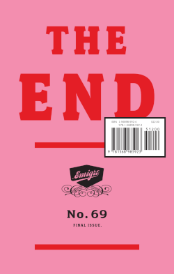
Emigre, Inc., doing business as Emigre Fonts, is a digital type foundry based in Berkeley, California, that was founded in 1985 by husband-and-wife team Rudy VanderLans and Zuzana Licko. The type foundry grew out of Emigre magazine, a publication founded by VanderLans and two Dutch friends who met in San Francisco, CA in 1984. Note that unlike the word émigré, Emigre is officially spelled without accents.

Emigre was a (mostly) quarterly magazine published from 1984 until 2005 in Berkeley, California, dedicated to visual communication, graphic design, typography, and design criticism. Produced by Rudy VanderLans and Zuzana Licko, Emigre was known for creating some of the very first digital layouts and typeface designs. Exposure to Licko's typefaces through the magazine lead to the creation of Emigre Fonts in 1985.

Apple Inc. uses a large variety of typefaces in its marketing, operating systems, and industrial design with each product cycle. These change throughout the years with Apple's change of style in their products. This is evident in the design and marketing of the company. The current logo is a white apple with a bite out of it, which was first utilized in 2013.

In typography, a counter is the area of a letter that is entirely or partially enclosed by a letter form or a symbol. The stroke that creates such a space is known as a "bowl". Latin letters containing closed counters include A, B, D, O, P, Q, R, a, b, d, e, g, o, p, and q. Latin letters containing open counters include c, f, h, s etc. The digits 0, 4, 6, 8, and 9 also have counters. An aperture is the opening between an open counter and the outside of the letter.

ITC Zapf Dingbats is one of the more common dingbat typefaces. It was designed by the typographer Hermann Zapf in 1978 and licensed by International Typeface Corporation.

Massimo Vignelli was an Italian designer who worked in a number of areas including packaging, houseware, furniture, public signage, and showroom design. He was the co-founder of Vignelli Associates, with his wife, Lella. His motto was, "If you can design one thing, you can design everything," which the broad range of his work reflects.
Plexifilm was an independent DVD label and film production company co-founded by Gary Hustwit and Sean Anderson in 2001. Plexifilm produced original films, released films theatrically, and produced, distributed and marketed DVDs.

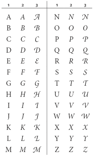
A swash is a typographical flourish, such as an exaggerated serif, terminal, tail, entry stroke, etc., on a glyph. The use of swash characters dates back to at least the 16th century, as they can be seen in Ludovico Vicentino degli Arrighi's La Operina, which is dated 1522. As with italic type in general, they were inspired by the conventions of period handwriting. Arrighi's designs influenced designers in Italy and particularly in France.
Max Miedinger was a Swiss typeface designer, best known for creating the Neue Haas Grotesk typeface in 1957, renamed Helvetica in 1960. Marketed as a symbol of cutting-edge Swiss technology, Helvetica achieved immediate global success.
Stephen Banham is an Australian typographer, type designer, writer, lecturer and founder of Letterbox, a typographic studio.
Unimark International was an international design firm headquartered in Chicago, Illinois. It was founded in 1965 by seven partners: Ralph Eckerstrom, Lella and Massimo Vignelli, Bob Noorda, James Fogelman, Wally Gutches, and Larry Klein. Although they were not listed as founding partners, Jay Doblin and Robert Moldafsky joined the new firm almost immediately. Initially, Unimark had three offices: Chicago, Milan and New York. The American branches were founded by Vignelli and his wife Lella, who subsequently founded Vignelli Associates. Additional offices opened around the world, but these were often short-lived as the client base and funding varied, and as American and global economic issues influenced the viability of each office.
Norm, is an experimental graphic design team best known for their typography. Their most influential project is typography for Cologne Airport. It is co-founded by two Swiss designers Dimitri Bruni and Manuel Krebs and later joined by Ludovic Varone. Their approach to typography is known to be very strict and rigorous with strong modernist features but with slight references to postmodernism.
Mike Russell Parker was a British-born American typographer and type designer.

Gary Hustwit is an American independent filmmaker and photographer. He is best known for his design documentaries, which examine the impact of trends in graphic design, typography, industrial design, architecture, and urban planning. He told Dwell magazine, "I like the idea of taking a closer look at the things we take for granted and changing the way people think about them." In addition to filmmaking, he has been active in the independent music and book publishing industries.
The Design Trilogy is the collective name of a series of three documentary films about design directed by film director Gary Hustwit.

Lella Vignelli was an Italian architect, designer, and businesswomen. She collaborated closely throughout much of her life with her husband Massimo Vignelli, with whom she founded Vignelli Associates in 1971.

Filosofia is a serif typeface designed by Zuzana Licko and released by Emigre Fonts in 1996. It is a revival of Italian type designer Giambattista Bodoni's late eighteenth century typeface, Bodoni.
