Related Research Articles

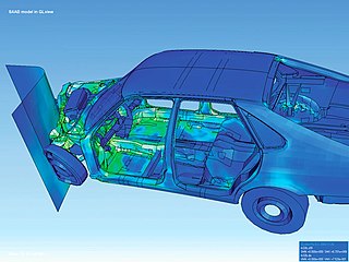
Scientific visualization is an interdisciplinary branch of science concerned with the visualization of scientific phenomena. It is also considered a subset of computer graphics, a branch of computer science. The purpose of scientific visualization is to graphically illustrate scientific data to enable scientists to understand, illustrate, and glean insight from their data. Research into how people read and misread various types of visualizations is helping to determine what types and features of visualizations are most understandable and effective in conveying information.
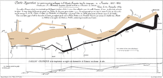
Visualization or visualisation is any technique for creating images, diagrams, or animations to communicate a message. Visualization through visual imagery has been an effective way to communicate both abstract and concrete ideas since the dawn of humanity. from history include cave paintings, Egyptian hieroglyphs, Greek geometry, and Leonardo da Vinci's revolutionary methods of technical drawing for engineering and scientific purposes.

In information visualization and computing, treemapping is a method for displaying hierarchical data using nested figures, usually rectangles.

Ben Shneiderman is an American computer scientist, a Distinguished University Professor in the University of Maryland Department of Computer Science, which is part of the University of Maryland College of Computer, Mathematical, and Natural Sciences at the University of Maryland, College Park, and the founding director (1983-2000) of the University of Maryland Human-Computer Interaction Lab. He conducted fundamental research in the field of human–computer interaction, developing new ideas, methods, and tools such as the direct manipulation interface, and his eight rules of design.
Stuart K. Card is an American researcher and retired senior research fellow at Xerox PARC. He is considered to be one of the pioneers of applying human factors in human–computer interaction. With Jock D. Mackinlay, George G. Robertson and others he invented a number of Information Visualization techniques. He holds numerous patents in user interfaces and visual analysis.
Geovisualization or geovisualisation, also known as cartographic visualization, refers to a set of tools and techniques supporting the analysis of geospatial data through the use of interactive visualization.
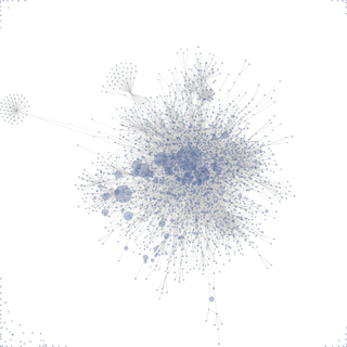
Data and information visualization is the practice of designing and creating easy-to-communicate and easy-to-understand graphic or visual representations of a large amount of complex quantitative and qualitative data and information with the help of static, dynamic or interactive visual items. Typically based on data and information collected from a certain domain of expertise, these visualizations are intended for a broader audience to help them visually explore and discover, quickly understand, interpret and gain important insights into otherwise difficult-to-identify structures, relationships, correlations, local and global patterns, trends, variations, constancy, clusters, outliers and unusual groupings within data. When intended for the general public to convey a concise version of known, specific information in a clear and engaging manner, it is typically called information graphics.
Prefuse is a Java-based toolkit for building interactive information visualization applications. It supports a rich set of features for data modeling, visualization and interaction. It provides optimized data structures for tables, graphs, and trees, a host of layout and visual encoding techniques, and support for animation, dynamic queries, integrated search, and database connectivity.
The Human–Computer Interaction Lab (HCIL) at the University of Maryland, College Park is an academic research center specializing in the field of human-computer interaction (HCI). Founded in 1983 by Ben Shneiderman, it is one of the oldest HCI labs of its kind. The HCIL conducts research on the design, implementation, and evaluation of computer interface technologies. Additional research focuses on the development of user interfaces and design methods. Primary activities of the HCIL include collaborative research, publication and the sponsorship of open houses, workshops and annual symposiums.

Visual analytics is an outgrowth of the fields of information visualization and scientific visualization that focuses on analytical reasoning facilitated by interactive visual interfaces.
George G. Robertson is an American information visualization expert and senior researcher, Visualization and Interaction (VIBE) Research Group, Microsoft Research. With Stuart K. Card, Jock D. Mackinlay and others he invented a number of Information Visualization techniques.
Jock D. Mackinlay is an American information visualization expert and Vice President of Research and Design at Tableau Software. With Stuart Card, George G. Robertson and others he invented a number of information visualization techniques.

The Scientific Computing and Imaging (SCI) Institute is a permanent research institute at the University of Utah that focuses on the development of new scientific computing and visualization techniques, tools, and systems with primary applications to biomedical engineering. The SCI Institute is noted worldwide in the visualization community for contributions by faculty, alumni, and staff. Faculty are associated primarily with the School of Computing, Department of Bioengineering, Department of Mathematics, and Department of Electrical and Computer Engineering, with auxiliary faculty in the Medical School and School of Architecture.
Martin M. Wattenberg is an American scientist and artist known for his work with data visualization. He is currently the Gordon McKay Professor of Computer Science at the Harvard University School of Engineering and Applied Sciences.
John Thomas Stasko III is a Regents Professor in the School of Interactive Computing in the College of Computing at Georgia Tech, where he joined the faculty in 1989. He also is one of the founding members of the Graphics, Visualization, and Usability (GVU) Center there. Stasko is best known for his extensive research in information visualization and visual analytics, including his earlier work in software visualization and algorithm animation.
MeVisLab is a cross-platform application framework for medical image processing and scientific visualization. It includes advanced algorithms for image registration, segmentation, and quantitative morphological and functional image analysis. An IDE for graphical programming and rapid user interface prototyping is available.
Ed Huai-Hsin Chi is a Taiwanese American computer scientist and research scientist at Google, known for his early work in applying the theory of information scent to predict usability of websites.

Jean-Daniel Fekete is a French computer scientist.
Robert (Bob) Spence is a British engineer and professor emeritus and senior research investigator at the Imperial College London, known for his work in the field of information visualization.
The IEEE Visualization Conference (VIS) is an annual conference on scientific visualization, information visualization, and visual analytics administrated by the IEEE Computer Society Technical Committee on Visualization and Graphics. As ranked by Google Scholar's h-index metric in 2016, VIS is the highest rated venue for visualization research and the second-highest rated conference for computer graphics over all. It has an 'A' rating from the Australian Ranking of ICT Conferences, an 'A' rating from the Brazilian ministry of education, and an 'A' rating from the China Computer Federation (CCF). The conference is highly selective with generally < 25% acceptance rates for all papers.
References
- ↑ Ed H. Chi. A Framework for Information Visualization Spreadsheets. Ph.D. Thesis. University of Minnesota, Computer Science Department. March, 1999.
- 1 2 E.H. Chi (2000). "A taxonomy of visualization techniques using the data statereference model". In: Information Visualization, 2000. InfoVis 2000. IEEE Symposium on Volume, Issue, 2000 Page(s):69 - 75.
- ↑ Jock D. Mackinlay (1999). Readings in information visualization: using vision to think. With Stuart K. Card and Ben Shneiderman (eds.), Morgan Kaufmann Publishers Inc, p686.