Related Research Articles

In typography and lettering, a sans-serif, sans serif, gothic, or simply sans letterform is one that does not have extending features called "serifs" at the end of strokes. Sans-serif typefaces tend to have less stroke width variation than serif typefaces. They are often used to convey simplicity and modernity or minimalism. For the purposes of type classification, sans-serif designs are usually divided into these major groups: § Grotesque and § Neo-grotesque, § Geometric, § Humanist and § Other or mixed.

Gill Sans is a humanist sans-serif typeface designed by Eric Gill and released by the British branch of Monotype from 1928 onwards.
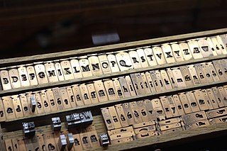
In the manufacture of metal type used in letterpress printing, a matrix is the mould used to cast a letter, known as a sort. Matrices for printing types were made of copper.

Caslon is the name given to serif typefaces designed by William Caslon I (c. 1692–1766) in London, or inspired by his work.

In typography, a slab serif typeface is a type of serif typeface characterized by thick, block-like serifs. Serif terminals may be either blunt and angular (Rockwell), or rounded (Courier). Slab serifs were introduced in the early nineteenth century.

Didone is a genre of serif typeface that emerged in the late 18th century and was the standard style of general-purpose printing during the 19th century. It is characterized by:

Impact is a sans-serif typeface in the industrial or grotesk style designed by Geoffrey Lee in 1965 and released by the Stephenson Blake foundry of Sheffield. It is well known for having been included in the core fonts for the Web package and distributed with Microsoft Windows since Windows 98. In the 2010s, it gained popularity for its use in image macros and other internet memes.

Scotch Roman is a class of typefaces popular in the early nineteenth century, particularly in the United States and to a lesser extent the United Kingdom. These typefaces were modeled on a design known as Pica No. 2 from the Edinburgh foundry of William Miller. Some accounts suggest that Miller's type, the oldest surviving specimen of which dates to 1813, was cut by Richard Austin, who had previously produced the Bell types for the British Letter Foundry.

Vincent Figgins was a British typefounder based in London, who cast and sold metal type for printing. After an apprenticeship with typefounder Joseph Jackson, he established his own type foundry in 1792. His company was extremely successful and, with its range of modern serif faces and display typefaces, had a strong influence on the styles of British printing in the nineteenth century. A successor company continued to make type until the 1970s.
Memphis is a slab-serif typeface designed by Dr. Rudolf Wolf and released in 1929 by the Stempel Type Foundry.
Stevens, Shanks & Sons Ltd. was an English type foundry formed in 1933 by the merger of the Figgins Foundry with P. M. Shanks to form Stevens, Shanks. Sometime after 1971 the foundry ceased operations and all materials went to St. Bride's Printing Library.

A reverse-contrast or reverse-stress letterform is a design in which the stress is reversed from the norm: a typeface or custom lettering where the horizontal lines are the thickest. This is the reverse of the vertical lines being the same width or thicker than horizontals, which is normal in Latin-alphabet writing and especially printing. The result is a dramatic effect, in which the letters seem to have been printed the wrong way round. The style invented in the early nineteenth century as attention-grabbing novelty display designs. Modern font designer Peter Biľak, who has created a design in the genre, has described them as "a dirty trick to create freakish letterforms that stood out."

A display typeface is a typeface that is intended for use in display type at large sizes for titles, headings, pull quotes, and other eye-catching elements, rather than for extended passages of body text.
Justin Howes (1963–2005) was a British historian of printing and lettering.
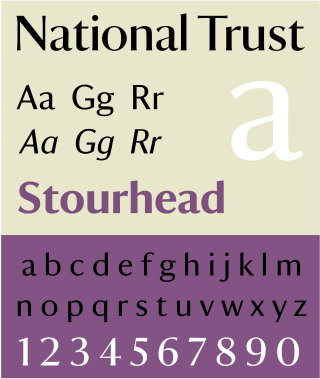
National Trust is a humanist sans-serif typeface designed by Paul Barnes for the National Trust of England, Wales and Northern Ireland. It is a corporate font family and not available for licensing.
Egyptian is a typeface created by the Caslon foundry of Salisbury Square, London around or probably slightly before 1816, that is the first general-purpose sans-serif typeface in the Latin alphabet known to have been created.

In typography, a fat face letterform is a serif typeface or piece of lettering in the Didone or modern style with an extremely bold design. Fat face typefaces appeared in London around 1805–1810 and became widely popular; John Lewis describes the fat face as "the first real display typeface."

The Caslon type foundry was a type foundry in London which cast and sold metal type. It was founded by the punchcutter and typefounder William Caslon I, probably in 1720. For most of its history it was based at Chiswell Street, Islington, was the oldest type foundry in London, and the most prestigious.

In letterpress printing, wood type is movable type made out of wood. First used in China for printing body text, wood type became popular during the nineteenth century for making large display typefaces for printing posters, because it was lighter and cheaper than large sizes of metal type.

Roman lettering or Trajan lettering refers to the use by artists and signwriters of Roman capitals in modern lettering, particularly in Britain.
References
- 1 2 3 4 Barnes, Paul. "James Mosley: a life in objects". Eye magazine. Retrieved 11 December 2015.
- 1 2 3 4 Mosley, James. "2003 Individual Award: acceptance speech". APHA. Retrieved 12 December 2015.
- ↑ Howes, Justin (2004). James Mosley. Mark Batty. ISBN 0972424059.
- ↑ Mosley, compiled by Steven Tuohy; with two essays by James (1995). James Mosley: librarian, St Bride Printing Library, London : a checklist of the published writings 1958-95. Cambridge: Rampart Lions Press. ISBN 9780902591608.
{{cite book}}: CS1 maint: multiple names: authors list (link) - ↑ Mosley, James. "Working Letters – an affectionate view of the vernacular". Letter Exchange . Retrieved 11 May 2023.
- ↑ Kinross, Robin. "Temple of Type". Eye. Retrieved 12 December 2015.
- ↑ "Ornamented types: a prospectus" (PDF). imimprimit. Archived from the original (PDF) on 22 December 2015. Retrieved 12 December 2015.
- ↑ Young, Timothy. "London Dispatch: The St. Bride Foundation". Design Observer. Retrieved 12 December 2015.
- ↑ "Professor James Mosley". University of Reading. Retrieved 11 December 2015.
- ↑ "James Mosley: Hyphen Press". Hyphen Press. Retrieved 11 December 2015.
- ↑ Mosley, James (2006). "Garamond, Griffo and Others: The Price of Celebrity". Bibiologia. Retrieved 3 December 2015.
- ↑ Vervliet, Hendrik D.L. (2008). The palaeotypography of the French Renaissance. Selected papers on sixteenth-century typefaces. 2 vols. Leiden: Koninklijke Brill NV. ISBN 9789004169821.
- 1 2 Mosley, James. "Talbot Baines Reed, typefounder and sailor". Type Foundry (blog). Retrieved 12 December 2015.
- ↑ Barker, Nicolas (11 September 2001). "Philip Gaskell: obituary". The Guardian . Retrieved 12 December 2015.
- 1 2 Mosley, James (2001). "Memories of an Apprentice Typefounder". Matrix . 21: 1–13.
- ↑ "Eric Gill: Monotype Recorder special issue" (PDF). Monotype Recorder. 41 (3). 1958. Retrieved 6 November 2015.
- ↑ Richardson, Bob (5 May 2015). "The Mosley effect". St. Bride Foundation. Retrieved 12 December 2015.
- ↑ "Change at Oxford...and at St. Bride's". Motif (1): 82.
- ↑ Mosley, James (1963). "English Vernacular". Motif. 11: 3–56.
- ↑ Mosley, James. "English vernacular (2006)". Type Foundry (blog). Retrieved 21 October 2017.
- ↑ Mosley, James. "The Nymph and the Grot: an update". Typefoundry blog. Retrieved 12 December 2015.
- ↑ Walters, John (2 September 2013). Fifty Typefaces That Changed the World: Design Museum Fifty. Hachette. ISBN 978-1840916492.
- ↑ "Motif Magazine: the world made visible". Design Observer. Retrieved 12 December 2015.
- ↑ Kinross, Robin (5 May 2005). "Justin Howes obituary". The Guardian . Retrieved 12 December 2015.
- ↑ Mosley, James (1999). The nymph and the grot: the revival of the sanserif letter. London: Friends of the St Bride Printing Library. ISBN 9780953520107.
- ↑ Mosley, James (1964). "Trajan Revived". Motif: 17–48.
- ↑ Norton, David (1988). "John Wilson, Hume's First Printer" (PDF). The British Library Journal. 14 (2): 123–135. Retrieved 12 December 2015.
- ↑ Mosley, James. "Handmade Type: Thoughts on the preservation of typographic materials". Incline Press. Retrieved 29 January 2016.
- ↑ Drucker, Margaret Re; essays by Johanna; Mosley, James (2003). Typographically speaking : the art of Matthew Carter (2. ed.). New York: Princeton Architectural. ISBN 9781568984278.
{{cite book}}: CS1 maint: multiple names: authors list (link) - ↑ Mosley, James. "The materials of typefounding". Type Foundry. Retrieved 14 August 2015.
- ↑ Danielli, Darryl. "Interview: 'St Bride's is a living, breathing thing that pulls you in'". Print Week. Retrieved 12 December 2015.
- ↑ Mosley, James. "Lettres à jour: public stencil lettering in France". Type Foundry (blog). Retrieved 12 December 2015.
- ↑ Mosley, James (10 November 2015). Lecture on Gill's work (Speech). 'Me & Mr Gill' talk. Old Truman Brewery, London.
- ↑ "HMS Victory to be re-painted in Battle of Trafalgar colours after 210 years". Portsmouth Historic Dockyard. Retrieved 12 December 2015.
- ↑ "Font Victory". Whybrow Wayfinding. Retrieved 12 December 2015.
- ↑ Mosley, James. "A British National Letter". Typefoundry (blog). Retrieved 12 December 2015.
- ↑ Foyle, Jonathan (27 November 2015). "Globemaker Peter Bellerby, the man with the world in his hands". Financial Times . Nikkei. Retrieved 21 February 2016.