Mark Simonson | |
|---|---|
 Simonson in 2018 | |
| Born | 1955 (age 68–69) |
| Occupation | Type designer |
| Notable work | Proxima Nova |
Mark Simonson (born 1955) is an American independent type designer who works in St. Paul, Minnesota. [2] [3] [4] [5] [6]
Mark Simonson | |
|---|---|
 Simonson in 2018 | |
| Born | 1955 (age 68–69) |
| Occupation | Type designer |
| Notable work | Proxima Nova |
Mark Simonson (born 1955) is an American independent type designer who works in St. Paul, Minnesota. [2] [3] [4] [5] [6]
Simonson has described his typefaces as often being inspired by lettering styles of the past, such as the graphic design of the 1970s, Art Deco graphics and wood type. [7] [8] [9]
Simonson’s most popular font family is Proxima Nova (1994, revised 2005), a sans-serif design in the geometric and grotesque styles used by companies such as BuzzFeed, Mashable, NBC, The Onion , TikTok and Wired . [10] [11] [12] As of October 2021, it is the fifth highest-selling family on font sales website MyFonts. [13] His fonts also include Anonymous Pro, a monospaced font designed for programming released under the OFL.
Simonson worked as a graphic designer before specialising in type design. [1] [14] [15] His career as a type designer got a boost when his partner Pat won money on the game show Who Wants to Be a Millionaire , [16] [17] as her success allowed him to take six months off from graphic design work to design several new typefaces that he could sell. [7] [8] He has also written blog articles on the history of type design and the lettering styles used in films, including the type blog Typographica. [18] [19]

Typography is the art and technique of arranging type to make written language legible, readable and appealing when displayed. The arrangement of type involves selecting typefaces, point sizes, line lengths, line spacing, letter spacing, and spaces between pairs of letters. The term typography is also applied to the style, arrangement, and appearance of the letters, numbers, and symbols created by the process. Type design is a closely related craft, sometimes considered part of typography; most typographers do not design typefaces, and some type designers do not consider themselves typographers. Typography also may be used as an ornamental and decorative device, unrelated to the communication of information.

Palatino is the name of an old-style serif typeface designed by Hermann Zapf, initially released in 1949 by the Stempel foundry and later by other companies, most notably the Mergenthaler Linotype Company.

A typeface is a design of letters, numbers and other symbols, to be used in printing or for electronic display. Most typefaces include variations in size, weight, slope, width, and so on. Each of these variations of the typeface is a font.

Helvetica, also known by its original name Neue Haas Grotesk, is a widely used sans-serif typeface developed in 1957 by Swiss typeface designer Max Miedinger and Eduard Hoffmann.

Matthew Carter is a British type designer. A 2005 New Yorker profile described him as 'the most widely read man in the world' by considering the amount of text set in his commonly used typefaces.

Gill Sans is a humanist sans-serif typeface designed by Eric Gill and released by the British branch of Monotype from 1928 onwards.

William Addison Dwiggins, was an American type designer, calligrapher, and book designer. He attained prominence as an illustrator and commercial artist, and he brought to the designing of type and books some of the boldness that he displayed in his advertising work. His work can be described as ornamented and geometric, similar to the Art Moderne and Art Deco styles of the period, using Oriental influences and breaking from the more antiquarian styles of his colleagues and mentors Updike, Cleland and Goudy.
Raymond Larabie is a Canadian designer of TrueType and OpenType computer fonts. He owns Typodermic Fonts, which distributes both commercially licensed and shareware/freeware fonts.

Ephram Edward Benguiat was an American type designer and lettering artist. He designed over 600 typefaces, including Tiffany, Bookman, Panache, Souvenir, Edwardian Script, and the eponymous Benguiat and Benguiat Gothic.

Lettering is an umbrella term that covers the art of drawing letters, instead of simply writing them. Lettering is considered an art form, where each letter in a phrase or quote acts as an illustration. Each letter is created with attention to detail and has a unique role within a composition. Lettering is created as an image, with letters that are meant to be used in a unique configuration. Lettering words do not always translate into alphabets that can later be used in a typeface, since they are created with a specific word in mind.
Rian Hughes is a British graphic designer, illustrator, type designer, comics artist and novelist.

Kris Holmes is an American typeface designer, calligrapher, type design educator and animator. She, with Charles Bigelow, is the co-creator of the Lucida and Wingdings font families, among many other typeface designs. She is President of Bigelow & Holmes Inc., a typeface design studio.
Robert Joseph Slimbach is Principal Type Designer at Adobe, Inc., where he has worked since 1987. He has won many awards for his digital typeface designs, including the rarely awarded Prix Charles Peignot from the Association Typographique Internationale, the SoTA Typography Award, and repeated TDC2 awards from the Type Directors Club. His typefaces are among those most commonly used in books.
Oblique type is a form of type that slants slightly to the right, used for the same purposes as italic type. Unlike italic type, however, it does not use different glyph shapes; it uses the same glyphs as roman type, except slanted. Oblique and italic type are technical terms to distinguish between the two ways of creating slanted font styles; oblique designs may be labelled italic by companies selling fonts or by computer programs. Oblique designs may also be called slanted or sloped roman styles. Oblique fonts, as supplied by a font designer, may be simply slanted, but this is often not the case: many have slight corrections made to them to give curves more consistent widths, so they retain the proportions of counters and the thick-and-thin quality of strokes from the regular design.

Didone is a genre of serif typeface that emerged in the late 18th century and was the standard style of general-purpose printing during the 19th century. It is characterized by:

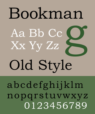
Bookman, or Bookman Old Style, is a serif typeface. A wide, legible design that is slightly bolder than most body text faces, Bookman has been used for both display typography, for trade printing such as advertising, and less commonly for body text. In advertising use it is particularly associated with the graphic design of the 1960s and 1970s, when revivals of it were very popular.

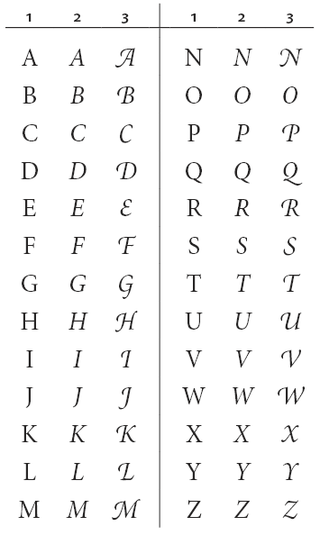
A swash is a typographical flourish, such as an exaggerated serif, terminal, tail, entry stroke, etc., on a glyph. The use of swash characters dates back to at least the 16th century, as they can be seen in Ludovico Vicentino degli Arrighi's La Operina, which is dated 1522. As with italic type in general, they were inspired by the conventions of period handwriting. Arrighi's designs influenced designers in Italy and particularly in France.

DIN 1451 is a sans-serif typeface that is widely used for traffic, administrative and technical applications.

A display typeface is a typeface that is intended for use in display type at large sizes for titles, headings, pull quotes, and other eye-catching elements, rather than for extended passages of body text.

In typography, a fat face letterform is a serif typeface or piece of lettering in the Didone or modern style with an extremely bold design. Fat face typefaces appeared in London around 1805–1810 and became widely popular; John Lewis describes the fat face as "the first real display typeface."
{{cite web}}: CS1 maint: bot: original URL status unknown (link)