P22 (type foundry)

Last updated
P22 Type Foundry
IndustryGraphic design
GenreTypeface design
Founded1994
FounderRichard Kegler, Carima El-Behairy
Headquarters
Rochester, New York
,
United States
Number of locations
1
ProductsFonts, Books, Letterpress Printing Supplies
Website http://www.p22.com

P22 Type Foundry is a digital type foundry and letterpress printing studio based in Rochester, New York. The company was created in 1994 in Buffalo, New York by co-founders Richard Kegler [1] and Carima El-Behairy. The company is best known for its type designs, which have appeared in films (e.g. Harry Potter, Suburbicon) and on commercial products (e.g. Trader Joe's, Founders Brewing Co.). The P22 Type Foundry retail font collection specializes in historical letterforms inspired by art, history, and science [2] that otherwise have never been available previously in digital form. P22 works with museums and foundations to ensure the development of accurate historical typefaces, [1] and with private clients to create custom bespoke fonts.

Contents

History

The name P22 has no specific significance and was used by founder Richard Kegler prior to the type foundry as a label for various art projects including an ambitious mail art correspondence. [1] Once P22 started developing fonts, they began to sell them packaged on floppy disks. These were very popular in museum stores because of their art history focus. P22 began to work with museums and artist foundations (Frank Lloyd Wright Foundation, Guggenheim Museum, Burchfield-Penney Art Center, Philadelphia Museum of Art, Albright-Knox Art Gallery, et al.) to develop these art history based font sets. The floppy disks soon gave way in the late 1990s to CD-ROMs packaged in boxes with key charts. During this decade P22 moved locations three times within Buffalo to accommodate growth and manufacturing concerns. Later, with the adaptation of the internet as a means to deliver fonts, P22 reduced its staff and moved to its last Buffalo location. P22 went virtual for a few years when founder Richard Kegler became the Director of the Book Arts at Wells College in Aurora, NY. [3] When Kegler ended his tenure at Wells in 2019, P22 once again coalesced into a studio location in Rochester, NY. [4]

P22 Type Collections

P22 as independent type foundry consists of a few partners and outside contractors, who create the core P22 collection fonts. However P22 licenses new exclusive type designs from independent designers and makes them available via the International House of Fonts (IHOF) collection, since 2001. [1]

In 2003, P22 acquired the collection of Ted Staunton (briefly known as the Sherwood Type Collection), [1] which consists of expertly designed alphabets that have historical basis, but tend toward the fanciful and mythic. Staunton continues to design and publish new fonts to this collection.

In 2004, P22 acquired the Lanston Type Co. from Gerald Giampa, [1] and continues to update and publish fonts from this renowned collection of type. Known as the Lanston Type Collection (LTC), it contains classic type designs from the likes of Fredric Goudy, Sol Hess, Bruce Rogers, among many others.

In 2005, Richard Kegler initiated the Rimmer Type Foundry with Jim Rimmer, [1] to make his proprietary type designs available to a larger audience. Because Jim Rimmer is a Canadian national artistic treasure, the digital holdings of this division were repatriated to Patrick Griffin of Canada Type in 2012. [5]

In 2012, P22 partnered with the Hamilton Wood Type & Printing Museum to publish a collection of wood type revivals. A portion of every sale of the Hamilton Wood Type Collection (HWT) fonts goes to help fund the museum's mission. [6]

Notable P22 Typefaces

P22 Publications

P22 self publishes from time to time. They published the Indie Fonts books (a collection of 3 volumes) in the early 2000s, to illuminate the work of small independent type designers. [11] P22 produced a documentary film in 2011 called Making Faces, to document the process of book artist Jim Rimmer as he developed a traditional metal font, from concept drawing through to casting in lead. [1] P22 has also published Savage Impressions, a comprehensive book on the work of artist and letterpress-printer Bruce Licher and his Independent Project Records & Press. [12]

P22 / Atom Smash Records

P22/Atom Smash Records is P22's music publishing branch. Originally started to promote and publish local Buffalo, NY bands, they have gone on to produce nineteen releases, including reissues of Rod McKuen records, a techno band called The William Caslon Experience, and the latest release is a vinyl LP of Bruce Licher's demos called Tape Excavation to accompany the Savage Impressions book.

Related Research Articles

<span class="mw-page-title-main">Times New Roman</span> Serif typeface

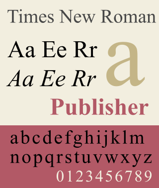
Times New Roman is a serif typeface. It was commissioned by the British newspaper The Times in 1931 and conceived by Stanley Morison, the artistic adviser to the British branch of the printing equipment company Monotype, in collaboration with Victor Lardent, a lettering artist in The Times's advertising department. It has become one of the most popular typefaces of all time and is installed on most personal computers.

<span class="mw-page-title-main">Garamond</span> Typeface family

Garamond is a group of many serif typefaces, named for sixteenth-century Parisian engraver Claude Garamond, generally spelled as Garamont in his lifetime. Garamond-style typefaces are popular and particularly often used for book printing and body text.

<span class="mw-page-title-main">Matthew Carter</span> British type designer (born 1937)

Matthew Carter is a British type designer. A 2005 New Yorker profile described him as 'the most widely read man in the world' by considering the amount of text set in his commonly used fonts.

<span class="mw-page-title-main">Frederic Goudy</span> American printer and type designer (1865–1947)

Frederic William Goudy was an American printer, artist and type designer whose typefaces include Copperplate Gothic, Goudy Old Style and Kennerley. He was one of the most prolific of American type designers and his self-named type continues to be one of the most popular in America.

<span class="mw-page-title-main">William Addison Dwiggins</span>

William Addison Dwiggins, was an American type designer, calligrapher, and book designer. He attained prominence as an illustrator and commercial artist, and he brought to the designing of type and books some of the boldness that he displayed in his advertising work. His work can be described as ornamented and geometric, similar to the Art Moderne and Art Deco styles of the period, using Oriental influences and breaking from the more antiquarian styles of his colleagues and mentors Updike, Cleland and Goudy.

<span class="mw-page-title-main">Monotype Imaging</span> American typesetting and typeface design company

Monotype Imaging Holdings Inc., founded as Lanston Monotype Machine Company in 1887 in Philadelphia by Tolbert Lanston, is an American company that specializes in digital typesetting and typeface design for use with consumer electronics devices. Incorporated in Delaware and headquartered in Woburn, Massachusetts, the company has been responsible for many developments in printing technology—in particular the Monotype machine, which was a fully mechanical hotmetal typesetter, that produced texts automatically, all single type. Monotype was involved in the design and production of many typefaces in the 20th century. Monotype developed many of the most widely used typeface designs, including Times New Roman, Gill Sans, Arial, Bembo and Albertus.

<span class="mw-page-title-main">Johnston (typeface)</span> Sans-serif typeface

Johnston is a sans-serif typeface designed by and named after Edward Johnston. The typeface was commissioned in 1913 by Frank Pick, commercial manager of the Underground Electric Railways Company of London, as part of his plan to strengthen the company's corporate identity. Johnston was originally created for printing, but it rapidly became used for the enamel station signs of the Underground system as well.

<span class="mw-page-title-main">Type foundry</span> Company that designs typefaces (fonts)

A type foundry is a company that designs or distributes typefaces. Before digital typography, type foundries manufactured and sold metal and wood typefaces for hand typesetting, and matrices for line-casting machines like the Linotype and Monotype, for letterpress printers. Today's digital type foundries accumulate and distribute typefaces created by type designers, who may either be freelancers operating their own independent foundry, or employed by a foundry. Type foundries may also provide custom type design services.

<span class="mw-page-title-main">Caslon</span> Typeface with serifs

Caslon is the name given to serif typefaces designed by William Caslon I (c. 1692–1766) in London, or inspired by his work.

<span class="mw-page-title-main">Slab serif</span> Type of serif typeface

In typography, a slab serif typeface is a type of serif typeface characterized by thick, block-like serifs. Serif terminals may be either blunt and angular (Rockwell), or rounded (Courier). Slab serifs were introduced in the early nineteenth century.

<span class="mw-page-title-main">Bookman (typeface)</span> 1869 serif typeface

Bookman, or Bookman Old Style, is a serif typeface. A wide, legible design that is slightly bolder than most body text faces, Bookman has been used for both display typography, for trade printing such as advertising, and less commonly for body text. In advertising use it is particularly associated with the graphic design of the 1960s and 1970s, when revivals of it were very popular. It is also used as the official font of Indonesian laws since 2011.

Richard Kegler is an American typographer and founding partner of P22 type foundry, which originated in 1994 as an outgrowth of his Master's thesis project on Marcel Duchamp.

<span class="mw-page-title-main">Cézanne (typeface)</span> Typeface

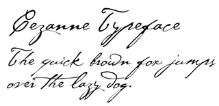
Cézanne is a script typeface based on Paul Cézanne's handwriting. The typeface includes alternate characters and swashes. It was created for the Philadelphia Museum of Art by designers Michael Want and Richard Kegler and published by P22 type foundry in 1996.

<span class="mw-page-title-main">Goudy Old Style</span> Typeface

Goudy Old Style is an old-style serif typeface originally created by Frederic W. Goudy for American Type Founders (ATF) in 1915.

Gerald Giampa was a printer, typographer and author.

<span class="mw-page-title-main">Gudrun Zapf-von Hesse</span> German typographer (1918–2019)

Gudrun Zapf-von Hesse was a German book-binder, calligrapher and typographer.

Jim Rimmer was a Canadian graphic designer, letterpress printer, proprietor of the Pie Tree Press and is especially notable as a designer of typefaces.

<span class="mw-page-title-main">Kennerley Old Style</span>

Kennerley Old Style is a serif typeface designed by Frederic Goudy. Kennerley is an "old-style" serif design, loosely influenced by Italian and Dutch printing traditions of the Renaissance and early modern period. It was named for New York publisher Mitchell Kennerley, who advanced Goudy money to complete the design. While Goudy had already designed 18 other typefaces, it was one of Goudy's most successful early designs in his own style. The regular or roman style was designed in 1911, the italic in 1918; bold styles followed in 1924.

Josef Týfa was a Czech type designer. He significantly contributed to the cultivation of corporate style and the development of book design and advertising in the 1950s and 60s. Typefaces he designed include: Kolektiv, Tyfa, Juvenis, Amos and Academia, many of which he digitized with František Štorm, founder of Storm Type Foundry. He has indicated that his influences include Jaroslav Benda, Pier Luigi Nervi, and modern graphic design and architecture including functionalism.

References

  1. 1 2 3 4 5 6 7 8 Spring, Jessica (June 14, 2008). "P22: Fond Found Typography". Boxcar Press. Retrieved March 27, 2020.
  2. 1 2 Middendorp, Jan (February 2008). "Creative Characters #8, P22". MyFonts. Retrieved March 27, 2020.
  3. "Wells Welcomes Richard Kegler as Director of the Book Arts Center". Wells College. August 26, 2014. Retrieved March 27, 2020.
  4. "Building Used by Frederick Douglass Now Home to Digital Font & Printing Company". Spectrum News Rochester. December 18, 2019. Retrieved March 27, 2020.
  5. Griffin, Patrick (July 1, 2012). "Canada Type Acquires the Rimmer Type Foundry". prMac. Retrieved March 27, 2020.
  6. "Partnerships". Hamilton Wood Type and Printing Museum. Retrieved March 27, 2020.
  7. "Greatest fonts countdown: 53 - P22 Underground Pro". Creative Bloq. January 27, 2015. Retrieved March 27, 2020.
  8. "100 Best Typefaces of All Time". FontShop. April 30, 2014. Retrieved March 27, 2020.
  9. New York Times Staff (August 26, 2004). "The Amateurs Are Coming". The New York Times Company. Retrieved 30 April 2020.
  10. Strizver, Ilene (31 January 2018). "Marcel's Letters: A Font and the Search for One Man's Fate". CreativePro. Retrieved 30 April 2020.
  11. Showker, Fred (1999). "Indie Fonts". The Designers' Bookshelf. Retrieved March 27, 2020.
  12. Moxon, Paul (January 9, 2020). "Book Review: Savage Impressions—An Aesthetic Expedition Through the Archives of Independent Project Records & Press". American Printing History Association. Retrieved March 27, 2020.