Paul Barnes | |
|---|---|
 | |
| Born | 1970 (age 50–51) |
| Nationality | British |
| Occupation | Graphic artist and typographer |
Paul Barnes (born 1970, Harlow, England) is a graphic designer and typographer. He has designed several new typefaces.
Paul Barnes | |
|---|---|
 | |
| Born | 1970 (age 50–51) |
| Nationality | British |
| Occupation | Graphic artist and typographer |
Paul Barnes (born 1970, Harlow, England) is a graphic designer and typographer. He has designed several new typefaces.
After an education at the University of Reading, in 1992 he emigrated to the United States to work with Roger Black. In 1995 he left Roger Black and began work as a freelance designer in London. He has worked with many large corporations, making logos for such well known companies as Givenchy, ABC television and the English bands New Order, Electronic [1] and Joy Division. With Christian Schwartz he designed the very large Guardian Egyptian family typefaces for The Guardian newspaper and operates the digital type design company Commercial Type. [2] [3] [4]
In April 2007 he designed the logo for Kate Moss with Saville. [5]
In September 2006 he was named one of the 40 most influential designers under 40 in Wallpaper and in September 2007 The Guardian named him one of the top 50 designers in Britain. [6]

In typography and lettering, a sans-serif, sans serif, gothic, or simply sans letterform is one that does not have extending features called "serifs" at the end of strokes. Sans-serif typefaces tend to have less stroke width variation than serif typefaces. They are often used to convey simplicity and modernity or minimalism.

Helvetica or Neue Haas Grotesk is a widely used sans-serif typeface developed in 1957 by Swiss typeface designer Max Miedinger with input from Eduard Hoffmann.
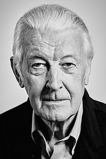
Matthew Carter is a British type designer. A 2005 New Yorker profile described him as 'the most widely read man in the world' by considering the amount of text set in his commonly used fonts.
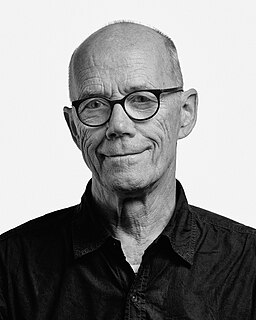
Erik Spiekermann is a German typographer, designer and writer. He is an honorary professor at the University of the Arts Bremen and ArtCenter College of Design.
Raymond Larabie is a Canadian designer of TrueType and OpenType computer fonts. He owns Typodermic Fonts, which distributes both commercially licensed and shareware/freeware fonts.
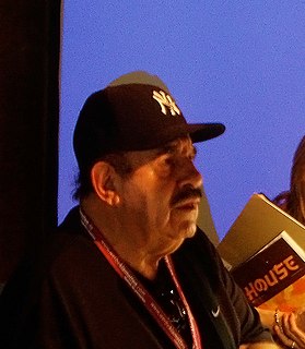
Ephram Edward Benguiat was an American typographer and lettering artist. He crafted over 600 typeface designs including Tiffany, Bookman, Panache, Souvenir, Edwardian Script, and the eponymous Benguiat and Benguiat Gothic.
William Golden was an American graphic designer. He is best known for his work at Columbia Broadcasting System, starting in the CBS Radio promotion department and culminating in his tenure as creative director of advertising and sales promotion for CBS Television Network. Golden gained a reputation of excellence by always striving for a perfect, simple solution to the problem at hand, producing an original and distinguished design to convey the message.
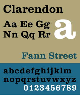
Clarendon is the name of a slab-serif typeface that was released in 1845 by Thorowgood and Co. of London, a letter foundry often known as the Fann Street Foundry. The original Clarendon design is credited to Robert Besley, a partner in the foundry, and was originally engraved by punchcutter Benjamin Fox, who may also have contributed to its design. Many copies, adaptations and revivals have been released, becoming almost an entire genre of type design.
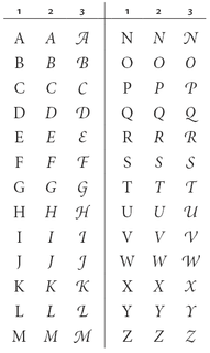
A swash is a typographical flourish, such as an exaggerated serif, terminal, tail, entry stroke, etc., on a glyph. The use of swash characters dates back to at least the 16th century, as they can be seen in Ludovico Vicentino degli Arrighi's La Operina, which is dated 1522. As with italic type in general, they were inspired by the conventions of period handwriting. Arrighi's designs influenced designers in Italy and particularly in France.

Christian Schwartz is an American type designer. He has been awarded the German Design Award and the Prix Charles Peignot.

Tempo is a 1930 sans-serif typeface designed by R. Hunter Middleton for the Ludlow Typograph company. Tempo is a geometric sans-serif design, closely copying German typefaces in this style, above all Futura, which had attracted considerable attention in the United States. Unlike Futura, however, it has a "dynamic" true italic, with foot serifs suggesting handwriting and optional swash capitals.

The Klim Type Foundry is a digital type foundry operated by Kris Sowersby, a New Zealand typeface designer. Klim was founded in 2005 and is currently based in Wellington. Klim produces retail typefaces, custom typefaces and custom lettering and logotypes. Sowersby has garnered many international awards for his typefaces.
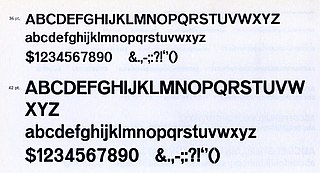
Venus or Venus-Grotesk is a sans-serif typeface family released by the Bauer Type Foundry of Frankfurt am Main, Germany from 1907 onwards. Released in a large range of styles, including condensed and extended weights, it was very popular in the early-to-mid twentieth century. It was exported to other countries, notably the United States, where it was distributed by Bauer Alphabets Inc, the U.S. branch of the firm.
Guardian Egyptian is a slab-serif typeface commissioned by Mark Porter for the UK newspaper The Guardian and designed by Paul Barnes and Christian Schwartz between 2004 and 2005 and published by their company Commercial Type.
A reverse-contrast letterform is a typeface or custom lettering in which the stress is reversed from the norm: instead of the vertical lines being the same width or thicker than horizontals, which is normal in Latin-alphabet writing and especially printing, the horizontal lines are the thickest. The result is a dramatic effect, in which the letters seem to have been printed the wrong way round. Originally invented in the early nineteenth century as attention-grabbing novelty display designs, modern font designer Peter Biľak, who has created a design in the genre, has described them as "a dirty trick to create freakish letterforms that stood out."

A display typeface is a typeface that is intended for use at large sizes for headings, rather than for extended passages of body text.
Commercial Type is a digital type foundry established in 2007 by type designers Paul Barnes and Christian Schwartz. Its work includes typefaces for The Guardian, such as the Guardian Egyptian series, and other retail and commissioned typefaces.

In typography, a fat face letterform is a serif typeface or piece of lettering in the Didone or modern style with an extremely bold design. Fat face typefaces appeared in London around 1805-10 and became widely popular; John Lewis describes the fat face as "the first real display typeface."