The ellipsis... is a series of dots that indicates an intentional omission of a word, sentence, or whole section from a text without altering its original meaning. The plural is ellipses. The term originates from the Ancient Greek: ἔλλειψις, élleipsis meaning 'leave out'.
Punctuation marks are marks indicating how a piece of written text should be read and, consequently, understood. The oldest known examples of punctuation marks were found in the Mesha Stele from the 9th century BC, consisting of points between the words and horizontal strokes between sections. The alphabet-based writing began with no spaces, no capitalization, no vowels, and with only a few punctuation marks, as it was mostly aimed at recording business transactions. Only with the Greek playwrights did the ends of sentences begin to be marked to help actors know when to make a pause during performances. Punctuation includes space between words and the other, historically or currently used, signs.

Typography is the art and technique of arranging type to make written language legible, readable and appealing when displayed. The arrangement of type involves selecting typefaces, point sizes, line lengths, line spacing, letter spacing, and spaces between pairs of letters. The term typography is also applied to the style, arrangement, and appearance of the letters, numbers, and symbols created by the process. Type design is a closely related craft, sometimes considered part of typography; most typographers do not design typefaces, and some type designers do not consider themselves typographers. Typography also may be used as an ornamental and decorative device, unrelated to the communication of information.
The hyphen‐ is a punctuation mark used to join words and to separate syllables of a single word. The use of hyphens is called hyphenation. Son-in-law is an example of a hyphenated word.
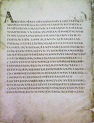
Scriptio continua, also known as scriptura continua or scripta continua, is a style of writing without spaces or other marks between the words or sentences. The form also lacks punctuation, diacritics, or distinguished letter case. In the West, the oldest Greek and Latin inscriptions used word dividers to separate words in sentences; however, Classical Greek and late Classical Latin both employed scriptio continua as the norm.
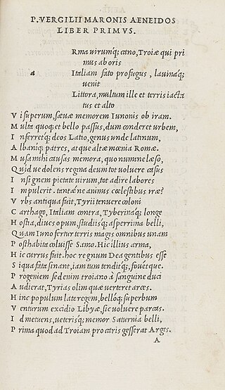
In writing, a space is a blank area that separates words, sentences, syllables and other written or printed glyphs (characters). Conventions for spacing vary among languages, and in some languages the spacing rules are complex. Inter-word spaces ease the reader's task of identifying words, and avoid outright ambiguities such as "now here" vs. "nowhere". They also provide convenient guides for where a human or program may start new lines.

In typography, emphasis is the strengthening of words in a text with a font in a different style from the rest of the text, to highlight them. It is the equivalent of prosody stress in speech.
A paragraph is a self-contained unit of discourse in writing dealing with a particular point or idea. Though not required by the orthographic conventions of any language with a writing system, paragraphs are a conventional means of organizing extended segments of prose.
In typography, italic type is a cursive font based on a stylised form of calligraphic handwriting. Along with blackletter and roman type, it served as one of the major typefaces in the history of Western typography.

The Russian alphabet is the script used to write the Russian language. It comes from the Cyrillic script, which was devised in the 9th century for the first Slavic literary language, Old Slavonic. Initially an old variant of the Bulgarian alphabet, it became used in the Kievan Rusʹ since the 10th century to write what would become the modern Russian language.

Letter case is the distinction between the letters that are in larger uppercase or capitals and smaller lowercase in the written representation of certain languages. The writing systems that distinguish between the upper- and lowercase have two parallel sets of letters: each in the majuscule set has a counterpart in the minuscule set. Some counterpart letters have the same shape, and differ only in size, but for others the shapes are different. The two case variants are alternative representations of the same letter: they have the same name and pronunciation and are typically treated identically when sorting in alphabetical order.
A paraphrase or rephrase is the rendering of the same text in different words without losing the meaning of the text itself. More often than not, a paraphrased text can convey its meaning better than the original words. In other words, it is a copy of the text in meaning, but which is different from the original. For example, when someone tells a story they heard in their own words, they paraphrase, with the meaning being the same. The term itself is derived via Latin paraphrasis, from Ancient Greek παράφρασις (paráphrasis) 'additional manner of expression'. The act of paraphrasing is also called paraphrasis.
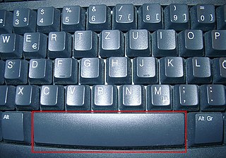
The space bar, spacebar, blank, or space key, Space bar is a key on a typewriter or alphanumeric keyboard in the form of a horizontal bar in the lowermost row, significantly wider than all other keys. Its main purpose is to conveniently enter a space, e.g., between words during typing.

The modern Japanese writing system uses a combination of logographic kanji, which are adopted Chinese characters, and syllabic kana. Kana itself consists of a pair of syllabaries: hiragana, used primarily for native or naturalised Japanese words and grammatical elements; and katakana, used primarily for foreign words and names, loanwords, onomatopoeia, scientific names, and sometimes for emphasis. Almost all written Japanese sentences contain a mixture of kanji and kana. Because of this mixture of scripts, in addition to a large inventory of kanji characters, the Japanese writing system is considered to be one of the most complicated currently in use.

Many East Asian scripts can be written horizontally or vertically. Chinese, Vietnamese Hán-Nôm, Korean, and Japanese scripts can be oriented along either axis, as they consist mainly of disconnected logographic or syllabic units, each occupying a square block of space, thus allowing for flexibility for which direction texts can be written, be it horizontally from left-to-right, horizontally from right-to-left, vertically from top-to-bottom, and even vertically from bottom-to-top.
Sentence spacing concerns how spaces are inserted between sentences in typeset text and is a matter of typographical convention. Since the introduction of movable-type printing in Europe, various sentence spacing conventions have been used in languages with a Latin alphabet. These include a normal word space, a single enlarged space, and two full spaces.

Modern typographers view typography as a craft with a very long history tracing its origins back to the first punches and dies used to make seals and coinage currency in ancient times. The basic elements of typography are at least as old as civilization and the earliest writing systems—a series of key developments that were eventually drawn together into one systematic craft. While woodblock printing and movable type had precedents in East Asia, typography in the Western world developed after the invention of the printing press by Johannes Gutenberg in the mid-15th century. The initial spread of printing throughout Germany and Italy led to the enduring legacy and continued use of blackletter, roman, and italic types.

The traditional Mongolian script, also known as the Hudum Mongol bichig, was the first writing system created specifically for the Mongolian language, and was the most widespread until the introduction of Cyrillic in 1946. It is traditionally written in vertical lines Top-Down, right across the page. Derived from the Old Uyghur alphabet, it is a true alphabet, with separate letters for consonants and vowels. It has been adapted for such languages as Oirat and Manchu. Alphabets based on this classical vertical script continue to be used in Mongolia and Inner Mongolia to write Mongolian, Xibe and, experimentally, Evenki.
Writing systems that use Chinese characters also include various punctuation marks, derived from both Chinese and Western sources. Historically, judou annotations were often used to indicate the boundaries of sentences and clauses in text. The use of punctuation in Written Chinese only became mandatory during the 20th century, due to Western influence. Unlike modern punctuation, judou marks were added by scholars for pedagogical purposes and were not viewed as integral to the text. Texts were therefore generally transmitted without judou. In most cases, this practice did not interfere with the interpretation of a text, although it occasionally resulted in ambiguity.
The dash is a punctuation mark consisting of a long horizontal line. It is similar in appearance to the hyphen but is longer and sometimes higher from the baseline. The most common versions are the en dash–, generally longer than the hyphen but shorter than the minus sign; the em dash—, longer than either the en dash or the minus sign; and the horizontal bar―, whose length varies across typefaces but tends to be between those of the en and em dashes.
