
In typography and lettering, a sans-serif, sans serif, gothic, or simply sans letterform is one that does not have extending features called "serifs" at the end of strokes. Sans-serif fonts tend to have less stroke width variation than serif fonts. They are often used to convey simplicity and modernity or minimalism.

A typeface is the design of lettering that can include variations in size, weight, slope, width, and so on. Each of these variations of the typeface is a font.

Helvetica or Neue Haas Grotesk is a widely used sans-serif typeface developed in 1957 by Swiss typeface designer Max Miedinger with input from Eduard Hoffmann.

Emigre Fonts is a digital type foundry based in Berkeley, California, that was founded in 1985 by husband-and-wife team Rudy VanderLans and Zuzana Licko. The type foundry grew out of Emigre magazine, a publication founded by VanderLans and two Dutch friends who met in San Francisco, CA in 1984. Note that unlike the word émigré, Emigre is officially spelled without accents.
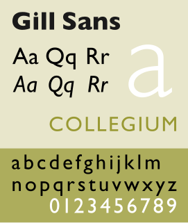
Gill Sans is a humanist sans-serif typeface designed by Eric Gill and released by the British branch of Monotype from 1928 onwards.

Adrian Johann Frutiger was a Swiss typeface designer who influenced the direction of type design in the second half of the 20th century. His career spanned the hot metal, phototypesetting and digital typesetting eras. Until his death, he lived in Bremgarten bei Bern.
Emigre was an award-winning (mostly) quarterly magazine published from 1984 until 2005 in Berkeley, California dedicated to visual communication, graphic design, typography, and design criticism. Produced by Rudy VanderLans and Zuzana Licko, Emigre was known for creating some of the very first digital layouts and typeface designs. Exposure to Licko's typefaces through the magazine lead to the creation of Emigre Fonts in 1985.

Johnston is a sans-serif typeface designed by and named after Edward Johnston. The typeface was commissioned in 1913 by Frank Pick, commercial manager of the Underground Electric Railways Company of London, as part of his plan to strengthen the company's corporate identity. Johnston was originally created for printing, but it rapidly became used for the enamel station signs of the Underground system as well.
Zuzana Licko is a Slovak-born American type designer and visual artist known for co-founding Emigre Fonts, a digital type foundry in Berkeley, CA. She has designed and produced numerous digital typefaces including the popular Mrs Eaves, Modula, Filosofia, and Matrix. As a corresponding interest she also creates ceramic sculptures, textile prints and jacquard weavings.

In typography, the x-height, or corpus size, is the distance between the baseline and the mean line of lower-case letters in a typeface. Typically, this is the height of the letter x in the font, as well as the letters v, w, and z. One of the most important dimensions of a font, x-height is used to define how high lower-case letters without ascenders are compared to the cap height of upper-case letters.
Rudy VanderLans is a Dutch graphic designer, photographer, and the co-founder of Emigre Fonts with his wife Zuzana Licko. Emigre Fonts is an independent type foundry in Berkeley, CA. He was also the art director and editor of Emigre magazine, the legendary journal devoted to visual communications from 1984–2005. Since arriving in California in 1981, he has been photographing his adoptive Golden State as an ongoing side project. He has authored a total of 11 photo books on the topic, and staged two solo exhibits at Gallery 16 in San Francisco.
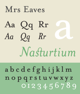
Mrs Eaves is a transitional serif typeface designed by Zuzana Licko in 1996. It is a variant of Baskerville, which was designed in Birmingham, England, in the 1750s. Mrs Eaves adapts Baskerville for use in display contexts, such as headings and book blurbs, through the use of a low x-height and a range of unusual combined characters or ligatures.

Bank Gothic is a rectilinear geometric sans-serif typeface designed by Morris Fuller Benton for American Type Founders and released in 1930. The design has become popular from the late twentieth century to suggest a science-fiction, military, corporate, or sports aesthetic.
P. Scott Makela was a graphic designer, multimedia designer and type designer. Among other work, he was especially noted for the design of Dead History, a postmodern typeface that combined features of a rounded sans serif typeface and a crisp neo-classical serif typeface. With the emergence of the personal computer in the mid-1980s, Makela was among the first to explore digital programs such as Photoshop and Adobe Illustrator. As a result, he created an idiosyncratic, original and highly controversial design aesthetic. In particular, his disregard for clean, modernist, problem-solving design agendas—synonymous with contemporary corporate graphic design—caused much debate among powerful, old-guard designers such as Massimo Vignelli, Paul Rand, and Henry Wolf.
Edward Fella is an American graphic designer, artist and educator. He created the OutWest typeface in 1993. His work is held in the collection of the Cooper-Hewitt, National Design Museum, the Brauer Museum of Art, and the Museum of Modern Art. He was the recipient of the 2007 AIGA Medal. He was also the recipient of a Chrysler Award in 1997. Curt Cloninger called Fella as "the contemporary master of hand-drawn typography."
Jeffery Keedy, born 1957, is an American graphic designer, type designer, writer and educator. He is notable as an essayist and contributor to books and periodicals on graphic design. He is also notable for the design of Keedy Sans, a typeface acquired in the permanent collection of the Museum of Modern Art in 2011.
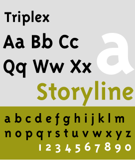
The Triplex type font style is a typeface designed by Zuzana Licko and John Downer in 1985 and 1989. It is distributed by Emigre. It is used by Avex & Prezi for its logo. it was also used as the typeface for Disney Channel from 1997-2002 It has both Sans-serif and Serif variation.

A display typeface is a typeface that is intended for use at large sizes for headings, rather than for extended passages of body text.

John Downer is an American sign painter, typeface and logo designer. Downer began his career as a painter of signs. Among his best-known digital fonts are Iowan Old Style, Roxy, Triplex Italic, and Brothers.
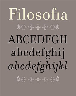
Filosofia is a serif typeface designed by Zuzana Licko and released by Emigre Fonts in 1996. It is a revival of Italian type designer Giambattista Bodoni's late eighteenth century typeface, Bodoni.
