
Frutiger is a series of typefaces named after its Swiss designer, Adrian Frutiger. Frutiger is a humanist sans-serif typeface, intended to be clear and highly legible at a distance or at small text sizes. A very popular design worldwide, type designer Steve Matteson described its structure as "the best choice for legibility in pretty much any situation" at small text sizes, while Erik Spiekermann named it as "the best general typeface ever".

Emigre, Inc., doing business as Emigre Fonts, is a digital type foundry based in Berkeley, California, that was founded in 1985 by husband-and-wife team Rudy VanderLans and Zuzana Licko. The type foundry grew out of Emigre magazine, a publication founded by VanderLans and two Dutch friends who met in San Francisco, CA in 1984. Note that unlike the word émigré, Emigre is officially spelled without accents.

Gill Sans is a humanist sans-serif typeface designed by Eric Gill and released by the British branch of Monotype from 1928 onwards.
Zuzana Licko is a Slovak-born American type designer and visual artist known for co-founding Emigre Fonts, a digital type foundry in Berkeley, CA. She has designed and produced numerous digital typefaces including the popular Mrs Eaves, Modula, Filosofia, and Matrix. As a corresponding interest she also creates ceramic sculptures, textile prints and jacquard weavings.
Aldo Novarese was an Italian type designer who lived and worked mostly in Turin.

Jonathan Hoefler is an American type designer. Hoefler founded the Hoefler Type Foundry in 1989, a type foundry in New York.
Oblique type is a form of type that slants slightly to the right, used for the same purposes as italic type. Unlike italic type, however, it does not use different glyph shapes; it uses the same glyphs as roman type, except slanted. Oblique and italic type are technical terms to distinguish between the two ways of creating slanted font styles; oblique designs may be labelled italic by companies selling fonts or by computer programs. Oblique designs may also be called slanted or sloped roman styles. Oblique fonts, as supplied by a font designer, may be simply slanted, but this is often not the case: many have slight corrections made to them to give curves more consistent widths, so they retain the proportions of counters and the thick-and-thin quality of strokes from the regular design.
Rudy VanderLans is a Dutch graphic designer, photographer, and the co-founder of Emigre Fonts with his wife Zuzana Licko. Emigre Fonts is an independent type foundry in Berkeley, CA. He was also the art director and editor of Emigre magazine, the legendary journal devoted to visual communications from 1984 to 2005. Since arriving in California in 1981, he has been photographing his adoptive Golden State as an ongoing side project. He has authored a total of 11 photo books on the topic, and staged two solo exhibits at Gallery 16 in San Francisco.

DIN 1451 is a sans-serif typeface that is widely used for traffic, administrative and technical applications.
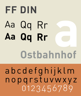
FF DIN is a sans-serif typeface in the industrial or "grotesque" style. It was designed in 1995 by Albert-Jan Pool, based on DIN-Mittelschrift and DIN-Engschrift, as defined in the German standard DIN 1451. DIN is an acronym for Deutsches Institut für Normung. It was published by FontShop in its FontFont library of typefaces.

Peter Biľak is a Slovak graphic and typeface designer, based in The Hague, The Netherlands. He works in the field of editorial, graphic, and type design; teaches typeface design at the postgraduate course Type&Media at the KABK, Royal Academy of Art. He started Typotheque in 1999, Dot Dot Dot in 2000, Indian Type Foundry in 2009, Works That Work magazine in 2012, and Fontstand in 2015. He is a member of AGI, and lectures on his work internationally. He is a writer for numerous design magazines and frequently contributes writing and design to books and publications that include Print, Emigre, Eye (magazine), Items, tipoGrafica, Idea (magazine), Abitare and, Page.

Web typography is the use of fonts on the World Wide Web. When HTML was first created, font faces and styles were controlled exclusively by the settings of each web browser. There was no mechanism for individual Web pages to control font display until Netscape introduced the font element in 1995, which was then standardized in the HTML 3.2 specification. However, the font specified by the font element had to be installed on the user's computer or a fallback font, such as a browser's default sans-serif or monospace font, would be used. The first Cascading Style Sheets specification was published in 1996 and provided the same capabilities.

In typography, Erbar or Erbar-Grotesk is a sans-serif typeface in the geometric style, one of the first designs of this kind released as type. Designer Jakob Erbar's aim was to design a printing type which would be free of all individual characteristics, possess thoroughly legible letter forms, and be a purely typographic creation. His conclusion was that this could only work if the type form was developed from a fundamental element, the circle. Erbar-Grotesk was developed in stages; Erbar wrote that he had originally sketched out the design in 1914 but had been prevented from working on it due to the war. The original version of Erbar was released in 1926, following Erbar's "Phosphor" titling capitals of 1922 which are very similar in design.
Neutraface is a geometric sans-serif typeface designed by Christian Schwartz for House Industries, an American digital type foundry. It was influenced by the work of architect Richard Neutra and was developed with the assistance of Neutra's son and former partner, Dion Neutra.
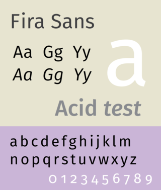
Fira Sans is a humanist sans-serif typeface designed by Erik Spiekermann, Ralph du Carrois, Anja Meiners, Botio Nikoltchev of Carrois Type Design and Patryk Adamczyk of Mozilla Corporation. Originally commissioned by Telefónica and Mozilla Corporation as part of the joint effort during the development of Firefox OS. It is a slightly wider and calmer adaptation of Spiekermann's typeface Meta, which was used at Mozilla's brand typeface at the time but optimized for legibility on (small) screens. With the name Fira, Mozilla wanted to communicate the concepts of fire, light and joy but in a language agnostic way to signal the project's global nature. Fira was released in 2013 initially under the Apache License and later reissued under the SIL Open Font License.
Nadine Chahine is a Lebanese type designer working as the CEO at I Love Typography Ltd and the Director at ArabicType Ltd. From 2005 till 2015 she worked as the Arabic Specialist at Linotype and Monotype Imaging and from 2015 to 2018 as the UK Type Director and Legibility Expert at Monotype UK. She designed Arabic versions of the popular typefaces Helvetica, Frutiger, and Zapfino. Her typeface Koufiya was the first to include a simultaneously designed matching Arabic and Latin parts.
Egyptian is a typeface created by the Caslon foundry of Salisbury Square, London around or probably slightly before 1816, that is the first general-purpose sans-serif typeface in the Latin alphabet known to have been created.
Graphik is a neo-grotesque sans-serif typeface designed by Christian Schwartz and published by Commercial Type in 2009. It is currently used as Accenture's, Snap Inc.'s, and Sprint's official typeface. Eighteen styles are included with macOS.

Zilla Slab is a free to use, open source slab serif font commissioned by the Mozilla Foundation as a part of their rebranding process from mid-2016 to 2017. It was created in 2017 by Peter Biľak and Nikola Djurek, typeface designers for the Typotheque foundry. It is inspired by the Tesla Slab font, also originally designed by Typotheque. Its variant, Zilla Slab Highlight, features a unique ligature in its bold weight, where the character sequence “ill” will turn into “://”, purposely intended for using the stylized Mozilla wordmark as “moz://a”.

Gilbert is sans-serif typeface, a tribute font to honor the memory of Gilbert Baker, the creator of the LGBT Rainbow Flag. This colorful typeface was supposedly designed to "express diversity and inclusion", specially made for striking headlines and statements that could live on banners for rallies and protests. It is part of the TypeWithPride initiative, a collaboration between NewFest, NYC Pride, Ogilvy and Fontself.