Century Gothic

Last updated
Century Gothic
CenturyGothicSpecimen.svg
Category Sans-serif
Classification Geometric
Designer(s) Sol Hess
Foundry Monotype
Date created1990
Design based on

Century Gothic is a digital sans-serif typeface in the geometric style, released by Monotype Imaging in 1990. [1] [2] It is a redrawn version of Monotype's own Twentieth Century, a copy of Bauer's Futura, to match the widths of ITC Avant Garde Gothic. It is an exclusively digital typeface that has never been manufactured as metal type.

Contents

Design

Like many geometric sans-serifs, Century Gothic's design has a single-story "a" and "g", and an "M" with slanting sides resembling an upturned "W". Century Gothic has a high x-height (tall lower-case characters). Its origins (see below) come from a design intended for large-print uses such as headings and signs, and so it has a reasonably purely geometric design closely based on the circle and square, with less variation in stroke width than fonts designed for small sizes tend to show, and a relatively slender design in its default weight.

Sources

While many geometric sans-serif typefaces have been released to compete with the popular typeface Futura, Century Gothic is perhaps unique in its origin: it redraws one to match the design proportions of a second. Century Gothic was created to be a substitute font for ITC Avant Garde, designed by Herb Lubalin, and released by the International Typeface Corporation (ITC) in 1970, so a document created in one can be displayed in the other with no change to copyfit. [3] [4] This allows it to substitute interchangeably for Avant Garde in documents, an important feature since Avant Garde is a standard font in some forms of the PostScript digital printing standard, and so Century Gothic allowed Microsoft to use it in preference to paying for an ITC Avant Garde license.

Additionally, Century Gothic's design was based on Monotype's own Twentieth Century, which was drawn by Sol Hess between 1937 and 1947 for the Lanston Monotype Company. [5] Century Gothic is similar to ITC Avant Garde in its pure geometry, and does not possess the subtle variation in stroke width found in either Futura or Twentieth Century. [6] However, it differs from ITC Avant Garde in that like Futura and Twentieth Century, Century Gothic does not have a descender at bottom right of the "u" (making it appear like a Greek upsilon υ), whereas Avant Garde does. Century Gothic also has larger, rounder tittles on the letters i and j more akin to Futura, whereas Avant Garde keeps the tittles square and the same width as the letter strokes. Most notably, it lacks the extreme stylistic alternates of Avant Garde, such as highly slanted letters designed to fit together closely in kerning. [7]

Design characteristics

Twentieth Century (above) and Century Gothic (below) at equalised x-height in their default weight. Twentieth Century has features for smaller text such as loose spacing and a solid stroke weight that narrows where curves join the verticals. Century Gothic has a finer structure, less variation in stroke width and sometimes wider characters, and by default tighter spacing. Century Gothic Twentieth Century comparison equalised x-height.png
Twentieth Century (above) and Century Gothic (below) at equalised x-height in their default weight. Twentieth Century has features for smaller text such as loose spacing and a solid stroke weight that narrows where curves join the verticals. Century Gothic has a finer structure, less variation in stroke width and sometimes wider characters, and by default tighter spacing.

ITC Avant Garde was intended as a display design for large headings and advertisements (although it is somewhat usable for body text because of the high x-height) and as a result Century Gothic is quite a light typeface, especially in default weight, with the classic display typeface feature of tight spacing and quite wide characters, in contrast to Twentieth Century which was intended more for small-size applications with a more solid stroke weight and open spacing. [8] While its structure is similar to Futura, its regular style is between Futura and Twentieth Century's regular and light weights.

Availability

Century Gothic was one of several clones of PostScript standard fonts created by Monotype in collaboration with or sold to Microsoft, including Arial (a clone of Helvetica), Book Antiqua (Palatino), and Bookman Old Style (ITC Bookman). [9] [10] As such, it has been bundled with many Microsoft products. Plus! 95 and Windows 98 included Century Gothic, but contemporary versions of Windows do not. It has been a part of Microsoft Office since the release of version 4.3 in 1994 and is available in the modern versions. [11] [12]

Levenim MT

Century Gothic and Levenim MT have minor differences in spacing and punctuation marks. Century Gothic vs Levenim MT.png
Century Gothic and Levenim MT have minor differences in spacing and punctuation marks.

Levenim MT is a version of Century Gothic that includes Hebrew alphabet and is available for free on most versions of Windows. [13] Levenim MT has two weights, namely Regular and Bold. Unlike Century Gothic, Levenim MT does not have true italics. The two fonts also have some minor visual differences.

Printer ink usage

According to the University of Wisconsin-Green Bay, Century Gothic uses much less ink than other, similar sans-serif typefaces. It was found that Century Gothic uses about 30% less ink than Arial. In order to save money that would be spent on printer ink for other typefaces, the university reportedly switched their default e-mail and printing typeface from Arial to Century Gothic. [14] However, the typeface has also been found to use more paper—due to its wider letters—meaning that the savings on ink are offset by an increase in paper costs. [15]

Along with the serif typeface Garamond, Century Gothic is one of the two typefaces that PrintWise, an initiative of the U.S. government's General Services Administration, recommends U.S. government workers use for printed documents. [16] [17]

Apart from Avant Garde and Futura, a number of other fonts based on Avant Garde have been created to substitute for it in PostScript implementations. A particular case of this is an open-sourced set of fonts developed by URW and donated to the Ghostscript project to create a free PostScript alternative. This includes an AvantGarde clone known as "Gothic L". It (or a derivative) is used by much open-source software such as R as a system font. [18] [19] A derivative of this family known as "TeX Gyre Adventor" has been prepared for use in the TeX scientific document preparation software. [20]

Related Research Articles

<span class="mw-page-title-main">Palatino</span> Serif typeface

Palatino is the name of an old-style serif typeface designed by Hermann Zapf, initially released in 1949 by the Stempel foundry and later by other companies, most notably the Mergenthaler Linotype Company.

<span class="mw-page-title-main">Sans-serif</span> Typeface classification for letterforms without serifs

In typography and lettering, a sans-serif, sans serif, gothic, or simply sans letterform is one that does not have extending features called "serifs" at the end of strokes. Sans-serif typefaces tend to have less stroke width variation than serif typefaces. They are often used to convey simplicity and modernity or minimalism. For the purposes of type classification, sans-serif designs are usually divided into these major groups: § Grotesque and § Neo-grotesque, § Geometric, § Humanist and § Other or mixed.

<span class="mw-page-title-main">Typeface</span> Set of characters that share common design features

A typeface is a design of letters, numbers and other symbols, to be used in printing or for electronic display. Most typefaces include variations in size, weight, slope, width, and so on. Each of these variations of the typeface is a font.

<span class="mw-page-title-main">Helvetica</span> Neo-grotesque sans-serif typeface

Helvetica, also known by its original name Neue Haas Grotesk, is a widely used sans-serif typeface developed in 1957 by Swiss typeface designer Max Miedinger and Eduard Hoffmann.

<span class="mw-page-title-main">Arial</span> Neo-grotesque sans-serif typeface

Arial is a sans-serif typeface and set of computer fonts in the neo-grotesque style. Fonts from the Arial family are included with all versions of Microsoft Windows after Windows 3.1, as well as in other Microsoft programs, Apple's macOS, and many PostScript 3 printers.

<span class="mw-page-title-main">Rockwell (typeface)</span> Slab-serif font

Rockwell is a slab serif typeface designed by the Monotype Corporation and released in 1934. The project was supervised by Monotype's engineering manager Frank Hinman Pierpont. This typeface is distinguished by a serif at the apex of the uppercase A, while the lowercase a has two storeys. Because of its monoweighted stroke, Rockwell is used primarily for display or at small sizes rather than as a body text. Rockwell is based on an earlier, more condensed slab serif design cast by the Inland Type Foundry called Litho Antique.

<span class="mw-page-title-main">Futura (typeface)</span> Geometric sans-serif typeface

Futura is a geometric sans-serif typeface designed by Paul Renner and released in 1927. It was designed as a contribution on the New Frankfurt-project. It is based on geometric shapes, especially the circle, similar in spirit to the Bauhaus design style of the period. It was developed as a typeface by the Bauer Type Foundry, in competition with Ludwig & Mayer's seminal Erbar typeface of 1926.

<span class="mw-page-title-main">Gill Sans</span> Humanist sans-serif typeface family developed by Monotype

Gill Sans is a humanist sans-serif typeface designed by Eric Gill and released by the British branch of Monotype from 1928 onwards.

<span class="mw-page-title-main">Monotype Imaging</span> American typesetting and typeface design company

Monotype Imaging Holdings Inc., founded as Lanston Monotype Machine Company in 1887 in Philadelphia by Tolbert Lanston, is an American company that specializes in digital typesetting and typeface design for use with consumer electronics devices. Incorporated in Delaware and headquartered in Woburn, Massachusetts, the company has been responsible for many developments in printing technology—in particular the Monotype machine, which was a fully mechanical hotmetal typesetter, that produced texts automatically, all single type. Monotype was involved in the design and production of many typefaces in the 20th century. Monotype developed many of the most widely used typeface designs, including Times New Roman, Gill Sans, Arial, Bembo and Albertus.

<span class="mw-page-title-main">Franklin Gothic</span> Family of sans-serif fonts

Franklin Gothic and its related faces are a large family of sans-serif typefaces in the industrial or grotesque style developed in the early years of the 20th century by the type foundry American Type Founders (ATF) and credited to its head designer Morris Fuller Benton. "Gothic" was a contemporary term meaning sans-serif.

<span class="mw-page-title-main">Font</span> Particular size, weight and style of a typeface

In metal typesetting, a font is a particular size, weight and style of a typeface. Each font is a matched set of type, with a piece for each glyph. A typeface consists of various fonts that share an overall design.

<span class="mw-page-title-main">Kabel (typeface)</span> Geometric sans-serif typeface

Kabel is a geometric sans-serif typeface that was designed by the German designer Rudolf Koch and released by the Klingspor foundry from 1927 onward.

<span class="mw-page-title-main">Twentieth Century (typeface)</span> Geometric sans-serif typeface

Twentieth Century is a geometric sans-serif typeface designed by Sol Hess for Lanston Monotype in 1937. It was created as a competitor to the successful Futura typeface for Monotype's hot metal typesetting system. Like Futura it has a single-story 'a' and a straight 'j' with no bend.

<span class="mw-page-title-main">Monotype Grotesque</span> Grotesque sans-serif typeface

Monotype Grotesque is a family of sans-serif typefaces released by the Monotype Corporation for its hot metal typesetting system. It belongs to the grotesque or industrial genre of early sans-serif designs. Like many early sans-serifs, it forms a sprawling family designed at different times.

<span class="mw-page-title-main">ITC Avant Garde</span> Sans-serif typeface

ITC Avant Garde Gothic is a geometric sans serif font family based on the logo font used in the Avant Garde magazine. Herb Lubalin devised the logo concept and its companion headline typeface, and then he and Tom Carnase, a partner in Lubalin's design firm, worked together to transform the idea into a full-fledged typeface.

<span class="mw-page-title-main">Bauhaus (typeface)</span> Sans-serif geometric typeface

The Bauhaus typeface design is based on Herbert Bayer's 1925 experimental Universal typeface and the Bauhaus aesthetic overall.

<span class="mw-page-title-main">Clearface</span>

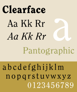
Clearface is a serif typeface designed by Morris Fuller Benton with the collaboration of his father Linn Boyd Benton, produced at American Type Founders in 1907.

ITC Zapf Chancery is a family of script typefaces designed by the type designer Hermann Zapf and marketed by the International Typeface Corporation. It is one of the three typefaces designed by Zapf that are shipped with computers running Apple's Mac OS. It is also one of the core PostScript fonts.

<span class="mw-page-title-main">Venus (typeface)</span> Grotesque sans-serif typeface

Venus or Venus-Grotesk is a sans-serif typeface family released by the Bauer Type Foundry of Frankfurt am Main, Germany from 1907 onwards. Released in a large range of styles, including condensed and extended weights, it was very popular in the early-to-mid twentieth century. It was exported to other countries, notably the United States, where it was distributed by Bauer Alphabets Inc, the U.S. branch of the firm.

References

  1. "Geometric fonts". Linotype. Retrieved 9 May 2016.
  2. "Century Gothic". Fonts.com. Retrieved 9 May 2016.
  3. Simonson, Mark. "Monotype's Other Arials". Mark Simonson Studio. Retrieved 14 July 2015.
  4. Gavin Ambrose; Paul Harris (1 November 2006). The Fundamentals of Typography. AVA Publishing. p. 145. ISBN   978-2-940373-45-1.
  5. David Kadavy (8 August 2011). Design for Hackers: Reverse Engineering Beauty. John Wiley & Sons. p. 298. ISBN   978-1-119-99901-0.
  6. Coles, Stephen. "Alternatives to Futura". Fontshop. Archived from the original on March 16, 2015. Retrieved 2 October 2015.
  7. "Avant Garde Gothic Alternates Are Back". Font Feed. FontShop . Retrieved 9 May 2016.
  8. Shaw, Paul (31 October 2011). "The Kerning Game". Print magazine. Retrieved 9 May 2016.
  9. Simonson, Mark. "The Scourge of Arial". Mark Simonson Studio Notebook. Retrieved 19 March 2016.
  10. Downer, John. "Call It What It Is". Emigre . Retrieved 20 March 2016.
  11. "Century Gothic font family" . Retrieved 7 December 2021.
  12. "Cloud fonts in Office" . Retrieved 7 December 2021.
  13. "Levenim MT font family" . Retrieved 6 December 2021.
  14. "Wis. college says new e-mail typeface will save money". Archived from the original on April 6, 2010.
  15. Ramde, Dinesh (April 7, 2010). "Century Gothic a font of wisdom". Twincities.com. Retrieved 2014-04-01.
  16. "PrintWise". Strategic Sourcing. General Services Administration. Archived from the original on 2014-03-29. Retrieved 2014-04-01.
  17. Stix, Madeleine (March 28, 2014). Teen to gov't: change your typeface, save millions. CNN via KOCO-TV. Retrieved March 28, 2014.
  18. "Fonts". R Cookbook. Retrieved 7 April 2016.
  19. Horton, Nicholas (19 April 2010). "Specifying fonts in graphics". SAS & R. Retrieved 7 April 2016.
  20. "URW Palladio". The LaTeX font catalogue. TeX Users Group Denmark. Retrieved 7 April 2016.