Perpetua is a seriftypeface that was designed by the English sculptor and stonemason Eric Gill for the British Monotype Corporation. Perpetua was commissioned at the request of Stanley Morison, an influential historian of printing and adviser to Monotype around 1925, when Gill's reputation as a leading artist-craftsman was high.[1] Perpetua was intended as a crisp, contemporary design that did not follow any specific historic model, with a structure influenced by Gill's experience of carving lettering for monuments and memorials. Perpetua is commonly used for covers and headings and also sometimes for body text and has been particularly popular in fine book printing.[2][3][4] Perpetua was released with characters for the Greek alphabet and a matching set of titling capitals for headings.
Perpetua is named for the Christian martyr Vibia Perpetua, an account of whose life was used in one of its first showings. Its companion italic is named "Felicity" for her companion of that name. The choice had appeal to Morison and Gill, both of whom were converts to Catholicism.[5][6]
Design
A Gill inscription in memorial to Sir Harry Johnston, showing some similarities to Perpetua.The first specimen of Perpetua in The Fleuron, a magazine on fine printing edited by Morison.
Perpetua is often classified as a transitional serif font, with a delicate structure somewhat similar to British fonts from the eighteenth century such as Baskerville and stonecarved (lapidary) inscriptions in the same style.[7][3] However, it does not directly revive any specific historical model. Characteristic "transitional" features in Perpetua include considerable contrast in stroke width, crisp horizontal serifs, a delicate colour on the page and a reasonably vertical axis, with letters such as 'O' having their thinnest points at the top and bottom.[8][9][10]
Perpetua in a metal type sample, showing the flourishes on italic 'B', 'D', 'P', 'Q' and 'R'
Along with these characteristics, Perpetua bears the distinct personality of Gill's characteristic preferences in carving monumental lettering for uses such as tombstones, dedications and war memorials. Fine book printer Christopher Sandford of the Chiswick Press, who knew Gill, commented that "all Gill's types…are variants of Gill's own very lovely, very personal hand-lettering."[11] Letter designs in Perpetua common in Gill's work include the 'a' that forms a sharp point without serif, the extended leg of the 'R' and the flat-topped 'A'.[12] In italic, the 'a' has a smooth top and the 'g' is a "single-storey" design recalling handwriting.[13][14] The top of the 'f' has a wedge-shaped serif.[15] Historian James Mosley suggests that a rubbing of a 1655 engraving at Rye may have been an influence on the design.[16] Perpetua's italic also has some flourishes in the capitals. However, rather than being fully cursive in style, some characters resemble oblique type or the "sloped roman" style, a style rarely used for serif fonts in which letters are slanted but do not take on as many handwriting characteristics as in a "true italic". Examples of this are the flat foot serifs on letters like 'h', 'm' and 'n', where most body text italics would have a curl or no serif at all.[17] In structure, Perpetua appears relatively light in colour and rather "small" on the page, although this is less problematic in the carefully designed metal type, in which every size was carefully drawn differently, than in digital facsimile.[18][19]
Background
A 1947 publicity manual advertising Hopton Wood stone, a limestone often used by Eric Gill for his carvings. Perpetua Italic is used for the heading and Baskerville for body text.
Gill began work on Perpetua in 1925 at the request of Stanley Morison, typographical advisor to Monotype; they had met in 1913.[20][21][22] Morison sought Gill's talent to design a new typeface for the foundry, asking for a "roman letter suitable for book reading, which while being new, was to be of general utility and in no respect unusual."[23] In his memoir and assessment of Monotype's work, A Tally of Types (1953, after Gill's death), Morison claimed that he had chosen to collaborate with Gill because of a desire to create a new typeface on a pattern following no past model, and an impression that previous artistically inclined typefaces cut as niche products for the private use of fine press printing companies had been too eccentric:
it still remained desirable to cut…an original face [which] required a living artist capable of the work. There was no lack of fine calligraphers or fine printers in Britain and Germany [but] the possibility was remote of securing from this source a satisfactory set of drawings of a new roman and italic suitable for work of every sort…with the possible exceptions of the Doves and Golden Type, their efforts had been new and peculiar...[22][lower-alpha 1]
A text showing types printed by the Kelmscott Press of William Morris, in a medieval style. Morison found this style somewhat excessive and sought in engaging Gill to create a typeface that would be artistic yet avoid such eccentricities.
Morison wrote that he felt that Gill as a sculptor, with a trade of work more akin to the engraving process used to sculpt the master punches traditionally used to make metal type, could succeed where these designers, mostly trained in calligraphy, had not:
The finely bracketed serif with which the sculptors of the roman inscriptions dignified their alphabet is symbolic; it signified their sense of the fundamental difference between private and public writing; between script and inscription. Thus the function of the serif must be understood by the artist if his book-type is to have a chance of succeeding. The fine serif is not in origin calligraphic but epigraphic; not written but sculptured. It follows that a set of drawings of a finely serifed type by a contemporary practitioner of lettering could best be made by [a sculptor] and Gill was the obvious man to solve it. He was asked to make drawings of the letters he had long been habitually carving.[22]
Morison engaged Gill to develop drawings for the face around 1925.[20]
Usage
A 1938 title page designed by Gill and cut into wood by Ralph Beedham, very similar in structure to Perpetua Titling. Printed by the Golden Cockerel Press.
Mosley, in an article on Perpetua's development, comments that the design's:
openness and small x-height make it far from economical in use, and the delicacy - even spindliness - of its cutting are a severe handicap. It reveals its qualities best in the richly-inked and crisply machined first specimen text.[28]
Perpetua in New Zealand Broadcasting Corporation concert programme from 1962. An example of the kind of niche printing on high-quality paper with which Perpetua has always been associated.
Ultimately, despite Morison's high hopes for Perpetua, it has remained something of a niche face, particularly popular for high-quality printing projects and uses such as headings. Morison late in life conceded that
the question whether the sizes 8- to 14-point fully realise the ambition with which they were begun, i.e. to create an original type serviceable for all kinds of books, does not permit of an answer in the unqualified affirmative. Perpetua, it may be said at once, is eminently suitable for certain kinds of books...with which a certain obvious degree of 'style' is desired, as for example, the semi-private printing with which Gill was for a long time intimately associated.[22]
Comparison between Perpetua Titling (above) and Perpetua (below). The display type has much finer details.
Perpetua's appeal to fine book printers has been long-standing since its release, both in the UK and abroad.[29][30][31] Christopher Sandford wrote of Perpetua and Gill's similar type for the Golden Cockerel Press that "it is important that type in combination with finely cut engravings should not be so 'bold' as to 'kill' the artists' work, it is also important that it should not be too light to make a comfortable combination. While Gill's Perpetua is probably better suited to combine with line-engravings in copper, etchings, mezzotints or watercolour paintings, the [somewhat bolder] 'Golden Cockerel' type undoubtedly fulfilled Gill's intention for it to combine most charmingly with surface printing from wood-blocks."[11][lower-alpha 2]Vivian Ridler, some years later to become Printer to the University of Oxford, was so inspired by Gill's work around this time that he named his side printing project the Perpetua Press after the font in 1933.[33][34][35] OUP book designer Hugh Williamson, in his Methods of Book Design (1956), however warned that Perpetua's 12 pt size was smaller than "any other series now in general use" but commented that Gill had proven that "the design of alphabets for printing has further achievements to offer to artists of the stature to reach them."[36]
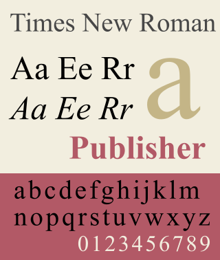
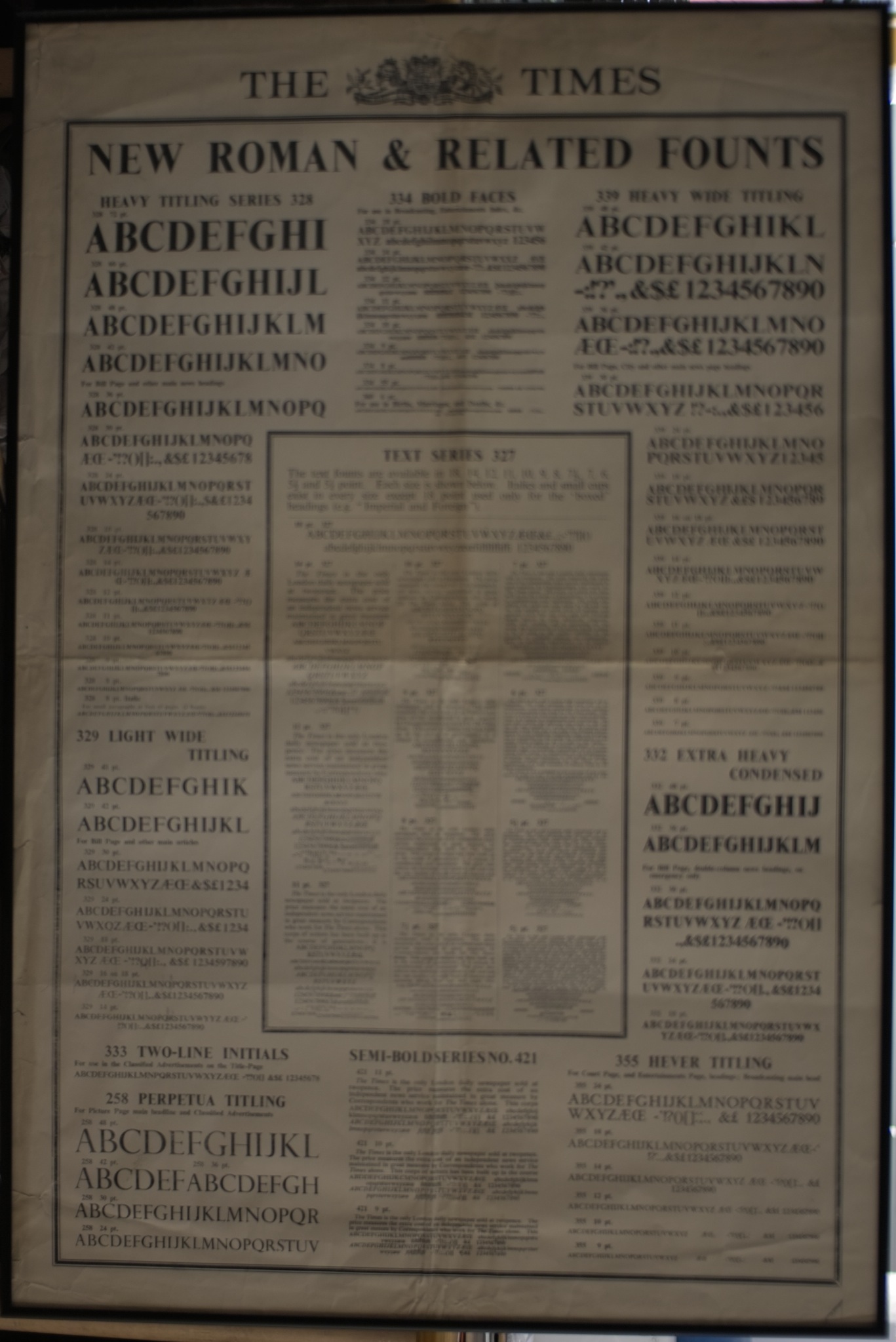
Two connected designs created around and after the time of its project at Morison's instigation became among the most popular typefaces ever designed. Morison was consulted to advise on a custom typeface for the Times around the end of Perpetua's convoluted development. One of several options proposed was a modified version of Perpetua, increased in bulk for the conditions of newspaper printing.[37] (Robin Kinross has noted that Perpetua's basic design is "hardly robust enough for newspaper printing."[37]) In the end Monotype created a new font, Times New Roman, for that project instead, basing it on an earlier typeface named Plantin, but one of the key modifications was sharpening Times's serifs, similar to Perpetua's design; Morison's cited reason for the change was to resemble the previous fonts used.[38][39][22] Times New Roman when released to general use rapidly became one of the most popular fonts in the history of printing. In Monotype's sales chart through to 1984 Times ranks top of all, with Perpetua eighteenth out of forty-three.[40] The Times did use Perpetua Titling for some sections in the metal type period.
While working on the project Morison engaged Gill also to begin work on a sans-serif project, which became the extremely successful Gill Sans series, ranking fifth on Monotype's sales chart.[41][42][43] Mosley describes this as "a best-selling design whose sales record must have compensated Monotype for many well-meaning failures."[44]
Development
Morison and Gill originally considered for Perpetua a sloped roman, in which the letterforms are slanted but not otherwise modified (top). (Shown is a digitally slanted image, not a copy of Gill's own drawing.) Perpetua's final italic has cursive features as in the 'a' and 'e', but still has some sloped roman features, such as the flat serifs on many letters. Shown below is the more conventional italic of Times New Roman for comparison.
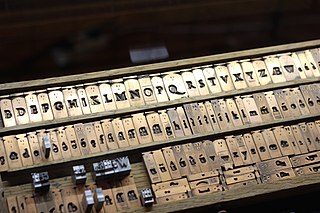
The process of Perpetua's development was extremely convoluted.[46] After Gill had produced his drawings, Morison decided not to send them to the Monotype engineering department at Salfords, Surrey, with which he had had disagreements. Instead, he commissioned at his own expense for the punchcutterCharles Malin of Paris in 1926 to manually engrave punches which were used to cast trial metal type. Manually cutting punches was the standard method of creating the matrices, or moulds used to cast metal type, in the previous century, but was now effectively a niche artisanal approach replaced by machine pantograph engraving.[47][48][lower-alpha 3]
Once the Malin type had been cast, Gill found some of his decisions unsatisfying seen in extended passages of text, leading him to propose changes and corrections. These were ultimately used to develop a final set of working drawings for commercial release.[20][28]
Gill made several attempts at designing a companion italic face for Perpetua. One was a sloped roman (oblique), in which the regular style is slanted without the different letterforms of italic type. This unusual design decision was done under the influence of Morison's opinion that a sloped roman form was preferable to that of cursive italics for use in book text, providing less of a contrast with the roman. However, the oblique was not accepted by Monotype management, who went so far as to declare it "worthless."[50] Ultimately a more conventional italic was used instead.[51] Morison commented to his friend Jan van Krimpen that "we did not give enough slope to it. When we added more slope, it seemed that the fount required a little more cursive to it." A slightly condensed italic alphabet Gill had drawn for Gerald Meynell of the Westminster Press was also considered as a basis for its italic.
An early showing of Perpetua in The Fleuron, a journal edited by Morison, suggested that Gill might design a script or calligraphic font, "Felicity Script", as a companion, but this was never developed. Perpetua was set in a limited edition of a new translation by Walter H. Shewring of The Passion of Perpetua and Felicity, giving birth to the name of the typeface and its companion italic. The book was printed in 1929. The same type and illustrations (also done by Gill) for that book subsequently appeared in the journal on printing Fleuron (number 7) which was edited by Morison and printed in 1930; Gill Sans was also promoted in an issue of it. Also set in Perpetua and published in 1929 was Gill's Art Nonsense and Other Essays.
While some sources give Perpetua a release date of 1929 based on these early uses,[40] Perpetua was not to enter full commercial sale until 1932.[51][28] Once on sale, it was sold for Monotype's typesetting machines, which cast metal type under the control of a keyboard, and also sometimes offered in metal type for hand-setting for the use of larger sizes and smaller printers.[32]
Comparison between printed (top) and digital (bottom) versions of Perpetua
Perpetua has been digitised by Monotype and a basic release is included with Microsoft Office.[4] The professional release adds additional features likely to be used in professional printing, such as small capitals and text figures.[65] Lapidary 333 by Bitstream is an unofficial digitisation.[66]
Related typefaces
As many of Gill's faces and lettering projects show characteristic features, many of Gill's other families are similar in spirit. Joanna has similarities to Perpetua but a more robust colour on the page with regular slab serifs and an only slightly slanted italic; Gill described it as "a book face free from all fancy business". Gill's family for the Golden Cockerel Press, which has been digitised as ITC Golden Cockerel, also has similarities.[67] Monotype's Gill Facia family from the digital period, reviving Gill's lettering projects such as for WH Smith, is a more festive and decorative family in the same style particularly intended for display-size text.[68] After Gill's death Monotype's competitor Linotype, seeking to have a Gill design for their line-up, licensed rights to a roman type by Gill for the Bunyan Press, and released it with a Gill-style italic under the name of "Pilgrim". This proved very successful: Frank Newfeld has praised it as "a gutsier Perpetua".[69][70]
Financier, by Kris Sowersby, is a respected revival influenced by Perpetua and other Gill designs, in particular the more solid Solus and Joanna.[71][72] Particularly acclaimed for being released in optical sizes for small and large text unlike the official Monotype digitisations, it was commissioned by the Financial Times and has also been commercially released.[73][74]
Also loosely inspired by Perpetua is Constantia, a typeface by John Hudson for Microsoft and intended to render well for onscreen display.[15][75]
Notes
↑ Morison was being polite on the topic of the Kelmscott Press's Golden Type. In his private correspondence, he had referred to it as "positively foul".[24][25]
↑ Although this may be a personal conclusion: Gill's friend Robert Gibbings wrote to the nun and artist Dame Hildelith Cumming seeking advice on improving Stanbrook Abbey's printing press in 1956 that "it is just the right weight to go with wood-engravings or large initials".[32]
↑ Historian G. W. Ovink derided Morison's attachment to manually engraving pilot versions of metal type by hand as worshipping the past for no good reason in a review of his work printed shortly after his death: "the data [of trial proofs]...could have been obtained more quickly and cheaply and with more informative results by the intelligent use of existing machine-cutting routines...the mystique of tradition…of craft secrets inexplicable to modern science but still so miraculously effective; of the dying race of venerable handworkers who have got it, in their fingertips…all this Morison should have seen through."[49]
Related Research Articles
Times New Roman is a serif typeface. It was commissioned by the British newspaper The Times in 1931 and conceived by Stanley Morison, the artistic adviser to the British branch of the printing equipment company Monotype, in collaboration with Victor Lardent, a lettering artist in The Times's advertising department. It has become one of the most popular typefaces of all time and is installed on most personal computers.
In typography and lettering, a sans-serif, sans serif, gothic, or simply sans letterform is one that does not have extending features called "serifs" at the end of strokes. Sans-serif typefaces tend to have less stroke width variation than serif typefaces. They are often used to convey simplicity and modernity or minimalism. For the purposes of type classification, sans-serif designs are usually divided into these major groups: § Grotesque and § Neo-grotesque, § Geometric, § Humanist and § Other or mixed.
In typography, a serif is a small line or stroke regularly attached to the end of a larger stroke in a letter or symbol within a particular font or family of fonts. A typeface or "font family" making use of serifs is called a serif typeface, and a typeface that does not include them is sans-serif. Some typography sources refer to sans-serif typefaces as "grotesque" or "Gothic", and serif typefaces as "roman".
In typography, italic type is a cursive font based on a stylised form of calligraphic handwriting. Along with blackletter and roman type, it served as one of the major typefaces in the history of Western typography.
Gill Sans is a humanist sans-serif typeface designed by Eric Gill and released by the British branch of Monotype from 1928 onwards.
In the manufacture of metal type used in letterpress printing, a matrix is the mould used to cast a letter, known as a sort. Matrices for printing types were made of copper.
Stanley Arthur Morison was a British typographer, printing executive and historian of printing. Largely self-educated, he promoted higher standards in printing and an awareness of the best printing and typefaces of the past.
Oblique type is a form of type that slants slightly to the right, used for the same purposes as italic type. Unlike italic type, however, it does not use different glyph shapes; it uses the same glyphs as roman type, except slanted. Oblique and italic type are technical terms to distinguish between the two ways of creating slanted font styles; oblique designs may be labelled italic by companies selling fonts or by computer programs. Oblique designs may also be called slanted or sloped roman styles. Oblique fonts, as supplied by a font designer, may be simply slanted, but this is often not the case: many have slight corrections made to them to give curves more consistent widths, so they retain the proportions of counters and the thick-and-thin quality of strokes from the regular design.
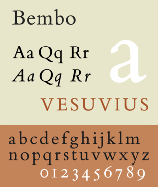
Bembo is a serif typeface created by the British branch of the Monotype Corporation in 1928–1929 and most commonly used for body text. It is a member of the "old-style" of serif fonts, with its regular or roman style based on a design cut around 1495 by Francesco Griffo for Venetian printer Aldus Manutius, sometimes generically called the "Aldine roman". Bembo is named for Manutius's first publication with it, a small 1496 book by the poet and cleric Pietro Bembo. The italic is based on work by Giovanni Antonio Tagliente, a calligrapher who worked as a printer in the 1520s, after the time of Manutius and Griffo.
Joanna is a serif typeface designed by Eric Gill (1882–1940) from 1930 to 1931 that was named for one of his daughters. Gill chose Joanna for setting An Essay on Typography, a book by Gill on his thoughts on typography, typesetting and page design. He described it as "a book face free from all fancy business".
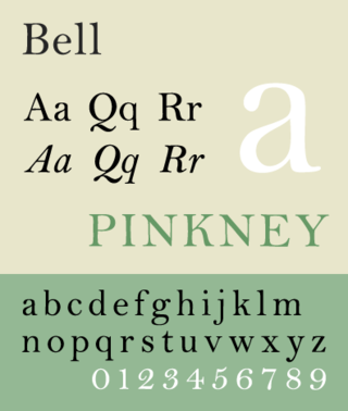
Bell is the name given to a serif typeface designed and cut in 1788 by the punchcutter Richard Austin for the British Letter Foundry, operated by publisher John Bell, and revived several times since.
Monotype Grotesque is a family of sans-serif typefaces released by the Monotype Corporation for its hot metal typesetting system. It belongs to the grotesque or industrial genre of early sans-serif designs. Like many early sans-serifs, it forms a sprawling family designed at different times.
Imprint is a serif typeface created by Monotype, commonly used for body text. Originally called Imprint Old Face, it is a sturdy, amiable design with a large x-height, Caslon-like but with more regularity in its letterforms. It was commissioned by the London publishers of The Imprint, a short-lived printing trade periodical published during 1913.
Ehrhardt is an old-style serif typeface released by the British branch of the Monotype Corporation in 1938. Ehrhardt is a modern adaptation of printing types of "stout Dutch character" from the Dutch Baroque tradition sold by the Ehrhardt foundry in Leipzig. These were cut by the Hungarian-Transylvanian pastor and punchcutter Miklós (Nicholas) Tótfalusi Kis while in Amsterdam in the period from 1680 to 1689.
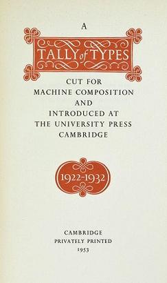
A Tally of Types is a book on typography authored by the type designer Stanley Morison. It was first published in 1953, and showcases significant typeface designs produced during Morison's tenure at the Lanston Monotype Corporation for their hot-metal typesetting machines during the 1920s and 1930s in England.
Solus is a serif typeface that was designed by English sculptor and stonemason Eric Gill for the British Monotype Corporation and released in 1929.
Old Style or Modernised Old Style was the name given to a series of serif typefaces cut from the mid-nineteenth century and sold by the type foundry Miller & Richard, of Edinburgh in Scotland. It was a standard typeface in Britain for literary and prestigious printing in the second half of the nineteenth century and the early twentieth century, with many derivatives and copies released.
Frank Hinman Pierpont was an American engineer and typeface designer. He worked primarily in England for the Monotype Corporation of Britain.
Roman lettering or Trajan lettering refers to the use by artists and signwriters of Roman capitals in modern lettering, particularly in Britain.
References
↑ Brewer, Roy. Eric Gill: The Man Who Loved Letters.
↑ Poole, J. Stephen (January 1982). "Stanley Morison, Catholic and Man of Letters". The Heythrop Journal. 23 (1): 51–55. doi:10.1111/j.1468-2265.1982.tb00629.x.
↑ Mosley, James. "Eric Gill and the Cockerel Press". Upper & Lower Case. International Typeface Corporation. Archived from the original on 29 July 2012. Retrieved 7 October 2016.{{cite web}}: CS1 maint: bot: original URL status unknown (link)
↑ Mosley, James (1982). "Eric Gill and the Golden Cockerel Type". Matrix. 2: 17–23.
↑ Rhatigan, Daniel (September 2014). "Gill Sans after Gill"(PDF). Forum (28): 3–7. Archived from the original(PDF) on 15 February 2015. Retrieved 26 December 2015.
This page is based on this Wikipedia article Text is available under the CC BY-SA 4.0 license; additional terms may apply. Images, videos and audio are available under their respective licenses.


