Horizon chart

Last updated
This image is an example of a horizon chart, illustrating a series of 13 datasets spanning from 2010 to 2020. Horizon-chart example.svg
This image is an example of a horizon chart, illustrating a series of 13 datasets spanning from 2010 to 2020.

A horizon chart or horizon graph is a 2-dimensional data visualisation displaying a quantitative data over a continuous interval, most commonly a time period. The horizon chart is valuable for enabling readers to identify trends and extreme values within large datasets. Similar to sparklines and ridgeline plot, horizon chart may not be the most suitable visualisation for precisely pinpointing specific values. Instead, its strength lies in providing an overview and highlighting patterns and outliers in the data. [1]

Contents

History

The technique of constructing the horizon chart from an area chart was first developed by Takafumi Saito et al. at the Tokyo University of Agriculture and Technology in 2005. [2] This technique was referred to as two-tone pseudo colouring. Subsequently, Panopticon Software independently commercialised the procedure and referred to the resulting visualisations as horizon charts. [3] [4]

Overview

The figure illustrates the five steps involved in transforming an area chart into a horizon chart:A. Define a horizontal axis to differentiate positive values from negative values. B. Reflect negative values above the axis, using blue for positive values and red for negative values. C. Divide the graph into distinct bands. D. Adjust the opacity of the areas based on the number of subdivisions. E. Layer the obtained bands on top of each other to create the final horizon chart. Horizon-chart-from-area-chart.svg
The figure illustrates the five steps involved in transforming an area chart into a horizon chart:A. Define a horizontal axis to differentiate positive values from negative values. B. Reflect negative values above the axis, using blue for positive values and red for negative values. C. Divide the graph into distinct bands. D. Adjust the opacity of the areas based on the number of subdivisions. E. Layer the obtained bands on top of each other to create the final horizon chart.

The horizon chart is a variation of the area chart. Having established a horizontal axis, negative values are mirrored over the horizontal axis, while positive values retain their position. As an alternative approach, rather than reflecting negative values, they can be shifted so that the smaller value aligns with the horizontal axis. Layers are formed by dividing the areas into equal horizontal intervals and overlaying the resulting bands. [2]

Colour is an essential visual element in horizon charts. It serves to differentiate positive values from negative values, and its intensity corresponds to the magnitude of the values. Typically, the colour of each area in the horizon chart is obtained by overlaying multiple transparent bands, with more intense colours indicating larger values and less intense colours representing smaller values. [1]

Horizon charts facilitate a reduction in vertical space, resulting in a more compact chart that resembles a heat map. This enables the consolidation of a substantial volume of data into a single visualisation. The compact nature of the horizon chart enables easy comparison of different data series within a single visualisation. It also lends itself well to the creation of small multiples, where multiple horizon charts can be displayed side by side to analyse and compare various datasets simultaneously. This compact design enhances the efficiency and effectiveness of data analysis and interpretation. [5] [6] [7]

Chart construction

Horizon chart displaying the difference between greenhouse gas emissions of some European country and the corresponding European average for each year, ranging from 2012 to 2021. European greenhouse-emission 2012-2021.svg
Horizon chart displaying the difference between greenhouse gas emissions of some European country and the corresponding European average for each year, ranging from 2012 to 2021.

When creating a horizon chart, the selection of the origin for the vertical axis, which determines the placement of the horizontal axis, is crucial. In most cases, the origin is set to zero. However, this characteristic of the horizon chart can be leveraged to emphasise trends based on an arbitrary value. By selecting a different origin point, such as a specific threshold or benchmark, trends and comparisons can be highlighted in relation to that value. This flexibility allows for the visualisation to be tailored to specific analytical needs or to draw attention to particular trends or deviations from a chosen reference point. Once the origin of the vertical axis is determined, the quantitative variable is assigned to the vertical axis, while the continuous variable is assigned to the horizontal axis. [7] The band layering process in a horizon chart involves dividing the range of values for a dataset into equal horizontal intervals and overlaying these bands to create the final chart. This is the main feature of an horizon chart, enabling its compact visualisation. The small size of the final visualisation, allows the comparison of multiple sets of data in a given series. [7]

Regarding the color scheme in a horizon chart, it is common to utilise a diverging color scheme, like red and blue. Red is typically used to represent negative values or values with a negative meaning, while blue is employed to indicate positive values or values with a positive meaning. [2] This color scheme helps visually distinguish between positive and negative values, aiding in the interpretation and understanding of the chart. [7] In their 2005 article, Saito et al. proposed a different approach to color usage in horizon charts. They utilised the concept of discrete colouring, where the range of the function is divided into multiple sequential intervals, and a distinct color is assigned to each interval. This allows for the precise reading of values based on colour. Unlike divergent colours (such as red and blue), the focus is on using a continuously changing scale of colours to represent the data accurately. By employing this method, the horizon chart enables readers to interpret specific values based on the assigned colours within the chart. [6]

Implementation

Horizon charts can be created using various open-source tools. These tools provide the necessary functionalities to generate horizon charts from data. Some popular open-source options for creating horizon charts include D3.js, [5] R [9] and RAWgraphs [10] among others.

See also

Related Research Articles

Biostatistics are the development and application of statistical methods to a wide range of topics in biology. It encompasses the design of biological experiments, the collection and analysis of data from those experiments and the interpretation of the results.

<span class="mw-page-title-main">Histogram</span> Graphical representation of the distribution of numerical data

A histogram is an approximate representation of the distribution of numerical data. The term was first introduced by Karl Pearson. To construct a histogram, the first step is to "bin" the range of values—that is, divide the entire range of values into a series of intervals—and then count how many values fall into each interval. The bins are usually specified as consecutive, non-overlapping intervals of a variable. The bins (intervals) must be adjacent and are often of equal size.

<span class="mw-page-title-main">Chart</span> Graphical representation of data

A chart is a graphical representation for data visualization, in which "the data is represented by symbols, such as bars in a bar chart, lines in a line chart, or slices in a pie chart". A chart can represent tabular numeric data, functions or some kinds of quality structure and provides different info.

<span class="mw-page-title-main">Bar chart</span> Type of chart

A bar chart or bar graph is a chart or graph that presents categorical data with rectangular bars with heights or lengths proportional to the values that they represent. The bars can be plotted vertically or horizontally. A vertical bar chart is sometimes called a column chart.

<span class="mw-page-title-main">Scatter plot</span> Plot using the dispersal of scattered dots to show the relationship between variables

A scatter plot is a type of plot or mathematical diagram using Cartesian coordinates to display values for typically two variables for a set of data. If the points are coded (color/shape/size), one additional variable can be displayed. The data are displayed as a collection of points, each having the value of one variable determining the position on the horizontal axis and the value of the other variable determining the position on the vertical axis.

A small multiple is a series of similar graphs or charts using the same scale and axes, allowing them to be easily compared. It uses multiple views to show different partitions of a dataset. The term was popularized by Edward Tufte.

<span class="mw-page-title-main">Infographic</span> Graphic visual representation of information

Infographics are graphic visual representations of information, data, or knowledge intended to present information quickly and clearly. They can improve cognition by utilizing graphics to enhance the human visual system's ability to see patterns and trends. Similar pursuits are information visualization, data visualization, statistical graphics, information design, or information architecture. Infographics have evolved in recent years to be for mass communication, and thus are designed with fewer assumptions about the readers' knowledge base than other types of visualizations. Isotypes are an early example of infographics conveying information quickly and easily to the masses.

<span class="mw-page-title-main">Parallel coordinates</span> Chart displaying multivariate data

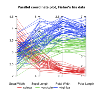
Parallel coordinates are a common way of visualizing and analyzing high-dimensional datasets.

<span class="mw-page-title-main">Color scheme</span> Choice of colors used in design

In color theory, a color scheme is the choice of colors used in various artistic and design contexts. For example, the "Achromatic" use of a white background with black text is an example of a basic and commonly default color scheme in web design.

<span class="mw-page-title-main">Data and information visualization</span> Visual representation of data

Data and information visualization is the practice of designing and creating easy-to-communicate and easy-to-understand graphic or visual representations of a large amount of complex quantitative and qualitative data and information with the help of static, dynamic or interactive visual items. Typically based on data and information collected from a certain domain of expertise, these visualizations are intended for a broader audience to help them visually explore and discover, quickly understand, interpret and gain important insights into otherwise difficult-to-identify structures, relationships, correlations, local and global patterns, trends, variations, constancy, clusters, outliers and unusual groupings within data. When intended for the general public to convey a concise version of known, specific information in a clear and engaging manner, it is typically called information graphics.

<span class="mw-page-title-main">Waterfall chart</span>

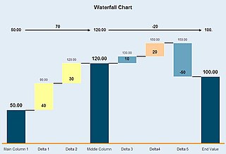
A waterfall chart is a form of data visualization that helps in understanding the cumulative effect of sequentially introduced positive or negative values. These intermediate values can either be time based or category based. The waterfall chart is also known as a flying bricks chart or Mario chart due to the apparent suspension of columns (bricks) in mid-air. Often in finance, it will be referred to as a bridge.

<span class="mw-page-title-main">Line chart</span> Chart type

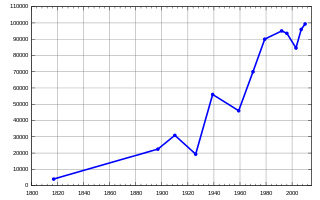
A line chart or line graph, also known as curve chart, is a type of chart which displays information as a series of data points called 'markers' connected by straight line segments. It is a basic type of chart common in many fields. It is similar to a scatter plot except that the measurement points are ordered and joined with straight line segments. A line chart is often used to visualize a trend in data over intervals of time – a time series – thus the line is often drawn chronologically. In these cases they are known as run charts.

A dot chart or dot plot is a statistical chart consisting of data points plotted on a fairly simple scale, typically using filled in circles. There are two common, yet very different, versions of the dot chart. The first has been used in hand-drawn graphs to depict distributions going back to 1884. The other version is described by William S. Cleveland as an alternative to the bar chart, in which dots are used to depict the quantitative values associated with categorical variables.

<span class="mw-page-title-main">Table of nuclides</span> Graph of neutrons vs. protons in nuclides

A table or chart of nuclides is a two-dimensional graph of isotopes of the elements, in which one axis represents the number of neutrons and the other represents the number of protons in the atomic nucleus. Each point plotted on the graph thus represents a nuclide of a known or hypothetical chemical element. This system of ordering nuclides can offer a greater insight into the characteristics of isotopes than the better-known periodic table, which shows only elements and not their isotopes. The chart of the nuclides is also known as the Segrè chart, after the Italian physicist Emilio Segrè.

<span class="mw-page-title-main">Area chart</span> Type of chart

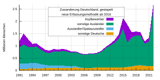
An area chart or area graph displays graphically quantitative data. It is based on the line chart. The area between axis and line are commonly emphasized with colors, textures and hatchings. Commonly one compares two or more quantities with an area chart.

<span class="mw-page-title-main">Plot (graphics)</span>

A plot is a graphical technique for representing a data set, usually as a graph showing the relationship between two or more variables. The plot can be drawn by hand or by a computer. In the past, sometimes mechanical or electronic plotters were used. Graphs are a visual representation of the relationship between variables, which are very useful for humans who can then quickly derive an understanding which may not have come from lists of values. Given a scale or ruler, graphs can also be used to read off the value of an unknown variable plotted as a function of a known one, but this can also be done with data presented in tabular form. Graphs of functions are used in mathematics, sciences, engineering, technology, finance, and other areas.

<span class="mw-page-title-main">Bubble chart</span> Type of chart

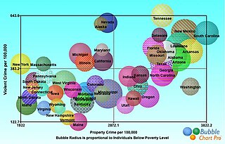
A bubble chart is a type of chart that displays three dimensions of data. Each entity with its triplet (v1, v2, v3) of associated data is plotted as a disk that expresses two of the vi values through the disk's xy location and the third through its size. Bubble charts can facilitate the understanding of social, economical, medical, and other scientific relationships.

<span class="mw-page-title-main">Motion chart</span>

A motion chart is a dynamic bubble chart which allows efficient and interactive exploration and visualization of longitudinal multivariate Data. Motion charts provide mechanisms for mapping ordinal, nominal and quantitative variables onto time, 2D coordinate axes, size, colors, glyphs and appearance characteristics, which facilitate the interactive display of multidimensional and temporal data.

D3.js is a JavaScript library for producing dynamic, interactive data visualizations in web browsers. It makes use of Scalable Vector Graphics (SVG), HTML5, and Cascading Style Sheets (CSS) standards. It is the successor to the earlier Protovis framework. Its development was noted in 2011, as version 2.0.0 was released in August 2011. With the release of version 4.0.0 in June 2016, D3 was changed from a single library into a collection of smaller, modular libraries that can be used independently.

<span class="mw-page-title-main">Misleading graph</span> Graph that misrepresents data

In statistics, a misleading graph, also known as a distorted graph, is a graph that misrepresents data, constituting a misuse of statistics and with the result that an incorrect conclusion may be derived from it.

References

  1. 1 2 Schwabish, Jonathan A. (2021). Better data visualizations: a guide for scholars, researchers, and wonks. New York: Columbia University Press. pp. 164–166. ISBN   978-0-231-19311-5.
  2. 1 2 3 Heer, Jeffrey; Kong, Nicholas; Agrawala, Maneesh (2009-04-04). "Sizing the horizon: the effects of chart size and layering on the graphical perception of time series visualizations". Proceedings of the SIGCHI Conference on Human Factors in Computing Systems. CHI '09. New York, NY, USA: Association for Computing Machinery: 1303–1312. doi:10.1145/1518701.1518897. ISBN   978-1-60558-246-7. S2CID   15483568.
  3. Camoes, Jorge (2012-06-11). "The Horizon Graph Is a Reorderable Matrix Too: Unemployment Rate 1976-2012". The Excel Charts Blog. Retrieved 2023-07-05.
  4. Few, Stephen (2008). "Time on the Horizon". Perceptual Edge
  5. 1 2 Bostock, Mike (2023-06-21). "Horizon Chart". Observable. Retrieved 2023-07-05.
  6. 1 2 Saito, T.; Miyamura, H.N.; Yamamoto, M.; Saito, H.; Hoshiya, Y.; Kaseda, T. (2005). "Two-tone pseudo coloring: Compact visualization for one-dimensional data". IEEE Symposium on Information Visualization, 2005. INFOVIS 2005. IEEE. pp. 173–180. doi:10.1109/INFVIS.2005.1532144. ISBN   978-0-7803-9464-3. S2CID   17952223.
  7. 1 2 3 4 Reijner, Hannes. "The Development of the Horizon Graph". Panopticon Software
  8. "Greenhouse gas emissions by source sector (source: EEA)". ec.europa.eu. Retrieved 2023-07-06.
  9. kjytay (2022-03-31). "What is a horizon chart? | R-bloggers" . Retrieved 2023-07-05.
  10. "How to make a horizon graph". www.rawgraphs.io. Retrieved 2023-07-05.

Further reading