Data and information visualization (data viz/vis or info viz/vis)[2] is the practice of designing and creating easy-to-communicate and easy-to-understand graphic or visual representations of a large amount[3] of complex quantitative and qualitative data and information with the help of static, dynamic or interactive visual items. Typically based on data and information collected from a certain domain of expertise, these visualizations are intended for a broader audience to help them visually explore and discover, quickly understand, interpret and gain important insights into otherwise difficult-to-identify structures, relationships, correlations, local and global patterns, trends, variations, constancy, clusters, outliers and unusual groupings within data (exploratory visualization).[4][5][6] When intended for the general public (mass communication) to convey a concise version of known, specific information in a clear and engaging manner (presentational or explanatory visualization),[4] it is typically called information graphics.
Information visualization, on the other hand, deals with multiple, large-scale and complicated datasets which contain quantitative (numerical) data as well as qualitative (non-numerical, i.e. verbal or graphical) and primarily abstract information and its goal is to add value to raw data, improve the viewers' comprehension, reinforce their cognition and help them derive insights and make decisions as they navigate and interact with the computer-supported graphical display. Visual tools used in information visualization include maps (such as tree maps), animations, infographics, Sankey diagrams, flow charts, network diagrams, semantic networks, entity-relationship diagrams, venn diagrams, timelines, mind maps, etc.
Effective data visualization is properly sourced, contextualized, simple and uncluttered. The underlying data is accurate and up-to-date to make sure that insights are reliable. Graphical items are well-chosen for the given datasets and aesthetically appealing, with shapes, colors and other visual elements used deliberately in a meaningful and non-distracting manner. The visuals are accompanied by supporting texts (labels and titles). These verbal and graphical components complement each other to ensure clear, quick and memorable understanding. Effective information visualization is aware of the needs and concerns and the level of expertise of the target audience, deliberately guiding them to the intended conclusion.[9][3] Such effective visualization can be used not only for conveying specialized, complex, big data-driven ideas to a wider group of non-technical audience in a visually appealing, engaging and accessible manner, but also to domain experts and executives for making decisions, monitoring performance, generating new ideas and stimulating research.[9][4] In addition, data scientists, data analysts and data mining specialists use data visualization to check the quality of data, find errors, unusual gaps and missing values in data, clean data, explore the structures and features of data and assess outputs of data-driven models.[4] In business, data and information visualization can constitute a part of data storytelling, where they are paired with a coherent narrative structure or storyline to contextualize the analyzed data and communicate the insights gained from analyzing the data clearly and memorably with the goal of convincing the audience into making a decision or taking an action in order to create business value.[3][10] This can be contrasted with the field of statistical graphics, where complex statistical data are communicated graphically in an accurate and precise manner among researchers and analysts with statistical expertise to help them perform exploratory data analysis or to convey the results of such analyses, where visual appeal, capturing attention to a certain issue and storytelling are not as important.[11]
The field of data and information visualization is of interdisciplinary nature as it incorporates principles found in the disciplines of descriptive statistics (as early as the 18th century),[12]visual communication, graphic design, cognitive science and, more recently, interactive computer graphics and human-computer interaction.[13] Since effective visualization requires design skills, statistical skills and computing skills, it is argued by authors such as Gershon and Page that it is both an art and a science.[14] The neighboring field of visual analytics marries statistical data analysis, data and information visualization and human analytical reasoning through interactive visual interfaces to help human users reach conclusions, gain actionable insights and make informed decisions which are otherwise difficult for computers to do.
Research into how people read and misread various types of visualizations is helping to determine what types and features of visualizations are most understandable and effective in conveying information.[15][16] On the other hand, unintentionally poor or intentionally misleading and deceptive visualizations (misinformative visualization) can function as powerful tools which disseminate misinformation, manipulate public perception and divert public opinion toward a certain agenda.[17] Thus data visualization literacy has become an important component of data and information literacy in the information age akin to the roles played by textual, mathematical and visual literacy in the past.[18]
Overview
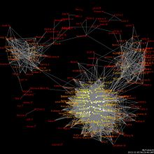
Data visualization is one of the steps in analyzing data and presenting it to users.Partial map of the Internet early 2005 represented as a graph, each line represents two IP addresses, and some delay between those two nodes.
Data and information visualization presumes that "visual representations and interaction techniques take advantage of the human eye's broad bandwidth pathway into the mind to allow users to see, explore, and understand large amounts of information at once. Information visualization focused on the creation of approaches for conveying abstract information in intuitive ways."[20]
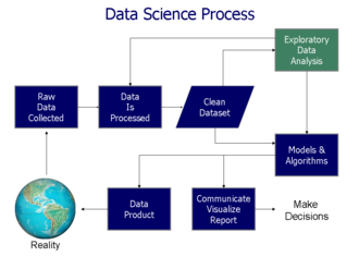
Data analysis is an indispensable part of all applied research and problem solving in industry. The most fundamental data analysis approaches are visualization (histograms, scatter plots, surface plots, tree maps, parallel coordinate plots, etc.), statistics (hypothesis test, regression, PCA, etc.), data mining (association mining, etc.), and machine learning methods (clustering, classification, decision trees, etc.). Among these approaches, information visualization, or visual data analysis, is the most reliant on the cognitive skills of human analysts, and allows the discovery of unstructured actionable insights that are limited only by human imagination and creativity. The analyst does not have to learn any sophisticated methods to be able to interpret the visualizations of the data. Information visualization is also a hypothesis generation scheme, which can be, and is typically followed by more analytical or formal analysis, such as statistical hypothesis testing.
To communicate information clearly and efficiently, data visualization uses statistical graphics, plots, information graphics and other tools. Numerical data may be encoded using dots, lines, or bars, to visually communicate a quantitative message.[21] Effective visualization helps users analyze and reason about data and evidence.[22] It makes complex data more accessible, understandable, and usable, but can also be reductive.[23] Users may have particular analytical tasks, such as making comparisons or understanding causality, and the design principle of the graphic (i.e., showing comparisons or showing causality) follows the task. Tables are generally used where users will look up a specific measurement, while charts of various types are used to show patterns or relationships in the data for one or more variables.
Data visualization refers to the techniques used to communicate data or information by encoding it as visual objects (e.g., points, lines, or bars) contained in graphics. The goal is to communicate information clearly and efficiently to users. It is one of the steps in data analysis or data science. According to Vitaly Friedman (2008) the "main goal of data visualization is to communicate information clearly and effectively through graphical means. It doesn't mean that data visualization needs to look boring to be functional or extremely sophisticated to look beautiful. To convey ideas effectively, both aesthetic form and functionality need to go hand in hand, providing insights into a rather sparse and complex data set by communicating its key aspects in a more intuitive way. Yet designers often fail to achieve a balance between form and function, creating gorgeous data visualizations which fail to serve their main purpose — to communicate information".[24]
Indeed, Fernanda Viegas and Martin M. Wattenberg suggested that an ideal visualization should not only communicate clearly, but stimulate viewer engagement and attention.[25]
Edward Tufte has explained that users of information displays are executing particular analytical tasks such as making comparisons. The design principle of the information graphic should support the analytical task.[28] As William Cleveland and Robert McGill show, different graphical elements accomplish this more or less effectively. For example, dot plots and bar charts outperform pie charts.[29]
In his 1983 book The Visual Display of Quantitative Information,[30]Edward Tufte defines 'graphical displays' and principles for effective graphical display in the following passage: "Excellence in statistical graphics consists of complex ideas communicated with clarity, precision, and efficiency. Graphical displays should:
show the data
induce the viewer to think about the substance rather than about methodology, graphic design, the technology of graphic production, or something else
avoid distorting what the data has to say
present many numbers in a small space
make large data sets coherent
encourage the eye to compare different pieces of data
reveal the data at several levels of detail, from a broad overview to the fine structure
serve a reasonably clear purpose: description, exploration, tabulation, or decoration
be closely integrated with the statistical and verbal descriptions of a data set.
Graphics reveal data. Indeed, graphics can be more precise and revealing than conventional statistical computations."[31]
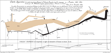
For example, the Minard diagram shows the losses suffered by Napoleon's army in the 1812–1813 period. Six variables are plotted: the size of the army, its location on a two-dimensional surface (x and y), time, the direction of movement, and temperature. The line width illustrates a comparison (size of the army at points in time), while the temperature axis suggests a cause of the change in army size. This multivariate display on a two-dimensional surface tells a story that can be grasped immediately while identifying the source data to build credibility. Tufte wrote in 1983 that: "It may well be the best statistical graphic ever drawn."[31]
Not applying these principles may result in misleading graphs, distorting the message, or supporting an erroneous conclusion. According to Tufte, chartjunk refers to the extraneous interior decoration of the graphic that does not enhance the message or gratuitous three-dimensional or perspective effects. Needlessly separating the explanatory key from the image itself, requiring the eye to travel back and forth from the image to the key, is a form of "administrative debris." The ratio of "data to ink" should be maximized, erasing non-data ink where feasible.[31]
The Congressional Budget Office summarized several best practices for graphical displays in a June 2014 presentation. These included: a) Knowing your audience; b) Designing graphics that can stand alone outside the report's context; and c) Designing graphics that communicate the key messages in the report.[32]
Quantitative messages
The same dataset plotted in three charts: Top panel is a bar chart depicting the flow of occurrences over time (resembles the Sankey diagram in the New York Times original ). Middle panel is a bubble chart that separately quantifies discrete outcomes. Bottom panel is an exploded pie chart showing relative shares of categories, and shares within categories.
Author Stephen Few described eight types of quantitative messages that users may attempt to understand or communicate from a set of data and the associated graphs used to help communicate the message:
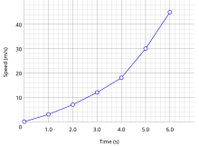
Time-series: A single variable is captured over a period of time, such as the unemployment rate or temperature measures over a 10-year period. A line chart may be used to demonstrate the trend over time.
Ranking: Categorical subdivisions are ranked in ascending or descending order, such as a ranking of sales performance (the measure) by sales persons (the category, with each sales person a categorical subdivision) during a single period. A bar chart may be used to show the comparison across the sales persons.
Part-to-whole: Categorical subdivisions are measured as a ratio to the whole (i.e., a percentage out of 100%). A pie chart or bar chart can show the comparison of ratios, such as the market share represented by competitors in a market.
Deviation: Categorical subdivisions are compared against a reference, such as a comparison of actual vs. budget expenses for several departments of a business for a given time period. A bar chart can show comparison of the actual versus the reference amount.
Frequency distribution: Shows the number of observations of a particular variable for given interval, such as the number of years in which the stock market return is between intervals such as 0–10%, 11–20%, etc. A histogram, a type of bar chart, may be used for this analysis. A boxplot helps visualize key statistics about the distribution, such as median, quartiles, outliers, etc.
Correlation: Comparison between observations represented by two variables (X,Y) to determine if they tend to move in the same or opposite directions. For example, plotting unemployment (X) and inflation (Y) for a sample of months. A scatter plot is typically used for this message.
Nominal comparison: Comparing categorical subdivisions in no particular order, such as the sales volume by product code. A bar chart may be used for this comparison.
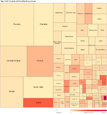
Geographic or geospatial: Comparison of a variable across a map or layout, such as the unemployment rate by state or the number of persons on the various floors of a building. A cartogram is a typical graphic used.[21][34]
Analysts reviewing a set of data may consider whether some or all of the messages and graphic types above are applicable to their task and audience. The process of trial and error to identify meaningful relationships and messages in the data is part of exploratory data analysis.
Visual perception and data visualization
A human can distinguish differences in line length, shape, orientation, distances, and color (hue) readily without significant processing effort; these are referred to as "pre-attentive attributes". For example, it may require significant time and effort ("attentive processing") to identify the number of times the digit "5" appears in a series of numbers; but if that digit is different in size, orientation, or color, instances of the digit can be noted quickly through pre-attentive processing.[35]
Compelling graphics take advantage of pre-attentive processing and attributes and the relative strength of these attributes. For example, since humans can more easily process differences in line length than surface area, it may be more effective to use a bar chart (which takes advantage of line length to show comparison) rather than pie charts (which use surface area to show comparison).[35]
Human perception/cognition and data visualization
Almost all data visualizations are created for human consumption. Knowledge of human perception and cognition is necessary when designing intuitive visualizations.[36] Cognition refers to processes in human beings like perception, attention, learning, memory, thought, concept formation, reading, and problem solving.[37] Human visual processing is efficient in detecting changes and making comparisons between quantities, sizes, shapes and variations in lightness. When properties of symbolic data are mapped to visual properties, humans can browse through large amounts of data efficiently. It is estimated that 2/3 of the brain's neurons can be involved in visual processing. Proper visualization provides a different approach to show potential connections, relationships, etc. which are not as obvious in non-visualized quantitative data. Visualization can become a means of data exploration.
Studies have shown individuals used on average 19% less cognitive resources, and 4.5% better able to recall details when comparing data visualization with text.[38]
The modern study of visualization started with computer graphics, which "has from its beginning been used to study scientific problems. However, in its early days the lack of graphics power often limited its usefulness. The recent emphasis on visualization started in 1987 with the special issue of Computer Graphics on Visualization in Scientific Computing. Since then there have been several conferences and workshops, co-sponsored by the IEEE Computer Society and ACM SIGGRAPH".[39] They have been devoted to the general topics of data visualization, information visualization and scientific visualization, and more specific areas such as volume visualization. In 1786, William Playfair published the first presentation graphics.
There is no comprehensive 'history' of data visualization. There are no accounts that span the entire development of visual thinking and the visual representation of data, and which collate the contributions of disparate disciplines.[40] Michael Friendly and Daniel J Denis of York University are engaged in a project that attempts to provide a comprehensive history of visualization. Contrary to general belief, data visualization is not a modern development. Since prehistory, stellar data, or information such as location of stars were visualized on the walls of caves (such as those found in Lascaux Cave in Southern France) since the Pleistocene era.[41] Physical artefacts such as Mesopotamian clay tokens (5500 BC), Inca quipus (2600 BC) and Marshall Islands stick charts (n.d.) can also be considered as visualizing quantitative information.[42][43]
The first documented data visualization can be tracked back to 1160 B.C. with Turin Papyrus Map which accurately illustrates the distribution of geological resources and provides information about quarrying of those resources.[44] Such maps can be categorized as thematic cartography, which is a type of data visualization that presents and communicates specific data and information through a geographical illustration designed to show a particular theme connected with a specific geographic area. Earliest documented forms of data visualization were various thematic maps from different cultures and ideograms and hieroglyphs that provided and allowed interpretation of information illustrated. For example, Linear B tablets of Mycenae provided a visualization of information regarding Late Bronze Age era trades in the Mediterranean. The idea of coordinates was used by ancient Egyptian surveyors in laying out towns, earthly and heavenly positions were located by something akin to latitude and longitude at least by 200 BC, and the map projection of a spherical Earth into latitude and longitude by Claudius Ptolemy [c.85–c.165] in Alexandria would serve as reference standards until the 14th century.[44]
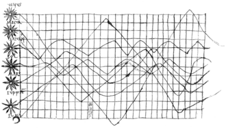
The invention of paper and parchment allowed further development of visualizations throughout history. Figure shows a graph from the 10th or possibly 11th century that is intended to be an illustration of the planetary movement, used in an appendix of a textbook in monastery schools.[45] The graph apparently was meant to represent a plot of the inclinations of the planetary orbits as a function of the time. For this purpose, the zone of the zodiac was represented on a plane with a horizontal line divided into thirty parts as the time or longitudinal axis. The vertical axis designates the width of the zodiac. The horizontal scale appears to have been chosen for each planet individually for the periods cannot be reconciled. The accompanying text refers only to the amplitudes. The curves are apparently not related in time.
Planetary movements
By the 16th century, techniques and instruments for precise observation and measurement of physical quantities, and geographic and celestial position were well-developed (for example, a "wall quadrant" constructed by Tycho Brahe [1546–1601], covering an entire wall in his observatory). Particularly important were the development of triangulation and other methods to determine mapping locations accurately.[40] Very early, the measure of time led scholars to develop innovative way of visualizing the data (e.g. Lorenz Codomann in 1596, Johannes Temporarius in 1596[46]).
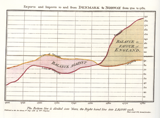
French philosopher and mathematician René Descartes and Pierre de Fermat developed analytic geometry and two-dimensional coordinate system which heavily influenced the practical methods of displaying and calculating values. Fermat and Blaise Pascal's work on statistics and probability theory laid the groundwork for what we now conceptualize as data.[40] According to the Interaction Design Foundation, these developments allowed and helped William Playfair, who saw potential for graphical communication of quantitative data, to generate and develop graphical methods of statistics.[36]
Playfair TimeSeries
In the second half of the 20th century, Jacques Bertin used quantitative graphs to represent information "intuitively, clearly, accurately, and efficiently".[36]
John Tukey and Edward Tufte pushed the bounds of data visualization; Tukey with his new statistical approach of exploratory data analysis and Tufte with his book "The Visual Display of Quantitative Information" paved the way for refining data visualization techniques for more than statisticians. With the progression of technology came the progression of data visualization; starting with hand-drawn visualizations and evolving into more technical applications – including interactive designs leading to software visualization.[47]
Programs like SAS, SOFA, R, Minitab, Cornerstone and more allow for data visualization in the field of statistics. Other data visualization applications, more focused and unique to individuals, programming languages such as D3, Python and JavaScript help to make the visualization of quantitative data a possibility. Private schools have also developed programs to meet the demand for learning data visualization and associated programming libraries, including free programs like The Data Incubator or paid programs like General Assembly.[48]
Beginning with the symposium "Data to Discovery" in 2013, ArtCenter College of Design, Caltech and JPL in Pasadena have run an annual program on interactive data visualization.[49] The program asks: How can interactive data visualization help scientists and engineers explore their data more effectively? How can computing, design, and design thinking help maximize research results? What methodologies are most effective for leveraging knowledge from these fields? By encoding relational information with appropriate visual and interactive characteristics to help interrogate, and ultimately gain new insight into data, the program develops new interdisciplinary approaches to complex science problems, combining design thinking and the latest methods from computing, user-centered design, interaction design and 3D graphics.
Terminology
Data visualization involves specific terminology, some of which is derived from statistics. For example, author Stephen Few defines two types of data, which are used in combination to support a meaningful analysis or visualization:
Categorical: Represent groups of objects with a particular characteristic. Categorical variables can either be nominal or ordinal. Nominal variables for example gender have no order between them and are thus nominal. Ordinal variables are categories with an order, for sample recording the age group someone falls into.[50]
Quantitative: Represent measurements, such as the height of a person or the temperature of an environment. Quantitative variables can either be continuous or discrete. Continuous variables capture the idea that measurements can always be made more precisely. While discrete variables have only a finite number of possibilities, such as a count of some outcomes or an age measured in whole years.[50]
The distinction between quantitative and categorical variables is important because the two types require different methods of visualization.
A table contains quantitative data organized into rows and columns with categorical labels. It is primarily used to look up specific values. In the example above, the table might have categorical column labels representing the name (a qualitative variable) and age (a quantitative variable), with each row of data representing one person (the sampled experimental unit or category subdivision).
A graph is primarily used to show relationships among data and portrays values encoded as visual objects (e.g., lines, bars, or points). Numerical values are displayed within an area delineated by one or more axes. These axes provide scales (quantitative and categorical) used to label and assign values to the visual objects. Many graphs are also referred to as charts.[51]
Eppler and Lengler have developed the "Periodic Table of Visualization Methods," an interactive chart displaying various data visualization methods. It includes six types of data visualization methods: data, information, concept, strategy, metaphor and compound.[52] In "Visualization Analysis and Design" Tamara Munzner writes "Computer-based visualization systems provide visual representations of datasets designed to help people carry out tasks more effectively." Munzner agues that visualization "is suitable when there is a need to augment human capabilities rather than replace people with computational decision-making methods."[53]
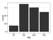
Presents categorical data with rectangular bars with heights or lengths proportional to the values that they represent. The bars can be plotted vertically or horizontally.
A bar graph shows comparisons among discretecategories. One axis of the chart shows the specific categories being compared, and the other axis represents a measured value.
Some bar graphs present bars clustered in groups of more than one, showing the values of more than one measured variable. These clustered groups can be differentiated using color.
For example; comparison of values, such as sales performance for several persons or businesses in a single time period.
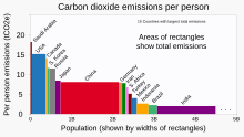
Variable-width bar chart relating: · population (along x axis), · per-person emissions (along y axis), and · total emissions (area as x*y product of values)
Areas of non-uniform-width bars represent quantities with areas A that are respective products of related pairs of
· vertical-axis quantities (A/X) and
· horizontal-axis quantities (X).
Arithmetically:
(A/X)*X=A for each bar
Instances: Mosaic plots (also known as Marimekko, or Mekko, charts)
Projected (1) frequency and (2) intensity of extreme "10-year heat waves" are connected in pairs of horizontal and vertical bars, respectively. Bars are distinguished by (3) color-coded primary category (degree of global warming).
Orthogonal (orthogonal composite) bar chart
numerical value of first variable (extent in first dimension; superimposed horizontal bars)
numerical value of second variable (extent in second dimension; like conventional vertical bar chart)
category for first and second variables (e.g., color-coded)
Includes most features of basic bar chart, above
Pairs of numeric variables, usually color-coded, rendered by category
Variables need not be directly related in the way they are in "variwide" charts
An approximate representation of the distribution of numerical data. Divide the entire range of values into a series of intervals and then count how many values fall into each interval this is called binning. The bins are usually specified as consecutive, non-overlapping intervals of a variable. The bins (intervals) must be adjacent, and are often (but not required to be) of equal size.
For example, determining frequency of annual stock market percentage returns within particular ranges (bins) such as 0–10%, 11–20%, etc. The height of the bar represents the number of observations (years) with a return% in the range represented by the respective bin.
A scatterplot showing negative correlation between two variables
Points can be coded via color, shape and/or size to display additional variables.
Each point on the plot has an associated x and y term that determines its location on the cartesian plane.
Scatter plots are often used to highlight the correlation between variables (x and y).
Also called "dot plots"
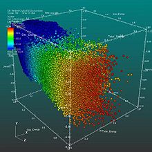
Scatter plot
Scatter plot (3D)
position x
position y
position z
color
symbol
size
Similar to the 2-dimensional scatter plot above, the 3-dimensional scatter plot visualizes the relationship between typically 3 variables from a set of data.
Again point can be coded via color, shape and/or size to display additional variables
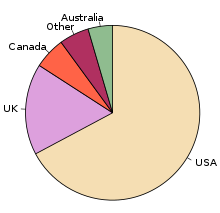
Represents one categorical variable which is divided into slices to illustrate numerical proportion. In a pie chart, the arc length of each slice (and consequently its central angle and area), is proportional to the quantity it represents.
For example, as shown in the graph to the right, the proportion of English native speakers worldwide
A type of stacked area chart that is displaced around a central axis, resulting in a flowing shape.
Unlike a traditional stacked area chart in which the layers are stacked on top of an axis, in a streamgraph the layers are positioned to minimize their "wiggle".
Streamgraphs display data with only positive values, and are not able to represent both negative and positive values.
Example: the visual shows music listened to by a user over time
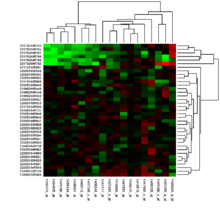
Represents the magnitude of a phenomenon as color in two dimensions.
There are two categories of heat maps:
cluster heat map: where magnitudes are laid out into a matrix of fixed cell size whose rows and columns are categorical data. For example, the graph to the right.
spatial heat map: where no matrix of fixed cell size for example a heat-map. For example, a heat map showing population densities displayed on a geographical map
Portrays a single dependent variable—prototypically temperature over time to portray global warming
Dependent variable is progressively plotted along a continuous "spiral" determined as a function of (a) constantly rotating angle (twelve months per revolution) and (b) evolving color (color changes over passing years)[55]
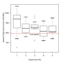
The two boxes graphed on top of each other represent the middle 50% of the data, with the line separating the two boxes identifying the median data value and the top and bottom edges of the boxes represent the 75th and 25th percentile data points respectively.
Box plots are non-parametric: they display variation in samples of a statistical population without making any assumptions of the underlying statistical distribution, thus are useful for getting an initial understanding of a data set. For example, comparing the distribution of ages between a group of people (e.g., male and females).
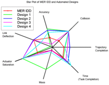
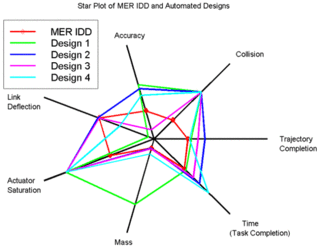
Displays multivariatedata in the form of a two-dimensional chart of three or more quantitative variables represented on axes starting from the same point.
The relative position and angle of the axes is typically uninformative, but various heuristics, such as algorithms that plot data as the maximal total area, can be applied to sort the variables (axes) into relative positions that reveal distinct correlations, trade-offs, and a multitude of other comparative measures.
For example, comparing attributes/skills (e.g., communication, analytical, IT skills) learnt across different university degrees (e.g., mathematics, economics, psychology)
all possible logical relations between a finite collection of different sets.
Shows all possible logical relations between a finite collection of different sets.
These diagrams depict elements as points in the plane, and sets as regions inside closed curves.
A Venn diagram consists of multiple overlapping closed curves, usually circles, each representing a set.
The points inside a curve labelled S represent elements of the set S, while points outside the boundary represent elements not in the set S. This lends itself to intuitive visualizations; for example, the set of all elements that are members of both sets S and T, denoted S ∩ T and read "the intersection of S and T", is represented visually by the area of overlap of the regions S and T. In Venn diagrams, the curves are overlapped in every possible way, showing all possible relations between the sets.
Replace a correlation matrix by a diagram where the "remarkable" correlations are represented by a solid line (positive correlation), or a dotted line (negative correlation).
Interactive data visualization enables direct actions on a graphical plot to change elements and link between multiple plots.[56]
Interactive data visualization has been a pursuit of statisticians since the late 1960s. Examples of the developments can be found on the American Statistical Association video lending library.[57]
Common interactions include:
Brushing: works by using the mouse to control a paintbrush, directly changing the color or glyph of elements of a plot. The paintbrush is sometimes a pointer and sometimes works by drawing an outline of sorts around points; the outline is sometimes irregularly shaped, like a lasso. Brushing is most commonly used when multiple plots are visible and some linking mechanism exists between the plots. There are several different conceptual models for brushing and a number of common linking mechanisms. Brushing scatterplots can be a transient operation in which points in the active plot only retain their new characteristics. At the same time, they are enclosed or intersected by the brush, or it can be a persistent operation, so that points retain their new appearance after the brush has been moved away. Transient brushing is usually chosen for linked brushing, as we have just described.
Painting: Persistent brushing is useful when we want to group the points into clusters and then proceed to use other operations, such as the tour, to compare the groups. It is becoming common terminology to call the persistent operation painting,
Identification: which could also be called labeling or label brushing, is another plot manipulation that can be linked. Bringing the cursor near a point or edge in a scatterplot, or a bar in a barchart, causes a label to appear that identifies the plot element. It is widely available in many interactive graphics, and is sometimes called mouseover.
Scaling: maps the data onto the window, and changes in the area of the. mapping function help us learn different things from the same plot. Scaling is commonly used to zoom in on crowded regions of a scatterplot, and it can also be used to change the aspect ratio of a plot, to reveal different features of the data.
Linking: connects elements selected in one plot with elements in another plot. The simplest kind of linking, one-to-one, where both plots show different projections of the same data, and a point in one plot corresponds to exactly one point in the other. When using area plots, brushing any part of an area has the same effect as brushing it all and is equivalent to selecting all cases in the corresponding category. Even when some plot elements represent more than one case, the underlying linking rule still links one case in one plot to the same case in other plots. Linking can also be by categorical variable, such as by a subject id, so that all data values corresponding to that subject are highlighted, in all the visible plots.
Other perspectives
There are different approaches on the scope of data visualization. One common focus is on information presentation, such as Friedman (2008). Friendly (2008) presumes two main parts of data visualization: statistical graphics, and thematic cartography.[58] In this line the "Data Visualization: Modern Approaches" (2007) article gives an overview of seven subjects of data visualization:[59]
Within The Harvard Business Review, Scott Berinato developed a framework to approach data visualisation.[61] To start thinking visually, users must consider two questions; 1) What you have and 2) what you're doing. The first step is identifying what data you want visualised. It is data-driven like profit over the past ten years or a conceptual idea like how a specific organisation is structured. Once this question is answered one can then focus on whether they are trying to communicate information (declarative visualisation) or trying to figure something out (exploratory visualisation). Scott Berinato combines these questions to give four types of visual communication that each have their own goals.[61]
These four types of visual communication are as follows;
Used to spot trends and make sense of data. This type of visual is more common with large and complex data where the dataset is somewhat unknown and the task is open-ended.
Conferences in this field, ranked by significance in data visualization research,[63] are:
IEEE Visualization: An annual international conference on scientific visualization, information visualization, and visual analytics. Conference is held in October.
ACM SIGGRAPH: An annual international conference on computer graphics, convened by the ACM SIGGRAPH organization. Conference dates vary.
Eurographics: An annual Europe-wide computer graphics conference, held by the European Association for Computer Graphics. Conference is usually held in April or May.
Data presentation architecture (DPA) is a skill-set that seeks to identify, locate, manipulate, format and present data in such a way as to optimally communicate meaning and proper knowledge.
Historically, the term data presentation architecture is attributed to Kelly Lautt:[lower-alpha 1] "Data Presentation Architecture (DPA) is a rarely applied skill set critical for the success and value of Business Intelligence. Data presentation architecture weds the science of numbers, data and statistics in discovering valuable information from data and making it usable, relevant and actionable with the arts of data visualization, communications, organizational psychology and change management in order to provide business intelligence solutions with the data scope, delivery timing, format and visualizations that will most effectively support and drive operational, tactical and strategic behaviour toward understood business (or organizational) goals. DPA is neither an IT nor a business skill set but exists as a separate field of expertise. Often confused with data visualization, data presentation architecture is a much broader skill set that includes determining what data on what schedule and in what exact format is to be presented, not just the best way to present data that has already been chosen. Data visualization skills are one element of DPA."
Objectives
DPA has two main objectives:
To use data to provide knowledge in the most efficient manner possible (minimize noise, complexity, and unnecessary data or detail given each audience's needs and roles)
To use data to provide knowledge in the most effective manner possible (provide relevant, timely and complete data to each audience member in a clear and understandable manner that conveys important meaning, is actionable and can affect understanding, behavior and decisions)
Scope
With the above objectives in mind, the actual work of data presentation architecture consists of:
Creating effective delivery mechanisms for each audience member depending on their role, tasks, locations and access to technology
Defining important meaning (relevant knowledge) that is needed by each audience member in each context
Determining the required periodicity of data updates (the currency of the data)
Determining the right timing for data presentation (when and how often the user needs to see the data)
Finding the right data (subject area, historical reach, breadth, level of detail, etc.)
Utilizing appropriate analysis, grouping, visualization, and other presentation formats
Related fields
DPA work shares commonalities with several other fields, including:
Business analysis in determining business goals, collecting requirements, mapping processes.
Business process improvement in that its goal is to improve and streamline actions and decisions in furtherance of business goals
Data visualization in that it uses well-established theories of visualization to add or highlight meaning or importance in data presentation.
Digital humanities explores more nuanced ways of visualising complex data.
Information architecture, but information architecture's focus is on unstructured data and therefore excludes both analysis (in the statistical/data sense) and direct transformation of the actual content (data, for DPA) into new entities and combinations.
HCI and interaction design, since many of the principles in how to design interactive data visualisation have been developed cross-disciplinary with HCI.
Visual journalism and data-driven journalism or data journalism: Visual journalism is concerned with all types of graphic facilitation of the telling of news stories, and data-driven and data journalism are not necessarily told with data visualisation. Nevertheless, the field of journalism is at the forefront in developing new data visualisations to communicate data.
Graphic design, conveying information through styling, typography, position, and other aesthetic concerns.
↑ The first formal, recorded, public usages of the term data presentation architecture were at the three formal Microsoft Office 2007 Launch events in Dec, Jan and Feb of 2007–08 in Edmonton, Calgary and Vancouver (Canada) in a presentation by Kelly Lautt describing a business intelligence system designed to improve service quality in a pulp and paper company. The term was further used and recorded in public usage on December 16, 2009 in a Microsoft Canada presentation on the value of merging Business Intelligence with corporate collaboration processes.
Related Research Articles
A chart is a graphical representation for data visualization, in which "the data is represented by symbols, such as bars in a bar chart, lines in a line chart, or slices in a pie chart". A chart can represent tabular numeric data, functions or some kinds of quality structure and provides different info.
Information design is the practice of presenting information in a way that fosters an efficient and effective understanding of the information. The term has come to be used for a specific area of graphic design related to displaying information effectively, rather than just attractively or for artistic expression. Information design is closely related to the field of data visualization and is often taught as part of graphic design courses. The broad applications of information design along with its close connections to other fields of design and communication practices have created some overlap in the definitions of communication design, data visualization, and information architecture.
Edward Rolf Tufte, sometimes known as "ET", is an American statistician and professor emeritus of political science, statistics, and computer science at Yale University. He is noted for his writings on information design and as a pioneer in the field of data visualization.
A bar chart or bar graph is a chart or graph that presents categorical data with rectangular bars with heights or lengths proportional to the values that they represent. The bars can be plotted vertically or horizontally. A vertical bar chart is sometimes called a column chart.
A scatter plot, also called a scatterplot, scatter graph, scatter chart, scattergram, or scatter diagram, is a type of plot or mathematical diagram using Cartesian coordinates to display values for typically two variables for a set of data. If the points are coded (color/shape/size), one additional variable can be displayed. The data are displayed as a collection of points, each having the value of one variable determining the position on the horizontal axis and the value of the other variable determining the position on the vertical axis.
A small multiple is a series of similar graphs or charts using the same scale and axes, allowing them to be easily compared. It uses multiple views to show different partitions of a dataset. The term was popularized by Edward Tufte.
Visualization or visualisation is any technique for creating images, diagrams, or animations to communicate a message. Visualization through visual imagery has been an effective way to communicate both abstract and concrete ideas since the dawn of humanity. from history include cave paintings, Egyptian hieroglyphs, Greek geometry, and Leonardo da Vinci's revolutionary methods of technical drawing for engineering and scientific purposes.
Chartjunk consists of all visual elements in charts and graphs that are not necessary to comprehend the information represented on the graph, or that distract the viewer from this information.
Infographics are graphic visual representations of information, data, or knowledge intended to present information quickly and clearly. They can improve cognition by using graphics to enhance the human visual system's ability to see patterns and trends. Similar pursuits are information visualization, data visualization, statistical graphics, information design, or information architecture. Infographics have evolved in recent years to be for mass communication, and thus are designed with fewer assumptions about the readers' knowledge base than other types of visualizations. Isotypes are an early example of infographics conveying information quickly and easily to the masses.
Chernoff faces, invented by applied mathematician, statistician and physicist Herman Chernoff in 1973, display multivariate data in the shape of a human face. The individual parts, such as eyes, ears, mouth and nose represent values of the variables by their shape, size, placement and orientation. The idea behind using faces is that humans easily recognize faces and notice small changes without difficulty. Chernoff faces handle each variable differently. Because the features of the faces vary in perceived importance, the way in which variables are mapped to the features should be carefully chosen.
A radar chart is a graphical method of displaying multivariate data in the form of a two-dimensional chart of three or more quantitative variables represented on axes starting from the same point. The relative position and angle of the axes is typically uninformative, but various heuristics, such as algorithms that plot data as the maximal total area, can be applied to sort the variables (axes) into relative positions that reveal distinct correlations, trade-offs, and a multitude of other comparative measures.
Statistical graphics, also known as statistical graphical techniques, are graphics used in the field of statistics for data visualization.
Visual analytics is an outgrowth of the fields of information visualization and scientific visualization that focuses on analytical reasoning facilitated by interactive visual interfaces.
Michael Louis Friendly is an American-Canadian psychologist, Professor of Psychology at York University in Ontario, Canada, and director of its Statistical Consulting Service, especially known for his contributions to graphical methods for categorical and multivariate data, and on the history of data and information visualisation.
A plot is a graphical technique for representing a data set, usually as a graph showing the relationship between two or more variables. The plot can be drawn by hand or by a computer. In the past, sometimes mechanical or electronic plotters were used. Graphs are a visual representation of the relationship between variables, which are very useful for humans who can then quickly derive an understanding which may not have come from lists of values. Given a scale or ruler, graphs can also be used to read off the value of an unknown variable plotted as a function of a known one, but this can also be done with data presented in tabular form. Graphs of functions are used in mathematics, sciences, engineering, technology, finance, and other areas.
Cultural analytics refers to the use of computational, visualization, and big data methods for the exploration of contemporary and historical cultures. While digital humanities research has focused on text data, cultural analytics has a particular focus on massive cultural data sets of visual material – both digitized visual artifacts and contemporary visual and interactive media. Taking on the challenge of how to best explore large collections of rich cultural content, cultural analytics researchers developed new methods and intuitive visual techniques that rely on high-resolution visualization and digital image processing. These methods are used to address both the existing research questions in humanities, to explore new questions, and to develop new theoretical concepts that fit the mega-scale of digital culture in the early 21st century.
A motion chart is a dynamic bubble chart which allows efficient and interactive exploration and visualization of longitudinal multivariate data. Motion charts provide mechanisms for mapping ordinal, nominal and quantitative variables onto time, 2D coordinate axes, size, colors, glyphs and appearance characteristics, which facilitate the interactive display of multidimensional and temporal data.
Howard Gray Funkhouser was an American mathematician, historian and associate professor of mathematics at the Washington and Lee University, and later at the Phillips Exeter Academy, particularly known for his early work on the history of graphical methods.
Graphical perception is the human capacity for visually interpreting information on graphs and charts. Both quantitative and qualitative information can be said to be encoded into the image, and the human capacity to interpret it is sometimes called decoding. The importance of human graphical perception, what we discern easily versus what our brains have more difficulty decoding, is fundamental to good statistical graphics design, where clarity, transparency, accuracy and precision in data display and interpretation are essential for understanding the translation of data in a graph to clarify and interpret the science.
A horizon chart or horizon graph is a 2-dimensional data visualisation displaying a quantitative data over a continuous interval, most commonly a time period. The horizon chart is valuable for enabling readers to identify trends and extreme values within large datasets. Similar to sparklines and ridgeline plot, horizon chart may not be the most suitable visualisation for precisely pinpointing specific values. Instead, its strength lies in providing an overview and highlighting patterns and outliers in the data.
1 2 3 Nussbaumer Knaflic, Cole (2 November 2015). Storytelling with Data: A Data Visualization Guide for Business Professionals. John Wiley & Sons. ISBN978-1-119-00225-3.
↑ Ananda Mitra (2018), "Managing and Visualizing Unstructured Big Data", Encyclopedia of Information Science and Technology (4thed.), IGI Global
↑ Bhuvanendra Putchala; Lasya Sreevidya Kanala; Devi Prasanna Donepudi; Hari Kishan Kondaveeti (2023), "Applications of Big Data Analytics in Healthcare Informatics", in Narasimha Rao Vajjhala; Philip Eappen (eds.), Health Informatics and Patient Safety in Times of Crisis, IGI Global, pp.175–194
↑ Olshannikova, Ekaterina; Ometov, Aleksandr; Koucheryavy, Yevgeny; Ollson, Thomas (2015), "Visualizing Big Data with augmented and virtual reality: challenges and research agenda.", Journal of Big Data, 2 (22), doi:10.1186/s40537-015-0031-2
↑ Card, Mackinlay, and Shneiderman (1999), Readings in Information Visualization: Using Vision to Think, Morgan Kaufmann, pp.6–7{{citation}}: CS1 maint: multiple names: authors list (link)
↑ E.H. Chi (2013), A Framework for Visualizing Information, Springer Science & Business Media, p.xxiii
↑ Gershon, Nahum; Page, Ward (1 August 2001). "What storytelling can do for information visualization". Communications of the ACM. 44 (8): 31–37. doi:10.1145/381641.381653. S2CID7666107.
↑ O'Donoghue, Seán I.; Baldi, Benedetta Frida; Clark, Susan J.; Darling, Aaron E.; Hogan, James M.; Kaur, Sandeep; Maier-Hein, Lena; McCarthy, Davis J.; Moore, William J.; Stenau, Esther; Swedlow, Jason R.; Vuong, Jenny; Procter, James B. (2018-07-20). "Visualization of Biomedical Data". Annual Review of Biomedical Data Science. 1 (1): 275–304. doi:10.1146/annurev-biodatasci-080917-013424. hdl:10453/125943. S2CID199591321. Retrieved 25 June 2021.
↑ Leo Yu-Ho Lo; Ayush Gupta; Kento Shigyo; Aoyu Wu; Enrico Bertini; Huamin Qu, Misinformed by Visualization: What Do We Learn From Misinformative Visualizations?
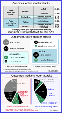
↑ Buchanan, Larry; Letherby, Lauren (June 22, 2022). "Who Stops a 'Bad Guy With a Gun'?". The New York Times. Archived from the original on June 22, 2022. Data source: Advanced Law Enforcement Rapid Response Training Center
1 2 Bulmer, Michael (2013). A Portable Introduction to Data Analysis. The University of Queensland: Publish on Demand Centre. pp.4–5. ISBN978-1-921723-10-0.
↑ Mooney, Chris (11 May 2016). "This scientist just changed how we think about climate change with one GIF". The Washington Post. Archived from the original on 6 February 2019. Ed Hawkins took these monthly temperature data and plotted them in the form of a spiral, so that for each year, there are twelve points, one for each month, around the center of a circle – with warmer temperatures farther outward and colder temperatures nearer inward.
↑ American Statistics Association, Statistical Graphics Section. "Video Lending Library". Archived from the original on 2021-01-20. Retrieved 2021-02-17.
Post, Frits H.; Nielson, Gregory M.; Bonneau, Georges-Pierre (2003). Data Visualization: The State of the Art. New York: Springer. ISBN978-1-4613-5430-7.
This page is based on this Wikipedia article Text is available under the CC BY-SA 4.0 license; additional terms may apply. Images, videos and audio are available under their respective licenses.