Bar chart

Last updated
Example of a grouped (clustered) bar chart, one with horizontal bars. Human losses of world war two by country.png
Example of a grouped (clustered) bar chart, one with horizontal bars.

A bar chart or bar graph is a chart or graph that presents categorical data with rectangular bars with heights or lengths proportional to the values that they represent. The bars can be plotted vertically or horizontally. A vertical bar chart is sometimes called a column chart.

Contents

A bar graph shows comparisons among discrete categories. One axis of the chart shows the specific categories being compared, and the other axis represents a measured value. Some bar graphs present bars clustered in groups of more than one, showing the values of more than one measured variable.

History

Many sources consider William Playfair (1759-1824) to have invented the bar chart and the Exports and Imports of Scotland to and from different parts for one Year from Christmas 1780 to Christmas 1781 graph from his The Commercial and Political Atlas to be the first bar chart in history. Diagrams of the velocity of a constantly accelerating object against time published in The Latitude of Forms (attributed to Jacobus de Sancto Martino or, perhaps, to Nicole Oresme) [1] about 300 years before can be interpreted as "proto bar charts". [2] [3]

Usage

20210413 Carbon capture and storage - CCS - proposed vs implemented.svg
A vertical stacked bar chart with positive values
20210331 Global tree cover loss - World Resources Institute.svg
A vertical stacked bar chart with negative values
2010 homicide rates - gun PLUS non-gun - high-income countries.png
A horizontal stacked bar chart
Personal pronouns2.jpg
A vertical, grouped (clustered) 3D bar chart

Bar graphs/charts provide a visual presentation of categorical data. [4] Categorical data is a grouping of data into discrete groups, such as months of the year, age group, shoe sizes, and animals. These categories are usually qualitative. In a column (vertical) bar chart, categories appear along the horizontal axis and the height of the bar corresponds to the value of each category.

Bar charts have a discrete domain of categories, and are usually scaled so that all the data can fit on the chart. When there is no natural ordering of the categories being compared, bars on the chart may be arranged in any order. Bar charts arranged from highest to lowest incidence are called Pareto charts.

Grouped (clustered) and stacked

Bar graphs can also be used for more complex comparisons of data with grouped (or "clustered") bar charts, and stacked bar charts. [4]

In grouped (clustered) bar charts, for each categorical group there are two or more bars color-coded to represent a particular grouping. For example, a business owner with two stores might make a grouped bar chart with different colored bars to represent each store: the horizontal axis would show the months of the year and the vertical axis would show revenue.

Alternatively, Stacked bar charts (also known as Composite bar charts) stack bars on top of each other so that the height of the resulting stack shows the combined result. Unlike a grouped bar chart where each factor is displayed next to another, each with their own bar, the stacked bar chart displays multiple data points stacked in a single row or column. This may, for instance, take the form of uniform height bars charting a time series with internal stacked colours indicating the percentage participation of a sub-type of data. Another example would be a time series displaying total numbers, with internal colors indicating participation in the total by sub-types. Stacked bar charts are not suited to data sets having both positive and negative values.

Grouped bar charts usually present the information in the same order in each grouping. Stacked bar charts present the information in the same sequence on each bar.

Variable-width (variwide)

Example: Variable-width bar chart relating:
* countries' respective populations (along x axis),
* per-person CO2 emissions (along y axis), and
* total emissions for that country (rectangle area = product x*y of sides' lengths) 20210626 Variwide chart of greenhouse gas emissions per capita by country.svg
Example: Variable-width bar chart relating:
* countries' respective populations (along x axis),
* per-person CO2 emissions (along y axis), and
* total emissions for that country (rectangle area = product x*y of sides' lengths)

Variable-width bar charts, sometimes abbreviated variwide (bar) charts, are bar charts having bars with non-uniform widths. Generally:

— vertical-axis quantities (A/X) and
— horizontal-axis quantities (X).
(A/X)*X = Area A for each bar

Roles of the vertical and horizontal axes may be reversed, depending on the desired application.

Examples of variable-width bar charts are shown at Wikimedia Commons.

Advantages

  1. Easy to read and interpret: Bar charts are easy to read and interpret, even for people without a background in statistics or data visualization. The bars make it easy to compare values and see trends, making it a useful tool for communicating information to a wide range of audiences.
  2. Can handle large amounts of data: Bar charts can handle large amounts of data and still provide a clear representation of the information. The bars can be made narrow or wide to fit a large number of categories or data points, and the use of color or patterns can make it easier to distinguish between them.
  3. Customizable: Bar charts can be customized to suit the needs of the user. For example, the color, width, and height of the bars can be adjusted to make the chart more visually appealing, and labels and annotations can be added to provide additional information.
  4. Useful for comparing values: Bar charts are particularly useful for comparing values between categories or data points. They allow for quick identification of differences and similarities, making it easy to draw conclusions and make decisions. [5] [6]

Limitations

  1. Limited use for continuous data: Bar charts are not useful for displaying continuous data, such as temperature or time. For continuous data, a line chart or scatter plot may be more appropriate. Bar charts of continuous data with error bars are sometimes referred to as dynamite plots. [7] [8]
  2. Limited use for small sample sizes: Bar charts may not be useful for displaying small sample sizes, as the bars may not accurately represent the data. In such cases, a histogram or box plot may be more appropriate.
  3. May be misleading: Bar charts can be misleading if the scale is not appropriate or if the data is presented in a way that is designed to mislead the viewer. For example, if the y-axis is truncated, the differences between the bars may appear larger than they actually are.
  4. Limited scope for multivariate data: Bar charts can only display one or two variables at a time, making them less useful for displaying multivariate data. In such cases, a scatter plot or heat map may be more appropriate. [5] [6]

See also

Related Research Articles

A histogram is a visual representation of the distribution of quantitative data. The term was first introduced by Karl Pearson. To construct a histogram, the first step is to "bin" the range of values— divide the entire range of values into a series of intervals—and then count how many values fall into each interval. The bins are usually specified as consecutive, non-overlapping intervals of a variable. The bins (intervals) are adjacent and are typically of equal size.

<span class="mw-page-title-main">Chart</span> Graphical representation of data

A chart is a graphical representation for data visualization, in which "the data is represented by symbols, such as bars in a bar chart, lines in a line chart, or slices in a pie chart". A chart can represent tabular numeric data, functions or some kinds of quality structure and provides different info.

<span class="mw-page-title-main">Scatter plot</span> Plot using the dispersal of scattered dots to show the relationship between variables

A scatter plot, also called a scatterplot, scatter graph, scatter chart, scattergram, or scatter diagram, is a type of plot or mathematical diagram using Cartesian coordinates to display values for typically two variables for a set of data. If the points are coded (color/shape/size), one additional variable can be displayed. The data are displayed as a collection of points, each having the value of one variable determining the position on the horizontal axis and the value of the other variable determining the position on the vertical axis.

<span class="mw-page-title-main">Pie chart</span> Circular statistical graph that illustrates numerical proportion

A pie chart is a circular statistical graphic which is divided into slices to illustrate numerical proportion. In a pie chart, the arc length of each slice is proportional to the quantity it represents. While it is named for its resemblance to a pie which has been sliced, there are variations on the way it can be presented. The earliest known pie chart is generally credited to William Playfair's Statistical Breviary of 1801.

<span class="mw-page-title-main">Infographic</span> Graphic visual representation of information

Infographics are graphic visual representations of information, data, or knowledge intended to present information quickly and clearly. They can improve cognition by using graphics to enhance the human visual system's ability to see patterns and trends. Similar pursuits are information visualization, data visualization, statistical graphics, information design, or information architecture. Infographics have evolved in recent years to be for mass communication, and thus are designed with fewer assumptions about the readers' knowledge base than other types of visualizations. Isotypes are an early example of infographics conveying information quickly and easily to the masses.

<span class="mw-page-title-main">Image histogram</span>

An image histogram is a type of histogram that acts as a graphical representation of the tonal distribution in a digital image. It plots the number of pixels for each tonal value. By looking at the histogram for a specific image a viewer will be able to judge the entire tonal distribution at a glance.

<span class="mw-page-title-main">Data and information visualization</span> Visual representation of data

Data and information visualization is the practice of designing and creating easy-to-communicate and easy-to-understand graphic or visual representations of a large amount of complex quantitative and qualitative data and information with the help of static, dynamic or interactive visual items. Typically based on data and information collected from a certain domain of expertise, these visualizations are intended for a broader audience to help them visually explore and discover, quickly understand, interpret and gain important insights into otherwise difficult-to-identify structures, relationships, correlations, local and global patterns, trends, variations, constancy, clusters, outliers and unusual groupings within data. When intended for the general public to convey a concise version of known, specific information in a clear and engaging manner, it is typically called information graphics.

In statistics, the frequency or absolute frequency of an event is the number of times the observation has occurred/recorded in an experiment or study. These frequencies are often depicted graphically or in tabular form.

<span class="mw-page-title-main">Line chart</span> Chart type

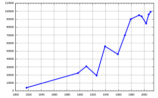
A line chart or line graph, also known as curve chart, is a type of chart that displays information as a series of data points called 'markers' connected by straight line segments. It is a basic type of chart common in many fields. It is similar to a scatter plot except that the measurement points are ordered and joined with straight line segments. A line chart is often used to visualize a trend in data over intervals of time – a time series – thus the line is often drawn chronologically. In these cases they are known as run charts.

<span class="mw-page-title-main">Radar chart</span> Type of chart

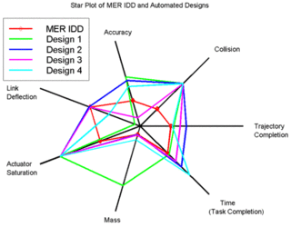
A radar chart is a graphical method of displaying multivariate data in the form of a two-dimensional chart of three or more quantitative variables represented on axes starting from the same point. The relative position and angle of the axes is typically uninformative, but various heuristics, such as algorithms that plot data as the maximal total area, can be applied to sort the variables (axes) into relative positions that reveal distinct correlations, trade-offs, and a multitude of other comparative measures.

A dot chart or dot plot is a statistical chart consisting of data points plotted on a fairly simple scale, typically using filled in circles. There are two common, yet very different, versions of the dot chart. The first has been used in hand-drawn graphs to depict distributions going back to 1884. The other version is described by William S. Cleveland as an alternative to the bar chart, in which dots are used to depict the quantitative values associated with categorical variables.

<span class="mw-page-title-main">Biplot</span> Type of exploratory graph used in statistics

Biplots are a type of exploratory graph used in statistics, a generalization of the simple two-variable scatterplot. A biplot overlays a score plot with a loading plot. A biplot allows information on both samples and variables of a data matrix to be displayed graphically. Samples are displayed as points while variables are displayed either as vectors, linear axes or nonlinear trajectories. In the case of categorical variables, category level points may be used to represent the levels of a categorical variable. A generalised biplot displays information on both continuous and categorical variables.

<span class="mw-page-title-main">Plot (graphics)</span> Graphical technique for data sets

A plot is a graphical technique for representing a data set, usually as a graph showing the relationship between two or more variables. The plot can be drawn by hand or by a computer. In the past, sometimes mechanical or electronic plotters were used. Graphs are a visual representation of the relationship between variables, which are very useful for humans who can then quickly derive an understanding which may not have come from lists of values. Given a scale or ruler, graphs can also be used to read off the value of an unknown variable plotted as a function of a known one, but this can also be done with data presented in tabular form. Graphs of functions are used in mathematics, sciences, engineering, technology, finance, and other areas.

<span class="mw-page-title-main">Bubble chart</span> Type of chart

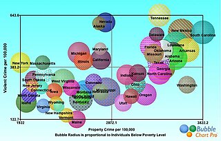
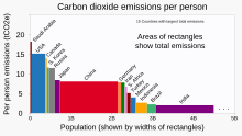
A bubble chart is a type of chart that displays three dimensions of data. Each entity with its triplet (v1, v2, v3) of associated data is plotted as a disk that expresses two of the vi values through the disk's xy location and the third through its size. Bubble charts can facilitate the understanding of social, economical, medical, and other scientific relationships.

<span class="mw-page-title-main">Misleading graph</span> Graph that misrepresents data

In statistics, a misleading graph, also known as a distorted graph, is a graph that misrepresents data, constituting a misuse of statistics and with the result that an incorrect conclusion may be derived from it.

<span class="mw-page-title-main">Mosaic plot</span> Data visualization

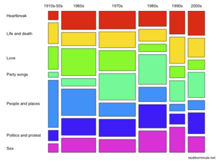
A mosaic plot, Marimekko chart, Mekko chart, or sometimes percent stacked bar plot, is a graphical visualization of data from two or more qualitative variables. It is the multidimensional extension of spineplots, which graphically display the same information for only one variable. It gives an overview of the data and makes it possible to recognize relationships between different variables. For example, independence is shown when the boxes across categories all have the same areas. Mosaic plots were introduced by Hartigan and Kleiner in 1981 and expanded on by Friendly in 1994. Mosaic plots are also called Marimekko or Mekko charts because they resemble some Marimekko prints. However, in statistical applications, mosaic plots can be colored and shaded according to deviations from independence, whereas Marimekko charts are colored according to the category levels, as in the image.

Ordinal data is a categorical, statistical data type where the variables have natural, ordered categories and the distances between the categories are not known. These data exist on an ordinal scale, one of four levels of measurement described by S. S. Stevens in 1946. The ordinal scale is distinguished from the nominal scale by having a ranking. It also differs from the interval scale and ratio scale by not having category widths that represent equal increments of the underlying attribute.

Looker Studio, formerly Google Data Studio, is an online tool for converting data into customizable, informative reports and dashboards. Looker Studio was announced by Google on March 15, 2016 as part of the enterprise Google Analytics 360 suite, and a free version was made available for individuals and small teams in May 2016.

<span class="mw-page-title-main">Horizon chart</span>

A horizon chart or horizon graph is a 2-dimensional data visualisation displaying a quantitative data over a continuous interval, most commonly a time period. The horizon chart is valuable for enabling readers to identify trends and extreme values within large datasets. Similar to sparklines and ridgeline plot, horizon chart may not be the most suitable visualisation for precisely pinpointing specific values. Instead, its strength lies in providing an overview and highlighting patterns and outliers in the data.

<span class="mw-page-title-main">Simulation decomposition</span> A method for visually performing an uncertainty and sensitivity analysis of model output

SimDec, or Simulation decomposition, is a hybrid uncertainty and sensitivity analysis method, for visually examining the relationships between the output and input variables of a computational model.

References

  1. Clagett, Marshall (1968), Nicole Oresme and the Medieval Geometry of Qualities and Motions, Madison: Univ. of Wisconsin Press, pp. 85–99, ISBN   0-299-04880-2
  2. Beniger, James R.; Robyn, Dorothy L. (1978), "Quantitative Graphics in Statistics: A Brief History", The American Statistician, 32 (1), Taylor & Francis, Ltd.: 1–11, doi:10.1080/00031305.1978.10479235, JSTOR   2683467
  3. Der, Geoff; Everitt, Brian S. (2014). A Handbook of Statistical Graphics Using SAS ODS. Chapman and Hall - CRC. ISBN   978-1-584-88784-3.
  4. 1 2 Kelley, W. M.; Donnelly, R. A. (2009) The Humongous Book of Statistics Problems. New York, NY: Alpha Books ISBN   1592578659
  5. 1 2 Reid, Nathalie (2018-01-12). "Data Visualization: A Guide to Visual Storytelling for Libraries". Journal of the Medical Library Association. 106 (1): 135. doi:10.5195/jmla.2018.346. ISSN   1558-9439. PMC   5764581 .
  6. 1 2 Healy, Kieran Joseph (2019). Data visualization : a practical introduction. Princeton, New Jersey. ISBN   978-0-691-18161-5. OCLC   1032356534.{{cite book}}: CS1 maint: location missing publisher (link)
  7. Riedel, Nico; Schulz, Robert; Kazezian, Vartan; Weissgerber, Tracey (2022-03-15). Replacing bar graphs of continuous data with more informative graphics: Are we making progress? (Report). Scientific Communication and Education. doi:10.1101/2022.03.14.484206.
  8. Doggett, Thomas J; Way, Connor (2024-01-08). "Dynamite plots in surgical research over 10 years: a meta-study using machine-learning analysis". Postgraduate Medical Journal. doi:10.1093/postmj/qgad134. ISSN   0032-5473.