IKEA Catalogue

Last updated
Cover of the 2015 edition catalogue (Australia) 2015 IKEA Catalogue.jpg
Cover of the 2015 edition catalogue (Australia)

The IKEA Catalogue (US spelling: IKEA Catalog; Swedish: Ikea-katalogen) was a catalogue published annually by the Swedish home furnishing retailer IKEA. First published in Swedish in 1951, [1] the catalogue was considered to be the main marketing tool of the company and, as of 2004, consumed 70% of its annual marketing budget. [2] Approximately 208 million copies of the catalogue were printed in fiscal year 2013, more than double the number of Bibles expected to be printed in the same period. [3]

Contents

The first IKEA catalogue was published in 1951 in Sweden. It had 68 pages and 285,000 copies were distributed in Southern Sweden. [4] At its peak in 2016, 200 million copies of the catalogue were distributed, in 69 different versions and 32 languages, to more than 50 countries. [5]

In December 2020, IKEA announced that, after a 70-year run, they would end publication of the catalogue, with the 2021 edition being the final edition. [4]

Production and distribution

Containing over 300 pages and about 12,000 products, it was distributed by mail, in stores and online. [6] Each edition of the catalogue takes about 10 months to develop from concept to final product. [3] Many different versions of the catalogue were created to reflect regional differences in product ranges as well as cultural differences. For example, photographs in the China edition may depict a smaller kitchen than the US edition. [7]

Most of the catalogue was produced by IKEA Communications AB in Älmhult, Sweden, the site of the original IKEA store and where IKEA Communications operates the largest photo studio in northern Europe (8,000 square meters in size). [1] As of 2012, the studio employed 285 photographers, carpenters, interior designers and other personnel working full-time on photo shoots. [3]

In 2017, IKEA worked with five paper suppliers and 31 printers around the world to produce the catalogue each year. [7] The catalogue itself was printed on chlorine-free paper of 10-15% post-consumer waste. [8]

According to Canadian broadcaster CTV, "IKEA's publications have developed an almost cult-like following online. Readers have found all kinds of strange tidbits, including mysterious cat pictures, apparent Mickey Mouse references and weird books wedged into the many shelves that clutter the catalogues." [9]

In December 2020, IKEA announced that they would be cease publication of both the print and digital versions of the catalogue, with the 2021 edition (released in 2020) being the final edition. The company said the catalogue had become less important as IKEA embraced new ways of connecting with customers. 40 million copies of the 2021 edition were printed. [4]

Innovation

The company began experimenting with computer-generated imagery in 2005 by placing a single computer-rendered image of a wooden chair in the 2006 edition of the catalogue. According to Anneli Sjögren, head of photography at IKEA, customers did not notice that the chair was computer-generated. [3] In 2010, the first entirely computer-generated room was created for the catalogue. [10] By the 2013 edition, 12% of imagery for the IKEA catalogue, brochures and website was computer-generated. [3] As of 2014, 75% of product images (i.e. white background images) and 35% of non-product images across all IKEA communications are fully computer-generated. [10]

Augmented reality was introduced in the 2013 edition of the catalogue. "X-ray" views through furniture compartments, videos, how-to guides and other interactive content could be accessed by scanning a symbol on the catalogue with a mobile device. [11] The 2014 catalogue contains an augmented reality app that projects an item into a real-time photograph image of the user's room. The augmented reality app also provides an indication of the scale of IKEA objects in relation to the user's living environment. [12]

Typeface

In 2009, IKEA changed the typeface used in its catalogue from Futura to Verdana, expressing a desire to unify its branding between print and web media. The change drew considerable media attention. [13] [14] [15] The controversy has been attributed to the perception of Verdana as a symbol of homogeneity in popular typography. [16] In 2019, the company switched from Verdana to IKEA Noto Sans as its official corporate typeface, including its catalogue. The typeface is a modified version of Google’s open-source font Noto Sans. [17]

Criticism

In October 2012, IKEA was criticised for removing women from photos in the Saudi Arabian version of the 2013 catalogue. [18] [19]

IKEA Family Live

IKEA also publishes and sells a regular style magazine, titled IKEA Family Live in thirteen languages which supplements the catalogue. An English language edition for the United Kingdom was launched February 2007 with a subscription of over 500,000. [20]

List of editions

Related Research Articles

<span class="mw-page-title-main">Graphic design</span> Interdisciplinary branch of design and of the fine arts

Graphic design is a profession, academic discipline and applied art whose activity consists in projecting visual communications intended to transmit specific messages to social groups, with specific objectives. Graphic design is an interdisciplinary branch of design and of the fine arts. Its practice involves creativity, innovation and lateral thinking using manual or digital tools, where it is usual to use text and graphics to communicate visually.

<span class="mw-page-title-main">IKEA</span> Swedish multinational retail conglomerate

Inter IKEA Systems B.V., trading as IKEA, is a Swedish multinational conglomerate that designs and sells ready-to-assemble furniture, kitchen appliances, decoration, home accessories, and various other goods and home services. Started in 1943 by Ingvar Kamprad and currently legally headquartered in the Netherlands, IKEA has been the world's largest furniture retailer since 2008. The brand used by the group is derived from an acronym that consists of the founder's initials, and those of Elmtaryd, the family farm where he was born, and the nearby village Agunnaryd.

<span class="mw-page-title-main">Verdana</span> Humanist sans-serif font

Verdana is a humanist sans-serif typeface designed by Matthew Carter for Microsoft Corporation, with hand-hinting done by Thomas Rickner, then at Monotype. Demand for such a typeface was recognized by Virginia Howlett of Microsoft's typography group and commissioned by Steve Ballmer. The name "Verdana" is derived from "verdant" (green) and "Ana".

<span class="mw-page-title-main">Sans-serif</span> Typeface classification for letterforms without serifs

In typography and lettering, a sans-serif, sans serif, gothic, or simply sans letterform is one that does not have extending features called "serifs" at the end of strokes. Sans-serif typefaces tend to have less stroke width variation than serif typefaces. They are often used to convey simplicity and modernity or minimalism. For the purposes of type classification, sans-serif designs are usually divided into these major groups: § Grotesque and § Neo-grotesque, § Geometric, § Humanist and § Other or mixed.

<span class="mw-page-title-main">Typeface</span> Set of characters that share common design features

A typeface is a design of letters, numbers and other symbols, to be used in printing or for electronic display. Most typefaces include variations in size, weight, slope, width, and so on. Each of these variations of the typeface is a font.

<span class="mw-page-title-main">Augmented reality</span> View of the real world with computer-generated supplementary features

Augmented reality (AR) is an interactive experience that combines the real world and computer-generated 3D content. The content can span multiple sensory modalities, including visual, auditory, haptic, somatosensory and olfactory. AR can be defined as a system that incorporates three basic features: a combination of real and virtual worlds, real-time interaction, and accurate 3D registration of virtual and real objects. The overlaid sensory information can be constructive, or destructive. As such, it is one of the key technologies in the reality-virtuality continuum.

<span class="mw-page-title-main">Matthew Carter</span> British type designer (born 1937)

Matthew Carter is a British type designer. A 2005 New Yorker profile described him as 'the most widely read man in the world' by considering the amount of text set in his commonly used typefaces.

<span class="mw-page-title-main">Typography of Apple Inc.</span> Overview of typography of Apple Inc.

Apple Inc. uses a large variety of typefaces in its marketing, operating systems, and industrial design with each product cycle. These change throughout the years with Apple's change of style in their products. This is evident in the design and marketing of the company. The current logo is a white apple with a bite out of it, which was first utilized in 2013.

<span class="mw-page-title-main">Georgia (typeface)</span> 1996 typeface by Matthew Carter

Georgia is a serif typeface designed in 1993 by Matthew Carter and hinted by Tom Rickner for Microsoft. It was intended as a serif typeface that would appear elegant but legible when printed small or on low-resolution screens. The typeface is inspired by Scotch Roman designs of the 19th century and was based on designs for a print typeface on which Carter was working when contacted by Microsoft; this would be released under the name Miller the following year. The typeface's name referred to a tabloid headline, "Alien heads found in Georgia."

<span class="mw-page-title-main">Andreas Gursky</span> German artist and photographer

Andreas Gursky is a German photographer and professor at the Kunstakademie Düsseldorf, Germany.

<span class="mw-page-title-main">Caslon</span> Typeface with serifs

Caslon is the name given to serif typefaces designed by William Caslon I (c. 1692–1766) in London, or inspired by his work.

<span class="mw-page-title-main">Century Gothic</span> Sans-serif font family

Century Gothic is a digital sans-serif typeface in the geometric style, released by Monotype Imaging in 1990. It is a redrawn version of Monotype's own Twentieth Century, a copy of Bauer's Futura, to match the widths of ITC Avant Garde Gothic. It is an exclusively digital typeface that has never been manufactured as metal type.

Ascender Corporation was a digital typeface foundry and software development company in the Chicago suburb of Elk Grove Village, Illinois. It was founded in 2004 by a team of software developers, typographers, and people previously involved in developing fonts used widely in computers, inkjet printers, phones, and other digital technology devices. On December 8, 2010, Ascender Corp. was acquired by Monotype Imaging.

<span class="mw-page-title-main">Intellectual property protection of typefaces</span> Copyright, trademark and patent considerations of fonts and related

Typefaces, fonts, and their glyphs raise intellectual property considerations in copyright, trademark, design patent, and related laws. The copyright status of a typeface and of any font file that describes it digitally varies between jurisdictions. In the United States, the shapes of typefaces are not eligible for copyright but may be protected by design patent. Typefaces can be protected in other countries, including the United Kingdom, Germany, and France, by industrial design protections that are similar to copyright or design patent in that they protect the abstract shapes. Additionally, in the US and some other countries, computer fonts, the digital instantiation of the shapes as vector outlines, may be protected by copyright on the computer code that produces them. The name of a typeface may also be protected as a trademark.

<span class="mw-page-title-main">Noto fonts</span> Multilingual font family from Google

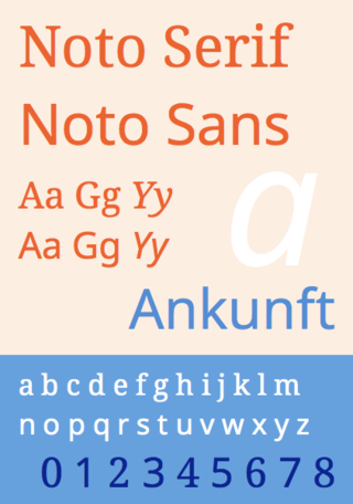
Noto is a font family comprising over 100 individual computer fonts, which are together designed to cover all the scripts encoded in the Unicode standard. As of October 2016, Noto fonts cover all 93 scripts defined in Unicode version 6.1, although fewer than 30,000 of the nearly 75,000 CJK unified ideographs in version 6.0 are covered. In total, Noto fonts cover over 77,000 characters, which is around half of the 149,186 characters defined in Unicode 15.0.

<span class="mw-page-title-main">OpenDyslexic</span> Typeface designed to mitigate reading errors caused by dyslexia

OpenDyslexic is a free typeface/font designed to mitigate some of the common reading errors caused by dyslexia. The typeface was created by Abbie Gonzalez, who released it through an open-source license. The design is based on DejaVu Sans, also an open-source font.

<span class="mw-page-title-main">Augment (app)</span>

Augment is an augmented reality SaaS platform that allows users to visualize their products in 3D in real environment and in real-time through tablets or smartphones. The software can be used for retail, e-commerce, architecture, and other purposes.

<span class="mw-page-title-main">Display typeface</span> Font that is used at large sizes for headings

A display typeface is a typeface that is intended for use in display type at large sizes for titles, headings, pull quotes, and other eye-catching elements, rather than for extended passages of body text.

Commercial augmented reality (CAR) describes augmented reality (AR) applications that support various B2B (Business-to-Business) and B2C (Business-to-Consumer) commercial activities, particularly for the retail industry. The use of CAR started in 2010 with virtual dressing rooms for E-commerce.

Global furniture and homeware retailer IKEA has been criticized for various issues, including their raw material sourcing, the size of their stores, the impact of their stores on local communities, legal violations, and unfair or discriminatory business practices, among others.

References

  1. 1 2 "IKEA Catalogue printable facts" (PDF). IKEA United Kingdom. September 2003. Archived from the original (PDF) on September 5, 2012. Retrieved August 29, 2007.
  2. "IKEA student info". IKEA United Kingdom. Archived from the original on June 22, 2004. Retrieved August 29, 2007.
  3. 1 2 3 4 5 Hansegard, Jens (August 23, 2012). "IKEA's New Catalogs: Less Pine, More Pixels" . The Wall Street Journal . Archived from the original on September 3, 2012. Retrieved September 2, 2012.
  4. 1 2 3 Ringstrom, Anna (2020-12-07). "IKEA turns the page on catalogue after seven decades". Reuters. Archived from the original on 2021-01-02. Retrieved 2021-01-02.
  5. "After 70 years, IKEA turning the page on the Catalog". www.ikea.com. 2020. Archived from the original on 2020-12-13. Retrieved 2021-01-02.
  6. "Vanliga frågor och svar - Kundservice". www.ikea.com.
  7. 1 2 Quito, Anne (July 25, 2017). "How the IKEA catalogue cracked what "domestic bliss" means in different cultures". Quartz. Archived from the original on November 9, 2020. Retrieved January 2, 2021.
  8. "FAQ". IKEA. Archived from the original on September 1, 2012. Retrieved September 2, 2012.
  9. "'Unfortunate' photo wasn't tampered with: IKEA". CTV . August 25, 2006. Archived from the original on June 29, 2011. Retrieved August 29, 2007.
  10. 1 2 Parkin, Kirsty (June 24, 2014). "Building 3D with Ikea". CGSociety. Archived from the original on July 4, 2014. Retrieved August 30, 2014.
  11. Baldwin, Roberto (July 20, 2012). "Ikea's Augmented Reality Catalog Will Let You Peek Inside Furniture". Wired. Archived from the original on August 24, 2012. Retrieved July 24, 2012.
  12. Luisa Rollenhagen (6 August 2013). "Virtually Furnish a Room With IKEA's Augmented Reality Catalog". Mashable. Mashable. Retrieved 6 August 2013.
  13. Abend, Lisa (August 28, 2009). "The Font War: Ikea Fans Fume over Verdana". Time. Archived from the original on August 29, 2009. Retrieved October 30, 2019.
  14. Campbell, Mel; Wortsman, Jeremy (September 1, 2009). "The Full Fonty: Why Type Nerds Went Mental Over IKEA". Crikey. Retrieved October 31, 2019.
  15. Garfield, Simon (September 2, 2009). "Verdana: Ikea's flat-pack font". The Guardian. Retrieved October 31, 2019.
  16. Vit, Armin (August 31, 2009). "Verdanagate". Brand New. Retrieved October 30, 2019.
  17. Schwab, Katharine (August 22, 2019). "Ikea is quietly changing its brand again—for a very good reason". Fast Company. Retrieved October 30, 2019.
  18. Molin, Anna (October 1, 2012). "IKEA Regrets Cutting Women From Saudi Ad". The Wall Street Journal . Archived from the original on February 9, 2013. Retrieved October 6, 2012.
  19. "Ikea criticised for airbrushing women out of Saudi catalogue". The Daily Telegraph . London. October 1, 2012. Archived from the original on October 3, 2012. Retrieved October 6, 2012.
  20. Farey-Jones, Daniel (July 5, 2006). "Ikea to introduce UK magazine in February". Brand Republic. Haymarket Business Media. Archived from the original on September 2, 2012. Retrieved September 2, 2012.