Related Research Articles

Typography is the art and technique of arranging type to make written language legible, readable and appealing when displayed. The arrangement of type involves selecting typefaces, point sizes, line lengths, line spacing, letter spacing, and spaces between pairs of letters. The term typography is also applied to the style, arrangement, and appearance of the letters, numbers, and symbols created by the process. Type design is a closely related craft, sometimes considered part of typography; most typographers do not design typefaces, and some type designers do not consider themselves typographers. Typography also may be used as an ornamental and decorative device, unrelated to the communication of information.

Type design is the art and process of designing typefaces. This involves drawing each letterform using a consistent style. The basic concepts and design variables are described below.

Verdana is a humanist sans-serif typeface designed by Matthew Carter for Microsoft Corporation, with hand-hinting done by Thomas Rickner, then at Monotype. Demand for such a typeface was recognized by Virginia Howlett of Microsoft's typography group and commissioned by Steve Ballmer. The name "Verdana" is derived from "verdant" (green) and "Ana".
In typography, a serif is a small line or stroke regularly attached to the end of a larger stroke in a letter or symbol within a particular font or family of fonts. A typeface or "font family" making use of serifs is called a serif typeface, and a typeface that does not include them is sans-serif. Some typography sources refer to sans-serif typefaces as "grotesque" or "Gothic", and serif typefaces as "roman".

A typeface is a design of letters, numbers and other symbols, to be used in printing or for electronic display. Most typefaces include variations in size, weight, slope, width, and so on. Each of these variations of the typeface is a font.
In typography, leading is the space between adjacent lines of type; the exact definition varies.

Johnston is a sans-serif typeface designed by and named after Edward Johnston. The typeface was commissioned in 1913 by Frank Pick, commercial manager of the Underground Electric Railways Company of London, as part of his plan to strengthen the company's corporate identity. Johnston was originally created for printing, but it rapidly became used for the enamel station signs of the Underground system as well.

In typography, text or font in all caps contains capital letters without any lowercase letters. For example: THIS TEXT IS IN ALL CAPS. All-caps text can be seen in legal documents, advertisements, newspaper headlines, and the titles on book covers. Short strings of words in capital letters appear bolder and "louder" than mixed case, and this is sometimes referred to as "screaming" or "shouting". All caps can also be used to indicate that a given word is an acronym.

In typography, the x-height, or corpus size, is the distance between the baseline and the mean line of lowercase letters in a typeface. Typically, this is the height of the letter x in the font, as well as the letters v, w, and z. One of the most important dimensions of a font, x-height defines how high lowercase letters without ascenders are compared to the cap height of uppercase letters.
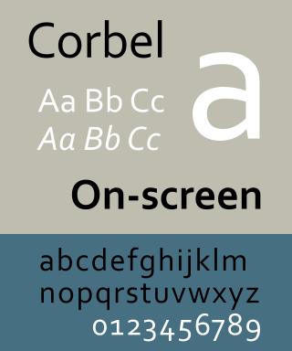
Corbel is a humanist sans-serif typeface designed by Jeremy Tankard for Microsoft and released to consumers in 2007. It is part of the ClearType Font Collection, a suite of fonts from various designers released with Windows Vista. All start with the letter C to reflect that they were designed to work well with Microsoft's ClearType text rendering system, a text rendering engine designed to make text clearer to read on LCD monitors. The other fonts in the same group are Calibri, Cambria, Candara, Consolas and Constantia.

In typography, a counter is the area of a letter that is entirely or partially enclosed by a letter form or a symbol. The stroke that creates such a space is known as a "bowl". Latin letters containing closed counters include A, B, D, O, P, Q, R, a, b, d, e, g, o, p, and q. Latin letters containing open counters include c, f, h, s etc. The digits 0, 4, 6, 8, and 9 also possess a counter. An aperture is the opening between an open counter and the outside of the letter.

Roboto is a neo-grotesque sans-serif typeface family developed by Google as the system font for its mobile operating system Android, and released in 2011 for Android 4.0 "Ice Cream Sandwich".

Didone is a genre of serif typeface that emerged in the late 18th century and was the standard style of general-purpose printing during the 19th century. It is characterized by:

In metal typesetting, a font is a particular size, weight and style of a typeface. Each font is a matched set of type, with a piece for each glyph. A typeface consists of various fonts that share an overall design.

In typography, line length is the width of a block of typeset text, usually measured in units of length like inches or points or in characters per line. A block of text or paragraph has a maximum line length that fits a determined design. If the lines are too short then the text becomes disjointed; if they are too long, the content loses rhythm as the reader searches for the start of each line.
Typeface anatomy describes the graphic elements that make up letters in a typeface.
Form and Document Creation is one of the things that technical communicators do as part of creating deliverables for their companies or clients. Document design is: "the field of theory and practice aimed at creating comprehensible, persuasive and usable functional documents". These forms and documents can have many different purposes such as collecting or providing information.

Metro is a sans-serif typeface family created by William Addison Dwiggins and released by the American Mergenthaler Linotype Company from 1929 onwards.

Atkinson Hyperlegible is a freely available typeface built around a grotesque sans-serif core, intended to be optimally legible for readers who are partially visually impaired, with all characters maximally distinguishable from one another. It was developed by the Braille Institute of America in collaboration with Applied Design Works and is available under the SIL Open Font License. It won Fast Company's Innovation by Design Award for Graphic Design in 2019 and was shortlisted for a graphic design award by Dezeen in 2020.
References
- ↑ Dragan, Anca D.; Lee, Kenton C.T.; Srinivasa, Siddhartha S. (March 2013). Legibility and Predictability of Robot Motion (PDF). ACM/IEEE International Conference on Human-Robot Interaction. Tokyo, Japan.
- ↑ Weisman, Jerry (March 1981). "Evaluating Architectural Legibility". Environment and Behavior. 13 (2): 189–204. doi:10.1177/0013916581132004. ISSN 0013-9165. S2CID 107939568.
- ↑ Tracy, Walter (1986). Letters of credit : a view of type design. London: David R. Godine. pp. 30–32.
- ↑ Lieberman, J. Ben (1967). Types of typefaces and how to recognize them. New York: Sterling Publishing Co. pp. 85–127.
- 1 2 3 4 5 Sheedy, James E.; Subbaram, Manoj V.; Zimmerman, Aaron B.; Hayes, John R. (December 2005). "Text Legibility and the Letter Superiority Effect". Human Factors: The Journal of the Human Factors and Ergonomics Society. 47 (4): 797–815. doi:10.1518/001872005775570998. ISSN 0018-7208. PMID 16553067. S2CID 207496095.
- 1 2 3 Strizver, Ilene (2010). Type Rules: The Designer's Guide to Professional Typography (3rd ed.). New Jersey: John Wiley & Sons. p. 73. ISBN 978-0-470-54251-4.
- ↑ Mustonen, Terhi; Olkkonen, Maria; Hakkinen, Jukka (2004). "Examining mobile phone text legibility while walking". Extended abstracts of the 2004 conference on Human factors and computing systems - CHI '04. New York, New York, USA: ACM Press. p. 1243. doi:10.1145/985921.986034. ISBN 1-58113-703-6.
- ↑ Smith, Sidney L. (December 1979). "Letter Size and Legibility". Human Factors: The Journal of the Human Factors and Ergonomics Society. 21 (6): 661–670. doi:10.1177/001872087912210604. ISSN 0018-7208. S2CID 110208067.
- ↑ Dobres, Jonathan; Chahine, Nadine; Reimer, Bryan; Gould, David; Mehler, Bruce; Coughlin, Joseph F. (2016-03-04). "Utilising psychophysical techniques to investigate the effects of age, typeface design, size and display polarity on glance legibility". Ergonomics. Informa UK Limited. 59 (10): 1377–1391. doi: 10.1080/00140139.2015.1137637 . ISSN 0014-0139. PMC 5213401 . PMID 26727912.
- 1 2 Beier, Sofie (May 2009). Typeface Legibility: Towards defining familiarity (PDF) (PhD thesis). Royal College of Art.
- ↑ Michael S. Wogalter, editor. "Handbook of Warnings". 2006. p. 395.
- ↑ Kevin Larson. "The science of word recognition".
- ↑ Susan Weinschenk. "It’s a Myth That All Capital Letters Are Inherently Harder to Read".
- ↑ Diana C. Reep. "Technical Writing: Principles, Strategies, and Readings". 1997. p. 455.
- ↑ Arditi, Aries; Cho, Jianna (2005-11-01). "Serifs and font legibility". Vision Research. 45 (23): 2926–2933. doi:10.1016/j.visres.2005.06.013. ISSN 0042-6989. PMC 4612630 . PMID 16099015.
- ↑ Robert A. Morris, Kathy Aquilante, Dean Yager, Charles Bigelow, 2002: Serifs Slow RSVP Reading at Very Small Sizes, but Don't Matter at Larger Sizes, DOI: 10.1889/1.1830242, http://cs.umb.edu/~ram/rsvp/publications/serifssubmittedv2.doc
- 1 2 Campbell-Dollaghan, Kelsey (2013-01-30). "Could Good Type Design Promote Literacy In The Middle East?". Fast Company. Retrieved 2020-03-26.
- ↑ Alpaca, U. X. (2016-11-01). "What to watch out for when working on typography for print and web". Medium. Retrieved 2020-04-02.
- ↑ "Legibility and readability issues". EUfont.eu. Retrieved 2020-03-26.
- ↑ Broschüre: Schriftarten für legasthene Menschen (in German). Erster Österreichischer Dachverband Legasthenie. 2013-07-19.
- ↑ Baer, Drake (2017-03-07). "The Reason Comic Sans Is a Public Good". The Cut. Retrieved 2020-03-26.
- ↑ Zorzi, M.; Barbiero, C.; Facoetti, A.; Lonciari, I.; Carrozzi, M.; Montico, M.; Bravar, L.; George, F.; Pech-Georgel, C.; Ziegler, J. C. (2012-06-04). "Extra-large letter spacing improves reading in dyslexia". Proceedings of the National Academy of Sciences. 109 (28): 11455–11459. doi: 10.1073/pnas.1205566109 . ISSN 0027-8424. PMC 3396504 . PMID 22665803.
- ↑ Rello, Luz; Baeza-Yates, Ricardo (21 October 2013). "Good fonts for dyslexia" (PDF). Proceedings of the 15th International ACM SIGACCESS Conference on Computers and Accessibility. pp. 1–8. doi:10.1145/2513383.2513447. ISBN 9781450324052. S2CID 4953793 . Retrieved 17 November 2022.
- ↑ Sassoon, Rosemary (1993). "Through the eyes of a child: perception and type design". Computers and typography. Oxford, England: Intellect. pp. 150–. ISBN 1-871516-23-4. OCLC 27468183.
- ↑ Beier, Sofie; Larson, Kevin (2010-06-01). "Design Improvements for Frequently Misrecognized Letters 1". Information Design Journal. John Benjamins Publishing Company. 18 (2): 118–137. doi:10.1075/idj.18.2.03bei. ISSN 0142-5471.