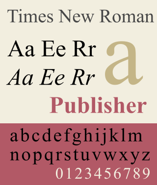
Times New Roman is a serif typeface. It was commissioned by the British newspaper The Times in 1931 and conceived by Stanley Morison, the artistic adviser to the British branch of the printing equipment company Monotype, in collaboration with Victor Lardent, a lettering artist in The Times's advertising department. It has become one of the most popular typefaces of all time and is installed on most personal computers.
The Mergenthaler Linotype Company is a corporation founded in the United States in 1886 to market the Linotype machine, a system to cast metal type in lines (linecaster) invented by Ottmar Mergenthaler. It became the world's leading manufacturer of book and newspaper typesetting equipment; outside North America, its only serious challenger for book typesetting was the Anglo-American Monotype Corporation. Starting in 1960, the Mergenthaler Linotype Company became a major supplier of phototypesetting equipment which included laser typesetters, typefonts, scanners, typesetting computers. In 1987, the US-based Mergenthaler Linotype Company became part of the German Linotype-Hell AG; in the US the company name changed to Linotype Co. In 1996, the German Linotype-Hell AG was taken over by the German printing machine company Heidelberger Druckmaschinen AG. A separate business, Linotype Library GmbH was established to manage the digital assets. In 2005, Linotype Library GmbH shortened its name to Linotype GmbH, and in 2007, Linotype GmbH was acquired by Monotype Imaging Holdings, Inc., the parent of Monotype Imaging, Inc. and others.
In typography, a serif is a small line or stroke regularly attached to the end of a larger stroke in a letter or symbol within a particular font or family of fonts. A typeface or "font family" making use of serifs is called a serif typeface, and a typeface that does not include them is sans-serif. Some typography sources refer to sans-serif typefaces as "grotesque" or "Gothic", and serif typefaces as "roman".

A typeface is a design of letters, numbers and other symbols, to be used in printing or for electronic display. Most typefaces include variations in size, weight, slope, width, and so on. Each of these variations of the typeface is a font.
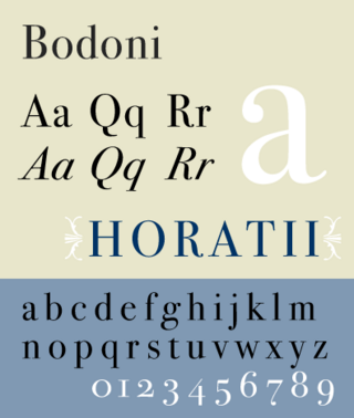
Bodoni is the name given to the serif typefaces first designed by Giambattista Bodoni (1740–1813) in the late eighteenth century and frequently revived since. Bodoni's typefaces are classified as Didone or modern. Bodoni followed the ideas of John Baskerville, as found in the printing type Baskerville—increased stroke contrast reflecting developing printing technology and a more vertical axis—but he took them to a more extreme conclusion. Bodoni had a long career and his designs changed and varied, ending with a typeface of a slightly condensed underlying structure with flat, unbracketed serifs, extreme contrast between thick and thin strokes, and an overall geometric construction.

Adrian Johann Frutiger was a Swiss typeface designer who influenced the direction of type design in the second half of the 20th century. His career spanned the hot metal, phototypesetting and digital typesetting eras. Until his death, he lived in Bremgarten bei Bern.

Bell Gothic is a sans-serif typeface in the industrial or grotesque style designed by Chauncey H. Griffith in 1938 while heading the typographic development program at the Mergenthaler Linotype Company. The typeface was commissioned by AT&T as a proprietary typeface for use in telephone directories and has since been made available for general licensing. Bell Gothic is designed for maximum legibility in the adverse conditions of small print on poor-quality newsprint paper, into which ink tends to absorb and spread out. It is therefore a popular font in printing at small sizes.

In typography, a slab serif typeface is a type of serif typeface characterized by thick, block-like serifs. Serif terminals may be either blunt and angular (Rockwell), or rounded (Courier). Slab serifs were introduced in the early nineteenth century.

Didone is a genre of serif typeface that emerged in the late 18th century and was the standard style of general-purpose printing during the 19th century. It is characterized by:

Bookman, or Bookman Old Style, is a serif typeface. A wide, legible design that is slightly bolder than most body text faces, Bookman has been used for both display typography, for trade printing such as advertising, and less commonly for body text. In advertising use it is particularly associated with the graphic design of the 1960s and 1970s, when revivals of it were very popular. It is also used as the official font of Indonesian laws since 2011.

Clarendon is the name of a slab serif typeface that was released in 1845 by Thorowgood and Co. of London, a letter foundry often known as the Fann Street Foundry. The original Clarendon design is credited to Robert Besley, a partner in the foundry, and was originally engraved by punchcutter Benjamin Fox, who may also have contributed to its design. Many copies, adaptations and revivals have been released, becoming almost an entire genre of type design.

Janson is the name given to a set of old-style serif typefaces from the Dutch Baroque period, and modern revivals from the twentieth century. Janson is a crisp, relatively high-contrast serif design, most popular for body text.

Didot is a group of typefaces. The word/name Didot came from the famous French printing and type producing Didot family. The classification is known as modern, or Didone.

Chauncey H. Griffith (1879–1956) was an American printer and typeface designer.

Bell Centennial is a sans-serif typeface in the industrial or grotesque style designed by Matthew Carter in the period 1975–1978. The typeface was commissioned by AT&T as a proprietary type to replace their then current directory typeface Bell Gothic on the occasion of AT&T's one hundredth anniversary. Carter was working for the Mergenthaler Linotype Company, which now licenses the face for general public use.

Granjon is an old-style serif typeface designed by George W. Jones around 1924 for the British branch of the Linotype company, and based on the Garamond typeface that was used in a book printed by the Parisian Jean Poupy in 1592. The roman design was from Claude Garamond and the italic version was from Robert Granjon. Because several other Garamonds were on the market in the 1920s, Jones decided to name his type Granjon. Jones, a master printer based in London, had been engaged by Linotype to improve the quality of their typeface range through the development of revivals of notable type designs of the past.
Aurora is a serif typeface, designed by Jackson Burke in 1960. The font is a darker derivative of the Corona typeface, initially designed for the Canada NewsWire.

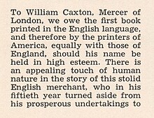
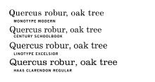
Century is a family of serif type faces particularly intended for body text. The family originates from a first design, Century Roman, cut by American Type Founders designer Linn Boyd Benton in 1894 for master printer Theodore Low De Vinne, for use in The Century Magazine. ATF rapidly expanded it into a very large family, first by Linn Boyd, and later by his son Morris.

In typography, Erbar or Erbar-Grotesk is a sans-serif typeface in the geometric style, one of the first designs of this kind released as type. Designer Jakob Erbar's aim was to design a printing type which would be free of all individual characteristics, possess thoroughly legible letter forms, and be a purely typographic creation. His conclusion was that this could only work if the type form was developed from a fundamental element, the circle. Erbar-Grotesk was developed in stages; Erbar wrote that he had originally sketched out the design in 1914 but had been prevented from working on it due to the war. The original version of Erbar was released in 1926, following Erbar's "Phosphor" titling capitals of 1922 which are very similar in design.

Metro is a sans-serif typeface family created by William Addison Dwiggins and released by the American Mergenthaler Linotype Company from 1929 onwards.