
Optima is a humanist sans-serif typeface designed by Hermann Zapf and released by the D. Stempel AG foundry, Frankfurt, West Germany in 1958.

In typography and lettering, a sans-serif, sans serif, gothic, or simply sans letterform is one that does not have extending features called "serifs" at the end of strokes. Sans-serif typefaces tend to have less stroke width variation than serif typefaces. They are often used to convey simplicity and modernity or minimalism. For the purposes of type classification, sans-serif designs are usually divided into these major groups: § Grotesque and § Neo-grotesque, § Geometric, § Humanist and § Other or mixed.

A typeface is a design of letters, numbers and other symbols, to be used in printing or for electronic display. Most typefaces include variations in size, weight, slope, width, and so on. Each of these variations of the typeface is a font.

Rockwell is a slab serif typeface designed by the Monotype Corporation and released in 1934. The project was supervised by Monotype's engineering manager Frank Hinman Pierpont. This typeface is distinguished by a serif at the apex of the uppercase A, while the lowercase a has two storeys. Because of its monoweighted stroke, Rockwell is used primarily for display or at small sizes rather than as a body text. Rockwell is based on an earlier, more condensed slab serif design cast by the Inland Type Foundry called Litho Antique.

Univers is a large sans-serif typeface family designed by Adrian Frutiger and released by his employer Deberny & Peignot in 1957. Classified as a neo-grotesque sans-serif, one based on the model of nineteenth-century German typefaces such as Akzidenz-Grotesk, it was notable for its availability from the moment of its launch in a comprehensive range of weights and widths. The original marketing for Univers deliberately referenced the periodic table to emphasise its scope.

Gill Sans is a humanist sans-serif typeface designed by Eric Gill and released by the British branch of Monotype from 1928 onwards.

In typography, a slab serif typeface is a type of serif typeface characterized by thick, block-like serifs. Serif terminals may be either blunt and angular (Rockwell), or rounded (Courier). Slab serifs were introduced in the early nineteenth century.

Didone is a genre of serif typeface that emerged in the late 18th century and was the standard style of general-purpose printing during the 19th century. It is characterized by:

In metal typesetting, a font is a particular size, weight and style of a typeface. Each font is a matched set of type, with a piece for each glyph. A typeface consists of various fonts that share an overall design.

Clarendon is the name of a slab serif typeface that was released in 1845 by Thorowgood and Co. of London, a letter foundry often known as the Fann Street Foundry. The original Clarendon design is credited to Robert Besley, a partner in the foundry, and was originally engraved by punchcutter Benjamin Fox, who may also have contributed to its design. Many copies, adaptations and revivals have been released, becoming almost an entire genre of type design.

Bank Gothic is a rectilinear geometric sans-serif typeface designed by Morris Fuller Benton for American Type Founders and released in 1930. The design has become popular from the late twentieth century to suggest a science-fiction, military, corporate, or sports aesthetic.

Monotype Grotesque is a family of sans-serif typefaces released by the Monotype Corporation for its hot metal typesetting system. It belongs to the grotesque or industrial genre of early sans-serif designs. Like many early sans-serifs, it forms a sprawling family designed at different times.

Karnak is a slab-serif typeface designed by R. Hunter Middleton for the Ludlow Typograph company and issued in the period 1931–1942.
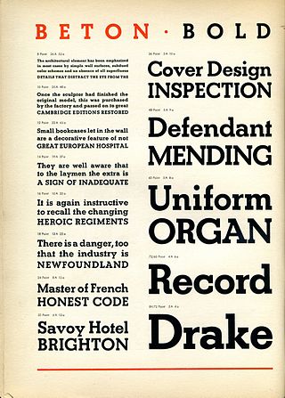
Beton is a slab-serif typeface designed by Heinrich Jost and released originally by the Bauer Type Foundry from 1929 onwards, with most major styles released by 1931. "Beton" is German for concrete, a choice of name suggesting its industrial aesthetic.

A reverse-contrast or reverse-stress letterform is a design in which the stress is reversed from the norm: a typeface or custom lettering where the horizontal lines are the thickest. This is the reverse of the vertical lines being the same width or thicker than horizontals, which is normal in Latin-alphabet writing and especially printing. The result is a dramatic effect, in which the letters seem to have been printed the wrong way round. The style invented in the early nineteenth century as attention-grabbing novelty display designs. Modern font designer Peter Biľak, who has created a design in the genre, has described them as "a dirty trick to create freakish letterforms that stood out."

A display typeface is a typeface that is intended for use in display type at large sizes for titles, headings, pull quotes, and other eye-catching elements, rather than for extended passages of body text.

Metro is a sans-serif typeface family created by William Addison Dwiggins and released by the American Mergenthaler Linotype Company from 1929 onwards.
Egyptian is a typeface created by the Caslon foundry of Salisbury Square, London around or probably slightly before 1816, that is the first general-purpose sans-serif typeface in the Latin alphabet known to have been created.
The Legibility Group is a series of serif typefaces created by the American Mergenthaler Linotype Company and intended for use in newspapers on Linotype's hot metal typesetting system. They were developed in-house by Linotype's design team, led by Chauncey H. Griffith, and released from 1922, when the first member, Ionic No. 5, appeared.

.jpg)