Slab serif

Last updated
Slab-serif type on the heading of a Chartist poster, 1848. Some headings and the lower passage are in Didone type, but much body text is slab serif. Chartist Demonstration.jpg
Slab-serif type on the heading of a Chartist poster, 1848. Some headings and the lower passage are in Didone type, but much body text is slab serif.

In typography, a slab serif (also called mechanistic, square serif, antique or Egyptian) typeface is a type of serif typeface characterized by thick, block-like serifs. [1] [2] Serif terminals may be either blunt and angular (Rockwell), or rounded (Courier). Slab serifs were introduced in the early nineteenth century.

Contents

Slab serifs form a large and varied genre. Some such as Memphis and Rockwell have a geometric design with minimal variation in stroke width: they are sometimes described as sans-serif fonts with added serifs. Others such as those of the Clarendon genre have a structure more like most other serif fonts, though with larger and more obvious serifs. [3] [4] These designs may have bracketed serifs which increase width along their length before merging with the main strokes of the letters, while on geometrics the serifs have a constant width.

Display-oriented slab serifs are often extremely bold, intended to grab the reader's attention on a poster, while slab serifs oriented towards legibility at small sizes show less extreme characteristics. Some fonts oriented towards small print use and printing on poor-quality newsprint paper may have slab serifs to increase legibility, while their other features are closer to conventional book type fonts.

Slab serif fonts were also often used in typewriters, most famously Courier, and this tradition has meant many monospaced text fonts intended for computer and programming use are slab serif designs.[ citation needed ]

History

A sample of the typeface Egyptienne, a slab serif face based on the Clarendon model. WmEgyptienne.png
A sample of the typeface Egyptienne, a slab serif face based on the Clarendon model.
A sample of the typeface Rockwell, a slab serif face based on the geometric model. RockwellWM.png
A sample of the typeface Rockwell, a slab serif face based on the geometric model.
A sample of the typeface Courier, a slab serif face based on strike-on typewriting faces. Courier.svg
A sample of the typeface Courier, a slab serif face based on strike-on typewriting faces.

Slab serif lettering and typefaces appeared rapidly in the early nineteenth century, having little in common with previous letterforms. As the printing of advertising material began to expand in the early nineteenth century, new and notionally more attention-grabbing letterforms became popular. [5] Poster-size types began to be developed that were not merely magnified forms of book type, but very different and bolder. Some were developments of designs of the previous fifty years: ultra-bold types known as "fat faces", which were related to "Didone" text faces of the period but much bolder. [6] Others had completely new structures: sans-serif letters, based on classical antiquity, and reverse-contrast letterforms. Some of the type designs appearing around this time may be based on signpainting and architectural lettering traditions, or vice versa. [lower-alpha 1] [ citation needed ]

The first known example of a slab-serif letterform is woodblock lettering on an 1810 lottery advertisement from London. [7] Slab-serif type was perhaps first introduced by London typefounder Vincent Figgins under the name "Antique", appearing in a type-specimen dated 1815 (but probably issued in 1817). [8] [1] [lower-alpha 2]

Writing in 1825, the printer Thomas Curson Hansard wrote with amusement that slab-serif and other such display types were 'the outrageous kind of face only adapted for placards, posting-bills, invitations to the wheel of Fortune...Fashion and Fancy commonly frolic from one extreme to another.' [15]

Slab serifs declined following the growing popularity of sans-serif faces, with which they always competed. [16] Notable collections of original wood type are held by the Hamilton in Wisconsin [17] [18] and the University of Texas at Austin, collected by Rob Roy Kelly, writer of a well-known book on American poster types. [19] Adobe Inc. has published a large collection of digitisations inspired by nineteenth-century wood type. [20] [21] [22] [23]

Following Napoleon's Egyptian campaign and dissemination of images and descriptions via publications like Description de l'Égypte (1809) an intense cultural fascination with all things Egyptian followed. Suites of contemporary parlor furniture were produced resembling furniture found in tombs. Multicolored woodblock printed wallpaper could make a dining room in Edinburgh or Chicago feel like Luxor. While there was no relationship between Egyptian writing systems and slab serif types, either shrewd marketing or honest confusion led to slab serifs often being called Egyptians. [24] Historian James Mosley has shown that the first typefaces and letters called 'Egyptian' were apparently all sans-serifs. [8]

The term Egyptian was adopted by French and German foundries, where it became Egyptienne. A lighter style of slab serif with a single width of strokes was called 'engravers face' since it resembled the monoline structure of metal engravings. The term 'slab-serif' itself is relatively recent, possibly twentieth-century. [25]

Because of the clear, bold nature of the large serifs, designs with some slab serif characteristics are also often used for small print, for example in printing with typewriters and on newsprint paper. For example, Linotype's Legibility Group, in which most newspapers were printed during much of the twentieth century, were based on the "Ionic" or "Clarendon" style adapted for continuous body text. [26] [27] [28]

More loosely, Joanna, TheSerif, FF Meta Serif and Guardian Egyptian are other examples of newspaper and small print-orientated typefaces that have regular, monoline serifs (sometimes more visible in bold weights) but a general humanist text face structure not particularly influenced by nineteenth-century stylings (as Clarendons are). The term "humanist slab serif" has been applied to serif text faces in this style. [29] [30]

Describing the process of designing slab serifs, modern font designers Jonathan Hoefler and Tobias Frere-Jones note that the structure of the large slab serifs imposes compromises on structure, with purely geometric designs harder to create in ultra-bold sizes where it becomes impossible to create a strictly monoline lower-case alphabet, and Clarendon-style designs harder to create in a lighter style. [3]

Sub-classifications

There are several main subgroups of slab serif typefaces:

Antique model

The earliest slab-serifs were often called "antiques" or "Egyptians". They were often quite monoline in construction and had similarities to nineteenth-century serif fonts, such as ball terminals. [3]

Miller and Richard's Oldstyle Antique. Just as Clarendon typefaces took the "Didone" or modern-face model as a basis for a slab-serif, it is based on their "Old Style" design inspired by type designs of the eighteenth century, made slightly bolder and lower in contrast. Originally intended for use as a bolder type for emphasis, it was often used for general-purpose body text for example if legibility was considered important. Bookman is a derivative of this style. Miller and Richard Oldstyle Antique type specimen (16146280364).jpg
Miller and Richard's Oldstyle Antique. Just as Clarendon typefaces took the "Didone" or modern-face model as a basis for a slab-serif, it is based on their "Old Style" design inspired by type designs of the eighteenth century, made slightly bolder and lower in contrast. Originally intended for use as a bolder type for emphasis, it was often used for general-purpose body text for example if legibility was considered important. Bookman is a derivative of this style.

Clarendon model

Clarendon typefaces, unlike other slab serifs, actually have some bracketing and some contrast in size in the actual serif: the serifs often have curves so they change width and become wider as they approach the main stroke of the letter. [3] Examples include Clarendon and Egyptienne.[ citation needed ]

Italienne model

French Clarendon type (top) compared to a conventional Clarendon design. French Clarendon.png
French Clarendon type (top) compared to a conventional Clarendon design.

In the Italienne model, also known as French Clarendon type, the serifs are even heavier than the stems, forging a dramatic, attention-drawing effect. This is known as reverse-contrast type. It is traditionally associated with use in circus and other posters, and is commonly seen in Western movies or to create a nineteenth-century atmosphere. It was most popular from the 1860s until the early twentieth century, particularly in the United States, although the basic concept originates from London printing of the 1820s and it was used outside the United States. It has often been revived since, for example by Robert Harling as Playbill and more recently by Adrian Frutiger as Westside.

Typewriter typefaces

Typewriter slab serif typefaces are named for their use in strike-on typewriting. These faces originated in monospaced format with fixed-width, meaning that every character takes up exactly the same amount of horizontal space. This feature is necessitated by the nature of the typewriter apparatus. Examples include Courier (on the geometric model) and Prestige Elite (on the Clarendon model).

A considerable variety of other names have been used, particularly in the 19th century: at the time the separation between typeface name and genre had yet to become established, so it is not clear if a name describes a specific typeface or is meant to refer to a subgenre. [34] [35] For example, slab serifs on the French Clarendon model were also called 'Celtic', 'Belgian', 'Aldine' and 'Teutonic' by American printers, as well as 'Tuscan', a name which refers to slab serifs with diamond-shaped points on the sides of the letterform. [19]

Geometric model

Beton Bold in a metal type sample. Contrast is minimal and letterforms take the circle as a basic shape. Beton Bold type specimen (12509036863).jpg
Beton Bold in a metal type sample. Contrast is minimal and letterforms take the circle as a basic shape.

Geometric designs have no bracketing and evenly weighted stems and serifs. Early examples include Memphis, Rockwell, Karnak, Beton, Rosmini, City and Tower, several of which were influenced by geometric sans-serifs of the 1920s and 30s, especially Futura. [3] Recent well-known geometric sans-serifs include ITC Lubalin, Neutraface Slab and Archer.

Some monoline slab serifs such as Serifa, Helserif and Roboto Slab have been designed under the influence of neo-grotesque sans-serif fonts of the 1950s and 60s onwards, and these may be called "neo-grotesque" slab serifs. [36] [37] [38] [39]

See also

Notes

  1. This can make tracing the descent of sans and slab-serif styles hard, since a trend can arrive in print directly and without apparent precedent from a signpainting tradition which has left less of a record.
  2. Whether Figgins' foundry produced the very first slab-serif is a question that is unlikely to be ever confirmed, but as Nicolete Gray has written "it seems probable". [9] This first Figgins specimen to show them was an "1815" specimen containing 1817 watermarked paper, held by Oxford University Press; other 1815-dated Figgins specimens do not show it; another "1815" specimen that was held by Stephenson Blake with 1820 on the spine shows more. [9] No specimens are known from Figgins' main rivals who produced many slab serifs, the Caslon and Thorne (later Thorowgood) foundries, over the relevant period, but their earliest known specimens of slab-serifs seem to show fewer sizes than contemporary Figgins specimens. Figgins had four sizes in c. 1817, nine c. 1820, and nineteen in a specimen dated 1821 [9] but containing 1823 pages; [10] no Caslon specimens are known between 1816 and 1821 but the first surviving specimen from Caslon to show slab-serifs dates from 1821 and shows eleven sizes. [9] [11] Thorne had four sizes in 1820. [12] Even fewer specimens survive from other foundries; none are known from Bower and Bacon between 1813 and 1826, by which time they had eighteen sizes. [13] Gray concluded that any of Figgins, Thorowgood and Caslon could have been first to issue a lower-case (already seen on the 1810 woodblock), as they all introduced ones around 1820. [14]

Related Research Articles

<span class="mw-page-title-main">Sans-serif</span> Typeface classification for letterforms without serifs

In typography and lettering, a sans-serif, sans serif, gothic, or simply sans letterform is one that does not have extending features called "serifs" at the end of strokes. Sans-serif typefaces tend to have less stroke width variation than serif typefaces. They are often used to convey simplicity and modernity or minimalism.

In typography, a serif is a small line or stroke regularly attached to the end of a larger stroke in a letter or symbol within a particular font or family of fonts. A typeface or "font family" making use of serifs is called a serif typeface, and a typeface that does not include them is sans-serif. Some typography sources refer to sans-serif typefaces as "grotesque" or "Gothic", and serif typefaces as "roman".

<span class="mw-page-title-main">Typeface</span> Set of characters that share common design features

A typeface is the design of lettering that can include variations in size, weight, slope, width, and so on. Each of these variations of the typeface is a font.

<span class="mw-page-title-main">Gill Sans</span> Humanist sans-serif typeface family developed by Monotype

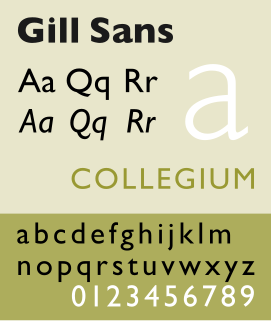
Gill Sans is a humanist sans-serif typeface designed by Eric Gill and released by the British branch of Monotype from 1928 onwards.

<span class="mw-page-title-main">Caslon</span> Typeface with serifs

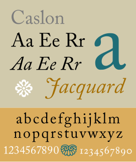
Caslon is the name given to serif typefaces designed by William Caslon I (c. 1692–1766) in London, or inspired by his work.

<span class="mw-page-title-main">Didone (typography)</span> Classification of serif typefaces

Didone is a genre of serif typeface that emerged in the late 18th century and was the standard style of general-purpose printing during the nineteenth. It is characterized by:

<span class="mw-page-title-main">Bookman (typeface)</span> 1869 serif typeface

Bookman or Bookman Old Style, is a serif typeface. A wide, legible design that is slightly bolder than most body text faces, Bookman has been used for both display typography, for trade printing such as advertising, and less commonly for body text. In advertising use it is particularly associated with the graphic design of the 1960s and 1970s, when revivals of it were very popular. It is also used as the official font of Indonesian laws since 2011.

<span class="mw-page-title-main">Clarendon (typeface)</span> Slab-serif typeface

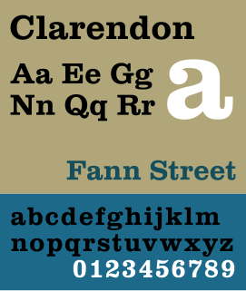
Clarendon is the name of a slab-serif typeface that was released in 1845 by Thorowgood and Co. of London, a letter foundry often known as the Fann Street Foundry. The original Clarendon design is credited to Robert Besley, a partner in the foundry, and was originally engraved by punchcutter Benjamin Fox, who may also have contributed to its design. Many copies, adaptations and revivals have been released, becoming almost an entire genre of type design.

<span class="mw-page-title-main">Joanna (typeface)</span> Typeface designed by Eric Gill

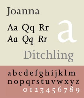
Joanna is a serif typeface designed by Eric Gill (1882–1940) in the period 1930–31, and named for one of his daughters. Gill chose Joanna for setting An Essay on Typography, a book by Gill on his thoughts on typography, typesetting, and page design. He described it as "a book face free from all fancy business".

<span class="mw-page-title-main">Vincent Figgins</span> British typefounder

Vincent Figgins was a British typefounder based in London, who cast and sold metal type for printing. After an apprenticeship with typefounder Joseph Jackson, he established his own type foundry in 1792. His company was extremely successful and, with its range of modern serif faces and display typefaces, had a strong influence on the styles of British printing in the nineteenth century.

Memphis is a slab-serif typeface designed by Dr. Rudolf Wolf and released in 1929 by the Stempel Type Foundry.

<span class="mw-page-title-main">Karnak (typeface)</span> Slab serif typeface

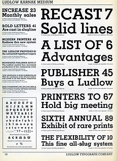
Karnak is a slab-serif typeface designed by R. Hunter Middleton for the Ludlow Typograph company and issued in the period 1931–1942.

<span class="mw-page-title-main">Beton (typeface)</span> Slab-serif typeface designed by Heinrich Jost

Beton is a slab-serif typeface designed by Heinrich Jost and released originally by the Bauer Type Foundry from 1929 onwards, with most major styles released by 1931. "Beton" is German for concrete, a choice of name suggesting its industrial aesthetic.

<span class="mw-page-title-main">Reverse-contrast typefaces</span> Kind of typeface or custom lettering

A reverse-contrast or reverse-stress letterform is a design in which the stress is reversed from the norm: a typeface or custom lettering where the horizontal lines are the thickest. This is the reverse of the vertical lines being the same width or thicker than horizontals, which is normal in Latin-alphabet writing and especially printing. The result is a dramatic effect, in which the letters seem to have been printed the wrong way round. The style invented in the early nineteenth century as attention-grabbing novelty display designs. Modern font designer Peter Biľak, who has created a design in the genre, has described them as "a dirty trick to create freakish letterforms that stood out."

<span class="mw-page-title-main">Display typeface</span> Font that is used at large sizes for headings

A display typeface is a typeface that is intended for use at large sizes for headings, rather than for extended passages of body text.

<span class="mw-page-title-main">Caslon Egyptian</span>

Egyptian is a typeface created by the Caslon foundry of Salisbury Square, London around or probably slightly before 1816, that is the first general-purpose sans-serif typeface in the Latin alphabet known to have been created.

<span class="mw-page-title-main">Legibility Group</span> Series of serif typefaces intended for use in newspapers

The Legibility Group is a series of serif typefaces created by the American Mergenthaler Linotype Company and intended for use in newspapers on Linotype's hot metal typesetting system. They were developed in-house by Linotype's design team, led by Chauncey H. Griffith, and released from 1922, when the first member, Ionic No. 5, appeared.

<span class="mw-page-title-main">Fat face</span> Style of display typeface and lettering

In typography, a fat face letterform is a serif typeface or piece of lettering in the Didone or modern style with an extremely bold design. Fat face typefaces appeared in London around 1805–1810 and became widely popular; John Lewis describes the fat face as "the first real display typeface."

<span class="mw-page-title-main">Caslon Type Foundry</span> English type foundry, founded c. 1720

The Caslon type foundry was a type foundry in London which cast and sold metal type. It was founded by the punchcutter and typefounder William Caslon I, probably in 1720. For most of its history it was based at Chiswell Street, Islington, was the oldest type foundry in London, and the most prestigious.

<span class="mw-page-title-main">Wood type</span> Movable type made out of wood

In letterpress printing, wood type is movable type made out of wood. First used in China for printing body text, wood type became popular during the nineteenth century for making large display typefaces for printing posters, because it was lighter and cheaper than large sizes of metal type.

References

  1. 1 2 Gray, Nicolete. "Slab-serif type design in England 1815-1845". Journal of the Printing Historical Society. 15: 1–35.
  2. Twyman, Michael. "The Bold Idea: The Use of Bold-looking Types in the Nineteenth Century". Journal of the Printing Historical Society. 22 (107–143).
  3. 1 2 3 4 5 "Sentinel: historical background". IDSGN. Archived from the original on 2019-04-28. Retrieved 15 July 2015.
  4. Challand, Skylar. "Know your type: Clarendon". IDSGN. Archived from the original on 2022-10-27. Retrieved 13 August 2015.
  5. Mosley, James (1963). "English Vernacular". Motif. 11: 3–56.
  6. Kennard, Jennifer (3 January 2014). "The Story of Our Friend, the Fat Face". Fonts in Use. Retrieved 11 August 2015.
  7. Mosley, James. "The Nymph and the Grot: an Update". Typefoundry blog. Retrieved 12 December 2015.
  8. 1 2 James Mosley, The Nymph and the Grot: the revival of the sanserif letter. London: Friends of the St Bride Printing Library, 1999.
  9. 1 2 3 4 Gray 1980, p. 12.
  10. Mosley 1984, p. 33.
  11. Mosley 1984, p. 29.
  12. Gray 1980.
  13. Gray 1980, p. 22.
  14. Gray 1980, pp. 12, 15.
  15. Hansard, Thomas Curson (1825). Typographia, an Historical Sketch of the Origin and Progress of the Art of Printing. p. 618. Retrieved 12 August 2015.
  16. Tam, Keith. "The revival of slab-serif typefaces in the 20th century" (PDF). KeithTam. Archived from the original (PDF) on 2022-02-18. Retrieved 3 March 2016.
  17. Hamilton Wood Type and Printing Museum
  18. Analog, digital, virtual: @Home with Hamilton Wood Type by Molly Doane
  19. 1 2 "Rob Roy Kelly Wood Type Collection". University of Texas. Retrieved 23 October 2015.
  20. Bringing Wood Type into the 21st Century by Angela Riechers
  21. Hamilton Wood Type Collection – joint venture between P22 Type Foundry and the Hamilton Wood Type and Printing Museum
  22. Wood Type Revival – created from hand-set letterpress prints of the original 19th century wood type by Matt Griffin & Matt Braun
  23. Etna – typeface adapted by Mark Simonson from HWT Aetna
  24. Carter, E., Day. B, Meggs P.: "Typographic Design: Form and Communication, Third Edition", page 35. John Wiley & Sons, 2002.
  25. Biggs, John (1954). The Use of Type: The Practice of Typography. Blandford Press.
  26. Hutt, Allen (1973). The Changing Newspaper: typographic trends in Britain and America 1622-1972 (1. publ. ed.). London: Fraser. pp. 100–2 etc. ISBN   9780900406225. The majority of the world's newspapers are typeset in one or another of the traditional Linotype 'Legibility Group', and most of the rest in their derivatives.
  27. Alexander S. Lawson (January 1990). Anatomy of a Typeface. David R. Godine Publisher. pp. 277–294. ISBN   978-0-87923-333-4.
  28. The Legibility of Type. Brooklyn: Mergenthaler Linotype Company. 1935. Retrieved 29 April 2016.
  29. Middendorp, Jan. Dutch Type. pp. 192 etc.
  30. Bryan, Marvin (1996). The Digital Typography Sourcebook . New York: Wiley. pp.  144–145. ISBN   9780471148111.
  31. Theodore Low De Vinne (1902). The Practice of Typography: A Treatise on Title-pages, with Numerous Illustrations in Facsimile and Some Observations on the Early and Recent Printing of Books. Century Company. pp. 233–241. ISBN   9780838309353.
  32. Alexander S. Lawson (January 1990). Anatomy of a Typeface. David R. Godine Publisher. pp. 262–280. ISBN   978-0-87923-333-4.
  33. Ovink, G.W. (1971). "Nineteenth-century reactions against the didone type model - I". Quaerendo. 1 (2): 18–31. doi:10.1163/157006971x00301 . Retrieved 20 February 2016.
  34. Frere-Jones, Tobias. "Scrambled Eggs & Serifs". Frere-Jones Type. Retrieved 23 October 2015.
  35. Type classifications are useful, but the common ones are not by Indra Kupferschmid
  36. "Helserif". MyFonts. URW++. Retrieved 19 March 2016.
  37. Loxley, Simon (14 May 2012). "Font Wars: A Story On Rivalry Between Type Foundries". Smashing Magazine. Retrieved 20 March 2016.
  38. Coles, Stephen. "Twitter post". Twitter. Retrieved 20 March 2016. [From a Helserif ad:] "Look what happened to Helvetica. It grew wings."
  39. Budrick, Callie. "Vintage Fonts: 35 Adverts From the Past". Print. Retrieved 20 March 2016.

Cited literature

  • Gray, Nicolete (1980). "Slab-serif type design in England 1815-1845". Journal of the Printing Historical Society. 15: 1–35.
  • Mosley, James (1984). British type specimens before 1831: a hand-list. Oxford Bibliographical Society/University of Reading.