Monospaced font

Last updated
Comparison between variable-width fonts and monospaced fonts Proportional-vs-monospace-v5.svg
Comparison between variable-width fonts and monospaced fonts

A monospaced font, also called a fixed-pitch, fixed-width, or non-proportional font, is a font whose letters and characters each occupy the same amount of horizontal space. [1] [lower-alpha 1] This contrasts with variable-width fonts, where the letters and spacings have different widths.

Contents

Monospaced fonts are customary on typewriters and for typesetting computer code.

Monospaced fonts were widely used in early computers and computer terminals, which often had extremely limited graphical capabilities. Hardware implementation was simplified by using a text mode where the screen layout was addressed as a regular grid of tiles, each of which could be set to display a character by indexing into the hardware's character map. Some systems allowed colored text to be displayed by varying the foreground and background color for each tile. Other effects included reverse video and blinking text. Nevertheless, these early systems were typically limited to a single console font.

Even though computers can now display a wide variety of fonts, the majority of IDEs and software text editors employ a monospaced font as the default typeface. This increases the readability of source code, which is often heavily reliant on distinctions involving individual symbols, and makes differences between letters more unambiguous in situations like password entry boxes where typing mistakes are unacceptable. [2] Monospaced fonts are also used in terminal emulation and for laying out tabulated data in plain text documents. In technical manuals and resources for programming languages, a monospaced font is often used to distinguish code from natural-language text. Monospaced fonts are also used by disassembler output, causing the information to align in vertical columns.

Optical character recognition has better accuracy with monospaced fonts. Examples are OCR-A and OCR-B.

The term modern is sometimes used as a synonym for monospace generic font family. The term modern can be used for a fixed-pitch generic font family name, which is used in OpenDocument format (ISO/IEC 26300:2006) and Rich Text Format. [3] [4]

Examples of monospaced fonts include Courier, Lucida Console, Menlo, Monaco, Consolas, Inconsolata and Source Code Pro.

Use in art

Multiple art forms have developed within computers' and typewriters' monospaced typographic settings in which the nth character of every line align vertically with each other. (Such a group of characters is sometimes called a column.) A proportional and monospaced font's reproduction of an element of ANSI art, line drawing, is illustrated below.

Proportional fontMonospaced font

┌─┐ ┌┬┐
│ │ ├┼┤
└─┘ └┴┘

┌─┐ ┌┬┐ │ │ ├┼┤ └─┘ └┴┘ 

The failure of a proportional font to reproduce the desired boxes above motivates monospaced fonts' use in the creation and viewing of ASCII and ANSI art. Some poetry composed monospaced on typewriters or computers also depends on the vertical alignment of character columns. E. E. Cummings' poetry is often set in monospaced type for this reason.[ citation needed ] Some classic video games (e.g. Rogue and NetHack) and those imitating their style (e.g. Dwarf Fortress) use a monospaced grid of characters to render their state for the player. Quiz Show (1976) is believed to be the first video game to use 8×8 monospaced "arcade font", which got widely adopted by computer games of the time.

Tabular figures

Proportional (upper) and tabular (lower) figures in Palatino Proportional & Tabular figures.tiff
Proportional (upper) and tabular (lower) figures in Palatino

Many fonts that generally are not monospaced have numerals that are known as tabular figures. [5] [6] As tabular spacing makes all numbers with the same number of digits the same width, it is used for typesetting documents such as price lists, stock listings and sums in mathematics textbooks, all of which require columns of numbers to line up on top of each other for easier comparison. [7] Tabular spacing is also a common feature of simple printing devices such as cash registers and date-stamps. [8] Fonts intended for professional use in documents such as business reports may also make the bold numbers take up the same width as the numbers in regular style; the consistency between styles is called "duplexing". [9]

Duplexed numerals in Concourse. The bold and non-bold digits have the same width. Duplexing numerals Concourse.png
Duplexed numerals in Concourse. The bold and non-bold digits have the same width.

The alternative to tabular spacing is proportional spacing, which places the numbers closely together, reducing empty space in a document, and is thought to allow the numbers to blend into the text more effectively. [10] With modern fonts using the TrueType or OpenType formats, it is possible to include both proportional and tabular figures in the same font file, and choose between them using font options settings in applications such as word processors or web browsers. [11] [12] [13]

Other uses

In biochemistry, monospaced fonts are preferred for displaying nucleic acid and protein sequences, as they ensure that the representation of every nucleotide or amino acid occupies the same amount of space. Alignment of the letters makes it easier to compare different sequences visually.

Both screenplays and stage play scripts frequently use monospaced fonts, to make it easier to judge the time a script will last for from the number of pages. The industry standard is 12 point Courier. A tradition holds that, on this format, one page of script will take one minute of screen or stage time. [14]

Monospaced fonts are frequently used in tablature music for guitar and bass guitar. Each line in a tabulature represents a guitar string, which requires that chords played across multiple strings be tabbed in vertical sequence, a feat accomplished only with the predictability of fixed width.

See also

Notes

  1. This definition does not apply to fonts with CJK support; see Duospaced font § In CJK typography.

Related Research Articles

In ISO/IEC 646 and related standards including ISO 8859 and Unicode, a graphic character, also known as printing character, is any character intended to be written, printed, or otherwise displayed in a form that can be read by humans. In other words, it is any encoded character that is associated with one or more glyphs.

<span class="mw-page-title-main">Typeface</span> Set of characters that share common design features

A typeface is a design of letters, numbers and other symbols, to be used in printing or for electronic display. Most typefaces include variations in size, weight, slope, width, and so on. Each of these variations of the typeface is a font.

<span class="mw-page-title-main">IBM Electric typewriter</span> Electric typewriter

The IBM Electric typewriters were an early series of electric typewriters that IBM manufactured, starting in the mid-1930s. They used the conventional moving carriage and typebar mechanism, as opposed to the fixed carriage and type ball used in the IBM Selectric, introduced in 1961. After 1944, each model came in both "Standard" and "Executive" versions, the latter featuring proportional spacing.

In writing, a space is a blank area that separates words, sentences, syllables and other written or printed glyphs (characters). Conventions for spacing vary among languages, and in some languages the spacing rules are complex. Inter-word spaces ease the reader's task of identifying words, and avoid outright ambiguities such as "now here" vs. "nowhere". They also provide convenient guides for where a human or program may start new lines.

<span class="mw-page-title-main">Emphasis (typography)</span> Typographical distinction

In typography, emphasis is the strengthening of words in a text with a font in a different style from the rest of the text, to highlight them. It is the equivalent of prosody stress in speech.

<span class="mw-page-title-main">Kerning</span> Adjustment of the space between the characters of a typeface

In typography, kerning is the process of adjusting the spacing between characters in a proportional font, usually to achieve a visually pleasing result. Kerning adjusts the space between individual letterforms while tracking (letter-spacing) adjusts spacing uniformly over a range of characters. In a well-kerned font, the two-dimensional blank spaces between each pair of characters all have a visually similar area. The term "keming" is sometimes used informally to refer to poor kerning.

<span class="mw-page-title-main">Univers</span> Sans-serif typeface family

Univers is a large sans-serif typeface family designed by Adrian Frutiger and released by his employer Deberny & Peignot in 1957. Classified as a neo-grotesque sans-serif, one based on the model of nineteenth-century German typefaces such as Akzidenz-Grotesk, it was notable for its availability from the moment of its launch in a comprehensive range of weights and widths. The original marketing for Univers deliberately referenced the periodic table to emphasise its scope.

<span class="mw-page-title-main">Computer Modern</span> Family of typefaces

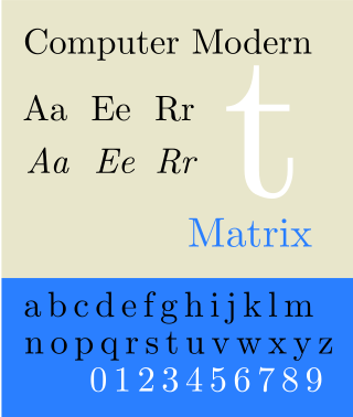
Computer Modern is the original family of typefaces used by the typesetting program TeX. It was created by Donald Knuth with his Metafont program, and was most recently updated in 1992. Computer Modern, or variants of it, remains very widely used in scientific publishing, especially in disciplines that make frequent use of mathematical notation.

<span class="mw-page-title-main">Font</span> Particular size, weight and style of a typeface

In metal typesetting, a font is a particular size, weight and style of a typeface. Each font is a matched set of type, with a piece for each glyph. A typeface consists of various fonts that share an overall design.

During the Killian documents controversy in 2004, the authenticity of the documents themselves was disputed by a variety of individuals and groups. Proof of authenticity is not possible without original documents, and since CBS used only faxed and photocopied duplicates, authentication to professional standards would be impossible regardless of the provenance of the originals. However, proving documents inauthentic does not depend on the availability of originals, and the validity of these photocopied documents has been challenged on a number of grounds, ranging from anachronisms in their typography to issues pertaining to their content.

<span class="mw-page-title-main">Thesis (typeface)</span> Font superfamily

Thesis is a large typeface family designed by Luc(as) de Groot. The typefaces were designed between 1994 and 1999 to provide a modern humanist family. Each typeface is available in a variety of weights as well as in italic. Originally released by FontFont in 1994, it has been sold by de Groot through his imprint LucasFonts since 2000.

<span class="mw-page-title-main">Halfwidth and fullwidth forms</span> Alternative width characters in East Asian typography

In CJK computing, graphic characters are traditionally classed into fullwidth and halfwidth characters. Unlike monospaced fonts, a halfwidth character occupies half the width of a fullwidth character, hence the name.

<span class="mw-page-title-main">OCR-A</span> Typeface designed for early computer OCR

OCR-A is a font issued in 1966 and first implemented in 1968. A special font was needed in the early days of computer optical character recognition, when there was a need for a font that could be recognized not only by the computers of that day, but also by humans. OCR-A uses simple, thick strokes to form recognizable characters. The font is monospaced (fixed-width), with the printer required to place glyphs 0.254 cm apart, and the reader required to accept any spacing between 0.2286 cm and 0.4572 cm.

<span class="mw-page-title-main">History of sentence spacing</span> Evolution of sentence spacing conventions from the introduction of movable type in Europe

The history of sentence spacing is the evolution of sentence spacing conventions from the introduction of movable type in Europe by Johannes Gutenberg to the present day.

Pitch is the number of (monospaced) letters, numbers and spaces in one inch (25.4 mm) of running text, that is, characters per inch, measured horizontally. The pitch was most often used as a measurement of the size of typewriter fonts as well as those of impact printers used with computers.

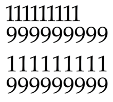
A duospaced font is a fixed-width font whose letters and characters occupy either of two integer multiples of a specified, fixed horizontal space. Traditionally, this means either a single or double character width, although the term has also been applied to fonts using fixed character widths with another simple ratio between them.

<span class="mw-page-title-main">Iosevka</span> Typeface

Iosevka is a monospace programming typeface, built declaratively using custom typeface generation software, and with an emphasis on compatibility with CJK characters. It is available under a FOSS license. The default builds are available in two styles of nine weights each, and come with italic and oblique versions. The typeface was designed, however, to be easily configurable by editing textual TOML configuration files in the custom generation software.

A uniwidth typeface, also known as an equal-width, duplexed, or multiplexed typeface, is a typeface where every variation (font) has the same metrics. As a result, changing the variation used, such as using bold or italics, does not change the layout (reflow).

References

  1. Rosendorf, Theodore (2009). The Typographic Desk Reference. New Castle, Delaware: Oak Knoll Press. p.  12. ISBN   978-1-58456-231-3.
  2. Spolsky, Joel (24 October 2001). "User Interface Design For Programmers". Joel On Software. Retrieved 17 November 2014.
  3. OpenDocument v1.1 specification (PDF), retrieved 2010-05-01.
  4. Microsoft Corporation (June 1992), Microsoft Product Support Services Application Note (Text File) – GC0165: RICH-TEXT FORMAT (RTF) SPECIFICATION (TXT), retrieved 2010-03-13.
  5. "A New Face for Adobe". Typekit Blog. Adobe. Retrieved 8 January 2016.
  6. Shinn, Nick. "Shinntype Modern Suite specification" (PDF). Shinntype. Retrieved 16 October 2015.
  7. Strizver, Elaine. "Proportional vs. Tabular Figures". fonts.com. Monotype Imaging. Retrieved 4 August 2014.
  8. "Revenue". Hoefler & Frere-Jones. Retrieved 4 August 2014.
  9. "Gotham Numerics". Hoefler & Frere-Jones. Retrieved 27 September 2014.
  10. "Gotham: Numerics". Hoefler & Frere-Jones . Retrieved 4 August 2014.
  11. Butterick, Matthew. "Alternate figures: consider the context". Butternick's Practical Typography.
  12. Saller, Carol. "Old-Style Versus Lining Figures". Chronicle of Higher Education . Retrieved 4 August 2014.
  13. Bergsland, David. "Using numbers in the proper case". Design & Publishing Center. Retrieved 4 August 2014.
  14. August, John (22 March 2006). "How accurate is the page-per-minute rule?" . Retrieved 17 November 2014.