Letterer

Last updated

A letterer is a member of a team of comic book creators responsible for drawing the comic book's text. The letterer's use of typefaces, calligraphy, letter size, and layout all contribute to the impact of the comic. The letterer crafts the comic's "display lettering": the story title lettering and other special captions and credits that usually appear on a story's first page. The letterer also writes the letters in the word balloons and draws in sound effects. Many letterers also design logos for the comic book company's various titles.

Contents

History

Origins

By the time comic books came of age in the 1940s, the huge volume of work demanded by publishers had encouraged an assembly-line process, dividing the creative process into distinct tasks: writer, penciller, letterer, inker, and colorist. By the late 1940s, it became possible to make a living just lettering comic strips and comic books for artists, studios, and companies that did not have the time or desire to do it in-house. The career of freelance letterer was born, and by the 1950s, letterers such as Gaspar Saladino, Sam Rosen, and Ben Oda were crafting full-time careers as letterers for DC Comics, Marvel Comics, and King Features. [1]

Letterer and logo designer Ira Schnapp defined the DC Comics look for nearly thirty years. Starting in 1940, he designed or refined such iconic logos as Action Comics , Superman , The Flash , and Justice League of America , while also creating the distinctive appearance of DC's house ads and promotions. (Schnapp also designed the Comics Code Authority seal, which was a fixture on comic book covers from all major companies for over forty years.) [2]

DC Comics used a stable of more than 20 letterers in the comics they published in the 1950s and 1960s (some of the letterers — like Jerry Robinson and Dick Sprang — were more well known as artists): [3]

Starting in around 1966, Ira Schnapp's classic, art deco-inspired look was replaced by the pulsing, organic style of Gaspar Saladino, who redesigned DC's house style for the counterculture era. [4] Gaspar became the cover letterer for all of DC's books throughout the 1970s, and even "ghosted" as Marvel Comics' "page-one" letterer for much of the same period. [5] [6] Gaspar's work became so iconic that various independent comics publishers which sprang up in the 1970s and 1980s – such as Atlas/Seaboard, [7] Continuity Comics, and Eclipse Comics [8] – hired him to design logos for their entire line of titles.

From the 1930 through the 1990s (with a few exceptions), the letterer plied his craft on the same page drawn by the penciler. (The penciled art was then inked after the letterer has completed his work on the page.) At DC Comics during the "Silver Age" of the 1960s, pencilers were required to "rough in balloons and sound effects" for the letterers to later go over. An accomplished letterer was able to adapt his or her style to the style of the art for that particular book. [9]

Computer lettering

The evolution of desktop publishing powered by computers, especially those made by Apple, began in the 1980s, and started having a gradual impact on comics lettering soon after. One of the first users of computer-generated lettering was writer/artist John Byrne, who made fonts from existing lettering. (Incidentally, Byrne made use of existing lettering by other artists, such as Dave Gibbons, without their permission. [10] Now Byrne uses a computer font based on the handwriting of letterer Jack Morelli – with Morelli's permission.) [11] Other early users of computer lettering were David Cody Weiss [10] and Roxanne Starr, who experimented in computer lettering with Bob Burden's Flaming Carrot Comics .

Computer lettering really started making an impact with the availability of the first commercial comic book font, "Whizbang" (created by Studio Daedalus) around 1990.

In the early 1990s letterer Richard Starkings and his partner John Roshell (formerly Gaushell) began creating comic book fonts and started Comicraft, which has since become the major source of comics fonts (though they have competition from others, such as Blambot).

In deference to tradition, at first computer lettering was printed out and pasted onto the original artwork, but after a few years, as comics coloring also moved to desktop publishing, digital lettering files began to be used in a more effective way by combining them directly with digital art files, eliminating the physical paste-up stage altogether. Wildstorm Comics was ahead of the curve, Marvel came around a few years later, and DC held to traditional production methods the longest, but now nearly all lettering is digitally applied. [10]

In the early years of the 21st Century, the mainstream American comics companies moved almost exclusively to in-house computer lettering, effectively ending the era of the freelance letterer. [12] Chris Eliopoulos designed the fonts for Marvel's in-house lettering unit, and Ken Lopez did the same at DC. [12] Since then the trend has swung the other way, with most comics publishers once again using freelance letterers rather than in-house staff. Nearly all use computer and digital comic book fonts.

Tools and methods

On-the-board

The traditional comic book letterer needs little more than a lettering guide, a pen or brush, India ink, and white paint for corrections. Some situations required the letterer to use vellum overlays on top of the original art. [7]

EC Comics

The lettering in the comics of the sensationalist horror comics publisher EC Comics (c. 1945 – c. 1955) was different from other publishers – its mechanical appearance gave it a sterile aspect, and helped define the particular style of comics EC was known for. EC's letterers achieved their particular look by using a Leroy lettering set, a device popular amongst draftsmen and architects. The Leroy lettering set consisted of a stylus and a pantographic lettering form. [13]

Computer lettering

Most Marvel and DC books are now lettered using a graphics program such as Adobe Illustrator, Adobe Photoshop or Adobe InDesign, and a font that resembles hand lettering. Computer lettering provides a lot of technical shortcuts, especially by combining the lettering work directly with digital art files, eliminating the tedious physical paste-up stage altogether. Some letterers handwrite part of the script. Hand-lettering is often used for sound effects and onomatopoeia in comics.

There are also still comics artists and inkers who prefer to have the lettering directly on their pages. First, it saves drawing time (not having to put art where a big caption will be); and second, comics tell a story, and a page of comics art without the lettering is only half the story.

Long-time letterer John Workman toes a middle ground between traditional and digital lettering. In addition to his "on-the-art boards work", Workman has been electronically hand-lettering by way of a Wacom tablet.

Awards and recognition

Both the Eisner Awards and the Harvey Awards feature a "best letterer" category. (The Shazam Awards also had a "best letterer" category until the Awards' demise in 1975.) Since the creation of the Eisner and Harvey lettering awards (in 1993 and 1992, respectively), Todd Klein has dominated the Eisner, winning fifteen times, and has come away with the Harvey eight times. Other repeat Harvey Award winners include Ken Bruzenak, Chris Ware, John Workman, and Dan Clowes.

Letterers and lettering studios

Notable letterers

Artist-letterers

Cartoonists known for the lettering on their own comics:

Companies

Companies and studios that create fonts and provide computer lettering:

Related Research Articles

William Douglas Oakley was a letterer for numerous comic books from Marvel, DC, and other companies. His most prominent works include the first two volumes of Alan Moore and Kevin O'Neill's The League of Extraordinary Gentlemen and Batman: Gotham Knights #1-11, #15-37.

<span class="mw-page-title-main">Inker</span> Comic book or graphic novel line artist

The inker is one of the two line artists in traditional comic book production.

<span class="mw-page-title-main">Dave Gibbons</span> English comics artist and writer

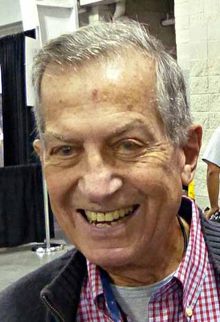
David Chester Gibbons is an English comics artist, writer and sometimes letterer. He is best known for his collaborations with writer Alan Moore, which include the miniseries Watchmen and the Superman story "For the Man Who Has Everything". He was an artist for 2000 AD, for which he contributed a large body of work from its first issue in 1977.

<span class="mw-page-title-main">Todd Klein</span> American comic letterer

Todd Klein is an American comic book letterer, logo designer, and occasional writer, primarily for DC Comics.

<span class="mw-page-title-main">Sam Rosen (comics)</span> Comic book letterer

Sam Rosen, often credited as S. Rosen, was an American calligrapher best known as a letterer for Marvel Comics during the period fans and historians call the Silver Age of Comic Books. Along with letterer Artie Simek, Rosen lettered and helped design logos for virtually all Marvel Comics published during the 1960s. Rosen also moonlighted for other companies during this time: he was the (uncredited) letterer for the 1965-66 Archie Comics series The Mighty Crusaders.

<span class="mw-page-title-main">Richard Starkings</span> British font designer

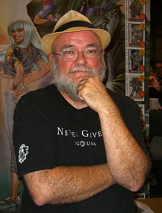
Richard Starkings is a British font designer and comic book letterer, editor and writer. He was one of the early pioneers of computer-based comic-book lettering, and is one of the most prolific creators in that industry.

<span class="mw-page-title-main">Jack Adler</span> American comics artist

Jack Adler was an artist who worked as a cover artist and colorist for DC Comics. He was a staff member of DC's production department from 1946 to 1981, rising steadily up the ranks to production manager and vice president of production.

<span class="mw-page-title-main">Gaspar Saladino</span>

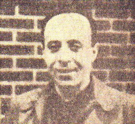
Gaspar Saladino was an American letterer and logo designer who worked for more than sixty years in the comic book industry, mostly for DC Comics. Eventually Saladino went by one name, "Gaspar," which he wrote in his trademark calligraphy.

<span class="mw-page-title-main">Academy of Comic Book Arts</span>

The Academy of Comic Book Arts (ACBA) was an American professional organization of the 1970s that was designed to be the comic book industry analog of such groups as the Academy of Motion Picture Arts and Sciences. Composed of comic-book professionals and initially formed as an honorary society focused on discussing the comic-book craft and hosting an annual awards banquet, the ACBA evolved into an advocacy organization focused on creators' rights.

<span class="mw-page-title-main">Chris Eliopoulos</span> American cartoonist

Chris Eliopoulos is an American cartoonist and letterer of comic books.

<span class="mw-page-title-main">John Workman</span> American comic book letterer

John Workman is an American editor, writer, artist, designer, colorist and letterer in the comic book industry. He is known for his frequent partnerships with writer/artist Walter Simonson and also for lettering the entire run of Grant Morrison/Rachel Pollack's Doom Patrol.

<span class="mw-page-title-main">Jack Morelli</span> American comic book letterer and author

Jack Morelli is an American comic book letterer and author, also credited under the name John Morelli. He has designed many comic book logos. His lettering is notable for being the basis for the computer font used by John Byrne when he letters his own work.

Comicraft is a company which provides graphic design and lettering services to various companies.

Thomas Orzechowski is a comic book letterer, primarily known for his work on Uncanny X-Men. Over the course of Orzechowski's career, he has lettered something on the order of 6,000 pages of Chris Claremont's scripts.

<span class="mw-page-title-main">Ira Schnapp</span> Austrian-American graphic designer

Ira Schnapp was a logo designer and letterer who brought his classic and art deco design styles to DC Comics beginning with the redesign of the Superman logo in 1940. He did a great deal of logo and lettering work for the company in the 1940s. Around 1949, he joined the staff as their in-house logo, cover lettering and house-ad designer and letterer, and continued in that role until about 1967.

Joe Rosen was an American comic book artist, primarily known for his work as a letterer. Over the course of his career with Marvel Comics and DC Comics, Rosen lettered such titles as The Fantastic Four, Captain America, Daredevil, Spider-Man, G.I. Joe: A Real American Hero, The Incredible Hulk, The Further Adventures of Indiana Jones, and X-Factor. He also lettered the DC/Marvel intercompany crossover book Superman and Spider-Man.

James R. Novak was a comic book creator, primarily working as a letterer for Marvel Comics, where he worked on almost every one of their ongoing series, and contributed to the development of the iconic Star Wars logo. He did occasional work as a writer, penciler, and colorist, and also worked at publishers including Dark Horse, Boom! Studios, Image, Dynamite, and IDW.

Ken Lopez is a letterer and logo designer for the comic book industry. A pioneer of computer lettering, Lopez designed the fonts for DC Comics's in-house lettering unit, and is currently DC's art director for lettering and its cover editor.

The Comics Buyer's Guide (CBG) magazine administered the annual Comics Buyer's Guide Fan Awards from 1982 to circa 2010, with the first awards announced in issue #500.

<i>Heroes Against Hunger</i>

Heroes Against Hunger is a 1986 all-star benefit comic book for African famine relief and recovery. Published by DC Comics in the form of a "comic jam" or exquisite corpse, the book starred Superman and Batman. Spearheaded by Jim Starlin and Bernie Wrightson, all proceeds from the comic went to hunger relief in Africa.

References

  1. Klein, Todd. "How it all began," Todd Klein: Lettering – Logos – Design. Retrieved July 22, 2008.
  2. Kimball, Kirk. "The Big Chill," Dial B for Blog #376 (Oct. 10, 2006). Retrieved July 21, 2008.
  3. "Letterer Index," DC Comics Artists. Archived at the Wayback Machine. Accessed July 31, 2019.
  4. B.D.S. Interview with Gaspar Saladino in "Silver Age Sage," The Silver Lantern: A Tribute to the Silver Age of DC Comics (May 25, 2007). Retrieved July 18, 2008.
  5. Mark Evanier quoted in Brian Cronin's "Comic Book Urban Legends Revealed" #66, Comic Book Resources (Aug. 21, 2006). Retrieved July 20, 2008.
  6. Kimball, Kirk. "Gaspar Saladino — The Natural," Dial B for Blog #489 (Sept.). Accessed May 18, 2011.
  7. 1 2 Kimball, Kirk. "Gaspar Saladino — Atlas Shrugged!" Dial B for Blog #497 (Sept.). Accessed May 19, 2011.
  8. "Gaspar Saladino," ComicVine. Retrieved July 20, 2008.
  9. Letterer Clem Robins, quoted in Kimball, Kirk. "Gaspar Saladino — A New Star on the DC Horizon," Dial B for Blog #490 (Sept.). Accessed May 19, 2011.
  10. 1 2 3 Klein, Todd. "Computer lettering," Todd Klein: Lettering – Logos – Design. Retrieved July 23, 2008.
  11. Byrne Robotics FAQ: Creative Process. Retrieved December 2, 2005.
  12. 1 2 Contino, Jennifer. "ABCs with Orzechowski," Comicon.com: The Pulse (Dec. 30, 2003). Retrieved July 17, 2008. Archived September 26, 2008, at the Wayback Machine
  13. Burns, Casey. "Squa Tront and Spa Fon (2001)", Casey Burns official website. Accessed May 21, 2011.