Web design encompasses many different skills and disciplines in the production and maintenance of websites. The different areas of web design include web graphic design; user interface design ; authoring, including standardised code and proprietary software; user experience design ; and search engine optimization. Often many individuals will work in teams covering different aspects of the design process, although some designers will cover them all. The term "web design" is normally used to describe the design process relating to the front-end design of a website including writing markup. Web design partially overlaps web engineering in the broader scope of web development. Web designers are expected to have an awareness of usability and be up to date with web accessibility guidelines.
Web colors are colors used in displaying web pages on the World Wide Web; they can be described by way of three methods: a color may be specified as an RGB triplet, in hexadecimal format or according to its common English name in some cases. A color tool or other graphics software is often used to generate color values. In some uses, hexadecimal color codes are specified with notation using a leading number sign (#). A color is specified according to the intensity of its red, green and blue components, each represented by eight bits. Thus, there are 24 bits used to specify a web color within the sRGB gamut, and 16,777,216 colors that may be so specified.

Gijsbert (Bert) Bos is a Dutch computer scientist known for the development of Argo, a web browser he developed as test application for his style sheet proposal.
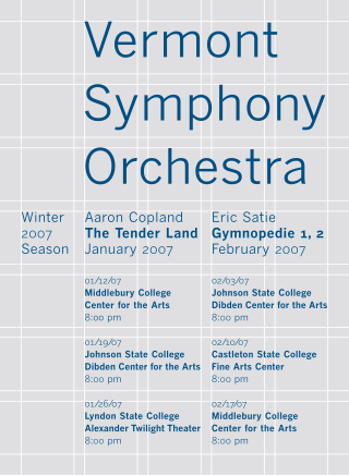
In graphic design, a grid is a structure made up of a series of intersecting straight or curved lines used to structure content. The grid serves as an armature or framework on which a designer can organize graphic elements in a rational, easy-to-absorb manner. A grid can be used to organize graphic elements in relation to a page, in relation to other graphic elements on the page, or relation to other parts of the same graphic element or shape.

In a written or published work, an initial is a letter at the beginning of a word, a chapter, or a paragraph that is larger than the rest of the text. The word is derived from the Latin initialis, which means standing at the beginning. An initial is often several lines in height and in older books or manuscripts are known as "inhabited" initials. Certain important initials, such as the Beatus initial or "B" of Beatus vir... at the opening of Psalm 1 at the start of a vulgate Latin. These specific initials in an illuminated manuscript were also called initiums.
A CSS hack is a coding technique used to hide or show CSS markup depending on the browser, version number, or capabilities. Browsers have different interpretations of CSS behavior and different levels of support for the W3C standards. CSS hacks are sometimes used to achieve consistent layout appearance in multiple browsers that do not have compatible rendering. Most of these hacks do not work in modern versions of the browsers, and other techniques, such as feature support detection, have become more prevalent.

Web typography, like typography generally, is the design of pages – their layout and typeface choices. Unlike traditional print-based typography, pages intended for display on the World Wide Web have additional technical challenges and – given its ability to change the presentation dynamically – additional opportunities. Early web page designs were very simple due to technology limitations; modern designs use Cascading Style Sheets (CSS), JavaScript and other techniques to deliver the typographer's and the client's vision.

CSS animations is a proposed module for Cascading Style Sheets that allows the animation of HTML document elements using CSS.

Cascading Style Sheets (CSS) is a style sheet language used for specifying the presentation and styling of a document written in a markup language such as HTML or XML. CSS is a cornerstone technology of the World Wide Web, alongside HTML and JavaScript.

In web development, the CSS box model refers to how HTML elements are modeled in browser engines and how the dimensions of those HTML elements are derived from CSS properties. It is a fundamental concept for the composition of HTML webpages. The guidelines of the box model are described by web standards World Wide Web Consortium (W3C) specifically the CSS Working Group. For much of the late-1990s and early 2000s there had been non-standard compliant implementations of the box model in mainstream browsers. With the advent of CSS2 in 1998, which introduced the box-sizing property, the problem had mostly been resolved.

The holy grail is a web page layout which has multiple equal-height columns that are defined with style sheets. It is commonly desired and implemented, but for many years, the various ways in which it could be implemented with available technologies all had drawbacks. Because of this, finding an optimal implementation was likened to searching for the elusive Holy Grail.
In software development, a polyfill is code that implements a feature of the development environment that does not natively support the feature. Most often, it refers to JavaScript code that implements an HTML5 or CSS web standard, either an established standard on older browsers, or a proposed standard on existing browsers. Polyfills are also used in PHP and Python.

Responsive web design (RWD) or responsive design is an approach to web design that aims to make web pages render well on a variety of devices and window or screen sizes from minimum to maximum display size to ensure usability and satisfaction.

Bootstrap is a free and open-source CSS framework directed at responsive, mobile-first front-end web development. It contains HTML, CSS and (optionally) JavaScript-based design templates for typography, forms, buttons, navigation, and other interface components.
The emphasis mark or emphasis dot is a typographic marking used in some East Asian languages to indicate emphasis. The markings takes in many forms like, a dot or a bullet, a circle, or a triangle. It was used more traditionally, but nowadays, with technology, quotations or changing of font style prevails.
The CSS Working Group is a working group created by the World Wide Web Consortium (W3C) in 1997, to tackle issues that had not been addressed with CSS level 1. As of December 2022, the CSSWG had 147 members.
CSS Flexible Box Layout, commonly known as Flexbox, is a CSS web layout model. It is in the W3C's candidate recommendation (CR) stage. The flex layout allows responsive elements within a container to be automatically arranged depending on viewport size.
Prince is a computer program that converts XML and HTML documents into PDF files by applying Cascading Style Sheets (CSS). Prince is a commercial product, which is free to download and use for non-commercial purposes.

Jen Simmons is an American graphic designer, web developer, educator and speaker known for her expertise in web standards, particularly HTML and CSS. She is a member of the CSS Working Group and has been prominent in the deployment of CSS grid layout. She worked as a developer advocate at Mozilla and later at Apple.

David Baron is an American computer scientist, web browser engineer, open web standards author, technology speaker, and open source contributor. He has written and edits several CSS web standards specifications including CSS Color Module Level 3, CSS Conditional Rules, and several working drafts. He started working on Mozilla in 1998, and was employed by Mozilla in 2003 to help develop and evolve the Gecko rendering engine, eventually as a Distinguished Engineer in 2013. He was Mozilla’s representative on the WHATWG Steering Group from 2017-2020. He has served on the W3C Technical Architecture Group (TAG) continuously since being elected in 2015 and re-elected subsequently, most recently in 2020. In 2021 he joined Google to work on Google Chrome.


