ColorChecker

Last updated

ColorChecker held in a photographic portrait setting Gretag-Macbeth ColorChecker.jpg
ColorChecker held in a photographic portrait setting
ColorChecker Passport ColorChecker Passport.png
ColorChecker Passport
Nominal chromaticities of ColorChecker patches in the CIE 1931 xy chromaticity diagram (in the SVG version, hover over a color swatch to highlight it; click it to select and deselect it) CIE1931xy ColorChecker SMIL.svg
Nominal chromaticities of ColorChecker patches in the CIE 1931 xy chromaticity diagram (in the SVG version, hover over a color swatch to highlight it; click it to select and deselect it)

The ColorChecker Color Rendition Chart (often referred to by its original name, the Macbeth ColorChecker [1] or simply Macbeth chart [2] ) is a color calibration target consisting of a cardboard-framed arrangement of 24 squares of painted samples. The ColorChecker was introduced in a 1976 paper by McCamy, Marcus, and Davidson in the Journal of Applied Photographic Engineering . [3] The chart’s color patches have spectral reflectances intended to mimic those of natural objects such as human skin, foliage, and flowers, to have consistent color appearance under a variety of lighting conditions, especially as detected by typical color photographic film, and to be stable over time.

Contents

In 2006, Gretag-Macbeth was acquired by X-Rite. In 2021, X-Rite spun off its consumer-level calibration products to a separate company Calibrite, which is currently producing the ColorChecker under the Calibrite brand name. [4]

Design

The ColorChecker Classic chart is a rectangular card measuring about 11 by 8.25 inches (27.9 by 21.0 cm), or in its original incarnation about 13 by 9 inches (33 by 23 cm), an aspect ratio approximately the same as that of 35 mm film. [5] It includes 24 patches in a 4 × 6 grid, each slightly under 2 inches (5.1 cm) square, made of matte paint applied to smooth paper, and surrounded by a black border. Six of the patches form a uniform gray lightness scale, and another six are primary colors typical of chemical photographic processes – red, green, blue, cyan, magenta, and yellow. The remaining colors include approximations of medium light and medium dark human skin, blue sky, the front of a typical leaf, and a blue chicory flower. The rest were chosen arbitrarily to represent a gamut "of general interest and utility for test purposes", though the orange and yellow patches are similarly colored to typical oranges and lemons. [3]

There is also a ColorCheckerPassport, a smaller version of the ColorChecker Classic with the same 24 chips but in a tri-fold version with some additional patches on two of the pages. Its dimensions are 125 mm (H) × 90 mm (W) × 9 mm (T). The pigments for ColorCheckerPassport were modified in November 2014, so the current available cards do not have exactly the same carnation, and hence RGB numbers, as before, and particularly are not the ones provided on next section.

Colors

PDF version of the chart Color Checker.pdf
PDF version of the chart

The colors of the chart were described by McCamy et al. with colorimetric measurements using the CIE 1931 2° standard observer and Illuminant C, and also in terms of the Munsell color system. Using measured reflectance spectra, it is possible to derive CIELAB coordinates for Illuminants D65 and D50 and coordinates in sRGB (D65). [6]

Table from Field (1990); CIE data for Illuminant C from Poynton (2008). [5] [7]
IndexDescriptionMunsell NotationCIE xyYManufacturer's sRGB color values [8] Reflectance Rel. MgCO3
Row 1: Natural colors
1Dark skin3 YR 3.7/3.20.400 0.350 10.1#735244
2Light skin2.2 YR 6.47/4.10.377 0.345 35.8#c29682
3Blue sky4.3 PB 4.95/5.50.247 0.251 19.3#627a9d
4Foliage6.7 GY 4.2/4.10.337 0.422 13.3#576c43
5Blue flower9.7 PB 5.47/6.70.265 0.240 24.3#8580b1
6Bluish green2.5 BG 7/60.261 0.343 43.1#67bdaa
Row 2: Miscellaneous colors
7Orange5 YR 6/110.506 0.407 30.1#d67e2c
8Purplish blue7.5 PB 4/10.70.211 0.175 12.0#505ba6
9Moderate red2.5 R 5/100.453 0.306 19.8#c15a63
10Purple5 P 3/70.285 0.202 6.6#5e3c6c
11Yellow green5 GY 7.1/9.10.380 0.489 44.3#9dbc40
12Orange yellow10 YR 7/10.50.473 0.438 43.1#e0a32e
Row 3: Primary and secondary colors
13Blue7.5 PB 2.9/12.70.187 0.129 6.1#383d96
14Green0.25 G 5.4/9.60.305 0.478 23.4#469449
15Red5 R 4/120.539 0.313 12.0#af363c
16Yellow5 Y 8/11.10.448 0.470 59.1#e7c71f
17Magenta2.5 RP 5/120.364 0.233 19.8#bb5695
18Cyan5 B 5/80.196 0.252 19.8#0885a1
Row 4: Grayscale colors
19WhiteN 9.5/0.310 0.316 90.0#f3f3f390.0%
20Neutral 8N 8/0.310 0.316 59.1#c8c8c859.7%
21Neutral 6.5N 6.5/0.310 0.316 36.2#a0a0a036.1%
22Neutral 5N 5/0.310 0.316 19.8#7a7a7a18.4%
23Neutral 3.5N 3.5/0.310 0.316 9.0#55555518.6%
24BlackN 2/0.310 0.316 3.1#3434343.0%

Use

Color targets such as the ColorChecker can be captured by cameras and other color input devices, and the resulting images’ output can be compared to the original chart, or to reference measurements, to test the degree to which image acquisition reproduction systems and processes approximate the human visual systems. It can also be used to color correct one photo with the chart in it (that may have a different color cast, for example due to a lighting coloration difference) to another "reference" photo with the chart in it.

Because of its wide availability and use, its careful design, and its consistency, and because comprehensive spectrophotometric measurements are available, the ColorChecker has also been used in academic research into topics such as spectral imaging. [9]

ColorChecker Digital SG

X-Rite also sells a 140-patch chart called the ColorChecker Digital SG, and is intended for automated use with computer software to characterize digital cameras and scanners.

See also

Related Research Articles

<span class="mw-page-title-main">Color temperature</span> Property of light sources related to black-body radiation

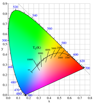
Color temperature is a parameter describing the color of a visible light source by comparing it to the color of light emitted by an idealized opaque, non-reflective body. The temperature of the ideal emitter that matches the color most closely is defined as the color temperature of the original visible light source. Color temperature is usually measured in kelvins. The color temperature scale describes only the color of light emitted by a light source, which may actually be at a different temperature.

<span class="mw-page-title-main">Metamerism (color)</span> Perceived matching of colors in colorimetry

In colorimetry, metamerism is a perceived matching of colors with different (nonmatching) spectral power distributions. Colors that match this way are called metamers.

<span class="mw-page-title-main">International Commission on Illumination</span> International authority on light, illumination, color, and color spaces

The International Commission on Illumination is the international authority on light, illumination, colour, and colour spaces. It was established in 1913 as a successor to the Commission Internationale de Photométrie, which was founded in 1900, and is today based in Vienna, Austria.

Color management is the process of ensuring consistent and accurate colors across various devices, such as monitors, printers, and cameras. It involves the use of color profiles, which are standardized descriptions of how colors should be displayed or reproduced.

<span class="mw-page-title-main">CIELAB color space</span> Standard color space with color-opponent values

The CIELAB color space, also referred to as L*a*b*, is a color space defined by the International Commission on Illumination in 1976. It expresses color as three values: L* for perceptual lightness and a* and b* for the four unique colors of human vision: red, green, blue and yellow. CIELAB was intended as a perceptually uniform space, where a given numerical change corresponds to a similar perceived change in color. While the LAB space is not truly perceptually uniform, it nevertheless is useful in industry for detecting small differences in color.

Colorimetry is "the science and technology used to quantify and describe physically the human color perception". It is similar to spectrophotometry, but is distinguished by its interest in reducing spectra to the physical correlates of color perception, most often the CIE 1931 XYZ color space tristimulus values and related quantities.

<span class="mw-page-title-main">Gamut</span> Color reproduction capability

In color reproduction and colorimetry, a gamut, or color gamut, is a convex set containing the colors that can be accurately represented, i.e. reproduced by an output device or measured by an input device. Devices with a larger gamut can represent more colors. Similarly, gamut may also refer to the colors within a defined color space, which is not linked to a specific device. A trichromatic gamut is often visualized as a color triangle. A less common usage defines gamut as the subset of colors contained within an image, scene or video.

sRGB Standard RGB color space

sRGB is a standard RGB color space that HP and Microsoft created cooperatively in 1996 to use on monitors, printers, and the World Wide Web. It was subsequently standardized by the International Electrotechnical Commission (IEC) as IEC 61966-2-1:1999. sRGB is the current defined standard colorspace for the web, and it is usually the assumed colorspace for images that are neither tagged for a colorspace nor have an embedded color profile.

<span class="mw-page-title-main">Color rendering index</span> Measure of ability of a light source to reproduce colors in comparison with a standard light source

A color rendering index (CRI) is a quantitative measure of the ability of a light source to reveal the colors of various objects faithfully in comparison with a natural or standard light source. Light sources with a high CRI are desirable in color-critical applications such as neonatal care and art restoration.

A white point is a set of tristimulus values or chromaticity coordinates that serve to define the color "white" in image capture, encoding, or reproduction. Depending on the application, different definitions of white are needed to give acceptable results. For example, photographs taken indoors may be lit by incandescent lights, which are relatively orange compared to daylight. Defining "white" as daylight will give unacceptable results when attempting to color-correct a photograph taken with incandescent lighting.

<span class="mw-page-title-main">ProPhoto RGB color space</span> Photographic color space developed by Kodak

The ProPhoto RGB color space, also known as ROMM RGB, is an output referred RGB color space developed by Kodak. It offers an especially large gamut designed for use with photographic output in mind. The ProPhoto RGB color space encompasses over 90% of possible surface colors in the CIE L*a*b* color space, and 100% of likely occurring real-world surface colors documented by Michael Pointer in 1980, making ProPhoto even larger than the Wide-gamut RGB color space. The ProPhoto RGB primaries were also chosen in order to minimize hue rotations associated with non-linear tone scale operations. One of the downsides to this color space is that approximately 13% of the representable colors are imaginary colors that do not exist and are not visible colors.

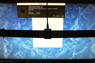
The aim of color calibration is to measure and/or adjust the color response of a device to a known state. In International Color Consortium (ICC) terms, this is the basis for an additional color characterization of the device and later profiling. In non-ICC workflows, calibration sometimes refers to establishing a known relationship to a standard color space in one go. The device that is to be calibrated is sometimes known as a calibration source; the color space that serves as a standard is sometimes known as a calibration target. Color calibration is a requirement for all devices taking an active part in a color-managed workflow and is used by many industries, such as television production, gaming, photography, engineering, chemistry, medicine, and more.

<span class="mw-page-title-main">Standard illuminant</span> Theoretical source of visible light

A standard illuminant is a theoretical source of visible light with a spectral power distribution that is published. Standard illuminants provide a basis for comparing images or colors recorded under different lighting.

In color management, an ICC profile is a set of data that characterizes a color input or output device, or a color space, according to standards promulgated by the International Color Consortium (ICC). Profiles describe the color attributes of a particular device or viewing requirement by defining a mapping between the device source or target color space and a profile connection space (PCS). This PCS is either CIELAB (L*a*b*) or CIEXYZ. Mappings may be specified using tables, to which interpolation is applied, or through a series of parameters for transformations.

IT8 is a set of American National Standards Institute (ANSI) standards for color communications and control specifications. Formerly governed by the IT8 Committee, IT8 activities were merged with those of the Committee for Graphics Arts Technologies Standards in 1994.

<span class="mw-page-title-main">Color chart</span> Card with color samples

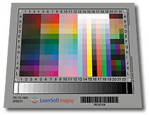
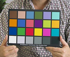
A color chart or color reference card is a flat, physical object that has many different color samples present. They can be available as a single-page chart, or in the form of swatchbooks or color-matching fans.

The color rendering of a light source refers to its ability to reveal the colors of various objects faithfully in comparison with an ideal or natural light source. Light sources with good color rendering are desirable in color-critical applications such as neonatal care and art restoration. It is defined by the International Commission on Illumination (CIE) as follows:

Effect of an illuminant on the color appearance of objects by conscious or subconscious comparison with their color appearance under a reference illuminant.

<span class="mw-page-title-main">Tristimulus colorimeter</span> Device to measure color values

A tristimulus colorimeter, colloquially shortened to colorimeter, is used in digital imaging to profile and calibrate output devices. It takes a limited number of wideband spectral energy readings along the visible spectrum by using filtered photodetectors; e.g. silicon photodiodes.

A color appearance model (CAM) is a mathematical model that seeks to describe the perceptual aspects of human color vision, i.e. viewing conditions under which the appearance of a color does not tally with the corresponding physical measurement of the stimulus source.

References

  1. The ColorChecker was originally produced by Macbeth (then a subsidiary of Kollmorgen), which through a series of mergers and acquisitions now belongs to X-Rite.
  2. Trémeau, Alain; Schettini, Raimondo; Tominaga, Shoji (29 July 2009). Computational Color Imaging – Alain Trémeau – Google Books. Springer. ISBN   978-3-642-03265-3 . Retrieved 12 October 2015.
  3. 1 2 C. S. McCamy, H. Marcus, and J. G. Davidson (1976). "A Color-Rendition Chart". Journal of Applied Photographic Engineering2(3). 95–99.
  4. "Some X-Rite Products Rebranding to Calibrite". Image Science.
  5. 1 2 Charles Poynton (2008). "ColorChecker (‘Macbeth’) Chart". poynton.com
  6. Measured reflectance spectra are available Archived 10 November 2012 at the Wayback Machine from the Munsell Color Science Laboratory website in html Archived 4 March 2016 at the Wayback Machine and Excel Archived 21 November 2014 at the Wayback Machine formats, taken from measurements published in Noboru Ohta (1997). "The Basis of Color Reproduction Engineering" (Japanese). Corona-sha Company of Japan.
    See also Danny Pascale’s page.
  7. Field, Gary G. (1990), Color Scanning and Imaging Systems, Pittsburgh, PA: Graphic Arts Technical Foundation, ISBN   0-88362-120-7
  8. ColorChecker Colorimetric Data (PDF), archived (PDF) from the original on 9 October 2012, retrieved 17 April 2012
  9. For example, Roy S. Berns and Lawrence A. Taplin (2006). "Practical Spectral Imaging Using a Color-Filter Array Digital Camera".