Color chart

Last updated

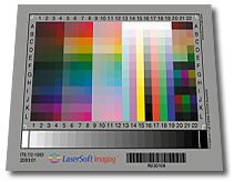
An IT8.7 Target by LaserSoft Imaging used for color management of digital cameras or scanners. IT8target.jpg
An IT8.7 Target by LaserSoft Imaging used for color management of digital cameras or scanners.
Color chips or color samples from a plastic pellet manufacturer that enables customers to evaluate the color range as molded objects to see final effects Color chips 2.jpg
Color chips or color samples from a plastic pellet manufacturer that enables customers to evaluate the color range as molded objects to see final effects

A color chart or color reference card is a flat, physical object that has many different color samples present. They can be available as a single-page chart, or in the form of swatchbooks or color-matching fans.

Contents

Typically there are two different types of color charts:

Color reference charts

Color reference charts are used for color comparisons and measurements such as checking the color reproduction of an imaging system, and calibration and/or profiling of digital input devices such as digital cameras, and scanners and output display systems like printers, monitors and projectors. They are also used by traditional photographers and cinematographers to calibrate cameras that use film and to check the color temperature of the lighting.

Color reference cards can also be used to assess light quality, as in the color rendering index, where reflectance from a set of Munsell samples are evaluated.

Shirley cards

Shirley cards are color reference cards that are used to perform skin-color balance in still photography printing. The industry standard for these cards in North American photography labs in the 1940s and 1950s depicted a solitary "Caucasian" female dressed in brightly colored clothes. Very few of these color reference cards showed an adult male as the reference image. [1] Light skin tones therefore served as the recognized skin ideal standard. Stock color film chemistry for still cameras was designed originally with a positive bias toward "Caucasian" skin tones because of its high level of reflectivity. [1]

By the mid-1990s, Japanese companies redesigned their Shirley cards using data from their own color preference tests. The new reference card featured Japanese women with light yellow skin. [1]

In 1995, Kodak designed a multiracial norm reference card. This card showed three women (Caucasian, Asian, African) with different skin colors and brightly contrasted clothing. [1]

A similar cinematic calibration technique is known as the China Girl.

ColorChecker charts

The ColorChecker, first produced as the "Macbeth ColorChecker" in 1976, is a cardboard-framed arrangement of twenty-four squares of painted samples based on Munsell colors. Its previous maker Gretag–Macbeth was acquired in 2006 by X-Rite.

ColorChecker Color Rendition Chart Gretag-Macbeth ColorChecker.jpg
ColorChecker Color Rendition Chart

A ColorChecker chart can be used to manually adjust color parameters (e.g. color temperature) to achieve a desired color rendition. ColorChecker charts are available in different sizes and forms.

IT8 charts

Standardized IT8 charts (also called IT8 targets) are made by several companies including Coloraid.de, FujiFilm, Kodak, LaserSoft Imaging. [2] [ needs update ] Unlike ColorChecker charts, IT8 charts are supplied with measurement values and can be used to create ICC color profiles by software (e.g. for digital cameras) to create reproducible color management.

This is an IT8 color target made in EGM Laboratories in Barcelona, Spain. It has a very big gamut, slightly bigger than the ProPhoto color space. IT8 color target by EGM Laboratories.jpg
This is an IT8 color target made in EGM Laboratories in Barcelona, Spain. It has a very big gamut, slightly bigger than the ProPhoto color space.

Other

Pier Andrea Saccardo proposed this "chromotaxy scale" in 1894, to standardize the naming of colors of plant specimens.

Pier Andrea Saccardo's chromotaxy scale Saccardo's chromotaxy scale.jpg
Pier Andrea Saccardo's chromotaxy scale

Color charts can take custom forms, as for example the calibration target used by the Curiosity rover for its Mars Hand Lens Imager (MAHLI).

Calibration target on the Mars Curiosity rover PIA16132-MarsCuriosityRover-CalibrationTarget-20120909.jpg
Calibration target on the Mars Curiosity rover

The European Pharmacopoeia monograph 2.2.2 is a method to determine the degree of coloration in liquids, applied to pharmacological compounds, drug substances and finished product. It consist in 3 stock solutions, yellow, red, and blue. These are prepared by dissolving in hydrochloride acid ferric chloride, cobalt chloride, or copper sulfate, respectively. The stock solutions are then used in different proportions to prepare five standard solutions, termed B (brown), BY (brownish-yellow), Y (yellow), GY (greenish-yellow), and R (red). Results are given by observation of the test material against the standard solutions, and expressed as less intensely colored as the next color standard (for example, "color of solution colorless to slightly brown-yellow liquid, <BY4"). [3] This method has been updated in Ph.Eur. release version 10 to include a digital method that eliminates the errors inherent in visual methods due to differences in human perception, while providing a quantitative color value.

Color selection charts

A RAL colour fan RAL K5 Facher RGB.jpg
A RAL colour fan

Because paints and inks depend for their color on pigments and dyes, a reference is needed to match specific combinations of coloring substances in a given matrix against the resulting color. One of the earliest attempts to achieve this goal was the 1692 manuscript Klaer Lightende Spiegel der Verfkonst. It presented a range of watercolor mixtures, but remained relatively unknown, because only one manuscript was produced. Due to the development of the paint and ink industry, the requirement for this kind of chart intensified, and a number of systems are now available, including:

See also

Further reading

Related Research Articles

<span class="mw-page-title-main">RGB color model</span> Color model based on red, green, and blue

The RGB color model is an additive color model in which the red, green and blue primary colors of light are added together in various ways to reproduce a broad array of colors. The name of the model comes from the initials of the three additive primary colors, red, green, and blue.

Pantone LLC is an American limited liability company headquartered in Carlstadt, New Jersey. The company is best known for its Pantone Matching System (PMS), a proprietary color space used in a variety of industries, notably graphic design, fashion design, product design, printing, and manufacturing and supporting the management of color from design to production, in physical and digital formats, among coated and uncoated materials, cotton, polyester, nylon and plastics.
<span class="mw-page-title-main">Munsell color system</span> Color space

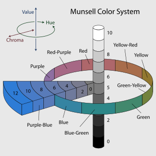
In colorimetry, the Munsell color system is a color space that specifies colors based on three properties of color: hue, chroma, and value (lightness). It was created by Albert H. Munsell in the first decade of the 20th century and adopted by the United States Department of Agriculture (USDA) as the official color system for soil research in the 1930s.

Color depth or colour depth, also known as bit depth, is either the number of bits used to indicate the color of a single pixel, or the number of bits used for each color component of a single pixel. When referring to a pixel, the concept can be defined as bits per pixel (bpp). When referring to a color component, the concept can be defined as bits per component, bits per channel, bits per color, and also bits per pixel component, bits per color channel or bits per sample (bps). Modern standards tend to use bits per component, but historical lower-depth systems used bits per pixel more often.

<span class="mw-page-title-main">Spot color</span> Type of ink or pigment used in printing

In offset printing, a spot color or solid color is any color generated by an ink that is printed using a single run, whereas a process color is produced by printing a series of dots of different colors.

The Color Association of the United States (CAUS), known until 1955 as the Textile Color Card Association of the United States (TCCA), is an independent color trend forecasting and color consulting service to the business community, known for its textile color swatch book, the Standard Color Reference of America.

The aim of color calibration is to measure and/or adjust the color response of a device to a known state. In International Color Consortium (ICC) terms, this is the basis for an additional color characterization of the device and later profiling. In non-ICC workflows, calibration sometimes refers to establishing a known relationship to a standard color space in one go. The device that is to be calibrated is sometimes known as a calibration source; the color space that serves as a standard is sometimes known as a calibration target. Color calibration is a requirement for all devices taking an active part in a color-managed workflow and is used by many industries, such as television production, gaming, photography, engineering, chemistry, medicine, and more.

IT8 is a set of American National Standards Institute (ANSI) standards for color communications and control specifications. Formerly governed by the IT8 Committee, IT8 activities were merged with those of the Committee for Graphics Arts Technologies Standards in 1994.

Federal Standard 595, known as SAE AMS-STD-595 – Colors Used in Government Procurement, formerly FED-STD-595, is a United States Federal Standard for colors, issued by the General Services Administration.

<span class="mw-page-title-main">Shades of green</span> Varieties of the color green

Varieties of the color green may differ in hue, chroma or lightness, or in two or three of these qualities. Variations in value are also called tints and shades, a tint being a green or other hue mixed with white, a shade being mixed with black. A large selection of these various colors is shown below.

<span class="mw-page-title-main">Shades of red</span> Varieties of the color red

Varieties of the color red may differ in hue, chroma or lightness, or in two or three of these qualities. Variations in value are also called tints and shades, a tint being a red or other hue mixed with white, a shade being mixed with black. A large selection of these various colors are shown below.

<span class="mw-page-title-main">Color gradient</span> Specifies a range of position-dependent colors

In color science, a color gradient specifies a range of position-dependent colors, usually used to fill a region.

Color analysis, also known as personal color analysis (PCA), seasonal color analysis, or skin-tone matching, is a term often used within the cosmetics and fashion industry to describe a method of determining the colors of clothing, makeup, hair style that harmonizes with a person's skin complexion, eye color, and hair color for use in wardrobe planning and style consulting. Color analysis theory claims that some colors will draw attention to wrinkles or uneven skin tone while other colors will enhance the individual's features.

<span class="mw-page-title-main">ColorChecker</span> Color calibration target

The ColorChecker Color Rendition Chart is a color calibration target consisting of a cardboard-framed arrangement of 24 squares of painted samples. The ColorChecker was introduced in a 1976 paper by McCamy, Marcus, and Davidson in the Journal of Applied Photographic Engineering. The chart’s color patches have spectral reflectances intended to mimic those of natural objects such as human skin, foliage, and flowers, to have consistent color appearance under a variety of lighting conditions, especially as detected by typical color photographic film, and to be stable over time.

<span class="mw-page-title-main">SilverFast</span>

SilverFast is the name of a family of software for image scanning and processing, including photos, documents and slides, developed by LaserSoft Imaging.

<span class="mw-page-title-main">Color space</span> Standard that defines a specific range of colors

A color space is a specific organization of colors. In combination with color profiling supported by various physical devices, it supports reproducible representations of color – whether such representation entails an analog or a digital representation. A color space may be arbitrary, i.e. with physically realized colors assigned to a set of physical color swatches with corresponding assigned color names, or structured with mathematical rigor. A "color space" is a useful conceptual tool for understanding the color capabilities of a particular device or digital file. When trying to reproduce color on another device, color spaces can show whether shadow/highlight detail and color saturation can be retained, and by how much either will be compromised.

<span class="mw-page-title-main">Image color transfer</span> Function that maps the colors of one image to the colors of another image

Image color transfer is a function that maps (transforms) the colors of one (source) image to the colors of another (target) image. A color mapping may be referred to as the algorithm that results in the mapping function or the algorithm that transforms the image colors. The image modification process is sometimes called color transfer or, when grayscale images are involved, brightness transfer function (BTF); it may also be called photometric camera calibration or radiometric camera calibration.
<span class="mw-page-title-main">Shades of yellow</span> Overview about the shades of yellow

Varieties of the color yellow may differ in hue, chroma or lightness, or in two or three of these qualities. Variations in value are also called tints and shades, a tint being a yellow or other hue mixed with white, a shade being mixed with black. A large selection of these various colors is shown below.
References

  1. 1 2 3 4 Roth, Lorna (March 28, 2009). "Looking at Shirley, the Ultimate Norm: Colour Balance, Image Technologies, and Cognitive Equity". Canadian Journal of Communication. 34 (1). Canadian Journal of Communication/CCSP Press: 111–136. doi: 10.22230/cjc.2009v34n1a2196 . Retrieved November 4, 2013.
  2. Ian Lyons. "IT8 Calibration Targets: Does cost really make a difference?". Computer Darkroom. Archived from the original on August 4, 2003.
  3. European Pharmacopoeia 7.0. "2.2.2. DEGREE OF COLORATION OF LIQUIDS". European Directorate for the Quality of Medicines & HealthCare . Retrieved August 25, 2021.{{cite web}}: CS1 maint: numeric names: authors list (link)
  4. William E. Kasdorf (2003). The Columbia Guide to Digital Publishing. Columbia University Press. ISBN   978-0-231-12498-0.
  5. "Online RAL Classic Color Table". Online Color Charts. Retrieved March 14, 2024.