Pastel (color)

Last updated

Pastel
Commercial pastels.JPG
Pastel sticks in a variety of colors
Common connotations
Soothing

Pastels or pastel colors belong to a pale family of colors, which, when described in the HSV color space, have high value and low saturation. [1] [2] They are named after an artistic medium made from pigment and solid binding agents, similar to crayons. Pastel sticks historically tended to have lower saturation than paints of the same pigment, hence the name of this color family. The popularity of pastel colors has evolved over time, with notable periods of prominence in various historical and cultural contexts. A significant era that saw a surge in the popularity of pastel colors was the late 19th century, particularly during the Victorian era. [3]

Contents

These delicate tones exhibit a soft and muted appearance, evoking a sense of tranquility and refinement. Pastel colors are characterized by their gentle, subtle quality, [4] often conveying a feeling of innocence and sophistication. The colors of this family are usually described as "soothing." [5] Pink, mauve, [6] and baby blue [7] are commonly used pastel colors, as are mint green, peach, periwinkle, lilac, and lavender. Pastel colors are common in the kawaii aesthetic.

Commonly utilized in art, design, fashion, and interior decoration, pastel hues encompass a spectrum of soft pinks, blues, greens, yellows, and purples. Their understated elegance renders them a popular choice for conveying a sense of gentleness and aesthetic subtlety in various creative endeavors. The pastel color still has its presences overtime in design world, since it preserve the natural beauty of raw colors without being too hard on the eyes.

Practicality

The main characteristic of pastel color is a low saturation. This property makes it easy to create a color scheme of pastel colors. Consequently, it has been applied in branding, photography, fashion, and interior design for decades.

Branding

In modern days, branding statements can be introduced through the design of color which coherence with the products or services the brand offers; It can be sweet pale yet bold at the same time. [8]

Photography

The pale value of pastel colors has been portrayed in the photography field. Its beauty appears in soft or diffused sunlight. On the other hand, excessive exposure to sunlight will result in washing out. [9]

Fashion

In the fashion world, pastel colors express romantic and delicate features to the collection. The color scheme was popular during the spring and summer collections. The soft palette harmonize with the warm weather and joyful atmosphere of the seasons. [10]

Interior Design

Interior design field has used a subdued color as a mood booster. It plays with color psychology to evoke an emotion of calmness and peace in your house. Likewise, introducing a femininity and a sweetness to environment. [11]

Palette

Examples of pastels in HEX-code
     
  fea3aa  f8b88b  faf884  
  baed91  b2cefe  f2a2e8  
     

Color with psychology

Human perception and experience are greatly influenced by color, which has an impact on a variety of life factors such as cultural background, emotional reactions, and behavioral inclinations. Every hue has a symbolic value of its own and may elicit various feelings and reactions in people.

Pablo Picasso's phrase, "Colors, like features, follow the changes of the emotions,"[1] emphasizes the close relationship between color and feelings in people. Colors are a very useful tool in art, design, and communication because they can indicate, interact with, and elicit responses from living things. Pastel color also provides a specific psychological effect in each particular color.

Peach

The pale orange hue, commonly referred to as Peach, holds particular allure within residential spaces. Its inherent warmth fosters a sense of comfort and emotional well-being while concurrently casting a complimentary light upon one's complexion, imbuing the visage with a healthy flush. This color exhibits an enduring aesthetic appeal, manifesting its captivating charm both during daylight hours and amidst artificial illumination, rendering it a favored choice for prestigious dining establishments seeking to cultivate an inviting ambiance. Moreover, Peach conveys connotations of freshness, vitality, and culinary appeal, rendering it a popular selection for table arrangements and culinary accoutrements.

Sea foam

The subdued tones of green, exemplified by Sea Foam, elicit a profound sense of tranquility and relaxation. This attribute finds practical application within healthcare settings, where such hues adorn hospital walls, strategically employed to assuage the anxieties of patients and visitors alike. Similarly, the utilization of "green rooms" backstage in theatrical and televised productions serves to assuage performers' pre-performance jitters, attesting to the calming influence of this color spectrum. Physiologically, pale green hues are conducive to ocular comfort, thereby enhancing visual acuity.

Light Blue

Light to medium shades of blue evoke a sensation of serenity and repose, exerting a discernible physiological impact by inducing reductions in pulse rate, respiration, and blood pressure. The universally positive associations with blue hues evoke imagery of expansive skies and tranquil waters, evoking sentiments of relaxation and leisure reminiscent of idyllic coastal retreats.

Lavender

Lavenders and violets evoke an aura of romance and nostalgia, rendering them well-suited for bedroom environments conducive to restful slumber. Renowned for their delicate and soothing qualities, these hues are often employed in aromatherapy and interior design to promote relaxation and sleep induction. However, the tranquilizing effects of purple hues may inadvertently deter productivity, as these shades tend to foster contemplative reverie.

Peachy Pink

Peachy pinks, frequently utilized in cosmetic packaging, exude a distinctly feminine allure while enhancing the complexion's natural radiance. In the realm of chromatherapy, pink environments are recommended for individuals grappling with stress and agitation, as this color possesses a notable capacity to pacify and engender a sense of emotional release, facilitating the relinquishment of negative emotions and fostering a state of inner calm.

[12]

Design and art

Soft colors, or pastel colors, are a special kind of hue that may evoke a variety of feelings and moods. This makes them valuable in the field of aesthetics and creative expression. These hues, which are distinguished by their soft, light tones, have been prized for generations due to their ability to evoke feelings of refinement, elegance, and serenity. Pastel colors have a significant influence on art and design, providing viewers with a soothing and aesthetically attractive experience. [13]

The capacity of pastel hues to create harmony in a composition is one of its most noteworthy qualities. Pastel colors, in contrast to bright and dramatic hues, help to lessen contrasts and create a harmonic balance that is especially helpful in intricate artworks. This harmonizing characteristic enables artists to combine dissimilar parts in a united and cohesive way by blending them together effortlessly. [14]

Pastel hues may also be employed in a variety of artistic mediums and styles due to their versatility. Pastels are a versatile and universally appealing color that may be used in a wide range of creative expressions, including paintings, digital art, fashion, and interior design. Pastel hues lend a sense of refinement and beauty to interior design projects by helping to create calm, cozy environments. [15]

Pastel colors have been used by artists for centuries to create particular atmospheres and emotions in their works. These hues never cease to enthrall and inspire viewers throughout the globe, from the dreamy pastel portraits of modern painters to the exquisite pastel landscapes of the Impressionists.</ref>https://www.linearity.io/blog/color-psychology/</ref>

Related Research Articles

<span class="mw-page-title-main">Pastel</span> Powdered-pigment-based art medium

A pastel is an art medium that consist of powdered pigment and a binder. It can exist in a variety of forms, including a stick, a square, a pebble, or a pan of color, though other forms are possible. The pigments used in pastels are similar to those used to produce some other colored visual arts media, such as oil paints; the binder is of a neutral hue and low saturation. The color effect of pastels is closer to the natural dry pigments than that of any other process.

<span class="mw-page-title-main">Pink</span> Pale tint of red

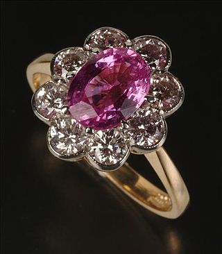
Pink is the color of a namesake flower that is a pale tint of red. It was first used as a color name in the late 17th century. According to surveys in Europe and the United States, pink is the color most often associated with charm, politeness, sensitivity, tenderness, sweetness, childhood, femininity, and romance. A combination of pink and white is associated with innocence, whereas a combination of pink and black links to eroticism and seduction. In the 21st century, pink is seen as a symbol of femininity, though it has not always been seen this way. In the 1920s, pink was seen as a color that reflected masculinity.

Color theory, or more specifically traditional color theory, is the historical body of knowledge describing the behavior of colors, namely in color mixing, color contrast effects, color harmony, color schemes and color symbolism. Modern color theory is generally referred to as Color science. While there is no clear distinction in scope, traditional color theory tends to be more subjective and have artistic applications, while color science tends to be more objective and have functional applications, such as in chemistry, astronomy or color reproduction. Color theory dates back at least as far as Aristotle's treatise On Colors. A formalization of "color theory" began in the 18th century, initially within a partisan controversy over Isaac Newton's theory of color and the nature of primary colors. By the end of the 19th century, a schism had formed between traditional color theory and color science.

<span class="mw-page-title-main">Color term</span> Word or phrase that refers to a specific color

A color term is a word or phrase that refers to a specific color. The color term may refer to human perception of that color which is usually defined according to the Munsell color system, or to an underlying physical property. There are also numerical systems of color specification, referred to as color spaces.

<span class="mw-page-title-main">Color wheel</span> Illustrative organization of color hues

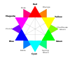
A color wheel or color circle is an abstract illustrative organization of color hues around a circle, which shows the relationships between primary colors, secondary colors, tertiary colors etc.

Peach is a color that is named for the pale color of the interior flesh of the peach fruit. This name may also be substituted for "peachy". Like the color apricot, the color peach is paler than most actual peach fruits and seems to have been formulated primarily to create a pastel palette of colors for interior design.

Shabby chic is a style of interior design that chooses either furniture and furnishings for their appearance of age and signs of wear and tear or distresses new ones to achieve the same result. Unlike much genuine period décor, this style features a soft, pastel-colored, cottage look.

<i>Emotional Design</i> Book by American writer Donald Norman

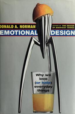
Emotional Design is both the title of a book by Donald Norman and of the concept it represents.

In color theory, a color scheme is a combination of 2 or more colors used in aesthetic or practical design. Aesthetic color schemes are used to create style and appeal. Colors that create a harmonious feeling when viewed together are often used together in aesthetic color schemes. Practical color schemes are used to inhibit or facilitate color tasks, such as camouflage color schemes or high visibility color schemes. Qualitative and quantitative color schemes are used to encode unordered categorical data and ordered data, respectively. Color schemes are often described in terms of logical combinations of colors on a color wheel or within a color space.

Visual design elements and principles describe fundamental ideas about the practice of visual design.

Light blue is a color or range of colors, typically a lightened shade with a hue between cyan and blue.

Earth tone is a term used to describe a palette of colors that are similar to natural materials and landscapes. These colors are inspired by the earth's natural hues, including browns, greens, grays, and other warm and muted shades. The term earth tone first became popular in the 1970s during the environmental movement, as people sought to reconnect with nature and embrace more natural and organic lifestyles.

<span class="mw-page-title-main">Visual merchandising</span> Marketing technique emphasizing 3D model displays

Visual merchandising is the practice in the retail industry of optimizing the presentation of products and services to better highlight their features and benefits. The purpose of such visual merchandising is to attract, engage, and motivate the customer towards making a purchase.

Historic paint analysis, or architectural paint research, is the scientific analysis of a broad range of architectural finishes, and is primarily used to determine the color and behavior of surface finishes at any given point in time. This helps us to understand the building's structural history and how its appearance has changed over time.

Color analysis, also known as personal color analysis (PCA), seasonal color analysis, or skin-tone matching, is a term often used within the cosmetics and fashion industry to describe a method of determining the colors of clothing, makeup, hair style that harmonizes with a person's skin complexion, eye color, and hair color for use in wardrobe planning and style consulting.

<span class="mw-page-title-main">Shades of pink</span> Varieties of the color pink

Pink colors are usually light or desaturated shades of reds, roses, and magentas which are created on computer and television screens using the RGB color model and in printing with the CMYK color model. As such, it is an arbitrary classification of color.

<span class="mw-page-title-main">Color psychology</span> Study of influence of color on human behavior

Color psychology is the study of hues as a determinant of human behavior. Color influences perceptions that are not obvious, such as the taste of food. Colors have qualities that can cause certain emotions in people. How color influences individuals may differ depending on age, gender, and culture. Although color associations can vary contextually between cultures, color preference is thought to be relatively uniform across gender and race.

Color-blocking is thought of as the exploration of taking colors that are opposites on the color wheel and pairing them together to make complementary color combinations. It is commonly associated in fashion as a trend that originated from the artwork of Dutch painter, Piet Mondrian. However, other experts argue whether his artwork is the true origin of color-blocking.

<span class="mw-page-title-main">Gendered associations of pink and blue</span> Cultural attribution of colors to genders

The colors pink and blue are associated with girls and boys respectively, in the United States, the United Kingdom and some other European countries.

An Internet aesthetic, also simply referred to as an aesthetic or microaesthetic, is a visual art style, sometimes accompanied by a fashion style, subculture, or music genre, that usually originates from the Internet or is popularized on it. Throughout the 2010s and 2020s, online aesthetics gained increasing popularity, specifically on social media platforms such as Tumblr, Pinterest, Instagram, and TikTok, and often were used by people to express their individuality and creativity. They can also be used to create a sense of community and belonging among people who share the same interests. The term aesthetic has been described as being "totally divorced from its academic origins", and is commonly used as an adjective.

References

  1. Gilbert, Beverly Ash (2009). Beaded Colorways: Freeform Beadweaving Projects and Palettes. Cincinnati, OH: North Light Books. p. 13. ISBN   9781600613180 . Retrieved July 27, 2013.
  2. Whitaker, Jerry C. (1996). "Principles of Light, Vision, and Photometry". In Whitaker, Jerry C. (ed.). The Electronics Handbook. Boca Raton, Fla.: CRC Press. p. 85. ISBN   9780849383458 . Retrieved July 27, 2013.
  3. Wright, Kelly (December 21, 2011). "Coloring Their World: Americans and Decorative Color in the Nineteenth Century". Transatlantica. Revue d'études américaines. American Studies Journal (in French) (2). doi:10.4000/transatlantica.5612. ISSN   1765-2766.
  4. "The Ultimate Guide to Using Pastel Color Codes in Your Designs". www.capcut.com. Retrieved March 1, 2024.
  5. Clark, Sally (2003). House Beautiful Magazine (ed.). House Beautiful Color: Bright Ideas for Every Room. New York: Sterling Publishing Company. p. 27. ISBN   9781588162519. OCLC   61439232 . Retrieved July 22, 2013.
  6. McCarthy, Michael; Felicity O'Dell (2002). English Vocabulary in Use (Advanced). Cambridge, UK: Cambridge University Press. p. 154. ISBN   9780521653978. OCLC   49550686 . Retrieved July 27, 2013.
  7. Weber, Jeanette (1990). Clothing: Fashion, Fabrics, Construction. McGraw-Hill Education. ISBN   9780026401616.
  8. "Why We Love the Pastel Color Palette". Linearity blog. July 23, 2021. Retrieved March 19, 2024.
  9. "In Praise of Pastels". Learning with Experts. June 20, 2012. Retrieved March 19, 2024.
  10. "Pastel colors: the trend that is conquering the world of design". Astra Vernici. June 30, 2023. Retrieved March 19, 2024.
  11. "Pastel colors: the trend that is conquering the world of design". Astra Vernici. June 30, 2023. Retrieved March 19, 2024.
  12. Marks, Terry, ed. (2009). Color harmony compendium: a complete color reference for designers of all types. Beverly, Mass: Rockport Pub. ISBN   978-1-59253-590-3.
  13. https://artistrybyaltenew.com/blogs/art-supplies-inspiration-tips-diy/the-power-of-pastels-exploring-soft-and-subtle-colors-in-your-artwork
  14. https://wave.video/blog/pastel-colors-in-design/
  15. https://www.nerolac.com/blog/pastel-colours-ultimate-guide-to-embracing-the-perfect-palette