Manganese violet

Last updated
Manganese violet
Manganese violet.jpg
Names
Other names
ammonium manganese(III) pyrophosphate
Identifiers
3D model (JSmol)
ChemSpider
ECHA InfoCard 100.030.221 OOjs UI icon edit-ltr-progressive.svg
EC Number
  • 233-257-4
PubChem CID
UNII
  • InChI=1S/Mn.H3N.H4O7P2/c;;1-8(2,3)7-9(4,5)6/h;1H3;(H2,1,2,3)(H2,4,5,6)/q+3;;/p-3
    Key: UHHXUPJJDHEMGX-UHFFFAOYSA-K
  • [N+H4].[Mn+3].O=P([O-])([O-])OP([O-])([O-])=O
Properties
NH4MnP2O7
Molar mass 246.885
Appearanceviolet solid
Except where otherwise noted, data are given for materials in their standard state (at 25 °C [77 °F], 100 kPa).

Manganese violet is the inorganic compound with the formula NH4MnP2O7. [1] As implied by its name and composition, it is a purple, inorganic pigment. [2] Because it is often impure, the pigment's hue is varied. [3] Notable artists who have used the pigment include Claude Monet, who relied on manganese violet in his Rouen Cathedral series to further his exploration of shadows. [4] Beyond the artistic community, manganese violet has been used in cosmetics to color products like lipstick and eyeshadow. [5]

Contents

History

The pigment was originally named Nurnberg violet, and little is known about its early history beyond its creation in 1866 by E. Leykeuf. The first documented production of the pigment was in 1890 by Messers Winsor and Newton (currently known as Winsor & Newton). [6] :128–29 In the Winsor & Newton 1892 catalog, both permanent violet and permanent mauve were listed. The two were distinguished by the company in 1896 when permanent mauve was described as phosphate of Manganese (which is another name for manganese violet). [7] :257 In 1898, the paint supplier Reeves listed permanent violet and permanent mauve as the same color. [7] :257  

Synthesis and structure

The compound can be generated by combining manganese dioxide, phosphoric acid, and ammonium dihydrogenphosphate. [2] [8] [9] For the synthesis from Mn(III) oxide, an idealized equation follows:

1/2 Mn2O3 + (NH4)H2PO4 + H3PO4 → (NH4)Mn(P2O7) + 2.5 H2O

The pigment has two polymorphs: α- and β-forms. Both are stable to about 340 °C. [10] The optical properties of manganese violet arise from the distorted octahedral sites. [10] The infrared spectroscopy, reflectance spectrum, and fluorescence spectroscopy can be found on ColourLex. [11]

According the X-ray crystallography, both polymorphs of manganese violet have similar structures. The feature octahedral Mn(III) centers, which are distorted by Jahn-Teller effect, as expected for a high spin (quintet state) d4 ions. [10]

Pigment characteristics

Manganese violet is a fine, vibrant purple pigment that is synthetically generated. [12] It exhibits exceptional permanence and high lightfastness. [13] [14]

The Waitress was created by Edouard Manet in 1879. Edouard Manet 006.jpg
The Waitress was created by Édouard Manet in 1879.

Some artists historically avoided manganese violet because of they found its color to be dull. [6] :128 Variances in visual characteristics can arise from impurities. [3] :178 The visual characteristics of manganese violet remain a source of contention among the artistic community. Some sources claim that manganese violet is actually a more accurate violet hue than previous pigments like cobalt violet, which has a redder tone. [12] Conversely, some sources assert that manganese violet (as well as cobalt violet) should not be categorized as violet according to modern color measurements. [15]

Artistic use

The Rouen, Cathedral, West Facade, Sunlight was created by Claude Monet in 1894 as another piece of the Rouen Cathedral series. Claude Monet - Rouen cathedral West facade Sunlight - NGA.jpg
The Rouen, Cathedral, West Facade, Sunlight was created by Claude Monet in 1894 as another piece of the Rouen Cathedral series.

The manganese violet pigment is compatible with many artistic techniques; however, it is incompatible with fresco and stereochromy. [13] The pigments' popularity was short lived within the artistic community because of its dullness and poor hiding power. [6]

A number of nineteenth-century artists used the pigment when representing shadows. In Édouard Manet's The Waitress, manganese violet was used to create the red or purple colors. [16] Claude Monet was an avid proponent of manganese violet's usage for shadows. Monet was quoted saying "I have finally discovered the true color of the atmosphere. It's violet. Fresh air is violet. Three years from now, everyone will work in violet." [4] Impressionists used violet in place of black, which they argued was not found in nature. [4] In Monet's Rouen Cathedral series, he utilized diverse colors to display how the perception of the same cathedral changes based on the lighting during the course of the day. In The Rouen Cathedral, West Facade, Sunlight and The Portal of Rouen Cathedral in the Morning Light, Monet manipulated the shadows through using manganese violet and other pigments to represent the time of the day. [4]

The Channel of Gravelines, Grand Fort-Philippe was created by Georges Seurat in 1890. Georges Seurat 016.jpg
The Channel of Gravelines, Grand Fort-Philippe was created by Georges Seurat in 1890.

Georges Seurat also employed manganese violet in his paintings, though he used it sparingly because he saw it as impure. [17] He tended to use what he regarded as pure pigments, such as cobalt blue, French ultramarine, and lead white. [18] For many of his works, Seurat would combine other pure pigments to create a violet hue and, consequently, he would only utilize impure pigments like manganese violet for specific purposes. [16] In Seurat's painting Channel of Gravelines, Grand Fort-Philippe, for example, manganese violet was used in the border. [18] There is speculation that Seurat utilized manganese violet in the border because of its low tinting power. In comparison to manganese violet, pure pigments and their mixtures have high tinting powers, which may have been undesirable in this case; therefore, Seurat opted to use manganese violet for this painting. [18]

Cosmetic use

The Portal of Rouen Cathedral in Morning Light was created by Claude Monet in 1894 as a part of the Rouen Cathedral series. Claude Monet - The Portal of Rouen Cathedral in Morning Light (1894) - Getty Center 2001.33.jpg
The Portal of Rouen Cathedral in Morning Light was created by Claude Monet in 1894 as a part of the Rouen Cathedral series.

Beyond the artistic community, manganese violet is used various cosmetics such as lipstick and eye products. [5] The United States categorizes it as a safe compound for products used around the eyes such as eyeshadow. [19] Additionally, the pigment is often used in lipstick to counter brighter pigments. [5] Health concerns have been raised about manganese violet and other metal pigments in cosmetics. [20]

See also

Related Research Articles

<span class="mw-page-title-main">Blue</span> Colour between violet and cyan on the visible spectrum of light

Blue is one of the three primary colours in the RYB colour model, as well as in the RGB (additive) colour model. It lies between violet and cyan on the spectrum of visible light. The term blue generally describes colours perceived by humans observing light with a dominant wavelength between approximately 450 and 495 nanometres. Most blues contain a slight mixture of other colours; azure contains some green, while ultramarine contains some violet. The clear daytime sky and the deep sea appear blue because of an optical effect known as Rayleigh scattering. An optical effect called the Tyndall effect explains blue eyes. Distant objects appear more blue because of another optical effect called aerial perspective.

<span class="mw-page-title-main">Violet (color)</span> Color between blue and ultraviolet on the electromagnetic spectrum

Violet is the color of light at the short wavelength end of the visible spectrum. It is one of the seven colors that Isaac Newton labeled when dividing the spectrum of visible light in 1672. Violet light has a wavelength between approximately 380 and 435 nanometers. The color's name is derived from the Viola genus of flowers.

<span class="mw-page-title-main">Purple</span> Range of colors with the hues between blue and red

Purple is a color similar in appearance to violet light. In the RYB color model historically used in the arts, purple is a secondary color created by combining red and blue pigments. In the CMYK color model used in modern printing, purple is made by combining magenta pigment with either cyan pigment, black pigment, or both. In the RGB color model used in computer and television screens, purple is created by mixing red and blue light in order to create colors that appear similar to violet light.

<span class="mw-page-title-main">Pigment</span> Colored material

A pigment is a powder used to add color or change visual appearance. Pigments are completely or nearly insoluble and chemically unreactive in water or another medium; in contrast, dyes are colored substances which are soluble or go into solution at some stage in their use. Dyes are often organic compounds whereas pigments are often inorganic. Pigments of prehistoric and historic value include ochre, charcoal, and lapis lazuli.

<span class="mw-page-title-main">Georges Seurat</span> French painter (1859–1891)

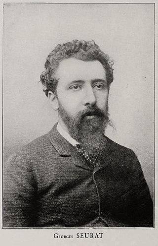
Georges Pierre Seurat was a French post-Impressionist artist. He devised the painting techniques known as chromoluminarism and pointillism and used conté crayon for drawings on paper with a rough surface.

<i>A Sunday Afternoon on the Island of La Grande Jatte</i> Painting by Georges Seurat

A Sunday Afternoon on the Island of La Grande Jatte was painted from 1884 to 1886 and is Georges Seurat's most famous work. A leading example of pointillist technique, executed on a large canvas, it is a founding work of the neo-impressionist movement. Seurat's composition includes a number of Parisians at a park on the banks of the River Seine. It is held in the collection of the Art Institute of Chicago.

<span class="mw-page-title-main">Umber</span> Earth pigment

Umber is a natural earth pigment consisting of iron oxide and manganese oxide; it has a brownish color that can vary among shades of yellow, red, and green. Umber is considered one of the oldest pigments known to humans, first seen in Ajanta Caves in 200 BC – 600 AD. Umber's advantages are its highly versatile color, warm tone, and quick drying abilities. While some sources indicate that umber's name comes from its geographic origin in Umbria, other scholars suggest that it derives from the Latin word umbra, which means "shadow". The belief that its name derives from the word for shadow is fitting, as the color helps create shadows. The color is primarily produced in Cyprus. Umber is typically mined from open pits or underground mines and ground into a fine powder that is washed to remove impurities. In the 20th century, the rise of synthetic dyes decreased the demand for natural pigments such as umber.

<span class="mw-page-title-main">Oil paint</span> Type of slow-drying paint

Oil paint is a type of slow-drying paint that consists of particles of pigment suspended in a drying oil, commonly linseed oil. The viscosity of the paint may be modified by the addition of a solvent such as turpentine or white spirit, and varnish may be added to increase the glossiness of the dried oil paint film. The addition of oil or alkyd medium can also be used to modify the viscosity and drying time of oil paint. Oil paints were first used in Asia as early as the 7th century AD and can be seen in examples of Buddhist paintings in Afghanistan. Oil-based paints made their way to Europe by the 12th century and were used for simple decoration, but oil painting did not begin to be adopted as an artistic medium there until the early 15th century. Common modern applications of oil paint are in finishing and protection of wood in buildings and exposed metal structures such as ships and bridges. Its hard-wearing properties and luminous colors make it desirable for both interior and exterior use on wood and metal. Due to its slow-drying properties, it has recently been used in paint-on-glass animation. The thickness of the coat has considerable bearing on the time required for drying: thin coats of oil paint dry relatively quickly.

<span class="mw-page-title-main">Neo-Impressionism</span> Art movement

Neo-Impressionism is a term coined by French art critic Félix Fénéon in 1886 to describe an art movement founded by Georges Seurat. Seurat's most renowned masterpiece, A Sunday Afternoon on the Island of La Grande Jatte, marked the beginning of this movement when it first made its appearance at an exhibition of the Société des Artistes Indépendants in Paris. Around this time, the peak of France's modern era emerged and many painters were in search of new methods. Followers of Neo-Impressionism, in particular, were drawn to modern urban scenes as well as landscapes and seashores. Science-based interpretation of lines and colors influenced Neo-Impressionists' characterization of their own contemporary art. The Pointillist and Divisionist techniques are often mentioned in this context, because they were the dominant techniques in the beginning of the Neo-Impressionist movement.

Cerulean, also spelled caerulean, is a variety of the hue of blue that may range from a light azure blue to a more intense sky blue, and may be mixed as well with the hue of green. The first recorded use of cerulean as a colour name in English was in 1590. The word is derived from the Latin word caeruleus, "dark blue, blue, or blue-green", which in turn probably derives from caerulum, diminutive of caelum, "heaven, sky".

<span class="mw-page-title-main">Cobalt blue</span> Blue pigment

Cobalt blue is a blue pigment made by sintering cobalt(II) oxide with aluminum(III) oxide (alumina) at 1200 °C. Chemically, cobalt blue pigment is cobalt(II) oxide-aluminium oxide, or cobalt(II) aluminate, CoAl2O4. Cobalt blue is lighter and less intense than the (iron-cyanide based) pigment Prussian blue. It is extremely stable and historically has been used as a coloring agent in ceramics (especially Chinese porcelain), jewelry, and paint. Transparent glasses are tinted with the silica-based cobalt pigment "smalt".

<span class="mw-page-title-main">Naples yellow</span> Lead-antimonate inorganic pigment used in paintings

Naples yellow, also called antimony yellow or lead antimonate yellow, is an inorganic pigment that largely replaced lead-tin-yellow and has been used in European paintings since the seventeenth century. While the mineral orpiment is considered to be the oldest yellow pigment, Naples yellow, like Egyptian blue, is one of the oldest known synthetic pigments. Naples yellow was used in ancient Egypt and Mesopotamia, finding widespread application during the Hellenistic and Roman periods. Prior to its earliest occurrences in European paintings, the pigment was commonly employed in pottery, glazes, enamels, and glass. The pigment ranged in hue from a muted, earthy, reddish yellow to a bright light yellow.

<span class="mw-page-title-main">Divisionism</span> Style in Neo-Impressionist paintings

Divisionism, also called chromoluminarism, is the characteristic style in Neo-Impressionist painting defined by the separation of colors into individual dots or patches that interact optically.

Aureolin is a pigment sparingly used in oil and watercolor painting. Its color index name is PY40. It was first made in 1831 by Nikolaus Wolfgang Fischer in Breslau characterizing it as "Doppelsalze" or double-salts and its chemical composition is potassium cobaltinitrite. He characterized it again and wrote more extensively about it in 1842, naming it "Salpetrichtsaures Kobaltoxydkali". In 1851–1852, Edouard Saint-Evre synthesized cobalt yellow independently. He is credited with the introduction of cobalt yellow as an artists pigment. The investigation by Gates gives the exact modern procedures for the preparation of aureolin and also the methods for its identification in paintings.

<span class="mw-page-title-main">Rose madder</span> Red paint made from the madder plant

Rose madder is a red paint made from the pigment madder lake, a traditional lake pigment extracted from the common madder plant Rubia tinctorum.

<span class="mw-page-title-main">Shades of violet</span> Varieties of the color violet

Violet is a color term derived from the flower of the same name. There are numerous variations of the color violet, a sampling of which are shown below.

<span class="mw-page-title-main">Shades of purple</span> Variations of the color purple

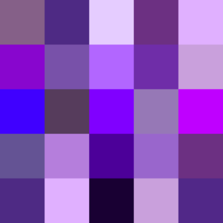
There are numerous variations of the color purple, a sampling of which is shown below.

<span class="mw-page-title-main">YInMn Blue</span> Inorganic blue pigment

YInMn Blue, also known as Oregon Blue or Mas Blue, is an inorganic blue pigment that was discovered by Mas Subramanian and his (then) graduate student, Andrew Smith, at Oregon State University in 2009. The pigment is noteworthy for its vibrant, near-perfect blue color and unusually high NIR reflectance. The chemical compound has a unique crystal structure in which trivalent manganese ions in the trigonal bipyramidal coordination are responsible for the observed intense blue color. Since the initial discovery, the fundamental principles of colour science have been explored extensively by the Subramanian research team at Oregon State University, resulting in a wide range of rationally designed novel green, purple, and orange pigments, all through intentional addition of a chromophore in the trigonal bipyramidal coordination environment.

<span class="mw-page-title-main">Blue pigments</span> Natural or synthetic materials

Blue pigments are natural or synthetic materials, usually made from minerals and insoluble with water, used to make the blue colors in painting and other arts. The raw material of the earliest blue pigment was lapis lazuli from mines in Afghanistan, that was refined into the pigment ultramarine. Since the late 18th and 19th century, blue pigments are largely synthetic, manufactured in laboratories and factories.

References

  1. Hugo Müller, Wolfgang Müller, Manfred Wehner, Heike Liewald "Artists' Colors" in Ullmann's Encyclopedia of Industrial Chemistry 2002, Wiley-VCH, Weinheim. doi : 10.1002/14356007.a03_143.pub2
  2. 1 2 Lee, J. D.; Browne, L. S. (1968-01-01). "The nature and properties of manganese violet". Journal of the Chemical Society A: Inorganic, Physical, Theoretical: 559–561. doi:10.1039/J19680000559. ISSN   0022-4944.
  3. 1 2 Hainbach, Rudolf (1924). Pottery decorating, a description of all the processes for decorating pottery and porcelain. Scott, Greenwood & Son. OCLC   3626727.
  4. 1 2 3 4 Finlay, Victoria (2014). The Brilliant History of Color in Art. Los Angeles: The J. Paul Getty Museum. pp. 94–97. ISBN   9781606064290.
  5. 1 2 3 Faulkner, Edwin (2021). Coloring the Cosmetic World: Using Pigments in Decorative Cosmetic Formulations (2nd ed.). Wiley. pp. 61–62. ISBN   9781119558132.
  6. 1 2 3 Gettens, R. J.; Stout, G. L. (2012-09-26). Painting Materials: A Short Encyclopedia. Courier Corporation. ISBN   978-0-486-14242-5.
  7. 1 2 Eastaugh, Nicholas; Walsh, Valentine; Chaplin, Tracey; Siddall, Ruth (2008). Pigment Compendium. Taylor & Francis. p. 257.
  8. Gardner, William (1999). Chemical Synonyms and Trade Names: A Dictionary and Commercial Handbook. C. Lockwood and Son. p. 208.
  9. Winter, Ruth (2009). A Consumer's Dictionary of Cosmetic Ingredients (7th ed.). New York City, New York: Harmony Books. p. 339. ISBN   9780307451118.
  10. 1 2 3 Begum, Yasmin; Wright, Adrian J. (2012). "Relating highly distorted Jahn–Teller MnO6 to colouration in manganese violet pigments". Journal of Materials Chemistry. 22 (39): 21110. doi:10.1039/c2jm33731b. ISSN   0959-9428.
  11. "Manganese violet". ColourLex. Retrieved 2023-04-12.
  12. 1 2 Church, Arthur Herbert (1915). The Chemistry of Paints and Painting. Seeley, Service & Company, limited.
  13. 1 2 Weber, Frederick W. (1923). Artists' Pigments: Their Chemical and Physical Properties. D. Van Nostrand Company.
  14. Koleske, Joseph, ed. (1995). Paint and Coating Testing Manual (14th ed.). Philadelphia, PA: American Society of Testing and Materials. p. 210.
  15. Comstock, C (2016). "Complex Inorganic Colored Pigments: Comparison of Options and Relative Properties when Faced with Elemental Restrictions". Journal of Surface Coatings Australia: 10–30.
  16. 1 2 Tager, Allen; Kirchner, Eric; Fedorovskaya, Elena (2021). "Computational Evidence of First Extensive Usage of Violet in the 1860s". Color Research and Application. 46 (5): 961–977. doi:10.1002/col.22638. S2CID   233671776.
  17. "Definition of PURE COLOR". www.merriam-webster.com. Retrieved 2023-04-14.
  18. 1 2 3 Kirby, Jo; Stonor, Kate; Roy, Ashok; Burnstock, Aviva; Grout, Rachel; White, Raymond (2003). "Seurat's Painting Practice: Theory, Development and Technology". National Gallery Technical Bulletin. 24: 4–37.
  19. Code of Federal Regulations. U.S. General Services Administration, National Archives and Records Service, Office of the Federal Register. 1995. p. 318.
  20. Brown, Valerie (2013). "Metals in Lip Products - A Cause for Concern?". Environmental Health Perspectives. 121 (6): A196. doi:10.1289/ehp.121-a196. PMC   3672926 . PMID   23732812.