
Typography is the art and technique of arranging type to make written language legible, readable and appealing when displayed. The arrangement of type involves selecting typefaces, point sizes, line lengths, line-spacing (leading), and letter-spacing (tracking), as well as adjusting the space between pairs of letters (kerning). The term typography is also applied to the style, arrangement, and appearance of the letters, numbers, and symbols created by the process. Type design is a closely related craft, sometimes considered part of typography; most typographers do not design typefaces, and some type designers do not consider themselves typographers. Typography also may be used as an ornamental and decorative device, unrelated to the communication of information.

Matthew Carter is a British type designer. A 2005 New Yorker profile described him as 'the most widely read man in the world' by considering the amount of text set in his commonly used fonts.

Emigre, Inc., doing business as Emigre Fonts, is a digital type foundry based in Berkeley, California, that was founded in 1985 by husband-and-wife team Rudy VanderLans and Zuzana Licko. The type foundry grew out of Emigre magazine, a publication founded by VanderLans and two Dutch friends who met in San Francisco, CA in 1984. Note that unlike the word émigré, Emigre is officially spelled without accents.
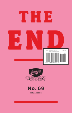
Emigre was a (mostly) quarterly magazine published from 1984 until 2005 in Berkeley, California, dedicated to visual communication, graphic design, typography, and design criticism. Produced by Rudy VanderLans and Zuzana Licko, Emigre was known for creating some of the very first digital layouts and typeface designs. Exposure to Licko's typefaces through the magazine lead to the creation of Emigre Fonts in 1985.
Zuzana Licko is a Slovak-born American type designer and visual artist known for co-founding Emigre Fonts, a digital type foundry in Berkeley, CA. She has designed and produced numerous digital typefaces including the popular Mrs Eaves, Modula, Filosofia, and Matrix. As a corresponding interest she also creates ceramic sculptures, textile prints and jacquard weavings.

Neville Brody, is an English graphic designer, typographer and art director. He is known for his work on The Face magazine (1981–1986), Arena magazine (1987–1990), and designing record covers for artists such as Clock DVA, Cabaret Voltaire, The Bongos, 23 Skidoo and Depeche Mode. He created the company Research Studios in 1994 and is a founding member of Fontworks. His work is included in the permanent collection of the Museum of Modern Art (MoMA). He was the Dean of the School of Communication at the Royal College of Art, London until September 2018. He is now Professor of Communication.
The Type Directors Club (TDC) is an international organization devoted to typography and type design, founded in 1946 in New York City. TDC believes that type drives culture, and that culture drives type—and is dedicated to cataloging, showcasing, and exhibiting typography worldwide.
Rudy VanderLans is a Dutch graphic designer, photographer, and the co-founder of Emigre Fonts with his wife Zuzana Licko. Emigre Fonts is an independent type foundry in Berkeley, CA. He was also the art director and editor of Emigre magazine, the legendary journal devoted to visual communications from 1984 to 2005. Since arriving in California in 1981, he has been photographing his adoptive Golden State as an ongoing side project. He has authored a total of 11 photo books on the topic, and staged two solo exhibits at Gallery 16 in San Francisco.

Peter Biľak is a Slovak graphic and typeface designer, based in The Hague, The Netherlands. He works in the field of editorial, graphic, and type design; teaches typeface design at the postgraduate course Type&Media at the KABK, Royal Academy of Art. He started Typotheque in 1999, Dot Dot Dot in 2000, Indian Type Foundry in 2009, Works That Work magazine in 2012, and Fontstand in 2015. He is a member of AGI, and lectures on his work internationally. He is a writer for numerous design magazines and frequently contributes writing and design to books and publications that include Print, Emigre, Eye (magazine), Items, tipoGrafica, Idea (magazine), Abitare and, Page.
Edward Fella is an American graphic designer, artist and educator. He created the OutWest typeface in 1993. His work is held in the collection of the Cooper-Hewitt, National Design Museum, the Brauer Museum of Art, and the Museum of Modern Art. He was the recipient of the 2007 AIGA Medal. He was also the recipient of a Chrysler Award in 1997. Curt Cloninger called Fella "the contemporary master of hand-drawn typography."

Thomas Maitland Cleland was an American book designer, painter, illustrator, and type designer.
Ahn Sang-soo is a South Korean politician. He was chairman of the Grand National Party, the precursor to the Saenuri Party. He was the Mayor of Changwon from 2014 to 2018. He hopes to improve that city's bicycle-sharing plan.

The Korean alphabet, known as Hangul in South Korea and Chosŏn'gŭl in North Korea, is the modern official writing system for the Korean language. The letters for the five basic consonants reflect the shape of the speech organs used to pronounce them, and they are systematically modified to indicate phonetic features; similarly, the vowel letters are systematically modified for related sounds, making Hangul a featural writing system. It has been described as a syllabic alphabet as it combines the features of alphabetic and syllabic writing systems, although it is not necessarily an abugida.
Anna Carolina Laudon is a typographic designer and graphic designer. Educated in Fine Art at Gerlesborgsskolan in Stockholm, Laudon earned a master's degree in graphic design at HDK School of Design and Crafts at the University of Gothenburg in Sweden, where she made her first font. She is fascinated in social topics such as Feminism, Human Issues, Intersectionality and Global Communication.
Lie Sang Bong is a Korean fashion designer. His designs have been worn by Beyoncé, Rihanna, Lady Gaga, and Lindsay Lohan.
Colin Brignall is an English type designer and photographer. In addition to designing typefaces himself, he has worked as a type director and typographic consultant to Letraset and the International Typeface Corporation (ITC), selecting and overseeing other designers' typefaces.

Roger Black is an American graphic designer whose work has been influential in the design of magazines, newspapers, digital typography and the web. His contributions include designs for Rolling Stone, Esquire, The New Republic, Fast Company, Reader's Digest, Foreign Affairs, the Los Angeles Times, the Houston Chronicle and the website Bloomberg.com.

Yang Sung-chun was a South Korean graphic designer. He is regarded as a great figure in graphic design in South Korea, as he produced more than 300 graphic design works.

The King's Letters is a Korean historical drama film released on 24 July 2019. Set in the early Joseon Dynasty, it depicts Sejong the Great and Shinmi as main characters in creating Hangul. The film was directed by Jo Chul-hyun, and stars Song Kang-ho, Park Hae-il, Jeon Mi-seon, Choi Deok-moon, and Jung Hae-kyun. It grossed US$6,454,970 worldwide.
East Asian typography is the application of typography to the writing systems of Chinese, Japanese, and Korean languages. Typography has been applied to all East Asian scripts, including Chinese characters, hiragana, katakana, and hangul.


